They are united in one common feature – success of design depends on the user. After all, design is all about user perception and ease of interaction. Whether it’s a face of a building or interface of an app the main purpose of design is to appeal to a target audience.
That is why it is reasonable to rely on psychology for better understanding of User Experience, involvement boost and improvement of the overall design perception.
As we strive to create a human-centered design, it’s essential to develop a system of principles and psychological approaches that would increase the efficiency of apps and websites, helping users to reach their goals quickly and effectively.
Laws of Perception
To get a deep understanding of the user perception mechanism, we have to define psychological phenomena behind the user / interface communication. It is well-known that user’s cognition and perception abide a particular set of ground rules, which have been described by psychologists from all over the world.
For instance, some of them are covered by Gestalt theory researched in the 1920s by a group of German psychologists. It specifies 6 basic principles of perception that also can be applied to UI.
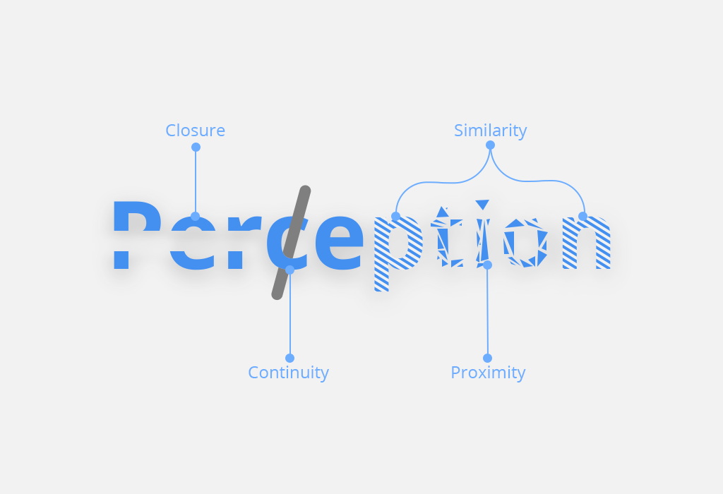
Basic principles of perception according to Gestalt theory:
proximity. Elements close to each other give an impression of a group, so can be recognized as connected;
similarity. Elements that look similar tend to be perceived as a group;
continuity. Users tend to perceive a line continuing its established direction;
closure. Humans tend to perceive collections of fragments and elements as a whole;
symmetry. Symmetrical patterns are perceived as more harmonious ;
figure/ground. Users tend to see smaller figure/element on a larger;
Restrictions of Perception
Unfortunately, human’s perception is not perfect. It is determined by a person’s experience, goals, and context – people usually see what they expect to see. Also, perception may be restricted by medical conditions. There are some of the most typical perception restrictions:
Color vision is limited.
Users find it difficult to differentiate pale colors, small color patches and separate patches in design. Around 8% of male and 0,5% of female users of Northern European ancestry have color-blindness. No interface can rely solely on color.
UX designers do not simply adopt the principles of inclusive color design. It is not just to satisfy users with color vision problems; it also generally improves the perception of the colors by everyone else.
In such cases, the UI designer chooses a color palette with sufficient contrast and avoids relying only on color to convey information. Additionally, designers can use alternative methods, such as patterns or symbols, to differentiate between elements in the interface.
Learn how to transform your product design with the best tools and practice
Accessibility considerations
Accessibility considerations for UI designers include ensuring that digital interfaces are accessible and understandable to people with disabilities. This inclusive approach aims to ensure equal access to information and functionality for all users, regardless of their abilities. Here are some key aspects of accessibility that UI designers mention most often.
- Visual accessibility. Your UX designers must consider the needs of visually impaired users. They may rely on screen readers, zoom tools, or alternative color contrasts to navigate interfaces. In such cases, the UX designer uses clear typography, sufficient color contrast, and descriptive alternative text for images. This allows for the receptivity and comprehensibility of the content for all users.
- Motor accessibility. Users with motor disabilities may have difficulty using traditional input devices such as a mouse or keyboard. That is why UX designers must ensure that interfaces work using alternative input methods. It can be voice commands or keyboard shortcuts. Also, UI designers should think about having enough clickable areas and interactive elements that are easy to activate.
- Cognitive availability. Your UX designer should keep in mind that people with cognitive disabilities may need a simplified user interface design with as clear navigation as possible and concise language to aid understanding. UI designers should avoid jargon, use consistent design patterns, and provide clear instructions to minimize cognitive load and ease of use.
Learn more about high-quality and modern UI design services
- Auditory accessibility. UX designers should think that users with hearing impairments can visual prompts or transcripts. This will help you understand the audio content. In addition, UI designers must provide captions, subtitles, or transcripts for multimedia content. UI designers are also advised to avoid relying solely on audio information to convey important messages or instructions.
- Inclusive design practices. Every UI designer will attest that designing with accessibility in mind not only benefits users with disabilities but also improves the overall interaction with all other users. With integrated design methods, UX designers can improve usability and satisfy various customer preferences and needs. This applies not only to visual elements, but also to the provision of customizable font sizes, keyboard navigation options, and flexible layout design.
- Device compatibility. Your UI designer must ensure that your product’s interface is compatible with the wide range of devices and assistive technologies commonly used by people with disabilities. These could be screen readers, Braille displays, or controls. UI designers must test different devices and assistive technologies to ensure compatibility and usability.
Read more about screen types in design here.
UX designers incorporate accessibility issues into design processes to create more inclusive and user-friendly interfaces. This ensures equal access and usability for all people, regardless of their abilities or disabilities.
Peripheral vision is poor.
Strict and precise allocation of elements within the interface is required. The main actions and most important features are implemented into the design in the serial position – it is called Serial Position effect and we will also examine it in this article.
Cultural and social influence
Every professional UX designer will confirm that cultural features greatly influence the perception of not only the user interface but also the product in general. Perhaps this is not the main limitation because globalization is doing its job. However, if you are going to create a product for a specific country or region, you need to hire experienced UI designers with an understanding of all the cultural details and nuances.
Therefore, different cultures can interpret symbols, colors and even gestures differently. This leads to different perception of visual elements. UI designers must take this into account to ensure full inclusiveness and efficiency for diverse user bases.
Users ignore tools aiming at tasks: recall is hard.
Users focus on achieving the goal, that is why they prefer familiar paths to exploration of new design to save time. Humans evolved to recognize things quickly, but not to recall arbitrary (random) facts – instructions should be visible or easily retrievable whenever they are needed.
Cognitive biases
If you have ever talked to a UI designer, then you know that cognitive biases can be a big limitation in creating a user interface and design in general. Why is this happening? People tend to interpret information in ways that confirm their prior beliefs or expectations. That is why UI designers must be aware of these biases and strive to create user interface design that minimizes their influence. This will help the UX designer in promoting a more objective interaction with the user.
Every professional UI designer pays attention to cognitive biases because they can affect how users perceive, interact with, and ultimately experience digital interfaces. Understanding these biases allows the UX designer to predict user behavior and create more efficient and intuitive designs.
Let’s take a closer look at the most common cognitive biases in user experience and user interface design.
- Confirmation bias. Your users may interpret interface elements in ways that confirm their existing beliefs or expectations. Therefore, your UI designer should be aware of this bias when designing interfaces. It is also worth checking items in focus groups to avoid misinterpretation or disappointment.
- Anchoring bias. Your users can focus on the first piece of information they come across, such as a prominent feature or price, and use that as a guide for further judgments. UI designers can use this bias to benefit the product. It is enough to strategically place key information or calls to action to influence users’ decisions.
- Choice supportive bias. Users tend to remember positive experiences with a user interface and pay less attention to its shortcomings when evaluating their overall satisfaction. Your UX designer should strive to create a consistently positive interaction to mitigate the impact of any potential negative experience.
Check out more tips from our UX designers
- Social proof bias. Users may be influenced by the actions or opinions of others when making decisions. Your UI designer can use the inclusion of social proof elements, such as user reviews or testimonials, to help validate the trustworthiness of the user interface and encourage user engagement.
- Scarcity bias. Users may perceive scarcity, such as limited-time offers or low-stock notifications, as a signal of value and urgency. UI designers can strategically use scarcity tactics to encourage users to take desired actions, such as making a purchase or signing up for a service.
- Loss aversion bias. Users are usually more sensitive to potential losses than to equivalent gains. This causes them to avoid actions that may lead to perceived losses. So UX designers must structure interactions in a way that emphasizes potential benefits and minimizes perceived risks to encourage user engagement.
By understanding and eliminating these cognitive biases, UX designers can create more user-centered products that effectively meet the needs and expectations of their target audience.
Learn more about web design trends in our article
Attention is limited and memory is imperfect.
User can simultaneously focus on 3-7 unrelated items: goals, numbers, images, etc. Moreover, old behavioral patterns are sometimes forgotten and hard to recall. Eventually, it is one of the main metrics in UI/UX design. It explains why it is so important to keep the user involved.
Attention in design
First, let us understand what exactly is user’s attention we seek so desperately. Attention is the ability of our mind to selectively concentrate on some aspect of information while ignoring other information flows.
When we regard the user’s attention in terms of UI, we mainly concentrate on visual information. There are two basic types of attention to visual data:
spatial (object-based) attention: user’s attention is attracted to a certain location in the interface;
feature-based attention: user’s attention is attracted to a certain feature of the object (shape, color, etc.);
Having determined the two main principles of user’s attention, let’s give a more precise scope for UX designer to focus on while projecting any interface – there are four general types of attention to affect user’s interaction with the interface and thus the process of interface design.
Selective attention is the type of attention that helps to choose the most important element in the particular situation. This type of attention is the most versatile and useful psychological tool for the designer to grab the user’s attention while creating software environment.
Divided attention allows us to keep in mind a few tasks simultaneously. The most common example of divided attention is watching any movie/sitcom or Youtube video and chatting online. This type of attention allows us to respond to multiple demands of the surrounding.
In games, for example, a user has to take control over multiple not necessarily closely connected elements or in interfaces that are somehow split into separate regions.
Alternating attention is the ability to switch your focus between tasks that have different cognitive demands, like when you check your route via Google Maps app and make changes to your driving direction.
Sustained attention is the most important type of attention UX designer should focus on when creating an interface in dynamics and building the flow. It allows the user to focus on the particular element or action for an extended period of time.
Basically, this type of attention is the key to understanding the bounce-rate of any interface. Addressing the sustained attention keeps the user involved within the interface as long as possible.
User perception effects
Except for principles, covered by Gestalt theory, there is also a range of effects described by scientists during the 20th century and in latest studies.
Von Restorff effect
One of the most common and basic practices of grabbing user’s attention from the first interaction with an interface is based on the works of German psychiatrist Hedwig von Restorff (1906-1962).
His 1933 study revealed – from a certain number of displayed elements a person will most likely remember the ones different from the rest.
It is the first and the foremost psychology principle we can operate with when creating an interface grabbing users’ attention.
Fonts, buttons, or pictures – anything we can highlight, emphasize or make look different from everything else can become an eye-catcher. Something the user gets hooked upon and remembers.
It becomes the first step towards grabbing the user’s attention, whether we speak of an app or a website. Isolation effect also serves to guide the user through the interface.
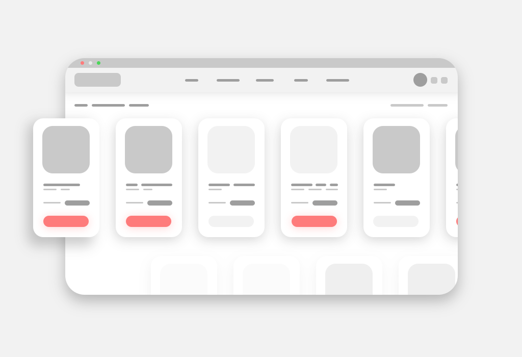
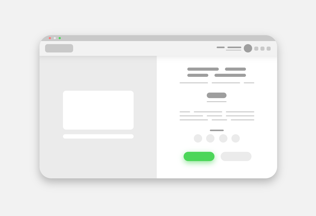
Look at the following example – this particular interface uses Von Restorff effect drawing the user’s attention to the illustration below. Von Restorff Effect is the reason why call-to-action buttons are different from the rest of the interface elements.
Means of grabbing the user’s attention with fonts, colors, and elements are covered by psychologist Susan Weinscheck in her book “Deep Insights into Human Behavior”.
Serial position effect
The serial position effect was studied by German psychologist Herman Ebbinghaus – it is the tendency to remember the first and last items in a list better than those in the middle. This effect is a form of cognitive bias based upon two other effects – primacy and recency effects.
The primacy effect determines our brain’s inclination to remember information perceived at the beginning of any interaction much better than anything that follows it.
This effect can be reduced when the amount of information is increased or presented quickly.
The opposite one is the recency effect. It is believed to be caused by more recent information blocks to be stored in short-term memory, which generally lasts for 30 seconds. It can be reduced with the other distractive task.
To influence buyers’ decision, e-commerce websites position the most important items in the beginning and the end of the pages, manipulating buyer’s attention. This effect is the key to SEO for obvious reasons.
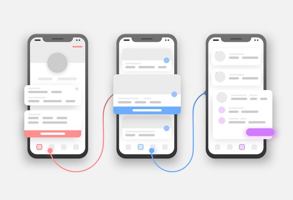
Most of the apps favor bottom or top bar navigation instead of the hamburger menu. Following a simple rule of serial position effect, designers put the most important user actions in the navigation bars to the right or left side.
The logical flow of the user’s attention from the left side to the right side determines which buttons or features should be placed first and last to manipulate the user and provide the most effective user experience design.
Cognitive load
The other issue to be considered while working on interface design is cognitive load – it is the total amount of mental effort required from a user to complete a particular task or set of tasks.
Australian psychologist John Sweller formulated three types of cognitive load in his theory:
intrinsic cognitive load is the level of difficulty associated with the particular instructional topic. This is why any microcopy or copy within the interface become vital for UX, as they should provide a user with prompt and short instructions;
the extraneous cognitive load determines anything that distracts the user and makes it difficult to perform the task or achieve the desired goal within the interface;
germane cognitive load is focused on enhancing information processing. It allows the user to acquire an understanding of UX structure and organize the information flow in the most effective manner.
Hick’s Law
Hick’s Law is named after a British-American psychologist team of William Edmund Hick and Ray Hyman. This law implies that the time needed to make a decision depends on the available choices.
The more choices the user faces within the interface, the longer it will take to reach a decision. This obvious conclusion is very often neglected while focusing on the functionality of the app or website.
Yet Hick’s Law allows designers to analyze the number of features they can implement without overloading the user. It also allows to control the user involvement by increasing or decreasing the number of decisions the user can make within the app’s flow.
Grabbing user’s attention may appear to be the foremost mission of any app, but keeping it and manipulating the decisions – that’s why it is important to take into account the principles described earlier.
That’s why it’s important for UI/UX designers to learn the psychological basis to understand users: how they perceive objects and how they interact with the environment of the software.
This is the only way to create a coherent and successful design for the audience.


