Therefore, a great deal of attention on the stage of the design and development of digital products is paid to its usability which is determined by both User Experience and User Interface.
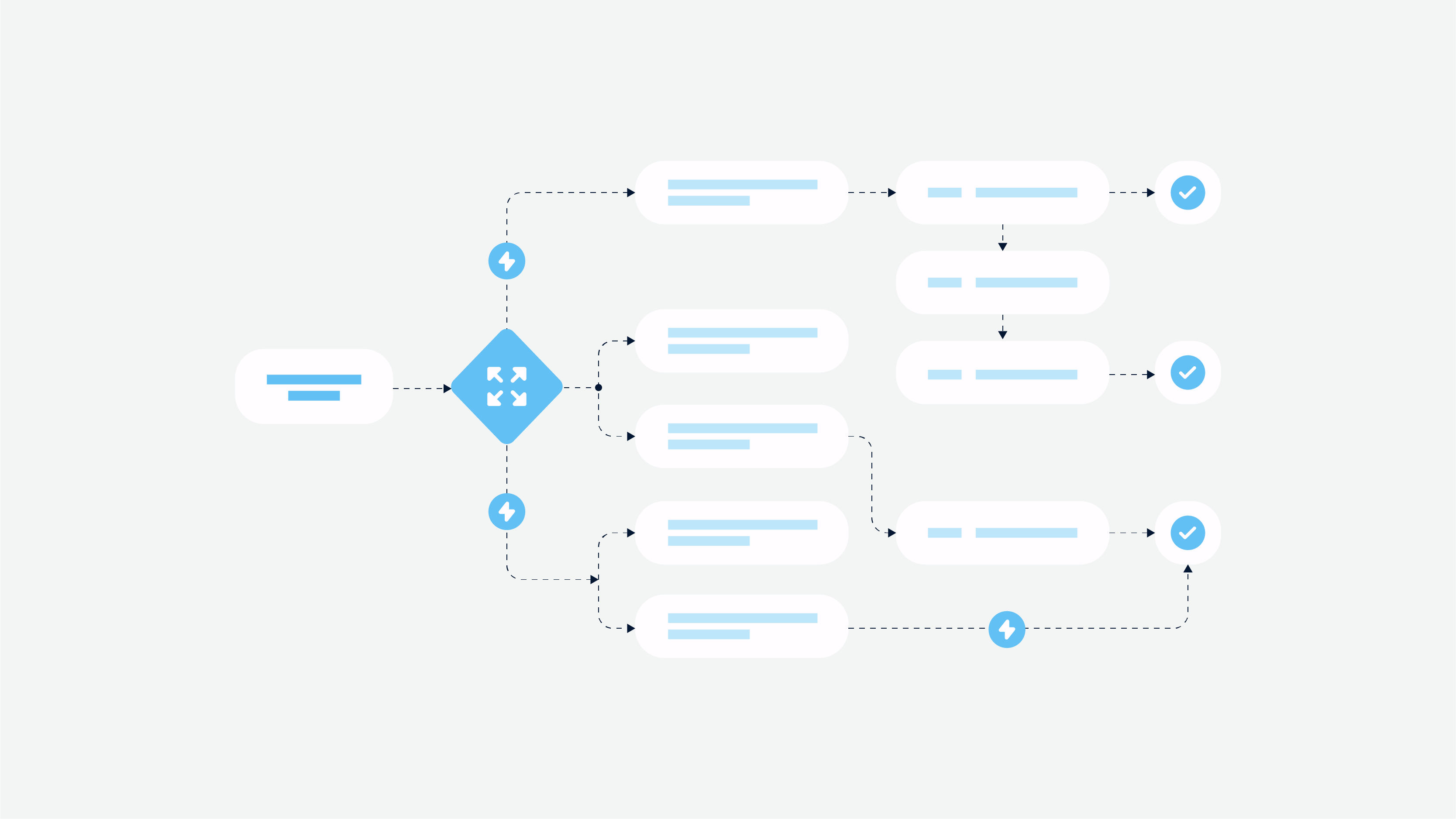
On the stage of UX, the importance of usability is obvious – UX matters, since it is not the design of visuals. The main aim of the UX is to decide how the users will solve their problems using the product, what is the user scenario and how it is reflected in features.
General principles to follow while creating truly comfortable UX.
Abandoning visuals
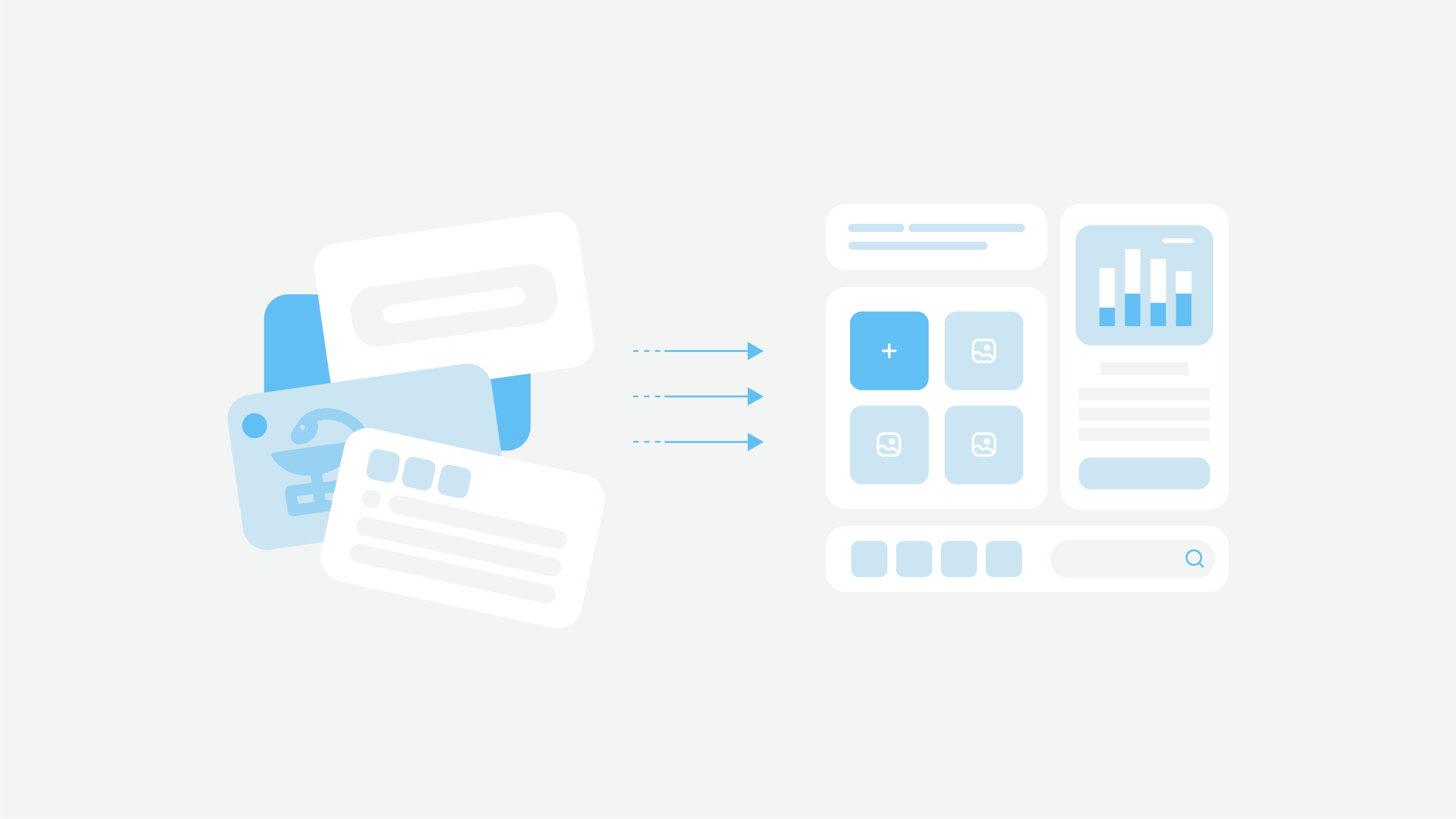
Since the main aim is to understand how the product works, UX is a plan of the future app or website, logical structure. It doesn’t require any special visual elements of decorations – that is why on the UX stage we don’t think about pictures, icons and so on since it distracts attention.

Useful tip: You don’t have to feel delighted about UX like about the ready design. If you think about wireframes as the ready product – you will never analyze the logic of the app. At this stage think only about the usability requirements and nothing more.
Simplifying the pace
Clever UX is all about convenience and simplicity. Usability matters when users come to your product – they have to get easily everything they want to. Websites and apps are expected to serve to users everything they need the moment they think about it. To make the intuitive design you have to know the audience perfectly and conduct plenty of research, for example, User research.

Useful tip: Never associate yourself with the user – you may not be the target audience of the product. While developing the UX, make sure any action inside the product doesn’t take more than five steps.
Early testing
Just imagine: a designer creates UX – UI is developed according to UX – UI is given to developers – product is developed – testers check the work done. Every time you decide to change something this chain starts all over again. And the later you implement changes the longer and harder it will take to complete it. The more effort it takes – the more expensive it is. To save your money and time, it is better to make corrections and improvements on the stage of UX.
Useful tip: Start the development only for the properly designed features. Conduct User Testing on the UX stage to discover the problems as early as possible.
Although a product’s usability factors depend on the quality of UX greatly, the really convenient product is born where both UX and UI are considered.
User interface design tips
As for UI, think it is only style and attractiveness is a great fallacy. Beauty for the sake of beauty without considering usability requirements makes a bad product. Perhaps, such a product will receive an award for the most creative design or the best animation, but at the same time, it will get irritation and hatred from active users who do not understand how to use it. To avoid it, follow a few simple rules:
Consider your target audience
Only by understanding your consumer well you can create a good product. Every detail is valuable: colors, fonts, size of controls, graphic design, hints type.
Useful tip:
ParameterAge | Children | Adults | Elderly |
Fonts | Large fonts (24-48 pt) | Normal fonts of medium size (12-16 pt) | Slightly enlarged fonts (16-24 pt) |
Colors | Bright, with distinct nuances | Depending on the category of the application both soft and bright colors. | Pale colors, but with emphasized controls and headings |
Graphic design | Customized illustrations and cartoon characters. | Depending on the specifics of the application both photos and custom illustrations are used. | The informative design is the best option – large fonts, segmented text, clear icons, the use of photos and illustrations. |
Onboarding | Build-in tips and/or introductory slides or video | The interface tour, tips or hybrid solution | Introductory slides/video, the interface tour or hybrid solution |
There are some more points to consider while working on the interface, for instance, the conditions in which users interact with the product:
devices – smartphone, tablet, desktop;
light – if the application is for round-the-clock operation, it is necessary to enable switching to night mode with a dark interface;
the level of tension and responsibility – for nervous work, the controls should be large, and all the important headers and alert messages are well marked;
Target audience specifics – if the application is aimed at people with disabilities, you must consider voice control, interface contrast, large fonts.
Build a design system
The design system is a set of all elements (controls, input fields, stabs, etc.) and their states that are used in the application. Thanks to the design system and clear instructions in which case to use a particular control state – duplication of functionality in different styles on different screens becomes impossible.
Useful tip:
The design system is especially good if a large project with a voluminous functionality is being developed, which later will only be expanded. Also, if there is a possibility that several designers can work on the project at the same time – in this case, it will help to unify their work.
Uniqueness when usability matters
In pursuit of uniqueness, we sometimes face with quite strange design solutions going against the usual behavioral patterns. Perhaps, some of them will be truly innovative and later become a role model, but it often leads to a lack of understanding from the user and the rejection of the application.

Useful tip:
Usability tips to stand out and delight users:
custom illustrations – you can experiment with styles and ideas;
native gestures for mobile devices – gestures can significantly simplify navigation within the application;
animated tutorials inside the application – the recipe for users’ delight and stimulation of the actions;
gamification – increases user engagement, thereby extending the user session.
design features – let users do something by hand in the application, for example: add ingredients to the pizza, change the visualization of the dashboard, create an avatar to your character, etc.
We truly believe that the successful product is an instrument that users apply to solve their problems. The instrument must be simple and clear to be useful. The given usability tips are not a guarantee of the project success, but it is the way to make users happier with the product and problem solving easier.

