
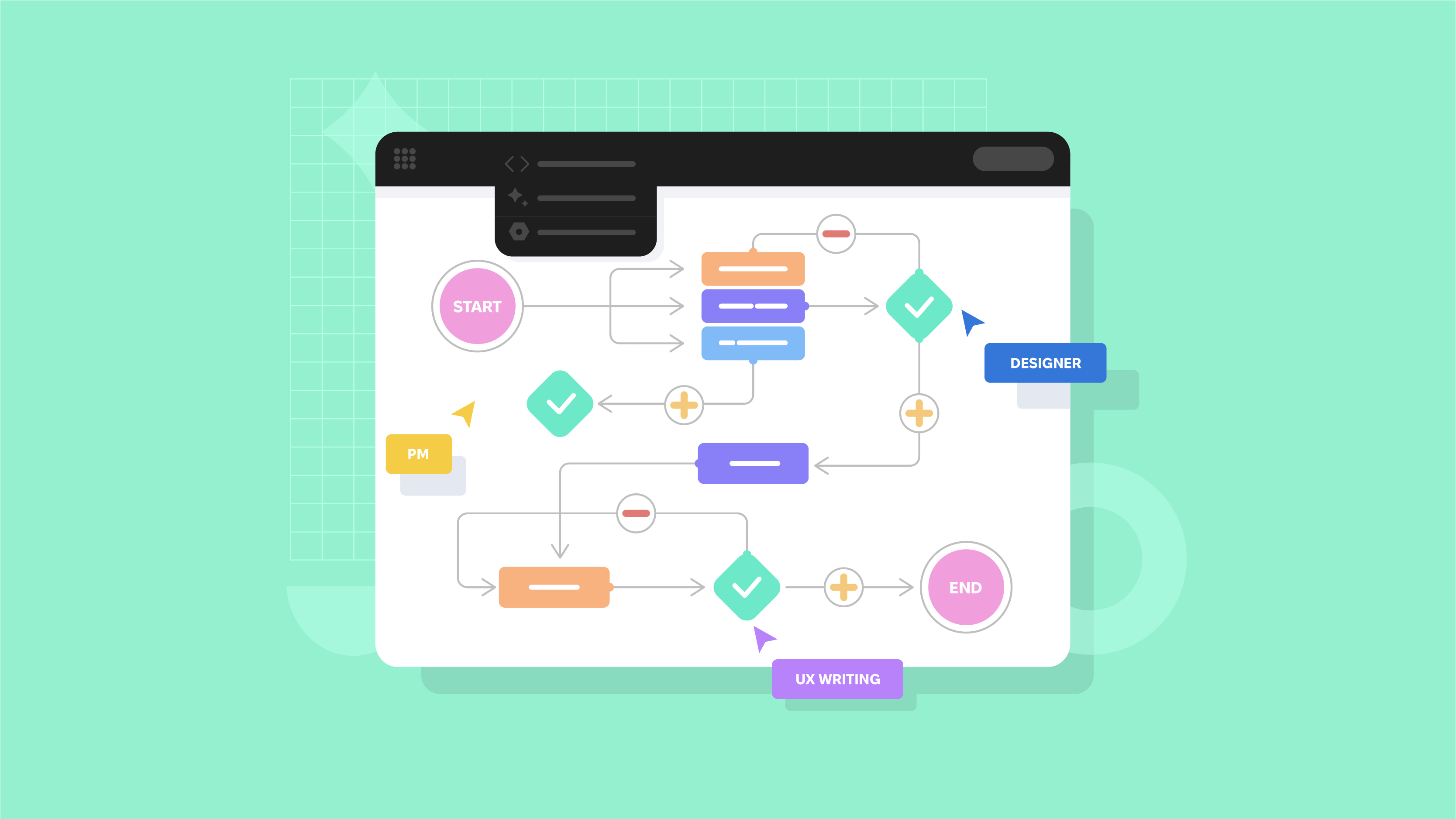
That is why you need to measure UX design efficiency and get up-to-date information to know how good your user experience is and how users perceive it. How can you do it? Monitoring the main metrics using specialized tools and services. We are going to share with you all the particularities of UX efficiency measurement.
The Goal Of UX Measurement And Why It Is Important

For a start, UX efficiency measurement is not performed with a few clicks. It is a long process that takes time and must be thought out. UX measurement implies the observation of users’ behavior — how they implement specific tasks, whether they have trouble with any actions, etc. It provides you with information about the experience of users.
But this information is not indicated as “cool,” “positive,” “bad,” “could be better,” and so on. It is stated precisely with numbers that you can understand if you figure out the principle of each metrics’ functionality and how it is calculated. It is especially important for investors if you spend their money to create software, and you need to provide them with the report.
So, UX measurement is not some kind of thermometer that shows you precise indications and calls to actions. You see the chain of users’ activities and their attitude concerning your product. There are many existing metrics, but you need only a few of them to measure UX efficiency. We will cover them in the next section.
Web and mobile UX measurement
Another critical issue you need to consider is UX efficiency measurement in mobile or web applications. There is no difference whether you create a mobile app or a website — you should know everything about the UX quality level in your software. The only difference lies in the types of services and tools for measurement.
What UX Metrics Exist And Their Difference

We will divide metrics into two categories — behavioral UX metrics and attitudinal UX metrics. Each type plays its essential role, and you should focus on both of them if you want to know everything about users’ opinions concerning your product.
Behavioral UX metrics
Behavioral UX metrics are quantitative indicators that help UX designers understand how users behave when interacting with a product. These metrics are based on observable actions and behaviors such as clicks, taps, navigation patterns, task completion rates, etc.
By analyzing behavioral metrics, teams providing UX design services can comprehend how users interact with various features and elements. Knowing this, they can identify usability issues and optimize the user journey, as well as generally improve UX design.
It is vital to understand how people use your product and what they do most in your product. Such metrics include the following:
- Pageviews
- Abandonment rate
- Conversions
- Task success rate
- Search and navigation
- User error rate
Pageviews
It makes it possible for you to figure out how many pages were viewed on your website or mobile app. How many clicks, taps, and steps were made on the pages? This data helps you know more about the activity in your software.
This helps to collect data for user testing. What does your user interact with the most? What pages are related to each other in the user’s mind? The number of pages viewed by users on a website or within an application indicates the level of engagement with content and helps to boost your UX design.
Abandonment rate
This rate helps you determine the number of users which added a product to the shopping cart and then left the page without further checkout. There are various reasons for it: a user was distracted by something, they found the same product at a more affordable price, or they decided to put off a purchase.
Abandonment rate in UX design can also refer to the proportion of users who abandon a specific process or task before reaching its intended completion. This could include actions like leaving a form incomplete or exiting a website before completing a desired action.
How to calculate the abandonment rate
UX design services providers calculate it by dividing the number of users who abandon the process by the total number of users who initiate it. Then, you have to multiply this number by 100 to express it as a percentage.
The formula is:
Abandonment Rate = (Number of Abandoned Processes / Total Number of Initiated Processes) x 100.
Understanding the abandonment rate in UX design and user research specifically is essential for identifying potential friction points or barriers in the user journey. High numbers can indicate usability issues, unclear instructions, or other factors that deter users from completing tasks. So, while providing UX design services, teams should monitor these rates so that they can pinpoint areas for improvement and optimize the UX design to reduce abandonment and increase conversion rates.
Factors influencing abandonment
Several factors can contribute to higher abandonment rates, influencing the UX design process and even user testing. The first factor is complex or lengthy processes and lack of clarity. Users may abandon tasks that require too many steps or take too long to complete. Unclear instructions, confusing navigation, or poorly designed interfaces can confuse users and cause them to abandon tasks. The aim of UX design is to fix it.
Another factor teams providing UX design services should pay attention to is technical issues. Glitches, slow loading times, or system errors can frustrate users and lead to abandonment. So, UX designers should consider fixing these issues using user research data.
Conversion rate
One of the most critical metrics you need to monitor is the conversion rate. This is the number of users that did some specific actions like subscription, contacting managers, made a purchase, filled out a contact form, etc. The higher the conversion rate is, the better it is for your business.
Task success rate
TSR, or task success rate, shows the number of tasks that were executed correctly from the beginning to endpoint. For example, if ten persons started making a purchase, and two of them failed to do it, you need to find out what problems they faced. If the task success rate is high, it means that the user experience is on a high level.
This is a key metric that UX designers use for usability testing, evaluating the effectiveness of user interaction with a digital product, and overall quality assessment of UX design services. In other words, TSR quantifies how well users are able to perform specific tasks within a specific interface or system.
These tasks can vary depending on the context but typically involve activities such as searching for information, filling out forms, or navigating a website to achieve a goal. They are equally important for UI/UX, web, mobile, or motion design.
Calculation
To calculate Task Success Rate and use it for improving ux design process, divide the number of successfully completed tasks by the total number of attempted tasks and multiply by 100 to get a percentage. The formula is as follows:

Suppose you provide UX design services and need to evaluate the usability of an e-commerce website. You ask a group of users to find and purchase a specific product. Out of 20 participants, 16 successfully completed the task. The TSR would be calculated as:
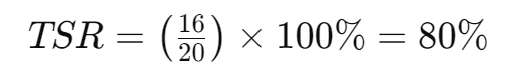
A higher Task Success Rate indicates that users are able to accomplish tasks efficiently and effectively within the system. So it is extremely important for UX designers to use these data for user research.
Interested in really useful design tips? We have a great blog post for you.
Search and navigation
It is required to know how people use navigation bars and search bars in your software. That is, if users failed to find what they need while using navigation, their next step is to use a search bar. It means that UX is too complicated, and navigation isn’t too clear for users. So check these two metrics to see how people navigate through your web or mobile app.
Each of the top companies offering UX design services pays a lot of attention to these components. Search is especially important for large or complex systems where manual navigation may simply be impractical. Effective search functionality in user interfaces should return relevant results quickly and accurately, helping users find what they are looking for with minimal effort. This is an important part of user testing and usability testing.
If you offer professional UI design services, make sure that the input field is visible and convenient, select relevant filter and sorting options, etc. Everything related to smooth and intuitive navigation should be considered in your UX design services.
Professional UX designers carefully compile a set of master links or categories that provide access to key sections of a website or application. They create a correct hierarchical path that indicates the user’s current location in the website structure. Effective navigation in UX design services affects all indicators, including user engagement and satisfaction.
User error rate
This rate shows the number of wrong entries. For example, users need to fill out the form to enroll. And they made a few unsuccessful attempts to input their credit card number or physical address. The higher the user error rate is, the more usability problems software has.
What do UX designers do wrong, and why do such mistakes occur? Whether it’s a simple mobile application for patient registration or a comprehensive web product for real estate, the factors for error in UX design are almost always the same. These include interface confusion, misunderstanding of instructions, lack of familiarity with the system, or cognitive limitations.
To improve UX design services and create optimally high-quality user interfaces, pay attention to the number of such errors, their types, forms, and frequency of repetition. This will allow you to understand the root causes of failure and correct them.
Attitudinal UX metrics
Attitudinal metrics in UX design focus on understanding users’ perceptions, attitudes, and emotional reactions to a product, platform, and UX design services as a whole. Unlike behavioral metrics, which measure observed actions, attitudinal metrics capture subjective feedback and opinions through surveys, interviews, and other qualitative research methods. These metrics provide insight into user satisfaction with your UX design, brand perception, and overall product attitude.
These metrics show you how users feel using your product, what opinion they have, what they say, etc. And how their attitude impacts brand perception. Metrics include the following ones:
- System usability scale
- Net Promoter Score
- Customer satisfaction
System usability scale
This is a short questionnaire with the most necessary list of questions. It helps you test the usability of your product and its particular parts. Why should it be short? Because users are unlikely to spend their time answering too many questions. SUS questionnaire may contain boxes where users just need to put a tick (agree/disagree, yes/no).
This is a great method of usability testing in UX design. It allows you to learn more about users’ subjective perceptions of various aspects of your product’s usability.
Typically, UX designers calculate the SUS score using a standardized formula that results in a score ranging from 0 to 100. In both UX design services for SaaS and mobile application work, a higher SUS score indicates better usability.
Therefore, your SUS questionnaire is universal and can be applied to a wide range of UX design systems, including software applications, websites, mobile applications, and hardware devices. It is often used in product evaluation to gather user feedback and identify areas for improvement in system design and functionality.
Net Promoter Score
This metric allows you to evaluate the loyalty of customers and their readiness for further actions on your software. To collect information about users’ loyalty, they are asked one main question “Would you recommend our product to a friend?” And there is a scale from 0 to 10, for example. Or answers like “Yes,” “Probably, yes,” “Certainly not,” etc.
Brand perception
Brand perception is all about how people perceive and interpret a brand, including its reputation, values, personality, and image. It encompasses consumers’ thoughts, feelings, and attitudes, which are shaped by their interactions with a brand, marketing communications, and UX design.
Positive brand perception is critical to building trust, loyalty, and preference among consumers. UX design services are also critical in this case because they create an experience for users. The right look and feel, based on user research, influence purchase decisions, willingness to pay more for products or services, and likelihood to recommend a brand to others. Conversely, negative brand perception and poor UX design can damage reputations, lead to customer dissatisfaction, and cause a loss of sales and market share.
So, marketers and designers work together on user testing. Measuring brand perception also involves conducting market research and using various qualitative and quantitative methods, such as surveys, interviews, focus groups, and social media listening. This helps the team identify UX design strengths and weaknesses and track changes in brand perception over time.
Customer Satisfaction Score
To evaluate this metric, you need to ask relevant questions regarding the service quality level and related issues. The first and straightforward question is “are you satisfied with our website?”. The number of questions may vary, but remember that you shouldn’t ask too many questions.
Such user research is usually conducted after a specific interaction, such as making a purchase, receiving customer support, or visiting a website. Users are asked to provide feedback based on their recent experience, and their responses are aggregated to calculate an overall satisfaction score. This works equally well for fintech products, healthcare services, gaming platforms, etc.
The CSAT score gives companies valuable information about customer sentiment and helps them evaluate the effectiveness of UX design. By tracking it over time and identifying trends, companies can more easily prioritize improvements and take preventative measures to boost overall customer service.
Tools And Services To Measure UX Efficiency

When you know what metrics you should track, your next step is to identify HOW you will track them. With the help of special tools, you will be able to monitor all essential indicators of your product life. Let’s check these tools out.
Google Analytics
Google Analytics is a service from Google created for webmasters and optimizers that allows them to analyze the behavior of users on the website. Collected information is stored on remote Google servers. To connect the system, specialists need to install a small block of JavaScript code on the website’s pages.
Google Analytics helps monitor vital metrics like the following:
- Bounce rate. This is a percentage of website/mobile app visitors that visited the landing page and then left software after 5-15 seconds. The main goal of any software owner is to reduce the bounce rate as much as possible.
- Exit rate. It is different from the bounce rate since it shows the page where users left a website/mobile app mostly. For example, Contact us page. When users leave this page after filling out the contact form, it is not bad. They make conversions, and you get leads. But if they leave a product page mostly, it is an issue to pay attention to.
- Average time on page. Well, it is a clear metric. You monitor what pages users spend their time on more and make relevant conclusions.
- Average pages per session. You see how many pages are viewed by users per session.
- Device usage. It is suitable for software owners that want to know what devices are used to enter their product. If it is a mobile app, it will be used on tablets or mobile devices, of course. But a website may be used on all of these devices, and analytics help you find out how users prefer to surf your website.
Besides, apart from standard metrics to track, Google Analytics allows you to monitor custom behavioral metrics that are required in your particular case. However, you need the assistance of a programmer to do it.
Google Optimize
Google Optimize is a service for website interface testing. Using Google Optimize, owners may conduct A/B and multichannel testing, collect and analyze information about users’ behavior on websites.
A/B tests make it possible to learn about changes in users’ reactions if one or several components of the website are changed. A/B tests help evaluate which version of the site is better — the previous or current one. Thus, the behavior of users shows how the ideal website should look.
Hotjar
Hotjar is a powerful tool that helps website owners optimize conversions and improve the usability of their websites. The most popular features of Hotjar are conversion funnels, heatmaps, and records of users.
It also combines customer feedback tools and analytics to help users find out where visitors click more, how much time they spend on each page and their scroll map. Hotjar also contributes to questionnaires — you can use the tool to calculate customer satisfaction rates. Using this data, you will know all the weak sides of your website to improve them.
Crazy Egg
Crazy Egg is an analytical online app that provides you with tools to monitor the number of views. It generates heatmaps depending on where people made clicks. So you know what parts of the website you should focus on.
Heatmaps show you where users made conversions, and you can improve these pages to increase conversions. Scroll maps show how long users scroll the page down and where they stop mostly. Crazy Egg is used to see an overall activity picture on your software.
Heap
This tool is used both for mobile and web analytics. It is a tremendous competitor of Google Analytics that has some similar features. Heap makes it possible to measure the efficiency of UX and capture all actions of each user on a website or mobile app.
Heap allows tracking user events automatically, defining active users and user segments. Also, it tags websites and mobile apps without writing any code.
Clicky
The online service that allows controlling traffic, makes an extended analysis of traffic, responds to traffic changes, and provides detailed statistics. So this tool is a perfect option to monitor your traffic and all related actions.
Localytics
A massive multi-platform tool for mobile and web that allows you to understand your users better, track key events and user interactions, boost ROI, and build a top-notch marketing strategy. This tool boasts many features, and you can use it comfortably for UX efficiency measurement.
And finally, you need to collect feedback from customers, consider their opinion to improve your product. Don’t ignore their complaints and suggestions since loyal customers mean business success.
Conclusion
Analyze, analyze, and analyze — this simple truth you need to remember, just like two and two make four. By monitoring particular UX metrics, you will be able to respond to any changes immediately and make your service competitive. Mind to use the tools mentioned above to measure UX efficiency and how people feel about it.
If you’re planning to entrust UX efficiency measurement to experts, you’d better contact Cadabra Studio — troubleshooting software development and design company. The reliable team will help you deal with all troubles like the design and development process and post-release services.