
A well-designed educational website is an ideal way for establishments and platforms like Coursera, Udemy, edX to show advantages and attract prospective students.
Awesome educational websites are multifunctional: they host self-learning courses, provide information about syllabuses, contain learning resources, and much more. But how to design an educational website that will succeed? What features are the must-haves? In this article, we’re covering all these questions — just keep reading.
The importance of educational websites
An educational website is a huge interactive platform to present various information for different types of people: future students, current students, teachers, parents, those who want to get a new profession, etc. All the sections have to be well-balanced and organized so users can easily find everything they need.
It’s a common thing that students and their parents look for more information about any educational organization. To make informed decisions, they need information about the management and infrastructure, as well as about the courses and services offered. This allows them to assure whether it is suitable for them and their children or not.
In addition, such websites are essential tools for communication and skill development for teachers, professors, and educational staff. Here, they can have a special user account with a schedule and performance parameters, educational blog examples, all the necessary sources of information for teaching, etc. Best school website design companies always take into account the fact that such digital solutions are created for both staff and students.
More broadly, such platforms enable people to explore new horizons, whether they are high school graduates about to enter university, professionals looking to improve their skills, or someone seeking for a fresh start in a new profession. It may sound strange, but it’s a fact: like churches and religious organizations’ websites, educational platforms must instill trust and a sense of belonging, ensuring that students and teachers can begin their educational journey well-prepared and full of hope.
Types of educational websites
From a broader perspective, there are 2 main types of educational websites which you can develop:
- websites of educational establishments (schools, lyceums, colleges, universities);
- online course marketplaces (Coursera, Preply, Udemy, edX, Udacity, Skillshare).

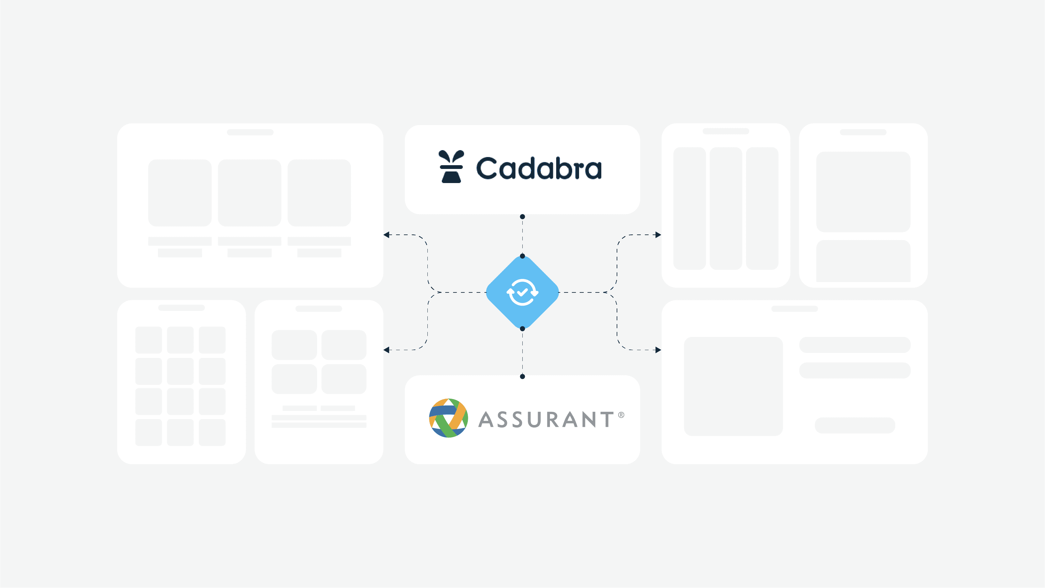
Educational Portal App Design by Cadabra
Let’s look at a few more specific types of educational platforms:
- Institutional websites. It can be a sample website for school or a platform for specific colleges and universities. They provide information about the institution, including programs, faculty, campus facilities, admission procedures, and more. Designs for educational institutions are primarily focused on future students and parents. A vivid example is the site of any of the Kansas City Public Schools.
- E-learning platforms. These are platforms that offer online courses and resources for learners of all ages. They can cover a wide range of subjects, from academic topics to professional development courses. Examples include platforms such as Coursera, edX, etc.
- Open Educational Resources or OER sites. Rather, they are social platforms that provide access to free educational materials such as textbooks, lecture notes, and educational videos. Teachers usually create the content, and it is available to anyone. OpenStax and MIT OpenCourseWare are well-known OER sites.
- Databases of educational resources. As the name implies, these platforms classify educational resources for teachers, students, and parents. They can include lesson plans, worksheets, educational games, and more. Their design often looks like real estate websites, with detailed information on each property and specific search filters. Websites like Teachers Pay Teachers fall into this category.
- Online platforms of tutors. Such solutions connect students with teachers who conduct individual or group lessons. They cover a variety of subjects and academic levels, offering a personalized learning experience.
- Websites with educational games. They are designed to make learning fun and engaging, often targeting a younger audience. Often, elements of educational games are available on classic school websites or platforms of driving schools.
- Government education websites. They are often supported by organizations such as the Department or Ministry of Education. They provide information on educational policies, curricula, and resources for students and teachers.
- Language learning websites. Users can learn new languages through lessons, exercises, and interactive activities. Depending on the goals of the platform and its functionality, developers create personal specifications for each site or application. Examples are Duolingo and Babbel.
- Educational research and publications. These websites publish research papers, articles, and educational journals, serving as valuable resources for educators and researchers. Sometimes, you can find separate platforms for scientific publications in the fields of healthcare and medicine.
- Professional development websites. These platforms offer resources and courses for teachers and educators to improve their skills and keep abreast of the latest teaching methodologies and technologies.
The importance of websites for educational institutions is constantly increasing, as they become a decision support for future students in selecting their place of study. Such websites should be versatile and secure. As the website is a reflection of the professional image of the establishment, its clean design should encourage the visitor to stick around and explore more.
Websites of online course marketplaces are akin to the workspaces for students and teachers with personal accounts, where they get actionable information about their courses, classes, and content delivery. A distinguishing feature of this type is that the attention must be paid to the profile and the course browsing pages. Students pay attention to the course materials, they want to understand their contents and can see the duration.
The process of choosing the educational website is an exciting but time-consuming task for users. Hence, our task as designers is to assist users in search by including some specific design features to the educational website.
Need a new educational platform? Contact Cadabra Studio development team — that is where we have expertise.
Must-have features for education website design

A good image is half the work. The education website design is not only about looking, but also about feeling and the overall user experience. We want to introduce some main features that might help you with understanding the general tendencies of educational websites. This way, you’ll know what to pay attention to.
Appearance
This includes the layout, colors, images, and fonts used to create educational websites. All these factors should be considered when building the website as they contribute towards creating an overall users’ impression.
Visually appealing platforms are always much more popular than others. Whether it’s a telemedicine application or a car sales website, the user’s eye should be drawn to pleasing things. The same applies to educational platforms.

Authentication page and profile
It is important to provide users with an authentication process (email/phone number + password combination). Students’ and teachers’ profiles should vary and contain different features. Whereas students need to have a list of active/completed courses, comprehensive information about certificates/points/credits, teachers need an info page about degree and the list of added courses.
All these components are incredibly important for any new school website because it is not just about a feature-rich interface but also about a personalized approach to users. A vivid example is payment gateways on online e-learning platforms. Language, driving, and other schools allow users to pay for the required course or materials online without wasting time. It’s about convenience and care.
Dashboard
A dashboard is a workspace both for students and teachers, where they track course progress and get feedback. Using a dashboard, students check the number of enrolled courses, number of available hours, etc. Teachers can check added courses, track ratings, traffic, and their earnings.
Content management system
content management system is another important component of educational platforms, which directly affects search engine optimization, performance, and popularity of the website. It should be convenient for administrators and users so that new materials for updating are quick and successful. This is the only way to effectively manage the platform, especially when it comes to large educational institutions with thousands of users.
Navigation
The most important and basic form of navigation on your site is the main menu found in the header. It should be simple with a limited number of options. Moreover, include clear calls-to-action to the website navigation, particularly to the pages such as Apply and See Programs/Courses.
A good website navigation is akin to guidance. Users don’t always know what they want to do next, so it is important to give them some options to go. If they find the website difficult to navigate, they might just leave it and search for another one that gives them what they are looking for.
The right message
Each educational website is created to convey the right message to its visitors. People want to be sure that the educational website is trust-worthy and fully meets their expectations. The website is very important when it comes to creating the best image and brand.
Any professional designer will say that school website design should be built around the message your organization is promoting. It will manifest itself in everything, starting with the choice of color palette and ending with the functionality and type of website. This is a critical moment not only from the branding point of view but also from the perspective of personalization and convenience because compliance with the message helps to choose the most optimal features and create an intuitive interface design that meets the precise needs of specific users.
Mobile version
This is another very important feature that should not be ignored. The website should have a responsive design, so the teachers, parents and students can visit it on their gadgets at any convenient time.
The listed features are obligatory in designing the website if education is your area of expertise. Generally, they make an essential part of any website, regardless of the type of knowledge offered or the desired audience that you’re trying to reach.
How to make your educational website outstanding?
The education website design process is an art. In order to make an educational website a masterpiece, there are some important principles of outstanding design to consider.
- Education website design should be moderate
Obviously, educational websites should contain catchy information, so users don’t actually need to scroll a half-empty page till forever. But it’s not necessary to use heavy fonts and add numerous buttons to the homepage. Opt for easy-to-read fonts on bold buttons. Present the catchy information in an unobtrusive way, so users can easily find what they want. Still, your website can be informative and useful, but moderate design helps you to provide better user experience and clean interface.
- Mind the hierarchy of website information
The best university website design is the one that minds the hierarchy of website information. If the educational institution has structured information for its website and filtering system, then the educational process is likely to be the same: structured and well-planned. While creating an educational website, make sure that all the important sections are accessible from the homepage.
- Use relevant and catchy content
Awesome educational websites are perfect platforms to host visual and audio content. Many people prefer visual materials over traditional texts. Upload useful guides, tutorials and lectures to interact with students. Moreover, you can use your site as a library, where you provide the students with course materials, reading lists, and even communicate with them through internal forums. Also, make attractive videos that tap into the social media sharing to get the message out.
Don’t forget about accessibility requirements
Accessibility is not just a major trend but also a regulatory requirement for all digital products, including e-learning ones. Your education website design ideas should take into account that some users of the product may have certain limitations. Therefore, your development team should familiarize themselves with the accessibility requirements and implement them in the design.
- The educational website has to be flexible
In other words, make your website agile. Trends change fast, so constant testing and optimization are necessary to figure out which information layout works better to keep the audience engaged. Also, it might be a good idea to feature materials on pages designed particularly for these materials.
- The website should have a global access for student around the world
From the design point of view, it means that different factors are to be considered. For example, there should always be English/Spanish/Chinese/Arabic/Russian/French versions of a website in addition to a local language one. Multilingual website expands the number of foreign students and teachers, and provides access to the global education market.
This article may be interesting for you: How We Made Arabic Website Design
Also, there should be two ways of presenting the website information — for local students and for international. It can give the website a competitive advantage in an international arena.
The listed features are necessary for design practice, and the examples of the best education website design (2 examples for each type of educational websites) are great proofs of it.
How to implement your idea without a technical background? Cadabra Studio will help you achieve the best result — contact us.
Examples of best-designed educational websites
Best online educational platform design:
Udemy
The website has interactive design. Visitors can use a search function that is realized with the help of Elasticsearch technology and quickly matches with the users’ requests. Also, the navigation bar has categorised drop-down lists, as well as Log In and Sign In. The interactive design improves the Udemy browsing experience.
This is a great example of an interactive and user-friendly learning platform where the designers have thought through the user journey and the interface’s usability down to the smallest detail. You may notice that the website has a lot of pages and features, but everything you need is still at your fingertips. It looks great in both desktop and mobile versions.
In addition, the Udemy platform is an excellent example of effective teacher website design. Users get a personalized experience, while teachers can easily share learning materials, track progress, communicate with students, and stay up to date with all changes. This is incredibly important for establishing the educational process and the effectiveness of training.

Coursera
It is one of the most popular educational platforms around the world. It contains a huge amount of educational materials and courses while remaining clear to use, adaptable, and convenient.
Web and mobile interfaces have excellent legibility, and a large, multi-language character set. The website has a clean and simple UI, and well-structured content hierarchy.
Every Coursera user gets a personalized experience no matter where they are. The global reach has influenced the design of the platform, making it fully accessible and universal. In addition, it can be used by people with different levels of digital comfort, which is also a credit to the design team, which is constantly working on updating and improving the website.

Best school website designs:
Lausanne collegiate school
The navigation bar has organised drop-down lists. The call to actions like Inquire, Give, Contact us are also highlighted in the header section. The full-screen video content grabs the attention of any visitor. The website has a mobile version.

Strathallan
The homepage contains activities overview performed in a simple and clear way. The visual content is perfectly placed following user-friendly principles. The website has desktop and mobile versions accessible for all gadgets and supported by Android and iOS.
Note that this design perfectly illustrates the school’s message. Constancy and order, cleanliness, and comprehensibility are observed in everything here. This is a great example of how web platforms of educational institutions successfully combine modern aesthetics and school traditions, creating a dignified and concise appearance.

Best college website designs:
Middlebury College
The homepage consists of colorful bars that act as a navigation system. Each clickable bar leads visitors to video snapshots of the community, homecoming highlights, a news story about new funding, and so on.
As we said above, it does not matter if it is a training website design or an official college platform; a digital solution should make users feel involved. And the Middlebury College website is an excellent example of how this requirement has been met. Here, you can delve into the history of the educational institution, review events, and feel like a part of a large community. And this is very important for user engagement and the organization’s reputation.

Bates college
The website has a user-friendly navigation — e.g, the productive content elements labeled with identifiers like “Future Students,” “Parents,” and “Alumni”. These elements are located at the bottom but above the fold, guiding visitors to the relevant information.

Best university website design:
The design of university websites is a rather complex process because it is worth paying attention to several important points at once. First, it must broadcast the institution’s values, which are of great importance to all universities. Secondly, it is worth making sure that traditions here are harmoniously combined with innovations, which is the basis of higher education.
In addition, such platforms perform many functions –informing, advertising, engaging new students, attracting financing, charity work, and so on. Designers must use their experience to make this available to every user from every part of the world. And they must do this without overloading the interface and losing stylistic consistency, which is a really hard task.
Stanford University
The website of the world-top university has a balanced approach with respect to information hierarchy and design. Visitors get comprehend information and answers to any kind of questions. The navigation is clear and easy. The display images are excellent.

John Hopkins University
The university website has bold headlines and titles ensuring high engagement ratio. Creative web design and graphics attract visitors from the first sight.
What is important about this website? Consistency and harmony in the use of colors and brand graphics. Whether it’s an educational product or a parking app, the use of colors and images greatly influences users’ first impressions. The designers of the Johns Hopkins University website understand this perfectly.

The listed examples include all the mentioned must-have features that make them convenient and also help those who have been desiring education to get it. Education sites have to find ways to appeal to their users and improving designs may just be that way. Our design team knows the peculiarities of creating successful educational websites and always consider the features that make your product become a leader in your field.
Are you eager to get an exceptional design? We can help
Education is an area of in-depth expertise, and your website should prove it. The implementation of the features listed above is a complex educational website development and design process.

With the help of Cadabra Studio, you can get a website with a wide range of possibilities and offerings. Moreover, our design choices can boost your brand and elevate your appeal, both for prospective students and employees. Drop us a line. We are always in touch.