In the digital era, you can find lots of church websites that are built by protestant or catholic communities. Each website has its design particularities, but they all have some common things, nevertheless.
We would like to focus on the best church website design in this article and provide you with the details on what makes a good church website.
Does A Church Need A Website?
First, let’s answer the question “what is the purpose of a church website?” Churches and religious communities build websites to engage new parishioners and members. Besides, church websites play a missionary role in inspiring people to change their points of view and values.
Also, the benefits of a church website include educational goals, both about general Christian traditions, and it allows users to learn more about a specific church, what they may expect when visiting it for the first time, etc. Additionally, a website shows what related events are going to be held soon.
Thus, the importance of a church website is evident if you want to bring your message to new members. To see what websites for churches exist and what design elements they contain, we make the compilation of sites below to get acquainted with.
And don’t forget that each business needs a website. Users have more trust in the business that is presented online. So get in touch with the Cadabra Studio team if you need qualified developers and designers.
Ten Top Church Websites
To build a custom church website design, you may use examples of good websites for churches. Of course, you shouldn’t copy a design and make a clone, but you may consider some crucial nuances when designing a church website. We will divide sites into Catholic and Protestant ones.
Catholic Church Website Design
The design of any Catholic Church website requires a special approach. It is a religious institution with a huge history and strict traditions that cannot be neglected. The task of the design studio, in such cases, is to develop a project that can combine modern UI/UX features and a soulful sense of grandeur.
There are some successful websites below that create just that impression on the user. Let’s talk about them in more detail.
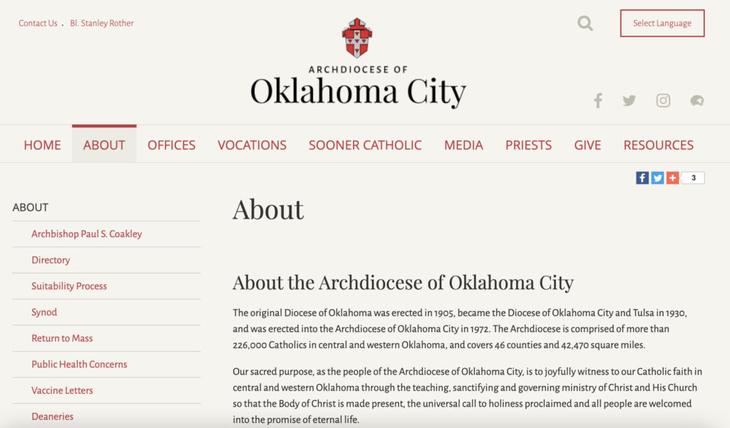
Archdiocese of Oklahoma City. The website of Archdiocese of Oklahoma is created for the Archdiocese, which is a church territorial and administrative unit. It is comprised of more than 120,000 Catholics in 46 counties. This church web design shows us a few banners with different CTAs. The homepage contains everything users may need like About, Offices, Contact us, etc. And all links are placed above the fold.
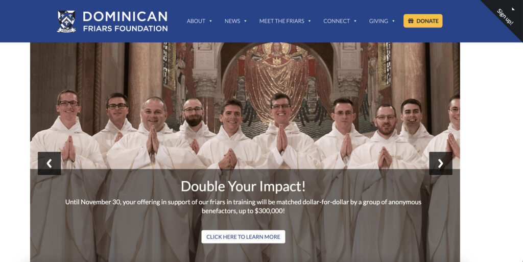
Dominican Friars. The website is dedicated to the Order of Friars Preachers. On the homepage, we can see a banner with a Learn more button if you need to know more about the Order or meet the Friars. The website has a fresh design, large and visible font. On the whole, it has a lot in common with the Archdiocese of Oklahoma website.

St. Mary’s Catholic center. The center of St. Mary is both a religious educational establishment and a place where weekly masses are held. The website has a beautiful video (it plays and loops automatically). Black color on a white background looks harmonious.
This is a great example of a discreet but incredibly stylish city church design. Traditional colors, the correct location of each element, accessibility and convenience for users – all of these details create a pleasant impression after using the platform. The site looks noble and fascinating at the same time.
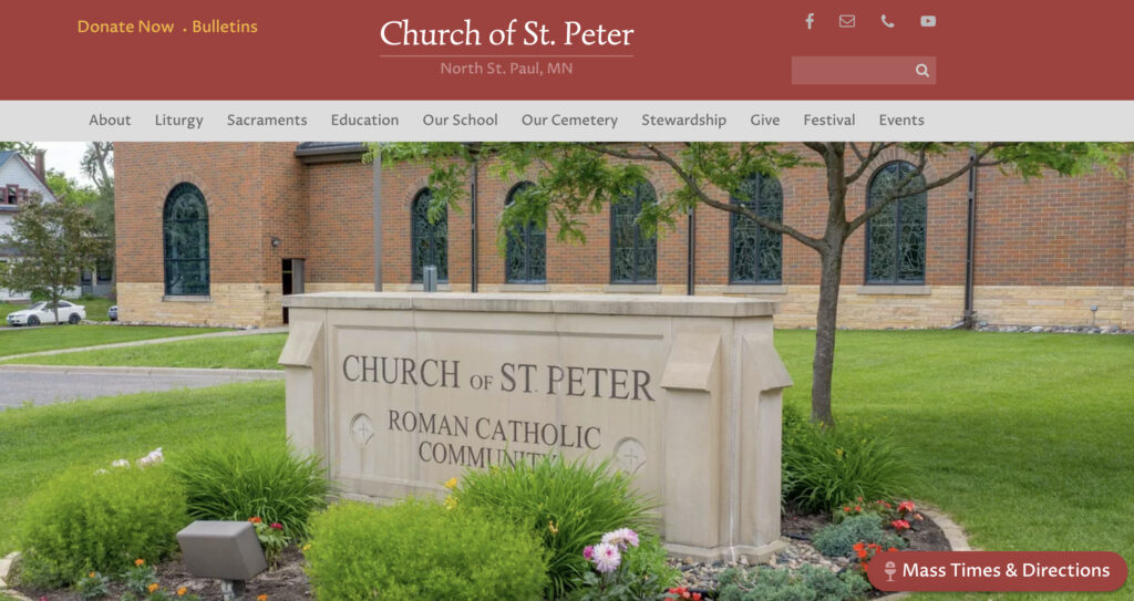
Church of St. Peter. The website has subtle content animations that appear unobtrusively when you scroll down the page. The already familiar central banner showcases a church photo and calendar of events with a schedule of masses. So it has all church website essentials to engage new parishioners.
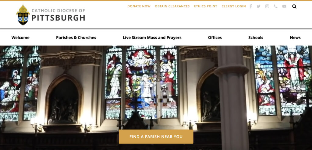
Catholic Diocese Of Pittsburgh. The website of Diocese of Pittsburgh demonstrates a homepage with a user-friendly design. Building a site map is always a tricky challenge for Dioceses since they contain a lot of information. But this website allows you to navigate through quickly due to the well-thought navigation menu.
Protestant Church Website Design
Since Protestant religious movements are more democratic in some aspects, the design of the Protestant church websites gives more room for experiments. Such platforms can also broadcast traditional elements of the organization, but most often they also contain entertaining details.
We’ve picked up some vivid examples of a successful combination of demonstrating spiritual values and exciting UX. Let’s discuss them.
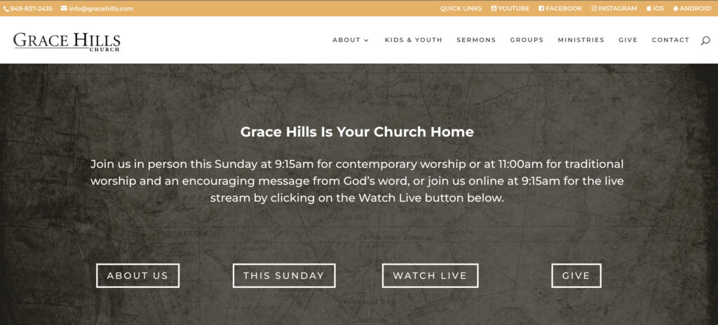
Grace Hills Church. This Protestant church website starts with the thing that captures the attention of visitors — the church website headlines. It shows the Identity of the church. On the central banner, you can see the What to expect button, so it lets visitors get acquainted with all the values of the church and what you may expect when you visit Grace Hills Church. The homepage is not overloaded with text — that is a great advantage.
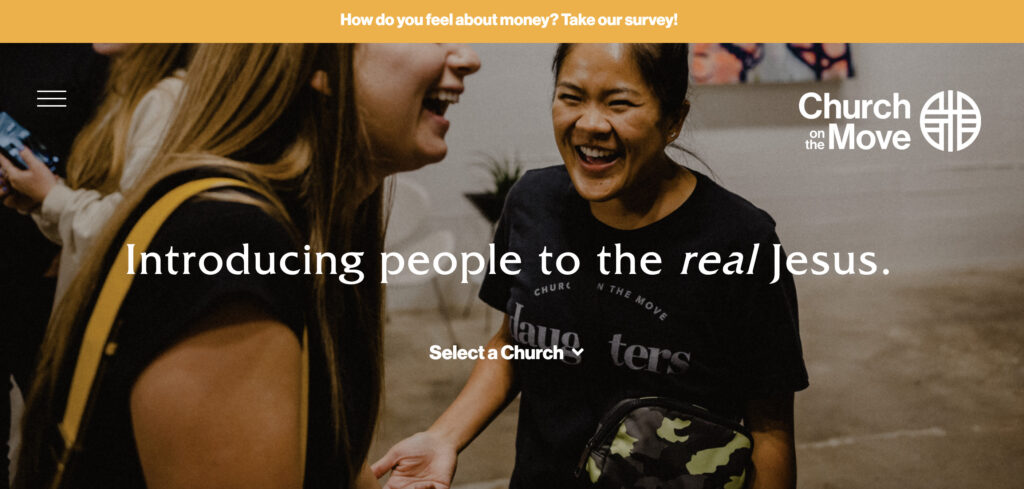
Church on the Move. The church website focuses on images and videos more to deliver as much visual content as possible to a new visitor. Well, mind that high-quality photos will always have a favorable effect on users. They show life in church, full of emotions and joy. As for colors, dark shades prevail on the website. Also, if new visitors want to know about upcoming events — locations and schedules are indicated right below the main banner on the homepage.
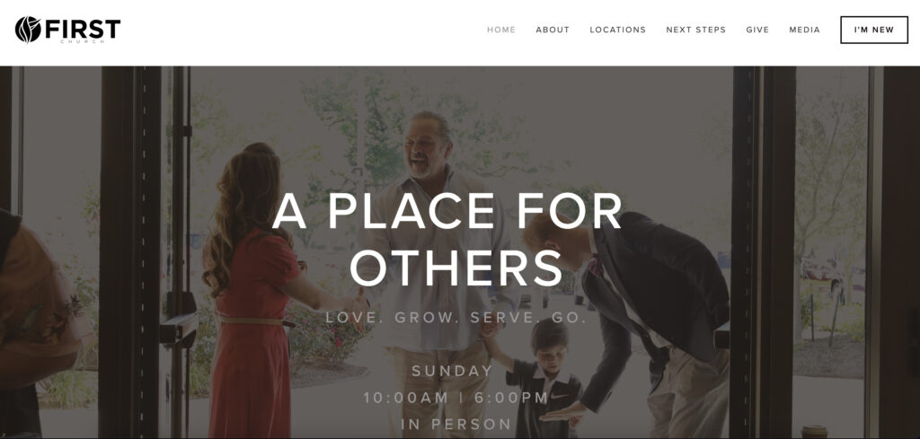
First Church. The First Church website offers a great homepage. Navigation bar moves when you scroll down, which is a convenient feature. The site contains a large number of call-to-action buttons. Also, in the navigation menu, they added I am — the new button that allows new visitors to get all essential information. The website design for the church was created considering the combination of an intuitive UX with a crowd-pleasing UI.
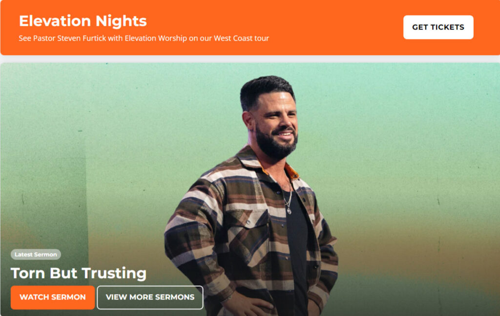
Elevation Church. An easy-to-navigate website in the church’s brand colors and with effective call-to-action buttons. The very first things users see on the main page are videos of the leader’s speeches, which attract attention from the first seconds, create a feeling of grandeur and joy. Such templates help to convey the sacred mood of religious events without losing practical things: the convenience of the user’s journey through the platform and helpful UI.
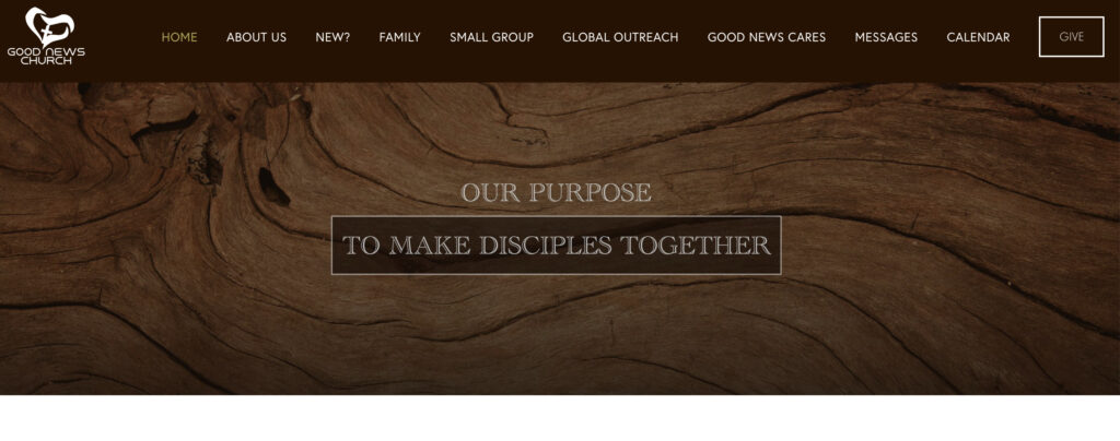
Good News Church. The overall design of Good News Church website is created in bright shades. As you can see on the homepage, there is an excellent contrast between the background of the page and the logo that looks awesome. The quotes of the church members play a useful role for new parishioners and increase their feeling of hospitality. If you are building a church website, mind to make visitors feel comfortable, providing a cozy design.
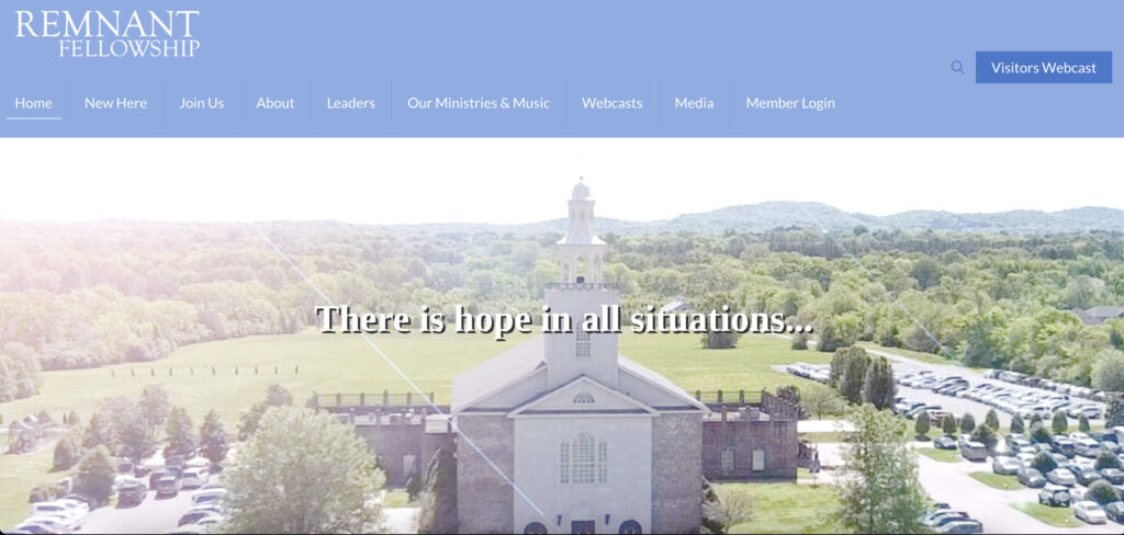
Remnant Church. This website may boast about full-screen videos on a homepage. The videos show regular activities in the church. The website contains short descriptions of the church events as well as calls to action to make people visit the church on Sundays. Thus, we see one mostly eye-catching and clear interface.
What Every Church Website Needs
So, we have drawn up the compilation of top church websites with an excellent design. And now, it is time to focus on designing tips of a church website if you’re planning to build your own church website.
There is no one-size-fits-all solution here. Every organization has its special needs, so the main task of church web design is to create a perfect eye-catching appearance, which would be a reflection of the organization’s values. And, at the same time, provide full functionality for an unforgettable user experience.
What Should A Church Website Include?
Like any other websites, there are necessary components that should be available by default. Nevertheless, web design for churches has its peculiarities. And we will provide you with the most important parts of a church website.
Design
Let’s start with fonts. You shouldn’t use more than three types of fonts. The diversity of fonts will lead to more complicated text perception by users. And don’t forget about consistency — fonts on all pages must be the same. To capture the attention of readers, use bold but not underlining — underlined text is usually perceived as a hyperlink. The size of fonts should be large enough to make text easy-to-read.
If you are not skilled in UI/UX design, it can be difficult to build an eye-capturing website design. But it is not your fault. Let specialists do this work for you — hire Cadabra Studio!
Colors. As is the case with fonts, the abundance of color schemes won’t be a good option. Try to use not more than three colors. The most popular colors on websites are blue, green, and white. But it depends on your vision, of course. Just keep in mind that church websites should include a color that affects trust and pacification. Avoid using too bright colors and make sure that the contrast doesn’t irritate visitors’ eyes.
As for the layout, you must consider the elements of an effective church website. That is, considering website design for churches that we have listed above, you can see that each website has a banner on a homepage that contains high-quality videos or images along with a title and CTA. So your new church website should use this widespread element since it works.
Besides, use white spaces between text lines — they allow users to read a text more naturally. Use visual hierarchy for your website, UI and UX should be intuitive and clear for every new visitor. The text should be split into short blocks (four-five lines); it also impacts readability quality.
And images. Images should have a middle size — not large and not small. And it is better to adapt them to one height and width. Too large images will negatively affect the loading speed of your website’s pages.
Why is it so important?
The task of any church is to lead its parishioners on the right path and provide for their spiritual needs. No matter how strange it sounds, UI/UX design is the perfect tool for this.
A quality church website design shows respect for the congregation, helps to find the right event and important words of support. This is a digital way to organize church life, all the activities, donations and marketing efforts.
Must-Have Features
There is content your church website must have. It includes various features and sections in the navigation bar. The list of essential features for a church website includes a Contact us page, Calendar and events (so visitors always stay up-to-date), Audio/Video page (it may consist of recorded masses or sermons, and users who couldn’t visit it may watch later), Blog page, Donation page, Map integration (it makes easier for new people to find your church).
Also, don’t forget about the convenient search feature. Be sure to discuss the options for filtering and outputting results with the development team. This will help make it easier for your users to navigate when the website has a lot of content and pages.
Why is this so important?
The church site must have comprehensive functionality for both users and administrators. In this way, you will be able to share important events, organize activities and better communicate with today’s target audience.
Additionally, your website can become your church’s magazine, its digital archive, if you will. And for its organization, you will definitely need such features as adding and optimizing video.
Plugins
Also, don’t forget about useful plugins for your church website. For example, calendar plugins will let you schedule some events easily. A Sermon Manager plugin (there are plugins explicitly built for church websites) allows you to publish recorded sermons online. SEO plugins and plugins for metrics tracking contribute to the optimization of your website and monitoring of critical metrics.
Finally, your website must be mobile-friendly. Since many users prefer surfing the web via mobile devices, your website should be responsive and provide users with a brilliant experience.
Why is this important?
Plugins just simplify website activities management and give more time to prepare for church services. Nothing extraordinary, but a very convenient solution that helps to add new content to the website more often and organize its functioning better.
Summing Up
We think that listed websites will inspire you to come up with new church website design ideas and create your website, considering designing tips mentioned above. The majority of such sites have standard features and design elements, so you need to remember them but not copying them all.
However, if you are not a designer and you are far from programming sciences, Cadabra Studio may become a troubleshooter for you. If you don’t have an idea of how to create a good church website design, our experts will use the skills to develop it according to your expectations.
Get in touch with our managers right now, and feel free to describe your problem. Our goal is to turn your hesitations into confidence and trust!


