No matter whether the app you are going to develop is a complicated system to include various features or just a simple app to satisfy the basic needs of the users, it still should be thoroughly planned. It is not easy to decide what to start with; the difficulties may appear in the stage of defining the scope of features needed and mobile app screen design.
Thus, a business owner should understand that regardless of the complexity of the project, there are some features of any mobile app that are basic and essential, and some other features may be crucial for particular types of apps.
This article will put in a nutshell all the necessary information on what app design screens are basic for any app and for your app in particular. We will define the 10 basic types of UI screens for the apps and tell about a few more as a bonus.
So, what are the app design screens that may be found in any app?
1. Splash screen
A splash screen is the screen shown while an app is loaded. It is the screen to make a first impression of your product or service, so take care of it being remembered by the user. Usually, this screen design includes the logo of the company, its name or slogan placed in the middle of the UI design screen.
A splash screen doesn’t have to be standard and boring. Custom mobile application development allows creating dynamic options that grab user attention from the first seconds. You can add animation, a joke, even a short game – anything that instantly catches the eye and entertains clients.
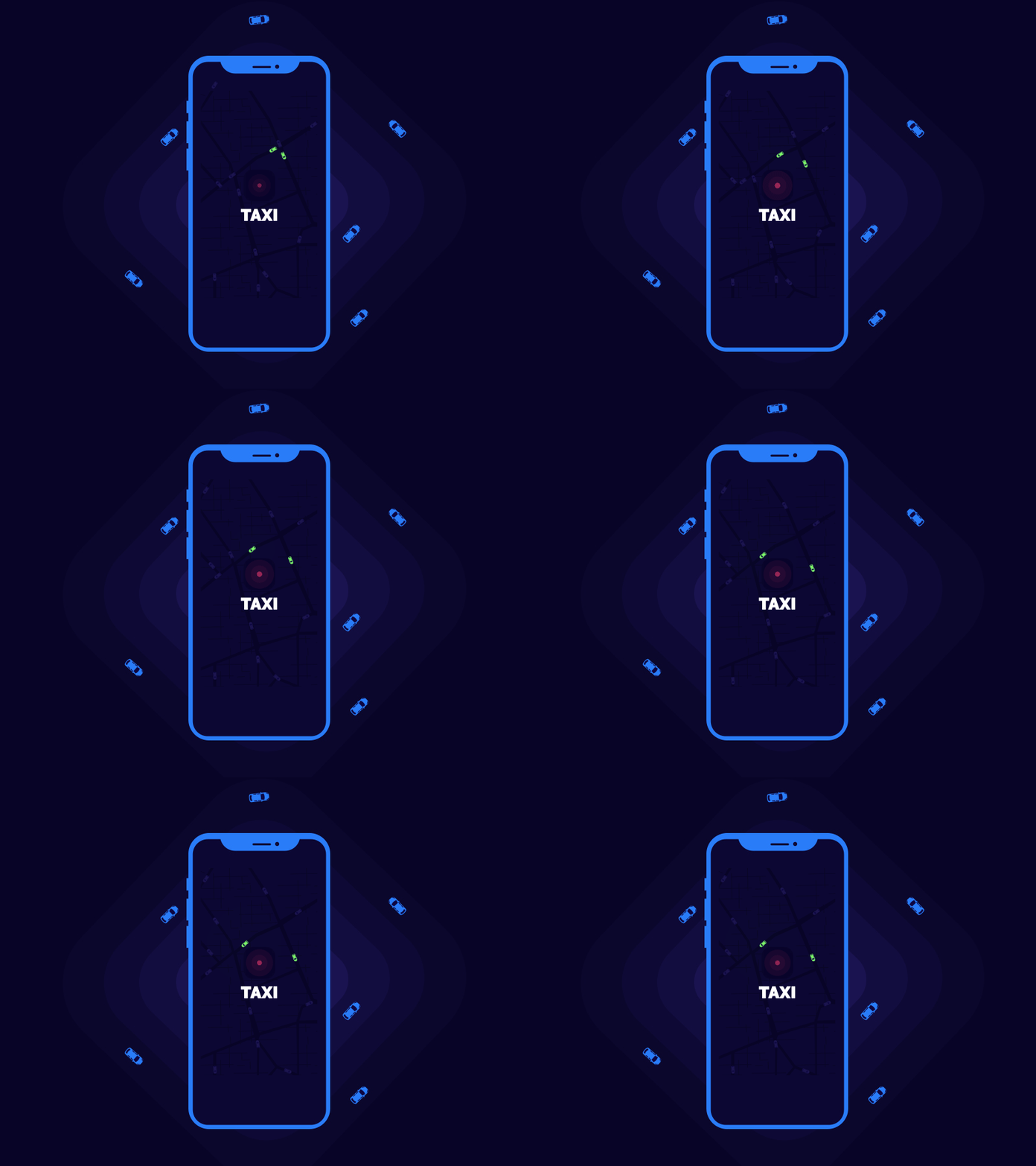
However impressive the screen is, make sure the app loads quickly and users don’t have to look at it longer than 4-6 seconds, otherwise it may annoy them.
Key Takeaways
- The best splash screens in mobile app design are simple. They are needed to give users something pleasant to associate with the brand and improve the experience while waiting.
- It should be light and free of distractions.
- The splash screen should be short so as not to be annoying, so it is better to avoid the accumulation of colors.
- The animation should also be ‘dosed.’
- It should be included in the design at an early stage.
- Your mobile application design agency should develop a splash screen in such a way that it can be adapted and improved in the future.
2. Home screen
This screen is the starting point of the user journey. In fact, this is the face of your product, its presentation. That is why it is so important to use all the possibilities of mobile application design to make it exciting. There are three main aspects of any home screen — it represents the idea of the product, and the features of the app, and reveals the general flow and possible paths for the user to go.
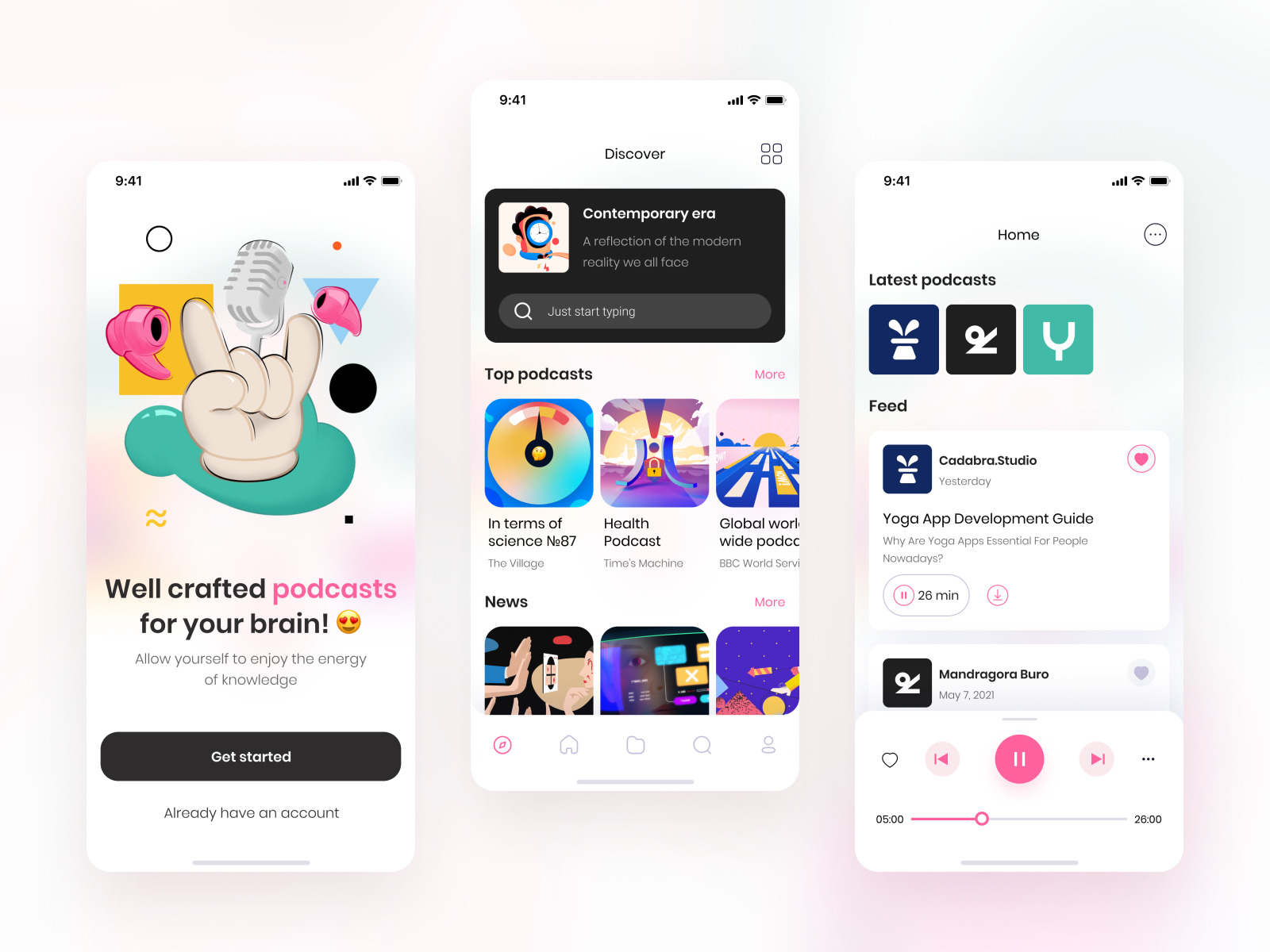
The design of such screens varies a lot depending on the type of app, still, the most important thing to remember — it includes the features to be right at hand.
The menu is often added to the home screen as a part of it, or designed as a separate screen, depending on the app needs and complexity.
Key Takeaways
- Home screen app design for iOS and Android has different requirements, which must be considered.
- All necessary features and buttons must be available to the user. At the same time, it is worth keeping the menu clean and clear.
- The home screen should support your brand and lead the user smoothly.
- It can contain unobtrusive calls to action, contact forms, and a chatbot window for personalized service.
3. Log-in screen
Most modern apps require a user to create a personal account, this makes a log-in screen basic for them since the possibility to sign up, and login is the first step to getting on board. Thus, a log-in screen is crucial for the vast majority of apps — it gives access to most of the features of an app.
What do the user experience design services have to do with this? Everything is simple and plain. Each form needs careful design review ‘cause it’s part of the user experience. The more convenient the log-in screen is, the more accessible, more precise and simpler it is, the more chances the visitor will register and become your client.
Unstructured and complex forms, on the other hand, annoy users. This leads to a large churn of site visitors or application users.
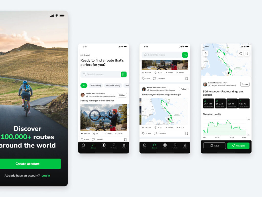
Summing up, the thing to remember for this mobile app screen design is the less activity log-in process requires, the less annoyed users are, so do not ask them to make a lot of steps on this stage.
Key Takeaways
- The log-in screen in mobile apps should give the user access to specific functionality and be easy to understand.
- It should not overload the user interface or contain complex forms.
- Such a screen should be handled by a professional UI designer who knows how to put all the requirements in a simple and accessible form.
4. Profile screen
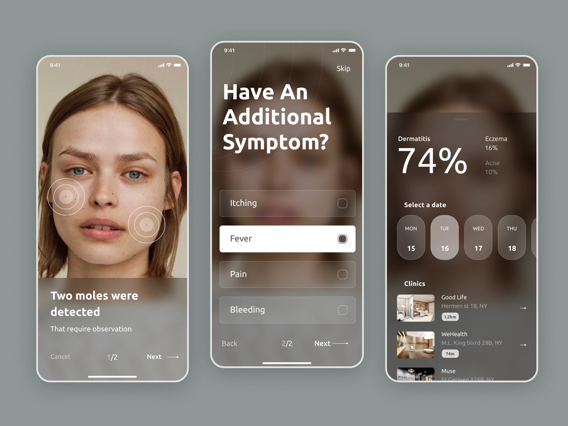
Once the user logged in, they make their presence in the app highly personalized. That’s when the profile screen appears — as a place to store personal information. The important issue here is keeping this screen easy to understand and intuitively clear without overloading it with information.
And here again, UX services come into the picture. Designers think through the user’s journey and each point of the profile screen, find optimal forms of information placement and improve the visual perception of the screen.
Key Takeaways
- The profile screen is a must in mobile app design as it is part of the personalized user experience.
- It can contain many different things, such as an image, name, contact or payment details, points, personal offers, etc. All this should be accessible for perception and easy to visualize.
- The profile screen should fit into the overall concept of the user interface but provide users with a sense of privacy and security.
5. Settings screen
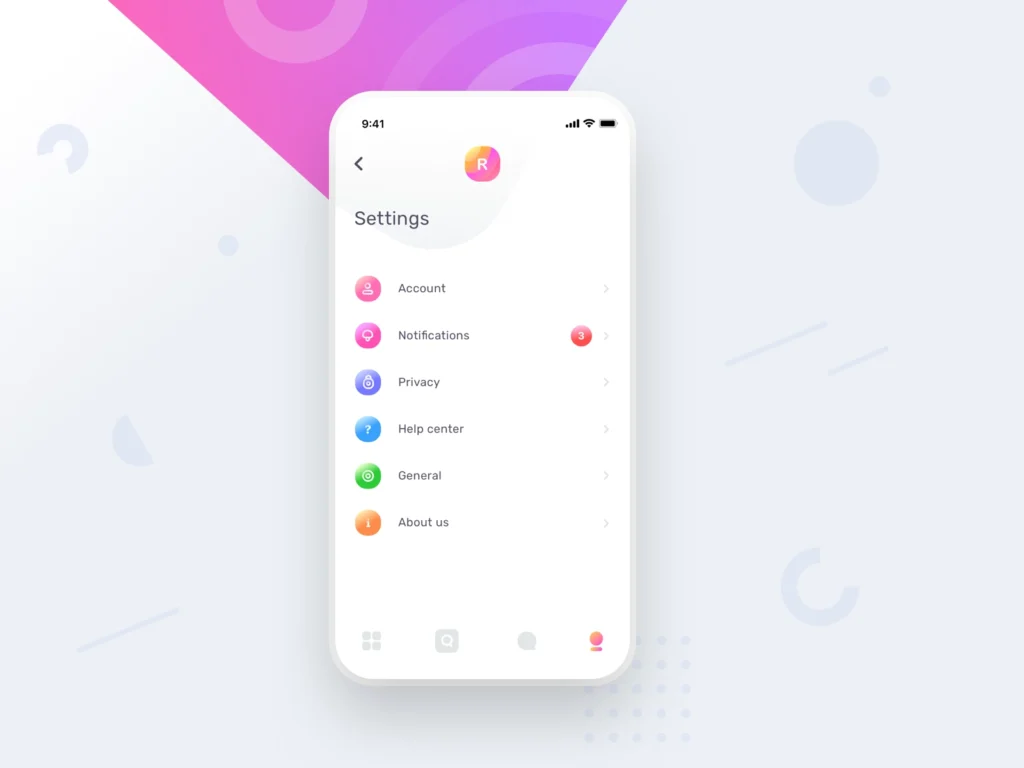
Quite an important screen for apps with a high level of customization. This UI design screen allows a user to be in control of the situation — it must be simple, clear but contain everything potentially needed for the user to feel in charge of aligning the app with their preferences.
As you can see, professional mobile application development services involve not only the development of functionality but also its correct presentation. Therefore, in this case, the designer’s task is to conduct fundamental research and develop a system of using the settings that would not make the user feel confused and abandoned. And there is always titanic work behind this.
Key Takeaways
- The settings screen should be accessible and clear. Whatever industry your product belongs to, from education websites to fintech apps, it’s good practice to group settings into categories for easy browsing.
- Your mobile application design agency should know your target audience and design the settings screen in such a way as to prioritize specific points according to the user’s needs. A clear hierarchy helps to avoid irritation.
- Also, don’t forget about suitable UI controllers, clear descriptions, and status indicators.
So, there are five basic types of mobile app screens in UI design that you definitely have to include in your product. Except for them, there are also some popular types of screens, but not always must-haves, and the screens are typical for some particular kinds of apps.
Further, we are going to name the optional but frequently used types of screens.
6. Onboarding screens
These app design screens are aimed at presenting the app to the user, its features, and how useful it may be. The onboarding app screen has to explain to the user the benefits of the app.
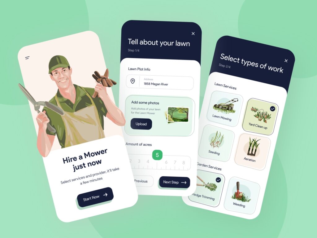
There are various ways of conducting the onboarding, it mainly depends on the type of the app and the character of communication with the user you would like to establish.
The idea trending now for this type of applications screens design is the animated onboarding that makes all the features clear and tangible.
As you can see, UI/UX design services help to make the user onboarding process smooth and easy, without unnecessary distractions.
Key Takeaways
- When creating an onboarding screen for mobile apps, it is critical to know users, their level of digital comfort, and their needs.
- The best adaptation option is interactive onboarding, which includes animated guides to product functionality. This helps to engage users and show how to perform an action rather than just reporting it.
Quality app design is accessible and meets user expectations, so designers think through the entire user journey from start to finish, providing prompts, directing attention, and creating contextual instructions.
7. Calendar
It is not so obvious, but let’s think about planners, event apps, travel apps or even feature of scheduling a message in the messenger — none of them can do without a good calendar screen.
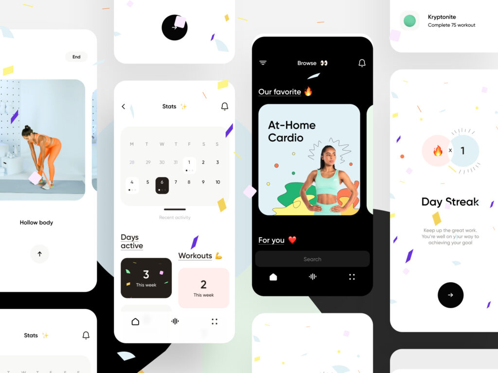
The only general requirement for the calendar — it should align with the aims and design of the app screens.
In the case of travel app development services, for example, the calendar should support booking and travel planning functionality. Healthcare apps often have calendars that allow users to mark specific parameters to monitor health conditions. In other words, the design of such screens is always tied to the purpose of their use and the value that the application offers.
Key Takeaways
- The calendar is not a required user interface component, but it can be a valuable and exciting feature for users.
- The calendar screen should be visually pleasing and support the brand style.
- It should be easy to use and contain functionality that matches the features of your product.
- A good practice in mobile app design is to create interactive calendars that can be shared with other users of the app or platform.
8. Map
As well as a calendar, it may be surprisingly useful for the apps of brick-and-mortar business, delivery services, transport, and travel apps — whenever knowledge of a location is necessary.
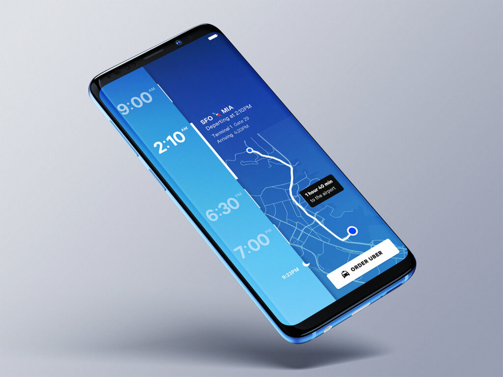
Despite the fact that there is an option of collaborating with third-party services for it, it may be cool to make your own stylish map for your app design needs.
For example, our travel application development services include complete user experience research and customized design based on it. Therefore, the map screen will support the functionality of your product and smoothly guide users to the desired point.
Key Takeaways
- You can integrate ready-made map solutions during the application development process, but custom maps created by a professional mobile application design agency will support your brand style and values.
- The design of the maps includes a complete study of user behavior and interaction with the product, the data of which can be used to work with other elements.
Maps in mobile apps for travel or logistics industries are a significant reputational part of the overall product.
9. Conversational screen
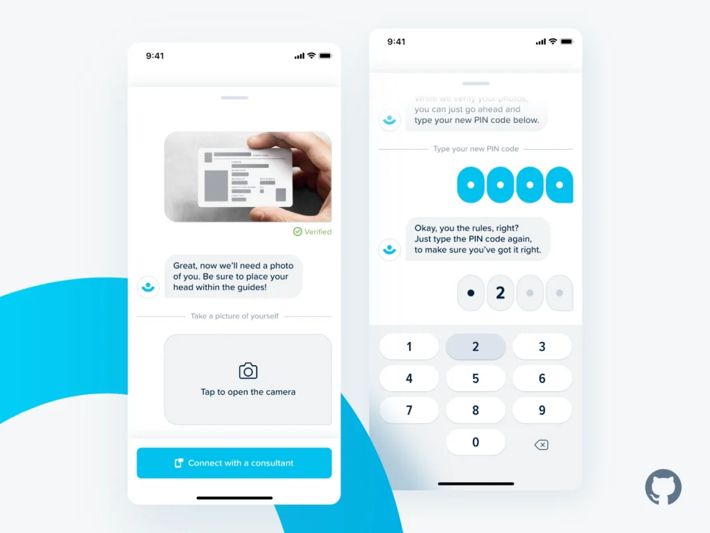
Chat screens are basic for any app that has traits of the social network. Also, they are quite useful for customer support goals — not only a real operator may answer users’ questions, but chatbots are also so popular now that there is a high chance for every app to have this screen in the near future.
Chat screens are used not only in such obvious areas as online banking and e-commerce but also as a part of travel mobile app development services, for example. The involvement of artificial intelligence in customer support has gained great popularity. The task of design, in this case, is to create a space where users can effortlessly express their questions and wishes, find needed info and receive easy-to-understand answers.
Key Takeaways
- Chat screens are elements of direct interaction and user communication, so they should be convenient and accessible.
- The design of such components requires professional UI/UX skills so that the user can find the necessary information and ask questions quickly.
In both cases – mobile apps and web development– the chat screen’s design is equally important.
10. Terms and conditions
In case you are working with the personal information of the users or working conditions of the service provided should be clearly defined — this screen is worth developing to avoid some of the users’ questions and even legacy issues.
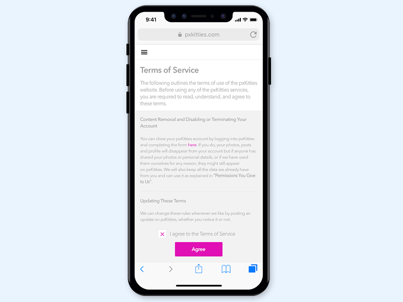
Terms and conditionals often cause irritation due to a large amount of complex information, so mobile app design professionals should make them as comfortable as possible for perception and reading.
Key Takeaways
Creating Terms and conditionals screens in app design is tricky because of the large amount of complex information.
Designers must do everything so that no components cause irritation to the user.
The task of app design, in this case, is to guide users and unobtrusively highlight all the key points.
So, there are five more types of screens you may need to include in your app. Every custom mobile app development company that provides truly professional and high-quality services pays attention to the design of each screen. UI/UX, and each screen design particularly, has become an integral part of creating digital products.
As it has been mentioned, there are also some types of screens basic for particular apps. For example, social media are impossible without feed, music players without playlists and the player itself. Remember, we promised a bonus?
As a design and development studio, we are often involved in the development of various e-commerce projects. Of course, all of them are different and have special features, but our expertise allows to share a list of the most important e-commerce screens.
For various e-commerce projects, there is a basic set of screens:
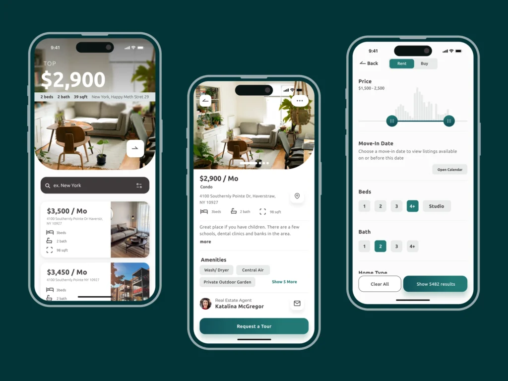
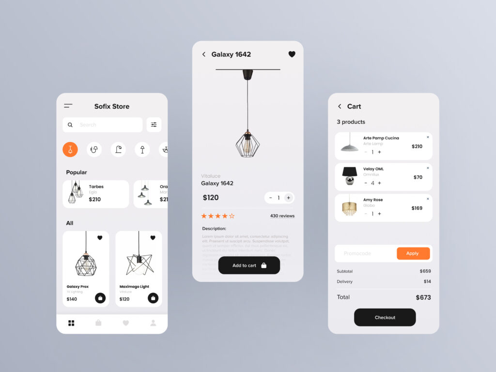
— Catalog
What’s on offer? No matter what you are going to make a profit of, the catalog will show customers the set of products/services on offer.
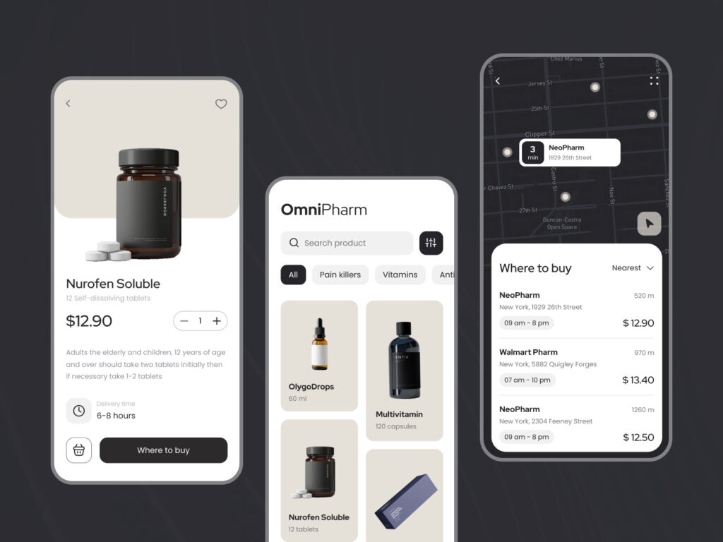
— Product card
A screen to give a detailed description of the position on offer. Be careful it has a place for all the potentially needed information.
The product card must anticipate the user’s expectations, so it must be thought out to the smallest detail. Where to put the product image? How to distribute info and highlight the main points? How to direct the user to purchase? Solving all these issues is a part of app design.
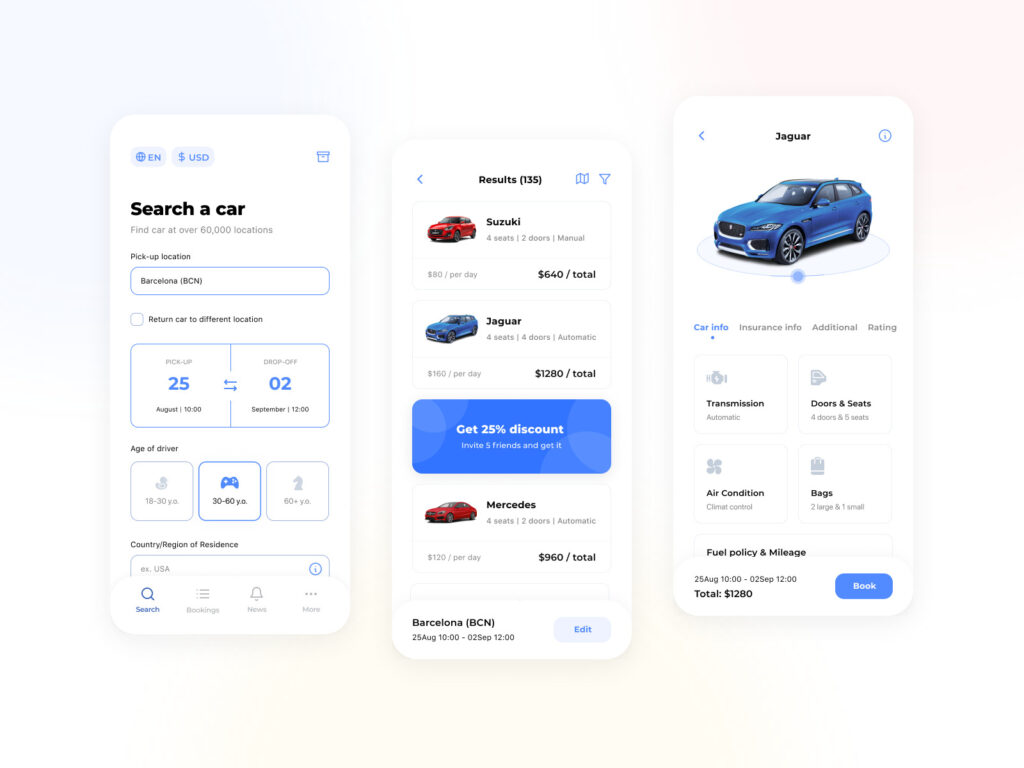
— Search
Sometimes, this feature is included in an app as a part of the catalog screen. If you want to provide a detailed search or some special opportunities, it is worth designing a screen for it.
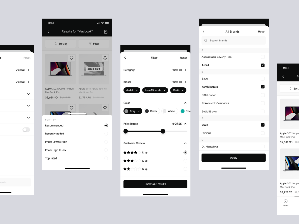
— Filter screen
A filter screen in UI design to help those users who know what they are searching for. The thing to remember — a filter and sorting are different, but both are highly important.
In this case, UX design services are necessary to structure huge amounts of data in such a way that users don’t get lost in them and quickly find needed items. In addition, designers create a clear visual representation of each element, find optimal solutions for displaying images, etc. All this is necessary to help users easily perceive the information provided and not to lose the freshness of vision in the search process.
— Basket
Usually, this screen is similar to the catalog — the list of the services or products users would like to buy. Make sure these items are easily manageable since users may want to delete or change something.
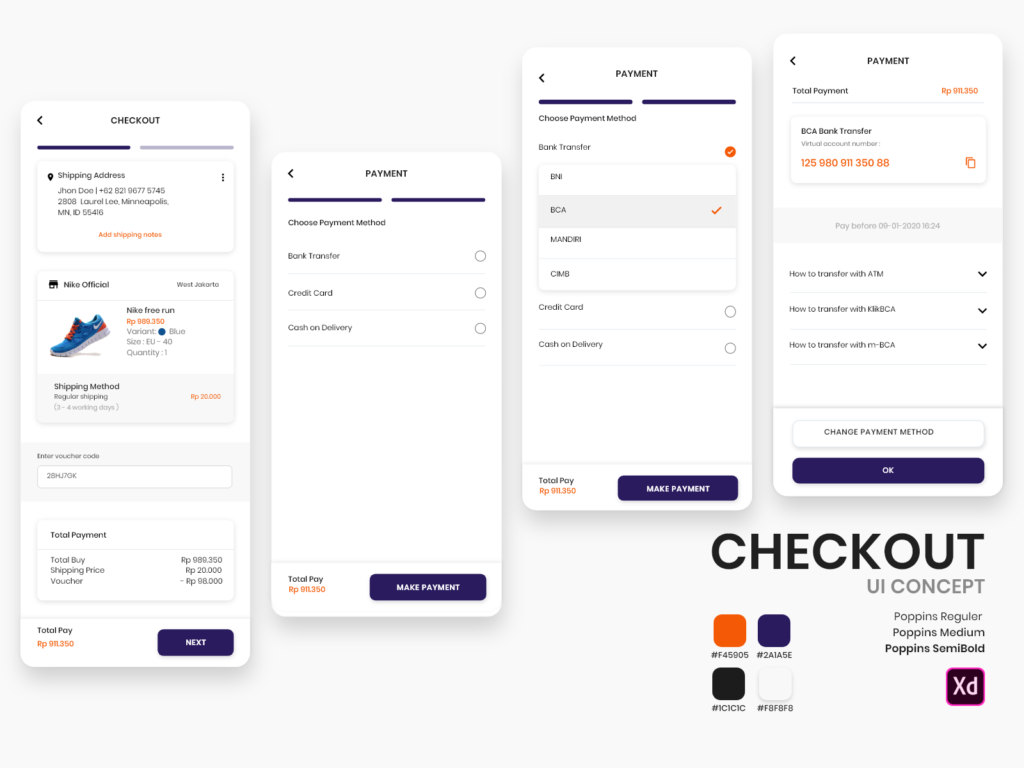
— Check out
The most important part of this screen is the screen with the methods of payment — it has to be clear and transparent. All the possible ways of payment and delivery have to be considered.
These 16 basic types of screens are worth to be known by not only designers but also business owners and the users of the apps. Can you think of some additional types of screens crucial for the app you would like to develop? Tell us!
Frequently Asked Questions
The mobile application primarily needs the following app screens: splash screen, home screen, log-in screen, profile screen, settings screen, onboarding screens, calendar, and map. You can find out the rest of the mobile screens above in our article.
To make a mobile app screen, you need to create a user flow diagram for each screen, draw wireframes, select design templates, and colors, create layouts, and create an animated prototype.
The creation of mobile app screens is included in the services of UI/UX design. As a rule, the cost of developing a brilliant UI/UX can range from $3000 to $12000.

