Today’s healthcare websites need to be more than just pretty pages – they’re the new front desk for doctors, clinics, and hospitals. Patients expect smooth, informative, and secure experiences online, just like they’d find with their favorite shopping or banking sites.
In our new article, we’ll discuss
- The main types of products in medical web development and examples of best healthcare website designs.
- What a patient-centric web design is, and how your healthcare organization can achieve it.
- How to build a medical website that meets users’ expectations.
- What healthcare providers need to create a digital space that’s patient-friendly, privacy-compliant, and fully functional.
Let’s – dive into what makes a healthcare website truly shine, from design tips to stand-out, design examples below.
Why Proper Healthcare Website Design Matters
Proper healthcare website design is like creating a reliable guide on a hike through the mountains – it helps prospective patients find their way and ensures they don’t get lost in the woods of information. Here’s a closer look at why these sites are so crucial.
Engaging patients online
Think of your healthcare website as a lively conversation that never has to end. With features like online scheduling, telemedicine options, and patient portals, you’re not only delivering the necessary information but keeping patients engaged, informed, and empowered to manage their healthcare from the comfort of their own homes.
Patient-centric web design gives them a remote control for their health – no need to step outside when everything they need is just a click away.
Building trust
Trust is the golden ticket in every field; the healthcare industry and medical web development are no exception. When patients visit your website, they want to feel secure and confident in their choice of provider.
A professional healthcare website design, complete with clear doctor bios, real patient testimonials, and comprehensive service descriptions, helps build that trust. It also reassures visitors that they’re in the capable hands of a trustworthy healthcare provider, which makes them more likely to take the next step in their healthcare journey.
Expanding access with medical web design
Proper healthcare website design has the power to break down barriers, allowing patients to access care that might otherwise be out of reach. For those in rural areas or individuals with mobility challenges, these sites can be a game-changer.
Imagine a world where your healthcare is just a few clicks away – whether it’s scheduling an appointment, consulting with a doctor, or getting health advice. It’s all about putting the “care” in “healthcare” and making services accessible to everyone, regardless of their location. This is critical for healthcare organizations.
Types of Healthcare Websites
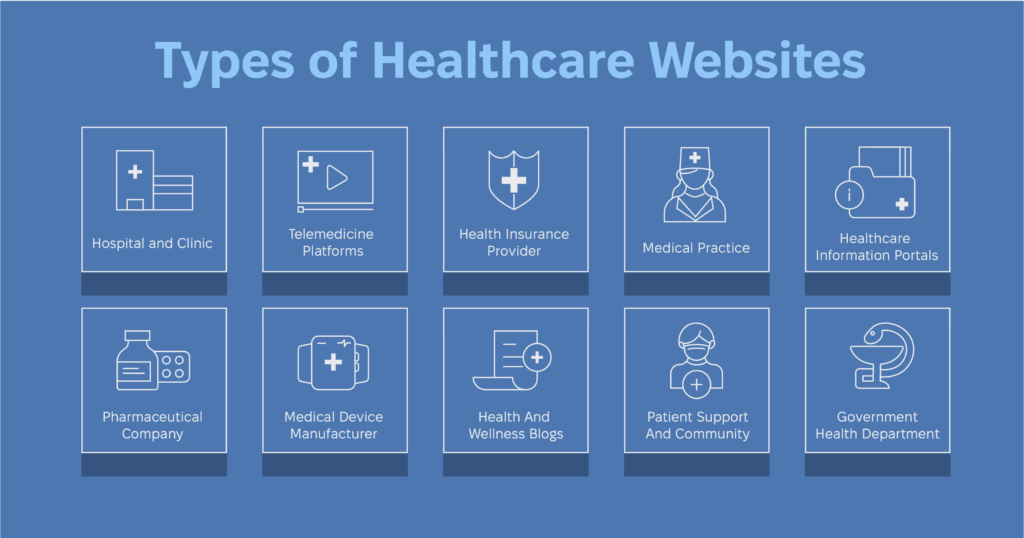
Just like not all superheroes wear capes, not all medical websites are built the same. Each type serves a unique purpose, making the online health landscape diverse and tailored to different needs.
Hospital and clinic websites
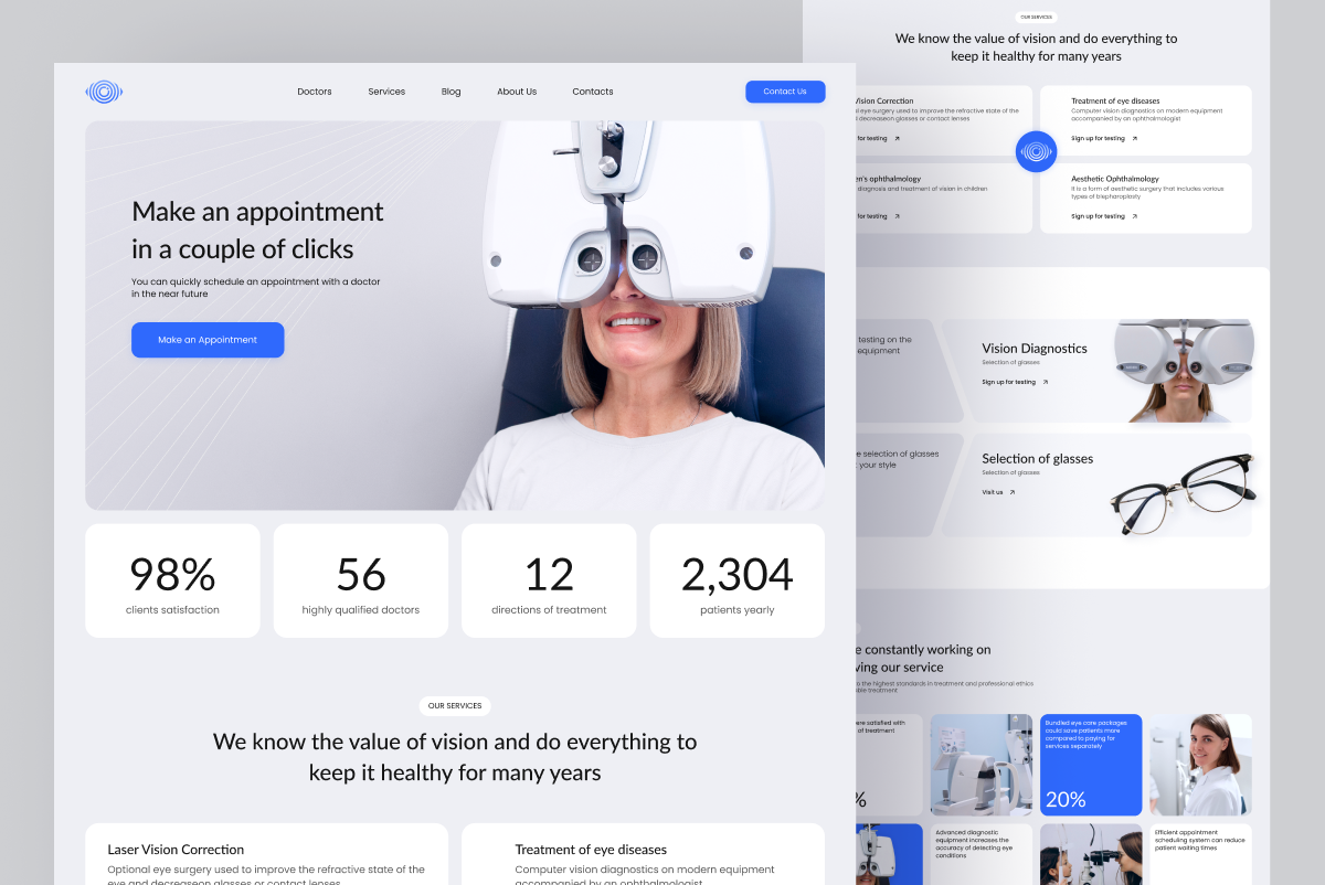
Ophthalmology Clinic | Landing Page Design by Cadabra Studio
Think of hospital and clinic websites as the bustling town squares of the healthcare world. They provide a wealth of information, covering everything from services offered and doctor bios to billing information and appointment scheduling.
These sites are the go-to destination for patients seeking a comprehensive view of what a healthcare facility has to offer. In this case, whether someone wants to know about the emergency room’s hours or the latest specialists on staff, the design must collect it all in one convenient spot.
Telemedicine platforms
![How To Design A Healthcare Website [With Examples] (November 2024).pdf-image-000](https://cadabra.studio/wp-content/uploads/2024/11/How-To-Design-A-Healthcare-Website-With-Examples-November-2024.pdf-image-000.png)
Source: MeMD website
Telemedicine platforms in medical web development connect patients and providers without the need for a waiting room. With these websites, patients can schedule virtual visits with doctors via video, chat, or phone calls.
This is a game-changer for busy people and those in remote areas who might otherwise struggle to access quality care. Everyone is able to consult with their doctor from the comfort of their couch – no traffic, no waiting, and no pants required (well, at least the bottoms)!
Health insurance websites
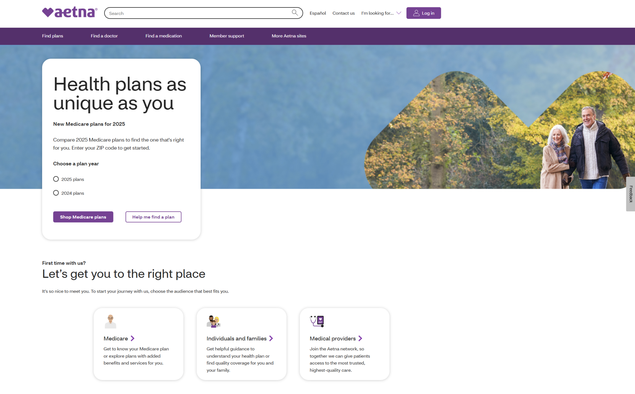
Source: aetna website
Navigating the world of health insurance can often feel like trying to solve a complex puzzle; healthcare user experience specialists aim to simplify that maze. These sites allow users to browse different plans, compare coverage options, file claims, and access member resources.
They act as a trusty compass in the sometimes treacherous landscape of healthcare costs and benefits, helping patients understand what they’re signing up for without the overwhelming jargon.
Medical practice websites
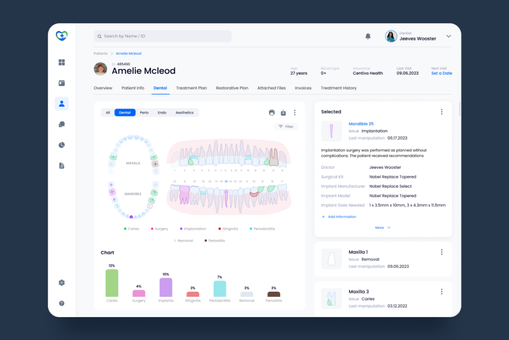
Dentist Dashboard Design by Cadabra Studio
Medical practice websites are the personalized touch in the healthcare universe, designed specifically for practices like dental offices or cardiology clinics. These sites focus on the unique needs of their specialties, making it easy for patients to book appointments, learn about specific treatments, and find tailored health information.
Health information portals
![How To Design A Healthcare Website [With Examples] (November 2024).pdf-image-002](https://cadabra.studio/wp-content/uploads/2024/11/How-To-Design-A-Healthcare-Website-With-Examples-November-2024.pdf-image-002.png)
Source: The Calm Zone website
Health information portals serve as trusted libraries where patients can gather information about symptoms, conditions, and wellness tips. These websites are packed with expert-reviewed articles, tools, and resources that help users better understand their health without the stress of sifting through unreliable sources. They’re like your friendly neighborhood librarian, always ready to help you find the answers you’re looking for (minus the shushing).
Pharmaceutical company websites
![How To Design A Healthcare Website [With Examples] (November 2024).pdf-image-003](https://cadabra.studio/wp-content/uploads/2024/11/How-To-Design-A-Healthcare-Website-With-Examples-November-2024.pdf-image-003-1024x682.png)
Source: Alnylam website
Pharmaceutical company websites keep patients and healthcare professionals informed about medications, research developments, and clinical trials. They’re essential for staying up to date with the latest treatments and innovations in the medical industry. These sites are essential for providing clear and reliable updates about the medications that might be part of a patient’s treatment plan.
Patient support communities
![How To Design A Healthcare Website [With Examples] (November 2024).pdf-image-004](https://cadabra.studio/wp-content/uploads/2024/11/How-To-Design-A-Healthcare-Website-With-Examples-November-2024.pdf-image-004-1010x1024.png)
Source: Patients Like Me website
Last but certainly not least, patient support community websites create safe havens for individuals to connect, share experiences, and find encouragement. They foster a sense of belonging and understanding, allowing patients to learn from one another in a compassionate space.
These platforms must have 100% patient-centric web design as these are the places where stories are shared, advice is exchanged, and friendships are formed, all centered around the shared journey of mental health and healing.
What Every Great Healthcare Website Needs
Creating a standout healthcare website is all about finding the sweet spot between usability, security, and engaging design. Here’s what you need to make your medical website memorable and useful to patients.
User-friendly interface and easy navigation
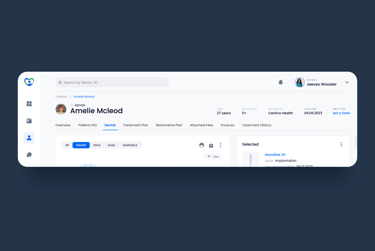
Dentist Dashboard by Cadabra Studio
Imagine a hospital with no signs – just a maze of corridors with no clear direction. Not exactly patient-friendly, right?
A healthcare website design without intuitive navigation can feel just as confusing. Patients should be able to find their way around without getting lost.
Keep menus clear and accessible, and avoid burying important pages so deep that users need a map to find them. Whether someone’s trying to book an appointment or research a specific service, easy navigation is essential for keeping frustration levels down and engagement up.
Mobile responsiveness
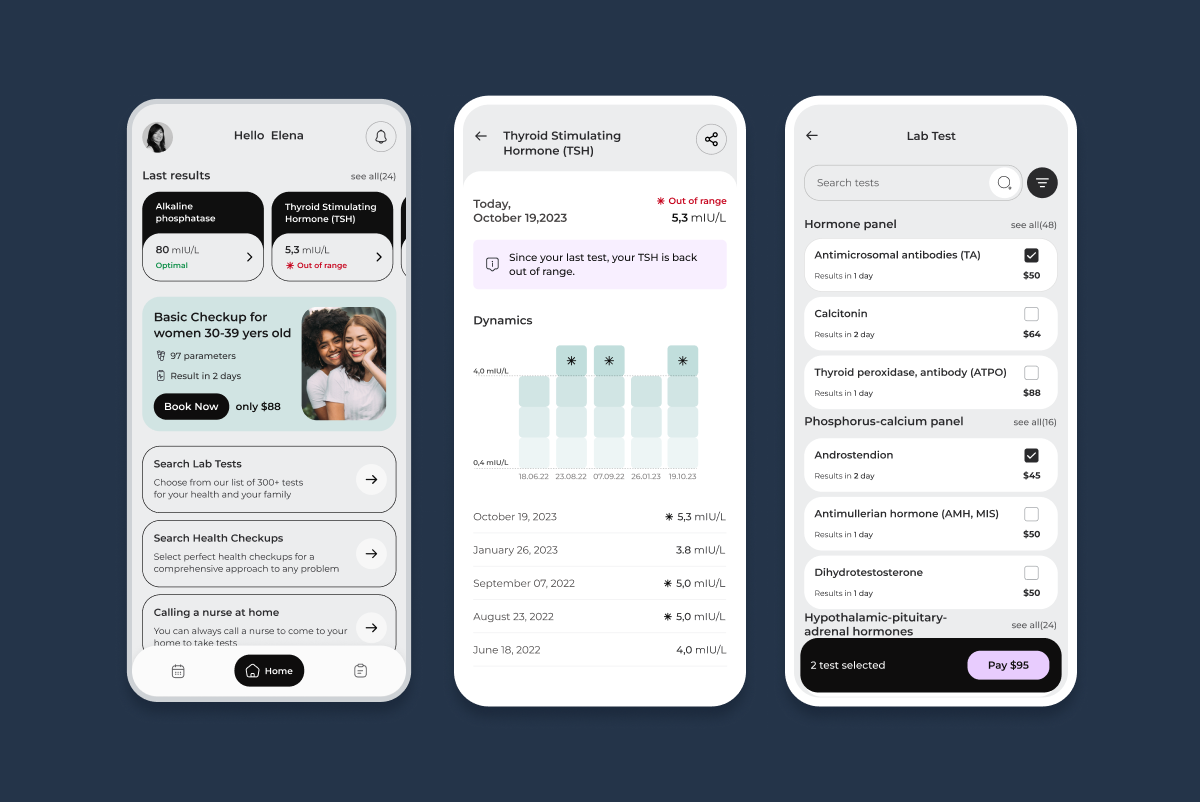
Lab Hub design by Cadabra Studio
Nowadays, patients aren’t just browsing on their desktops; they’re searching for healthcare info while on the go. If your website turns into a jigsaw puzzle on a mobile screen, users won’t stick around long. A responsive, mobile-friendly design ensures your site looks and functions smoothly on any device.
Accessibility features
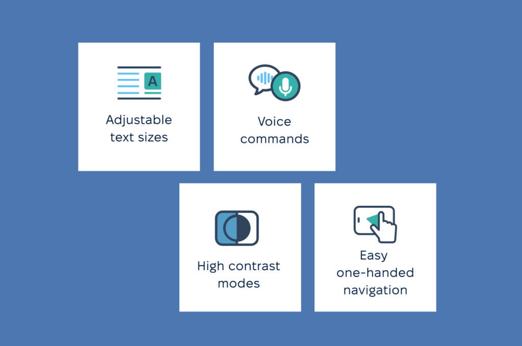
Rest Assured website (examples of accessible web design features: large, high-contrast fonts and large button, easy-to-use keyboard navigation)
Accessibility is the red carpet that welcomes every visitor, regardless of ability. This is a must for patient-centric web design.
Healthcare websites should be accessible to everyone, including people with disabilities. This contains features like alt-text for images, compatibility with screen readers, and keyboard navigation options.
When meeting ADA (Americans with Disabilities Act) requirements, you’re expanding your reach and showing prospective patients that your practice cares about inclusivity. You’re rolling out a universal welcome mat for patients of all backgrounds and abilities.
Secure patient portals
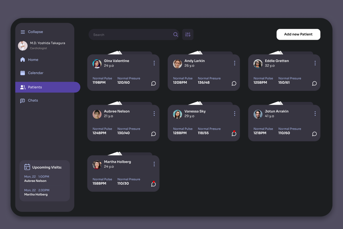
Patient Check | Doctor Dashboard by Cadabra Studio
Patient portals are often the nerve centers of healthcare websites, offering access to everything from lab results to secure messaging with doctors. Given the sensitivity of the data these portals handle, they need to be locked up tight – this is where HIPAA and other security frameworks come in.
Well-designed, HIPAA-compliant websites also may be a way for patients to feel connected to their care.
Online appointment scheduling
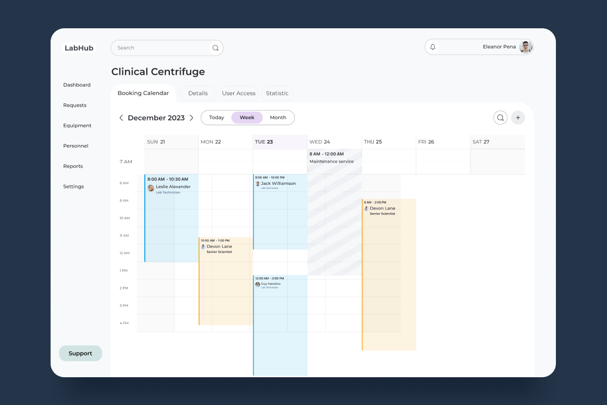
Online Appointment Calendar design by Cadabra Studio
Booking an appointment shouldn’t feel like a chore. Patients are used to the convenience of online reservations for everything from restaurants to flights, so healthcare should follow suit.
An excellent online scheduling feature in healthcare website design lets patients see available time slots, pick a convenient time, and confirm their booking without a hassle. Not only does this save patients the headache of phone wait times, but it also frees up your front-desk staff, making your practice more efficient.
Search functionality
![How To Design A Healthcare Website [With Examples] (November 2024).pdf-image-007](https://cadabra.studio/wp-content/uploads/2024/11/How-To-Design-A-Healthcare-Website-With-Examples-November-2024.pdf-image-007.png)
Source: Mayo Clinic website
For larger healthcare websites with tons of content, a search bar is non-negotiable. Patients want to quickly find what they’re looking for, whether it’s information about a procedure, a specific doctor, or a health article.
In modern medical web development, a well-designed search function lets users cut through the clutter and access what they need in seconds. It’s a small feature with big benefits – like giving patients a direct line to the information they’re seeking.
HIPAA compliance
![How To Design A Healthcare Website [With Examples] (November 2024).pdf-image-008](https://cadabra.studio/wp-content/uploads/2024/11/How-To-Design-A-Healthcare-Website-With-Examples-November-2024.pdf-image-008-1024x493.png)
Source: Cleveland Clinic website
I’d like to stress one more time that HIPAA compliance isn’t just a recommendation; it’s a legal requirement. HIPAA-compliant websites are the digital equivalent of a hospital’s strict privacy policies.
Encryption, secure access controls, and regular security audits are all essential for protecting sensitive data. When patients see that a website takes their privacy seriously, it builds trust and reassures them that their information is safe.
Integration with Electronic Health Records (EHR)
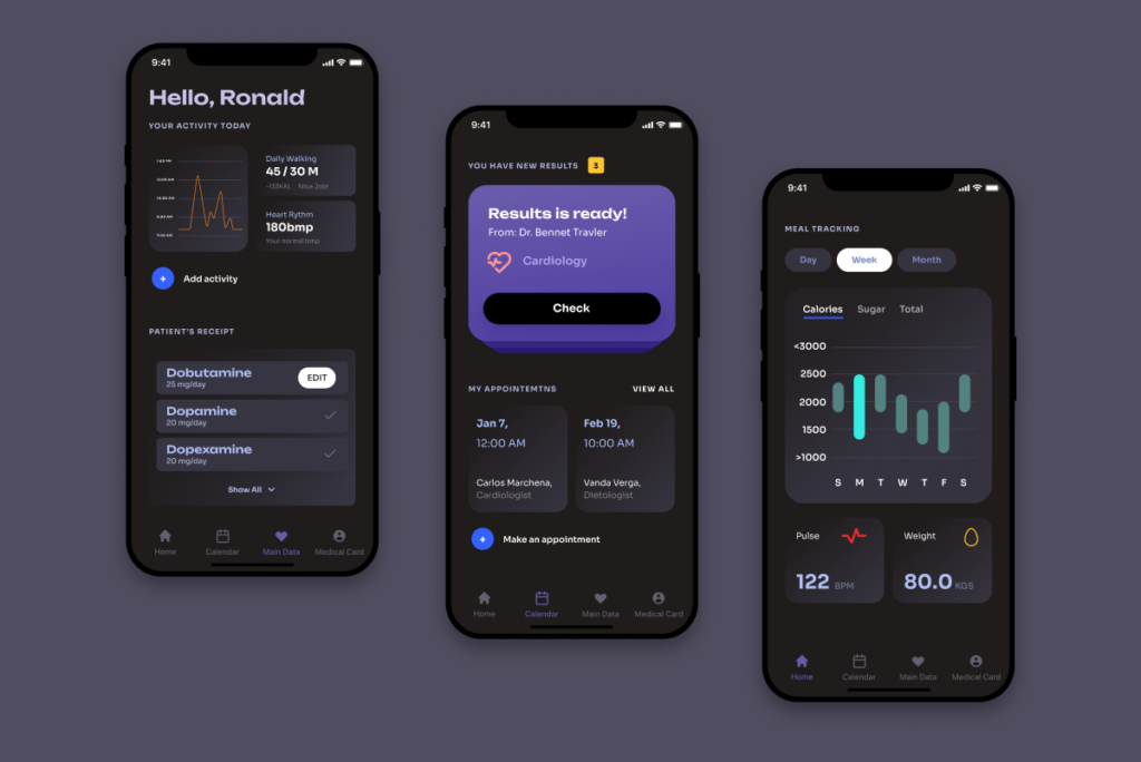
Patient Portal Design by Cadabra Studio
EHR integration can enhance the user experience by streamlining how patients access their records and manage their health information. This feature provides continuity of care by enabling patients to review their medical history, track test results, and receive treatment updates directly from your site. Seamless EHR integration can make a powerful impact on patient satisfaction and engagement.
Multilingual support

Source: World Health Organization website
Healthcare websites need to be accessible to diverse patient populations, including those who speak different languages. Offering multilingual support can broaden your reach, making it easier for patients from various backgrounds to feel welcome and supported. Consider adding language options to key pages like services, appointment scheduling, and patient resources.
How to Make Your Healthcare Website Stand Out
There are a few extra elements that can take it from just another site to an online experience that patients remember and trust. Here’s how to transform a standard healthcare user experience into one that feels inviting, informative, and genuinely helpful.
Implement a clean and professional design
Your website’s design is like the “face” of your practice. Clean, professional design communicates trustworthiness and helps patients feel comfortable right from the start. Avoid clutter, choose easy-to-read fonts, and stick to a layout that doesn’t overwhelm the eye. Think of your website as the digital waiting room – it should feel just as professional and welcoming.
Prioritize information hierarchy
Patients come to your site looking for quick answers, so make sure they can find what they need fast. Prioritize the most sought-after information, like contact details, service options, and appointment scheduling, so that it’s immediately accessible. Clear, organized sections make navigation a breeze, even for less tech-savvy visitors.
Use a calming design
![How To Design A Healthcare Website [With Examples] (November 2024).pdf-image-012](https://cadabra.studio/wp-content/uploads/2024/11/How-To-Design-A-Healthcare-Website-With-Examples-November-2024.pdf-image-012.png)
Source: Alnylam website
Imagine visiting a doctor’s office: warm lighting, soft colors, and comfortable seating make a world of difference. A healthcare website should feel just as welcoming.
- Go for a calming, patient-centric web design with colors like soft blues, greens, or earth tones, which evoke a sense of calm and comfort.
- A layout with plenty of white space, clear fonts, and a clean structure can help make the experience feel less overwhelming.
- Try to avoid clutter – think of your website as a peaceful waiting room, not a chaotic bulletin board. When patients visit, they should feel like they’re in good hands right from the homepage.
Include educational content
![How To Design A Healthcare Website [With Examples] (November 2024).pdf-image-013](https://cadabra.studio/wp-content/uploads/2024/11/How-To-Design-A-Healthcare-Website-With-Examples-November-2024.pdf-image-013.png)
Source: Patients Like Me website
Health-related websites that provide educational content aren’t just informative – they’re empowering. Adding a blog with health tips, wellness articles, or even preventive care advice shows that you’re invested in your patients’ well-being, not just in scheduling appointments.
Educational content can range from articles about managing chronic conditions to simple lifestyle advice, like tips for getting a better night’s sleep or stress-management techniques. When patients find this kind of valuable content, they’re more likely to keep coming back to your site, not just for appointments but for trustworthy information. Plus, content like this helps boost your SEO, making it easier for new patients to find you.
Share patient testimonials to show your medical expertise
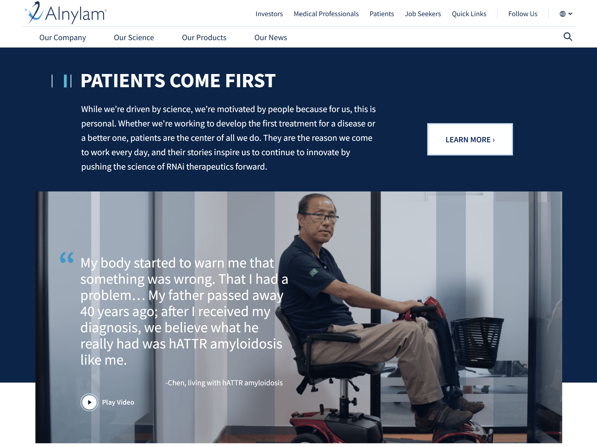
Source: Alnylam website
In healthcare, where trust is everything, few things build trust better than real-life stories. Patient testimonials offer powerful social proof that can make new visitors feel comfortable and confident.
For example, sharing stories of patients who have had positive experiences with your care can reassure others that they’ll be in good hands. A patient might think, “If it helped them, maybe it can help me, too.” You can make these stories even more compelling with brief quotes, photos (with patient permission), or short videos where patients share their experiences in their own words.
Add interactive tools to your healthcare website design
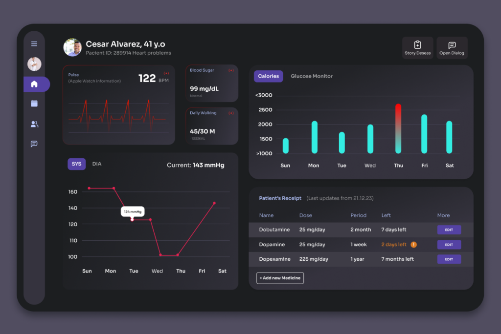
Patient Portal Design website
Interactive tools like symptom checkers, BMI calculators, and drug interaction checkers add an extra layer of value to your website. These aren’t just bells and whistles – they’re genuinely useful tools that make your site a practical resource for patients. Imagine a patient who’s not sure if their symptoms warrant a doctor’s visit. A symptom checker can help guide them, providing reassurance or encouraging them to seek care when needed. These tools don’t replace medical advice, but they do offer valuable initial guidance.
Include clear calls-to-action (CTAs)
Every page on your site should guide visitors toward an action, whether it’s scheduling an appointment, reading more about a service, or reaching out with questions. Well-placed, clear CTAs – like “Book Now,” “Learn More,” or “Contact Us” – help patients know exactly what to do next and make it easier for them to follow through.
Ensure fast loading times
In a fast-paced world, a slow-loading website can frustrate patients and lead them to click away. Make sure your site is optimized for quick loading by using compressed images, minimizing redirects, and choosing a reliable hosting service. Faster loading times create a smoother, more enjoyable experience for users and can even improve your site’s search engine ranking.
Think about local SEO optimization for medical web development
Even the best website won’t do much good if it doesn’t show up in search results. That’s where local SEO comes in – optimizing your site for local searches can make sure you’re visible to potential patients in your area. Imagine a person typing “pediatrician near me” or “physical therapy in [your city]” into Google. With good local SEO, your website will pop up in their results, making it easy for them to find you.
To boost local SEO, include keywords specific to your location, like “San Francisco dermatologist” or “Dallas family doctor.” Adding a Google Map to your contact page, creating content on the home page that highlights local health events or community involvement, and making sure your Google Business profile is up to date are all helpful steps. Local SEO optimization doesn’t just increase traffic – it connects you with the patients most likely to book appointments with you.
Examples of Best-Designed Healthcare Websites
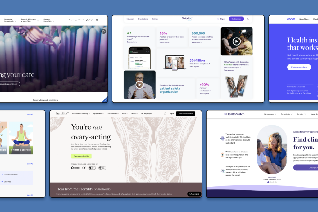
For a bit of inspiration, here are some healthcare websites that really hit the mark in terms of design, usability, and patient experience. These sites show how effective design can make healthcare more approachable and even enjoyable.
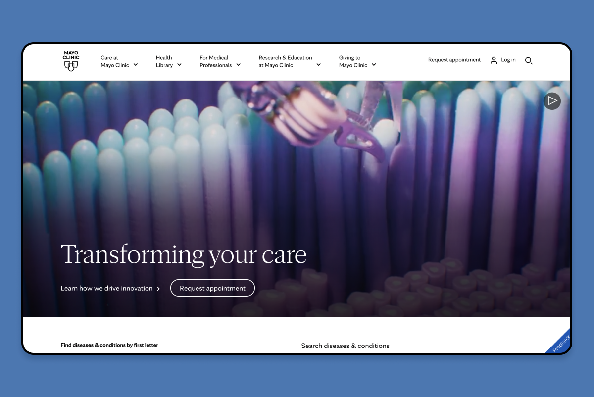
This site is a goldmine of health information, laid out in a way that’s easy to navigate. The design feels professional and trustworthy without being too stiff or clinical.
Mayo Clinic’s website seamlessly blends extensive medical content with a user-friendly interface, making it approachable for patients looking for reliable health advice. This is an excellent example of patient-centric web design.
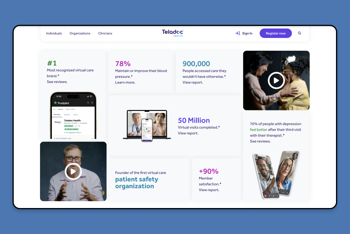
Teladoc’s website is all about making telemedicine as easy as possible. The clean design and intuitive layout guide patients through virtual care options without any fuss. Plus, it’s built with secure communication in mind, which helps your target audience (patients) feel safe and confident using telehealth services.
Teladoc shows that virtual care doesn’t have to be complicated. It may be comfortable with professional patient-centric web design.
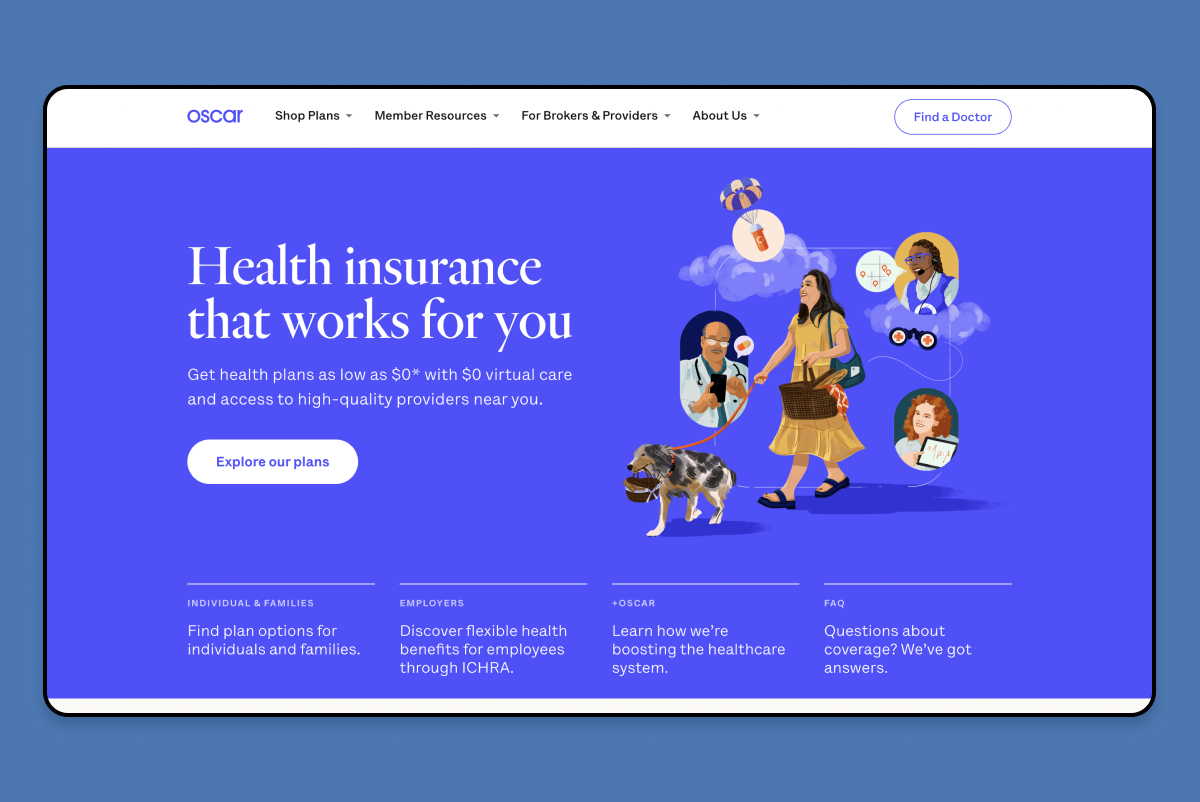
Oscar Health’s website is bright and approachable, with a layout that makes health insurance – often a confusing topic – feel manageable. It’s clear, colorful, and welcoming, giving users the impression that they’re in good hands. Oscar Health demonstrates that a little color and a lot of clarity go a long way in easing patient anxiety around insurance.
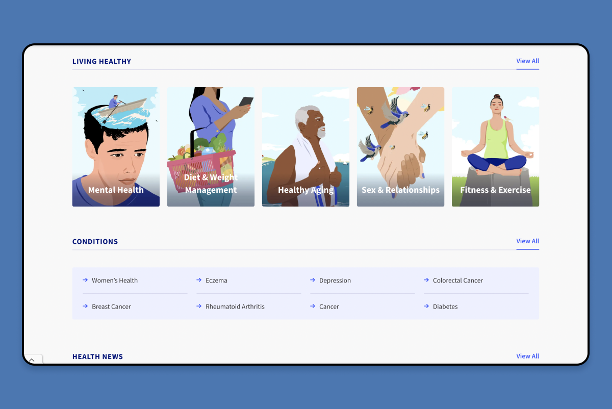
As one of the best-known healthcare information sites, WebMD keeps things simple and user-focused. With helpful tools like symptom checkers and health assessments, it’s easy for patients to find reliable health information and take action.
WebMD’s site proves that accessibility and trustworthiness can go hand-in-hand. It is built with the healthcare user experience in mind.
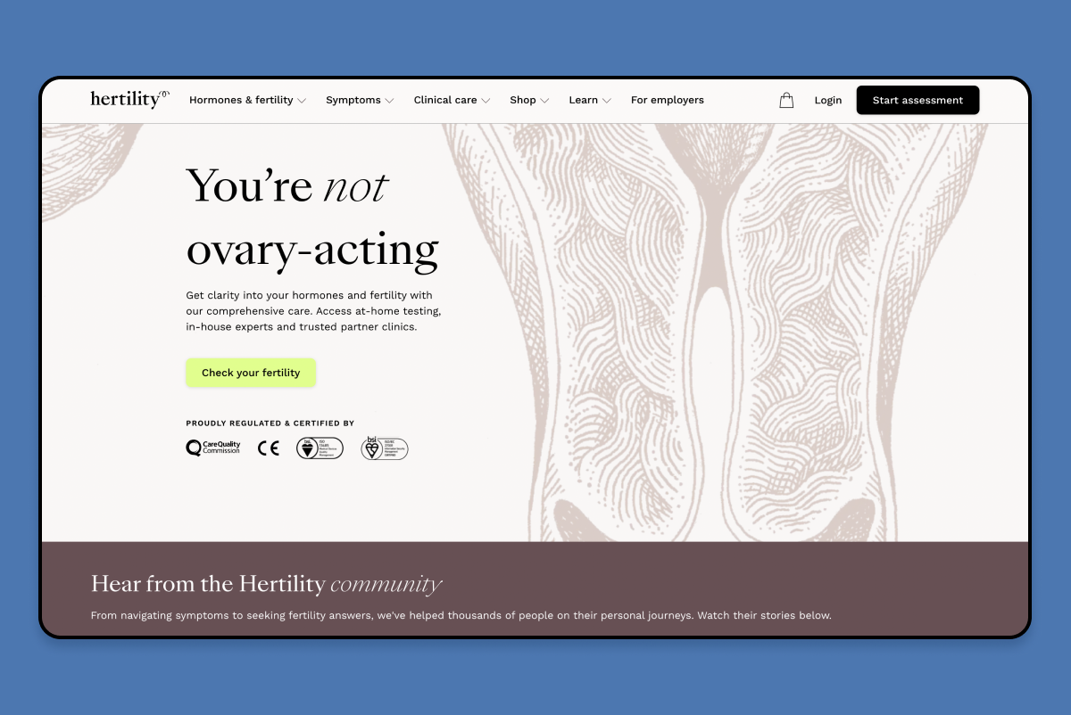
Hertility’s healthcare website design takes a warm, welcoming approach to women’s health. The site feels like a supportive guide rather than a clinical resource, and it’s designed to demystify women’s health assessments. With its friendly, modern design, Hertility shows that a healthcare website can be informative without feeling impersonal.
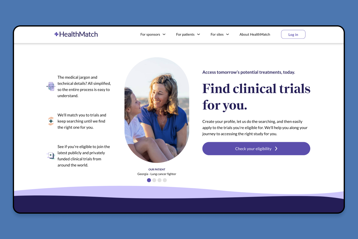
Health Match has streamlined the often complex process of signing up for clinical trials. The design is simple and straightforward, guiding users through research options with ease. For patients exploring treatment opportunities, Health Match’s clear and intuitive design is a huge plus.
Getting Started Without a Tech Background
Feeling a bit daunted by the idea of healthcare website design? Don’t sweat it! You don’t need a tech degree or a PhD in computer science to create a fantastic online presence for your practice. Think of it as navigating a new recipe – sure, you might not be a master chef, but with the right ingredients and a little guidance, you can whip up something great. Where to get the expertise?
We specialize in healthcare web design and can help you transform your vision into reality, handling everything from design aesthetics to ensuring your site meets HIPAA compliance standards.
Don’t hesitate to reach out to us. We know the ins and outs of healthcare user experience, allowing you to kick back and concentrate on what truly matters – providing exceptional care to your patients. Let us handle the techy stuff while you take your practice and user journey to new heights!
Frequently Asked Questions
How do I make a healthcare website?
Start with patient needs – like scheduling, access to records, and health info – and design around those. For complex sites, hiring experienced developers is a smart move.
What are the main points for HIPAA compliance?
HIPAA requires protecting patient data with secure logins, encrypted communication, and careful data handling. HIPAA-compliant websites follow strict security protocols to keep data safe.
How much does it cost to develop a healthcare website?
Prices vary based on features, complexity, and HIPAA requirements. Simple sites cost less, while sites with patient portals and scheduling can be pricier.
What technologies work best for healthcare sites?
Popular choices include secure backend frameworks like Django and Ruby on Rails, along with CMS platforms like WordPress and tools for EHR integration.
Final Thoughts
Healthcare website design does not create a simple digital brochure but builds a welcoming space where patients can gather information, feel reassured, and connect with the providers who care for them. When you prioritize thoughtful, patient-centric web design, top-notch security, and features that put patients first, you create an experience that makes all the difference.
If you’re looking for expert guidance in this journey, Cadabra Studio has got your back. We specialize in crafting HIPAA-compliant, user-centered websites that not only serve your patients but also enhance your practice.

