
We tend to check the best examples on the trendsetting platforms like Awwwards, Behance, or Muzli. What we see there are broken grid layouts, extravagant typefaces, and no sign of clickable buttons. We got a feeling that our website has to look exactly the same. And we modify it until it looks better, sharper, cooler — anything to try to tell people, “Hey, this is who we are,” or, “Look! We’ve changed.”
What we really get is a clone of other websites which makes users feel they got to a blank page with the fainting shades of grey. What about being useful, solving users’ problems, and earning with the help of your website?
While creating a stylish UI, think about how you can avoid common website mistakes. There are certain rules you should follow. So, what makes a bad website design?
Web Design Mistakes
Modern web development is not about pure HTML CSS. Sites have many pages, links, blocks and interactive components that require effort and tools. That is why web design has already a long time gone beyond the colors and fonts. It combines development practices and frameworks for creating a unique user experience, user interface and engaging digital presentation of the product value.
So, website development is a complex process, and web developers and designers can make some critical mistakes. Let’s discuss the most common.
No Responsive Design
Responsive design is the most important website feature. Yes, the optimization might be expensive and time-consuming. But, if you ignore responsive design, many customers won’t be happy to use a website that’s not optimized for mobile. Mobile-responsiveness provides users with a great mobile experience. Pay special attention to it. Otherwise, you will be missing out on a significant amount of traffic and conversions.
How to avoid. Make your site serve all devices on the same set of URLs, with each URL serving the same HTML to all devices and using just CSS to change how the page is rendered on the device.
Haven’t figured out what we’re talking about? Contact us and our Business Development Manager will gladly explain all the technicalities.
Poor Navigation
Statistics show that 38% of website users who visit the website first time pay attention to the layout and navigation menu. Users leave the resource and never return if the navigation is poor and messy.
How to avoid. If the user clicks links and buttons randomly, not understanding where to go next, this is a 100% negative experience. The task of websites and web design is to prevent confusion and disappointment, guide the client in the right direction and follow the three-click rule: the user must find the necessary information in three clicks at most.
Cluttered Layout
Haphazardly arranged websites are akin to puzzle — you need some time to put all the pieces together. But visitors won’t do it; they need a well-structured layout that enhances them to find quickly what they need.
How to avoid. To make a good layout choose one theme, one logo, and one typeface. Stay with them across all other aspects of your site, making it look user-friendly.
Lack of Communication
Your platform is the primary tool for communicating with customers. Its job is not just to talk about your value, offers or services. The site is needed to attract potential customers and improve the loyalty of regular ones. All this happens through HTML and CSS tools and communication exclusively.
How to avoid. When the users come to the home page, they should feel that you are talking to them. They should immediately understand who you are and what you offer. But even this is not enough. Give them a chance to answer you. Let the user communicate with you through feedback forms, chatbots, etc. All these components should be accessible, simple and engaging.
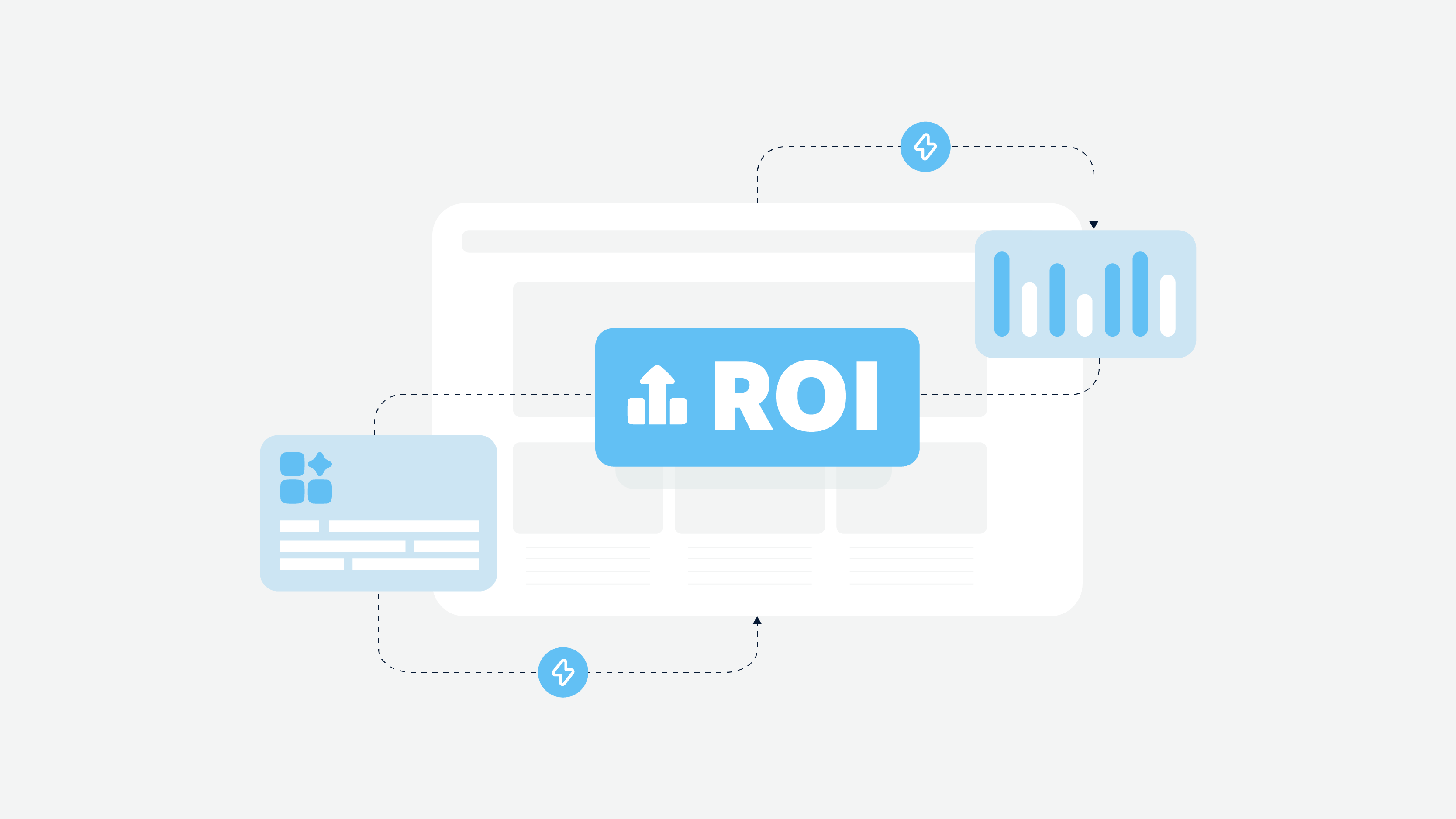
Lopsided Calls to Action
Missing or overusing Call to Action is probably one of the biggest website mistakes. A CTA should be simple and succinct, so the visitors won’t get confused. However, too many CTA buttons can worsen your relationship with users.
How to avoid. The best website user experience should tell a customer what to do, where to go, and how to feel. Clear CTAs nudge your visitors in the direction of the next step — to purchase, to lead, or to subscribe.
Poor Accessibility and Inclusivity
You can hire the best full-stack developer who will use the most advanced technologies, but it will be useless if your platform is not accessible and inclusive.
Inclusive design is a methodology for developing websites, applications, and other products that are understandable, accessible, and conducive to people of all backgrounds, genders, capabilities, and abilities. This approach can focus on various markers: differences in age, gender, language, geography, limitations in opportunities, etc.
Inclusive design has been a major trend in the last decade, as it has offered a non-obvious way to expand the target audience and improve brand awareness.
Unfortunately, not all web products meet the requirements of inclusiveness. However, there are many ways to fix this.
How to avoid. The essence of an inclusive approach is to empathize with users and adapt interfaces to meet their needs. How can you do this? For example, you may want to focus on the senior audience first. Research shows that the problem for this group can be too small fonts and weak contrast between characters, as well as difficulties in orientation on the page. Therefore, web developers can use fonts of a larger size and contrast, work with symbols in the background, and improve the interface for better visibility of the necessary navigation elements.
It is also worth paying attention to the forms. You can provide additional gender parameters other than female and male in appropriate contexts. To create a website that is friendly to all users regardless of gender and race, increase the diversity of illustrations and characters. And don’t forget about the third-party tools for people with disabilities. The development team can provide integration services for solutions like Live Captions, etc.
Messy Design

It’s a pretty common website design mistake for many businesses. If your business is mature, before your website might have started with simple landing pages and a couple of fancy banners; if you avoid website redesign, it could turn into a messy combination of different windows. So, your conversion rate can suffer greatly. Good design enhances users to buy or book anything just in 2 clicks.
How to avoid. Start sorting your priorities. Use smart, simple, and logical design. Don’t give any opportunities to include your website to the top of the worst website designs.
Suspicious Website Elements
Cybercriminals use all possible methods of fraud, including fake websites. Even one questionable element of your platform can damage your brand’s reputation.
An essential goal of web development is to build a trusting relationship with the user through the site’s components. Every visitor should understand that your company is real and reliable and shouldn’t feel threatened, especially if you work with personal data, financial transactions and payments.
If users visit your resource for the first time and feel insecure about your reliability, they will definitely leave. This way, the company loses traffic, which leads to higher bounce rates and lower search engine visibility, etc.
How to avoid. Every professional web developer, in this case, focuses on the best practices of UI/UX design, namely:
- Using quality HTML, CSS and other practices to create an attractive visual image of the home page.
- Temperance in graphics, animations and other elements (a minimum of pop-ups and unobtrusive communication with chatbots, etc.).
- Creation of a visible and easily accessible block with contact data (real address of representative offices, phone numbers, links to social media pages, e-mail, etc.).
- The presence of a detailed “About Us” page or section.
- Links to customer reviews on independent web resources.
Transparent and discreet communication through the platform elements helps to confirm your reliability.
Typography and Content
Mistakes
Now it’s time to talk about the critical elements of visualization, namely typography and content.
Why Does Typography Matter?
Web development is about combining functionality and appearance, CSS and Javascript, design and tech components. Typography helps to present the content as clear, accessible and understandable as possible.
In addition, this typography practice is a way to improve brand recognition, focus the viewer’s attention and effectively convey the desired message without unnecessary details. Good typography creates a mood and promotes memorization without being too eye-catching. So, for example, travel websites will have different fonts, colors and even the arrangement of elements than insurance platforms.
No matter how professionally the site is made, lousy typography will annoy the user and cause disgust. And here, no web development hooks can help. That is why it is so important to pay attention to this.
Unclear Font
Despite their desired presence cursive fonts, hand-drawn scripts, and symbols can’t be used in website typography. Unclear fonts are difficult to read, so they decrease cognitive fluency. Here we mean the ease of website use for the visitor. You want your visitors to look through the website and purchase your services, rather than taking apart curls and serifs in curly letters. Don’t you?
How to avoid. While choosing the font, ask yourself: “Is it easy for visitors to understand what they’re looking at?” Don’t make simple things too complicated. Mostly, people prefer content that’s readable and easy to think about.
Too Many Fonts
That’s another website visual design mistake. If your website has more than 3 different fonts, you make the users cry, so to speak. Too many fonts on the screen make your website look chaotic and unprofessional. Eventually, users may get confused with it and leave your website, forgetting the original purpose of the visit.
How to avoid. The ideal number of fonts is 1-2: one is for main headings, another is for sub-headings and body text.
Lack of Typographic Hierarchy
A clearly defined typographic hierarchy is an integral part of web development and design. It establishes the order of importance of text elements and unites the content in clear logical chains.
How to avoid. Use all available CSS and Javascript tools to select styles for header text (h1, h2, h3) and body text (p). Determine what exactly should catch the user’s eye and where other subheadings should lead your visitor. You can also use modular scaling apps to build a strong hierarchy.
Long Paragraphs on the Website Pages
Such web design mistakes as long paragraphs can clutter the visual design. Let’s be honest, nobody likes reading long posts or product descriptions.
How to avoid. If you have long-form website content, create a clean, spacious design. It divides the content into readable chunks. Also, add ample white space and images for proper flow. Just be laconic and clear.
Absence of Logical Blocks
The absence of logical blocks leads to chaos and irritation. The user begins to get lost and simply goes to another site.
The result of good web development is a platform that guides the user to the right section without effort. And breaking your content into logical blocks is a great way to achieve this.
How to avoid. In order to group information, you can use the simplest HTML and CSS tools: paddings, colored backgrounds, etc. Professional designers work with more complex elements such as contrasts, frames, font features and others.
The Text Isn’t Scannable
Website visitors can read only 28% of the whole text during an average visit. One of the common website mistakes is that the text isn’t scannable. Ask yourself a simple question: how easy is it for someone to find what you want them to present? If it takes more than two clicks for the customer to find some information, your content isn’t scannable.
How to avoid. The features of the scannable content are the following:
Sub-headings;
Short paragraphs (up to 5 sentences);
Bold and highlighted formatting;
Numbered lists and bullet points.
Include the listed features to the website content and far more likely your visitors will like it.
Poor Contrast
It is very important to create a website that is easy to read and scan. Contrast plays an essential role here, so its lack is a serious mistake. If you can’t see the text after moving away from the screen, the problem is contrast.
How to avoid. Use suitable color schemes with a combination of light and dark. Make sure that fonts on complex backgrounds have clear, visible outlines. Pay attention not only to the content in the foreground but also to the background elements.
Wrong Focus
The website you create has to focus not on your business, but on any kind of solutions you offer to your customers. If the content ignores visitors’ desires, goals, fears, and frustrations, it is a website mistake.
How to avoid. Change the focus, and this common error on a website will disappear. Write about the product efficiency and the problems it solves. Therefore, you increase visitors’ credibility.
Narrow Color Block Elements
Emphasizing narrow elements with the help of color looks difficult and disharmonious.
How to avoid. If you need to highlight a narrow element of a block, such as a header, then use hierarchical resizing in web development, indentation, or work with color saturation. You can also create a harmonious color background common to all elements of the block.
Wrong Use of Whitespace
A lack of whitespace is a common website mistake. Instead of an easy-to-read piece of Internet content, some websites present the walls of text akin to an English class essay. When there isn’t enough whitespace, content is overwhelming for visitors to read.
How to avoid. Make a scheme of white spaces, add relevant images. Break up the content with bullet points, and headings to increase the overall website readability.
Technical Realization
Technical realization is fundamental in web development. While UI/UX design creates a pleasant appearance and guides the user through the platform, the technical side makes sure that it is fast, functional and secure. These are invisible things to the user, but they are significant.
A Website Without SSL Certificate
SSL Certificate (Secure Sockets Layer) created an encrypted communication between a web browser and a web server. Not having the SSL Certificate is a website technical issue that will cost you consumer trust and potential hack.
Why is this so important in web development? SSL certification is the way to protect not only your company’s data but also user data collected by the site. It also confirms your website ownership, which helps prevent cybercrime and identify the real web platform.
In addition, it significantly increases the users’ loyalty and trust. This way, they can be sure to use your website without the risk of losing personal data.
How to avoid. In order to protect your website and customers’ data, you should always have an SSL Certificate and use HTTPS. It makes your website as safe and secure as possible.
The website is too slow
Everyone wants to find their information fast. And the slow loading of the page can kill your website, despite good visuals and design. Moreover, Google can penalize such a website in the rankings for this, so nobody will find you. Large images or animation are the most common reasons for slow loading.
However, performance issues can also be caused by outdated apps, plugins, or other platform components.
How to avoid. Firstly, we recommend you to cut the file sizes down using file-crunching aids. Secondly, it would be great if you invest in a CMS system that automatically resizes images. Or you can involve the website developer to find ways to improve the page load time. Do something with it. Don’t hold people in front of the homepage!
A professional full-stack web developer will help you determine the cause of slow loading and poor performance. He|she also can find different ways to solve the problem according to your needs and budget. Just don’t let things slide.
A Failure in Optimizing SEO
In the context of SEO optimization, a failure means that your customers won’t get to your site at all. Many problems with online websites are caused by the wrong SEO strategy.
How to avoid. Start doing SEO straight from the time you created your website. Include keywords and internal links to website content. Update frequently your website through new blog posts, advertisements to boost your SEO score.
Poor Links
Some website owners buy links to increase the ranking of pages in search results. And here, the lottery starts because quality links can be effective, but in most cases, they are not so good and can only harm.
How to avoid. Your website traffic should be organic, so find an SEO specialist with experience in web development who can help you with this. For example, you can create a guest blog to improve the ranking due to natural links.
To solve the problems listed above, you don’t necessarily need to hire a full-stack web developer, but technical assistance is required. Therefore, before starting development, find a reliable pro team with experience in creating successful web platforms.
Avoid Mistakes of Badly Designed Websites
In case you scrolled down the listed common website problems and solutions, and are just joining us now we recommend to include the following features to your website:
Strong CTAs (Call To Action) drive users down a path;
Install Google Analytics to measure website analytics;
Create a clear messaging with the right focus;
Optimize page load times to keep visitors in touch with you;
Ensure your website has a tested mobile-friendly experience.
Don’t worry, if you have any of the listed website problems. We can make in-depth expertise of your website and offer solutions that will generate loads of customers for your business. We’ll also be happy to help you with documentation and a web development proposal to structure your needs and goals.
Drop us a line and you’ll get the most dedicated and creative partner.