
Design color psychology has a direct impact on how people feel and perceive the world around them. It’s a secret weapon for shaping emotions, influencing decisions, and even guiding user behavior. Ever wonder why fast food logos are often red and yellow? Turns out, those colors can actually make you feel hungry.
In the world of design, knowing color theory and how color affects people is a quantum leap. Whether it’s branding, marketing, or user interface (UI) design, the right color choices can make or break a product’s success. A well-chosen palette can create an emotional connection, boost engagement, and even drive users toward specific actions – like clicking that tempting “Buy Now” button.
An essential aspect of creating effective color palettes is the use of an accent color. According to the 60-30-10 rule, a design should allocate 60% to a dominant color, 30% to a secondary color, and 10% to an accent color. This accent color can draw attention to important elements in a user interface, enhancing both aesthetics and functionality.
In this article, we’ll break down the psychology of colors in design, its impact on UX/UI, and how you can use it to your advantage. We’ll also analyze the emotional weight of different colors, real-world success stories, and maybe even debunk a color myth or two (spoiler: not all light blue logos mean “trust”). Get ready to see color in a whole new way!
Understanding Color Psychology
What is Color Psychology?
Color psychology is the study of how colors affect human emotions, perceptions, and behaviors. It delves into the psychological effects of different hues and shades, exploring how they can influence user behavior, evoke emotions, and create specific atmospheres. In the realm of digital design, color psychology is a powerful tool. It can shape the overall user experience, guide attention to key elements, and communicate a brand’s identity effectively.
Imagine walking into a room painted in a vibrant red versus a serene blue. The red room might make you feel energized or even a bit anxious, while the blue room could evoke a sense of calm and relaxation. This is color psychology at work. By understanding these effects, designers can strategically use colors to enhance user engagement, drive actions, and create memorable experiences.
The Science Behind Psychology of Color
So, color affects not only visual aesthetics, but how we think, feel, and react – often without us even realizing it. When light enters the eye, the brain processes different wavelengths and links them to different cultures, emotions, and experiences. That’s why certain colors can make us feel energized, calm, or even hungry (yes, red can increase appetite, which might explain why so many fast-food chains use it).
Studies show that colors trigger specific emotional responses. Warm colors like red and orange often create a sense of excitement, urgency, or passion, while cool colors like blue and green tend to feel calming, trustworthy, or professional. But context matters – a deep red can signal love or danger, depending on how it’s used.
Cultural Differences in The Psychology of Color in Graphic Design
Culture also plays a big role in color perception. In many Western cultures, white symbolizes purity, but in parts of Asia, it represents mourning.
Meanwhile, purple was once so expensive to produce that only royalty could afford it – hence the phrase “born to the purple.” Designers who work with global audiences need to consider the cultural background and these variations to their brand palette to avoid sending the wrong message. After all, no one wants to accidentally turn their brand launch into a funeral announcement.
The Color Wheel and Color Theory
Basic Elements of Color Theory
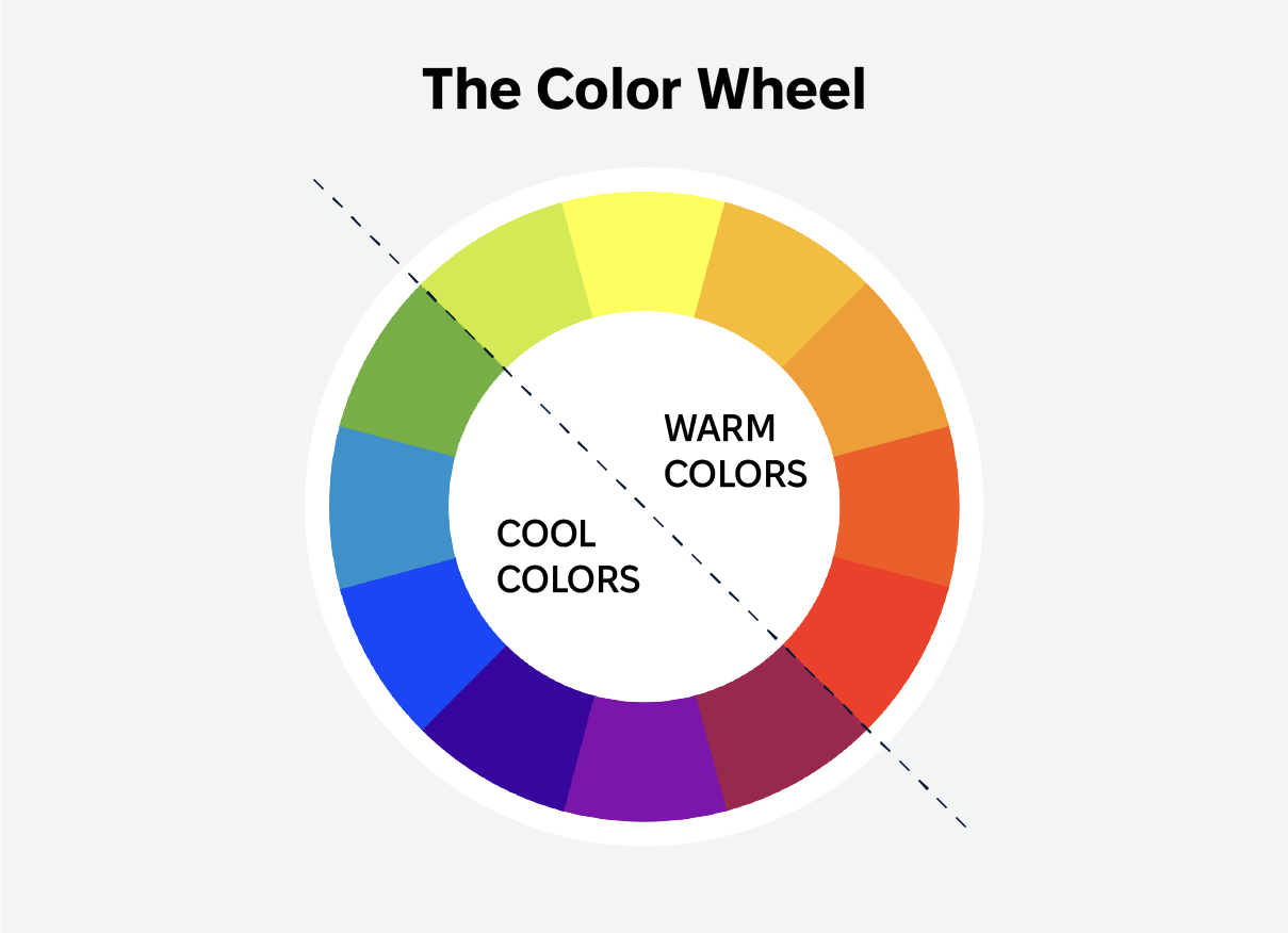
Color theory is a conceptual framework that helps us understand how colors interact, combine, and evoke specific emotions or reactions. At its core, color theory revolves around three primary components: the color wheel, color harmony, and the context of color.
The color wheel is a circular diagram that organizes colors based on their chromatic relationship. It starts with the primary colors—red, blue, and yellow. These are the building blocks of all other colors. When you mix two primary colors, you get secondary colors: green, orange, and purple. Tertiary colors are created by mixing a primary color with a neighboring secondary color, resulting in hues like red-orange or blue-green.
Understanding the color wheel and how colors relate to each other is essential for creating harmonious and visually appealing designs. It helps designers choose color combinations that work well together, whether they are looking for complementary colors that create contrast or analogous colors that provide a more cohesive look.
The Psychology of Warm Colors
Warm colors, such as red, orange, and yellow, are generally associated with positive emotions, passion, energy, and excitement. These colors can evoke feelings of warmth and comfort, making them ideal for designs that need to convey energy and enthusiasm. For instance, a red call-to-action button can create a sense of urgency, prompting users to act quickly.
However, warm colors can also be overwhelming if used excessively. A design dominated by red might feel aggressive or dominant, which could be off-putting to some users. The key is to use warm colors strategically, balancing them with cooler tones or neutrals to create a harmonious and engaging design.
Cool Colors and Neutrals
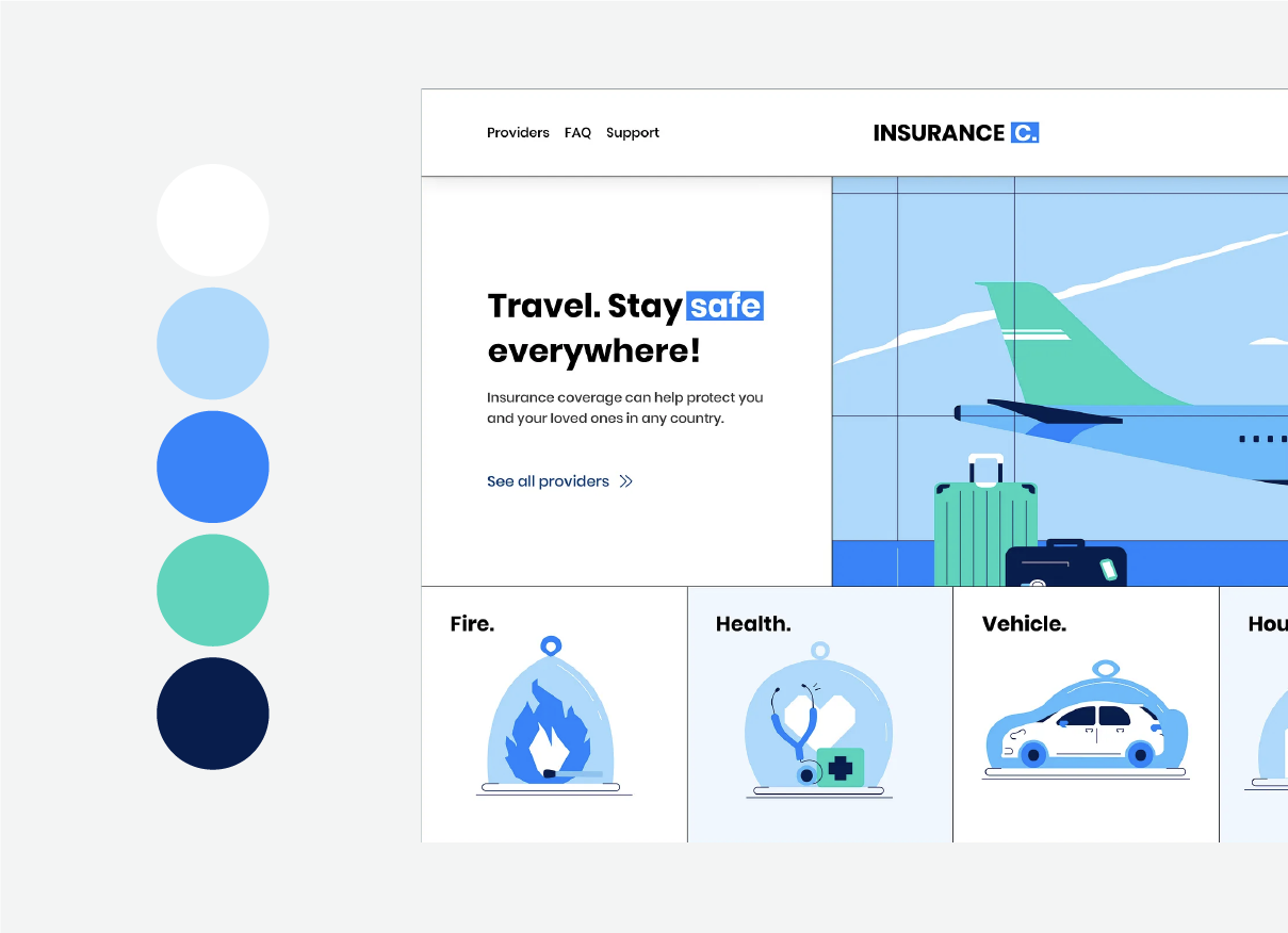
Cool colors, such as blue, green, and purple, are generally associated with calmness, serenity, and relaxation. These colors can evoke feelings of tranquility and peacefulness, making them perfect for designs that need to convey trust and stability. For example, many financial institutions use blue in their branding to create a sense of security and reliability.
Neutrals, such as black, white, gray, brown, and beige, are essential in every design. They provide a backdrop for brighter accent colors and can carry their own sophisticated meanings and messages. Neutrals can add a touch of elegance and simplicity to a design, making it feel more refined and professional.
By understanding the psychological effects of cool colors and neutrals, designers can create balanced and visually appealing designs that resonate with users on an emotional level. Whether it’s a calming blue interface for a meditation app or a sleek black-and-white palette for a luxury brand, the right color choices can make all the difference.
The Role of Color Psychology in UX/UI Design
As with any other design element, color can also shape your user’s experience and guide their actions.
Neutral colors are fundamental in graphic design, often serving as a backdrop to accent colors while also conveying sophisticated meanings on their own. They can enhance user interaction and engagement, suggesting strategic use within color palettes to achieve effective color harmony and positive design experiences.
Color Psychology in UX Design
The right color choices can make a big difference in how users engage with a product. They highlight key elements, guide navigation, and even impact conversion rates.
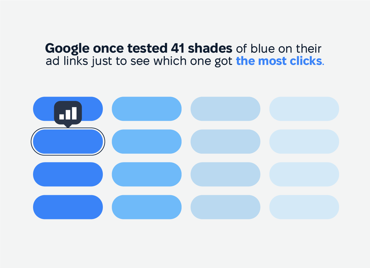
A red call-to-action button can create a sense of urgency, pushing users to act fast, while a blue button feels stable and reassuring, encouraging users to explore. Google once tested 41 shades of blue on their ad links just to see which one got the most clicks. It might sound excessive, but the winning shade ended up bringing in an extra $200 million a year. That’s a lot of money for what seems like a tiny change—proof that sometimes, obsessing over details pays off.
Beyond engagement, color plays a huge role in accessibility. High contrast between text and background improves readability, especially for users with visual impairments. Designers need to consider colorblind-friendly palettes to ensure that important information remains clear for everyone. Otherwise, a critical button might end up blending into the background—like a chameleon at a paint store.
Color Psychology in UI Design
In UI design, color helps users intuitively navigate an interface. A well-thought-out palette ensures consistency across pages and devices, making interactions feel natural. Primary colors guide users to key actions, secondary colors support content hierarchy, and accent colors add emphasis where needed.
Using the same color strategically strengthens brand recognition and user trust. A cluttered mix of random shades, on the other hand, can make a site feel chaotic and unreliable. Imagine opening your banking app and seeing neon pink transaction buttons—it wouldn’t exactly scream “financial security.”
How to Use Colors Effectively in UI/UX Design
Ever wondered why specific colors make you feel a certain way? Well, you may find the answer below.
Choosing the Right Color Palette
Selecting the right color palette goes beyond aesthetics. This design process shapes user experience by creating harmony and contrast. A well-balanced combination ensures that elements stand out without overwhelming the design. Complementary colors, like blue and orange, naturally draw attention, making them useful for highlighting key features or guiding users through an interface.
Industry preferences also play a role in color choices. Healthcare brands often lean toward soft blues and greens because they evoke trust and calmness, while financial institutions favor deeper blues and grays to reflect stability and professionalism. The tech industry, on the other hand, frequently incorporates vibrant colors like orange and purple to convey innovation and creativity.
Color decisions matter more than many realize. A study found that 93% of consumers prioritize visual appearance over other factors when shopping. So, besides being a design choice, color influences perception, engagement, and even purchasing behavior.
Emotional Associations of Colors
Proper psychology of color design can evoke specific emotional responses to dominant color, significantly influencing user interactions with a design. Each color carries unique psychological connotations that can shape user behavior and convey particular messages.
-
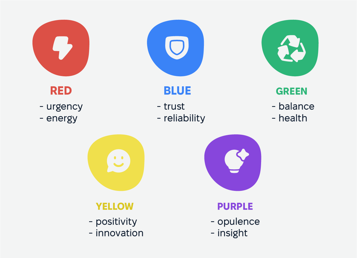
Red grabs attention like no other color. It’s linked to urgency, energy, and strong emotions, which is why it’s often used for warnings, sales, and call-to-action buttons that need an immediate response. When used strategically, it can create a sense of excitement, but too much can feel overwhelming.
-
Blue is the go-to color for trust and reliability. It’s a favorite in industries like finance and healthcare because it creates a sense of security and calm. That’s one reason why so many banks and insurance companies use blue—it reassures users without them even realizing it.
-
Green is all about balance, health, and nature. It’s commonly seen in wellness brands, eco-friendly initiatives, and anything tied to sustainability. Because it’s easy on the eyes, it’s also a great choice for designs that need to feel refreshing and stress-free.
-
Yellow: This color projects positivity, innovation, and caution. It draws attention and injects a sense of cheerfulness and creativity into a design. However, its intense nature necessitates thoughtful application to avoid overpowering users.
-
Purple: Associated with opulence, insight, and intrigue, purple adds an element of sophistication and elegance to designs. Its use can elevate a brand’s image, making it a favored choice for luxury products and creative industries.
Color Psychology in Graphic Design & Branding
Through the lens of color psychology, graphic design, and branding can use the emotional and psychological effects of colors to forge lasting connections with consumers. Among other capabilities, color reinforces brand identity.
Through color psychology UX design, brands can give color meanings to evoke emotions, communicate values, and build recognition. Thoughtfully chosen colors create a lasting impression, helping businesses stand out in a crowded market.
The right color in UI design aligns with a brand’s mission and audience. Eco-friendly companies often use calming greens to represent sustainability, while tech brands lean toward bold blues or sleek silvers to signal innovation. These choices of color wheel alone aren’t random—they strengthen brand messaging and influence consumer trust.
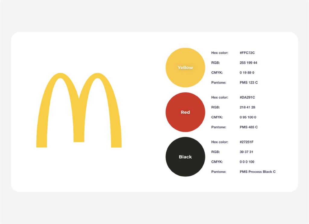
Successful brands show how graphic design and psychology of color drives recognition. McDonald’s signature red and yellow promote energy and warmth, reinforcing its fast, friendly service. Nike’s black-and-white palette exudes strength and simplicity, fueling its association with performance and empowerment.
Common Mistakes in Color Usage
Overusing Colors
Too many colors can overwhelm users, making a web design feel chaotic, while too few can leave it looking dull and unmemorable. A well-balanced palette helps guide users naturally without distraction. For example, eBay’s early website design was filled with clashing colors, which were later refined for better usability and visual appeal.
Ignoring Color Contrast and Accessibility
Poor contrast makes text hard to read, especially for users with visual impairments. Light gray text on a white background, for instance, can frustrate readers and make content inaccessible. Brands like Apple prioritize high contrast in UI design, ensuring readability across devices and lighting conditions. Following accessibility guidelines isn’t just helpful—it’s essential for usability.
Choosing Colors Based on Personal Preference Instead of Research
A favorite color doesn’t always align with a brand’s identity or audience expectations. For example, Tropicana’s 2009 packaging redesign swapped its familiar green and orange for a minimalist look that confused customers and hurt sales. Graphic design color psychology should be backed by audience research and industry trends to ensure the right message comes across.
Future Trends in Color Psychology for Digital Design
AI-Driven Color Personalization
AI is shaking up digital design by tailoring color schemes to individual users. Advanced algorithms analyze preferences and behavior to adjust colors in real time, making interfaces feel more personal and engaging. Spotify, for instance, subtly shifts UI colors based on album art, creating a seamless listening experience that feels just right.
Dark Mode and Its Impact on UX
Dark mode is more than just a trendy option—it helps reduce eye strain, saves battery on OLED screens, and makes bright colors pop. It’s no surprise that apps like Instagram and Twitter offer it as a standard feature. But designers still need to strike the right balance; a poorly executed dark mode can make text harder to read, defeating the purpose.
Evolution of Color Trends in Branding
Brands are increasingly using bold, unconventional color palettes to stand out in a crowded digital space. Fluid gradients, neon accents, and interactive transitions are becoming more common, particularly in tech and entertainment. Duolingo’s vibrant green and Discord’s mix of purple and blue demonstrate how strategic color choices can strengthen brand identity and improve user engagement.
How Cadabra Helps with UX/UI Design & Color Strategies
At Cadabra Studio, creativity meets strategy to design user experiences that not only look great but also feel intuitive and engaging. With expertise across different industries, we customize each project to match a brand’s identity while keeping usability and accessibility as our top priorities.
We ensure every design decision meets accessibility standards, testing color contrast to guarantee their interfaces are usable by everyone, including those with visual impairments. By blending aesthetic appeal with practical design choices, they deliver digital experiences that are not only beautiful but also effective.
When it comes to color, we take a well-thought-out approach. Instead of just picking colors on a whim, our designers deeply research audience needs, industry trends, and usability to create color schemes that boost both form and function.
As an example of our work, you can check our redesign services for Assurant. We used a well-thought-out color palette to increase user engagement and simplify complex workflows. Check out the full case study here.
Check out our Assurant Case Study for more information.
Conclusion
Color has a powerful impact on digital experiences, guiding user reactions and behaviors. When you understand the psychology of color and design, you can craft visually appealing and meaningful experiences. Co;ors can also strengthen the connection between users and platforms.
Using the psychology of color and design involves blending creativity with research. Designers make informed decisions based on user needs, cultural contexts, and brand stories.
This approach makes both the appeal and usability of designs much better. Whether using curated color palettes or advanced features like AI-driven customization and dark mode, colors are crucial.
As you dive into color psychology, keep in mind that the secret to success is really about knowing your audience, staying true to your brand, and using color to tap into emotions. When you apply these ideas thoughtfully, you’ll create digital experiences that truly connect with users, boosting engagement and building lasting relationships.
Enhance Your UX/UI Design with Expert Color Psychology
Ready to take your designs to the next level? Book a call with us at Cadabra Studio, and let’s chat about how we can bring your vision to life with customized digital solutions.
FAQs
What is the role of color psychology in digital design?
Color psychology shapes digital design by guiding user interactions and influencing perceptions. If you know how to use colors in UI design strategically, designers can create environments that evoke specific emotions and drive engagement. Utilizing insights into color associations helps align visual elements with both brand narratives and user expectations, enhancing the overall digital experience.
How do I choose the right color palette for my brand?
Choosing an effective color palette involves aligning your brand’s core message with the emotional responses you wish to evoke. Begin by analyzing your brand’s identity and target audience, and consider industry-specific color patterns.
Employ principles of color harmony to ensure a cohesive and appealing visual presentation. Experiment with various color combinations to determine what resonates best with your audience and refine your choices based on feedback.
How can color choices affect user accessibility in design?
Color choices play a critical role in ensuring accessibility by impacting clarity and ease of navigation. Ensuring sufficient contrast between elements enhances usability for all users, including those with visual impairments.
Adopting accessibility standards, and color preferences, such as those outlined in guidelines like the WCAG, supports the creation of inclusive digital interfaces tailored to diverse user needs, enhancing overall accessibility.