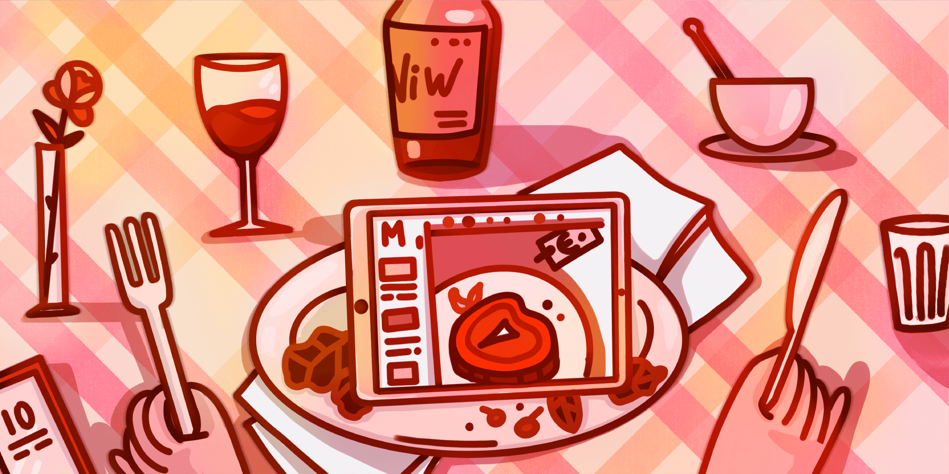
One of the essential components of that bridge is a website. The online presence of your restaurant makes it possible for potential visitors to get acquainted with cuisine and pricing. Do you know that 90% of guests research a restaurant before dining, according to Upserve? So you should have a website and approach this issue responsibly.
Today our goal is to explain to you the reasons for restaurant website availability and its must-have features. Besides, we provide a list of the best restaurant websites and their design tricks. We recommend reading it to the end (you will find a tip how you can save on a website development).
Why Your Restaurant Needs A Website
Even if you are new to the restaurant business, you should understand that your restaurant will not become famous without promotion. The restaurant may offer exquisite cuisine and the staff will include the best chefs, however, it is not enough for promotion if the restaurant lacks a website. Restaurant websites are a good start for promoting your business and attracting new visitors.
So to define the reasons for website development, we will list each of them below. Remember that there is great competition, and each nuance may be important.
Brand awareness. When people are searching for an excellent place to eat in a specific city, they will unlikely choose your restaurant if it lacks a website. Search via Google or any other engine prevails today, so when you have a website, people will see it, learn more about your cuisine, menu, offers, etc. People will remember it, especially if your restaurant web design is eye-catching.
Customers will more likely find out about your restaurant if you have a website rather than you don’t have one. So the number of potential visitors is increased due to the restaurant website and chic website design.
Marketing tool. What characterizes a good restaurant website from a marketing standpoint? Fantastic design and acceptable content. Your website for the restaurant becomes a tool to inform visitors about the menu, pricing, business hours, current vacancies (so potential employees may also come across your website). Thus, your online business presence contributes to your revenue growth.
Brand’s uniqueness. We recommend you to use innovative restaurant website design ideas to make your restaurant recognizable. The logo and website’s typography should be unique so that people won’t confuse it with any other restaurant. If you struggle with ideas on how to stand out, there is always the Cadabra Studio design team for your service. We can help you create original branding and design an outstanding user interface along with user experience.
You need a website because you need a website. Even though it sounds weird, there is an obviousness of the website’s availability. Today people are sure that any business has its website. When they see your website, their trust and loyalty are increasing. You do it for customers first, not for you. Meet their expectations if you want to succeed in this domain.
The world is too competitive. And the last but very motivating reasons — your competitors have a website for restaurants. And they already take advantage of it. If you don’t want to lag behind, your restaurant needs a website. Moreover, it should have specific particularities, as we noted above.
What Makes A Good Restaurant Website
Visual perception of your website for a restaurant is a crucial factor in customer satisfaction. And you need to know the secret of a successful website, how to make it good-looking. There are a few UX design tips you need to follow when building a web design for restaurants. Let’s look them through.
Keep It Simple
Remember the first and the main rule — don’t make people think about how to use your website. Your website should be attractive but not complicated. People don’t want to waste their time figuring out what this button does or how to make an order. It should be clear, as two and two make four.
Then, all essential information like contact details and menu should be kept right at the surface. Also, fonts and colors must be combined adequately, and font mustn’t be too small, high visibility is essential.
Make It Responsive
We bet that a large number of visits to your website will be performed via mobile devices. So your website should be responsive, i.e. mobile-friendly. Make sure that customers won’t have any difficulties with surfing your website on their smartphones or tablets.
Use High-Quality Images
Images of food, as well as photos of the interior, should have a high quality, and make people visit your restaurant. Think about hiring a food image agency who will take crowd-pleasing photos of dishes, so people will want to eat it right now.
Important note! Forget about menus as PDF files. Some restaurants offer visitors to download their menu in PDF, but it is a big mistake. Keep menus available right on website pages, so people don’t need to create additional digital garbage on their devices.
Ensure A Website Speed Optimization
Neil Patel states that 40% of people will abandon a website that takes more than 3 seconds to load. So the performance of your website should be high and uninterrupted. Try to combine the high quality of images on your website and the loading speed of your website. If your website also contains videos, think about compressing it.
And the final tip is to hire a restaurant web design company that will provide you with the required steps on how the best restaurant web design should look. It will help you understand how to create a restaurant website and make it profit-earning.
Top Restaurant Website Designs
How do existing restaurant websites benefit from online presence? We decided to draw up the list of the top restaurant websites and analyze their design particularities. We strongly encourage you not to ignore this section and check out what practices your competitors use to provide a win-win service.
Moxhe
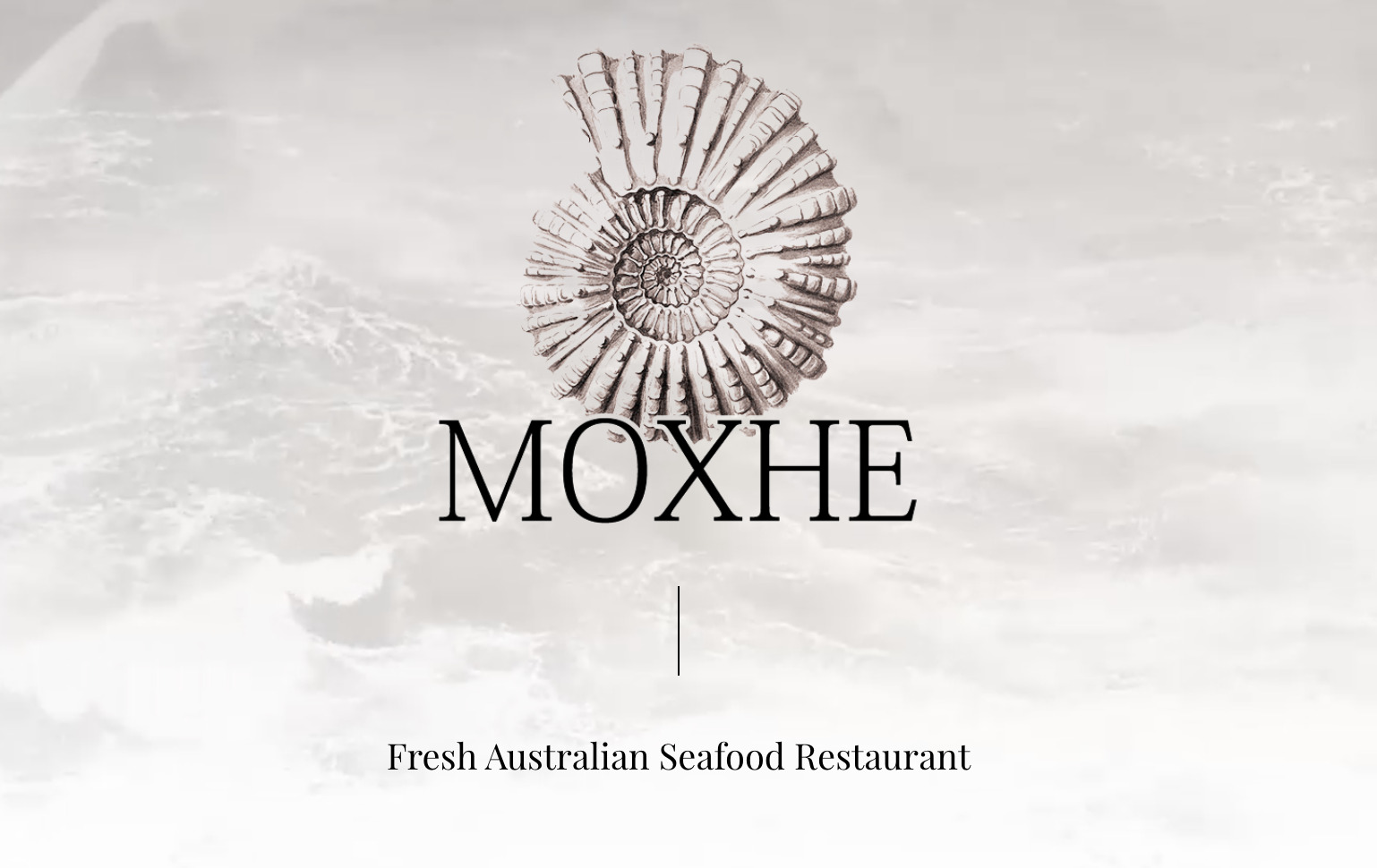
When you enter the Moxhe restaurant website, the first thing you can see is a looped live image of the ocean. Along with the shell on the center of a homepage, our mind creates an association with seafood, right? We think it was the Australian restaurant’s main idea: to make people relax and get up an appetite.
When scrolling down, images are changing smoothly, showing everything Moxhe may offer. The navigation bar is traditionally placed at the top and is dynamic (it moves down with scrolling).
Caravan
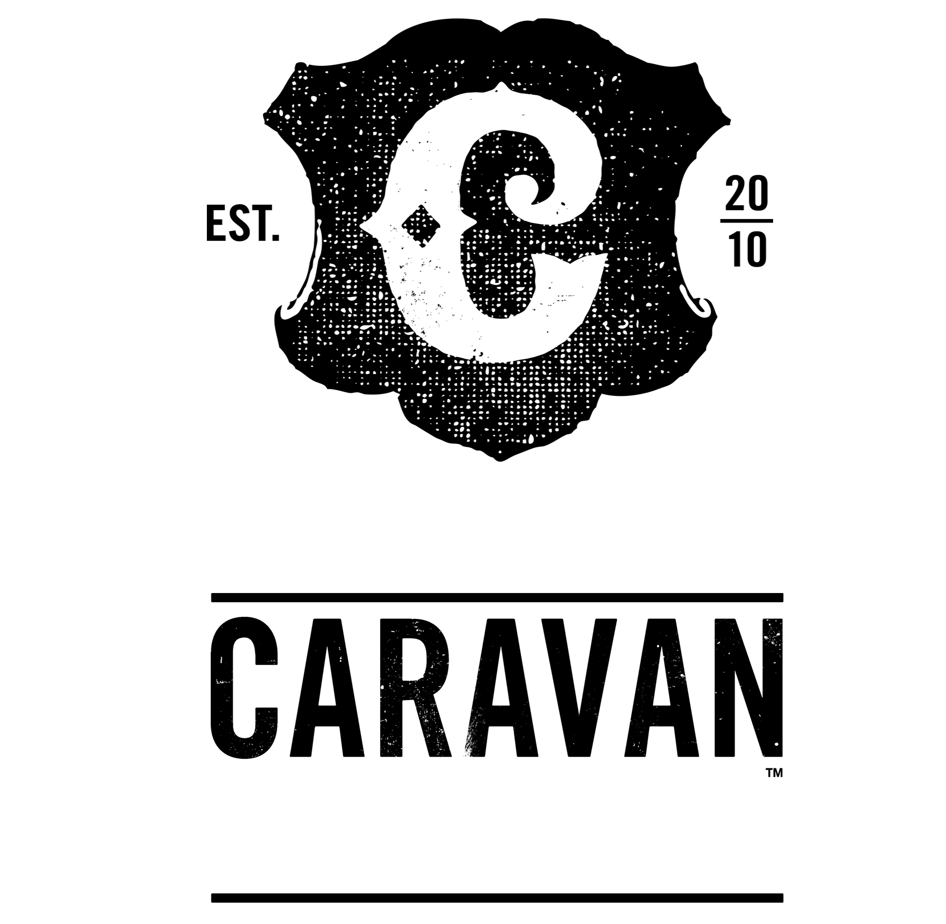
The London-based restaurant shows us how the one-page website may be helpful and informative without the necessity to navigate through the bunches of pages. The website is created in black and white colors. The menu transfers you to PDF files, but you don’t need to download them — everything can be checked in real-time mode. This is a good solution if you still want to save the menu in PDF.
Bresca

The restaurant is located in Washington, USA, and its website has a rather standard but simple design. The homepage contains all the necessary information — contact details, menu, cuisine. The Menu page has a carousel of images and a description of each dish with a price. To reserve a table, you should simply click the Order now button in the top right corner.
Tio Luchin
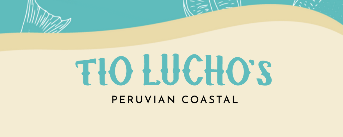
The surprising thing is the restaurant doesn’t need to be created for English-speaking visitors if it has an overwhelming design. The Tio Luchin restaurant is located in Lima, Peru, and its website is available in Spanish only. But the design truly inspires healthy competition and becomes one of the best restaurant websites.
Ingredients and equipment for cooking are flying around when you enter a homepage, and when you scroll down, it seems as if your dish is being cooked right now. A dark background is perfectly combined with videos and images. The Tio Luchin restaurant shows how brand awareness is created.
Protein Bar

The network of Protein Bar restaurants is located around the USA, and its primary cuisine is healthy food for athletes and those who lead a healthy lifestyle. The website is full of various colors, and you can see a carousel of images with a parallax effect. A dynamic navbar helps visitors make quick online ordering and choose the location for delivery.
Maaemo
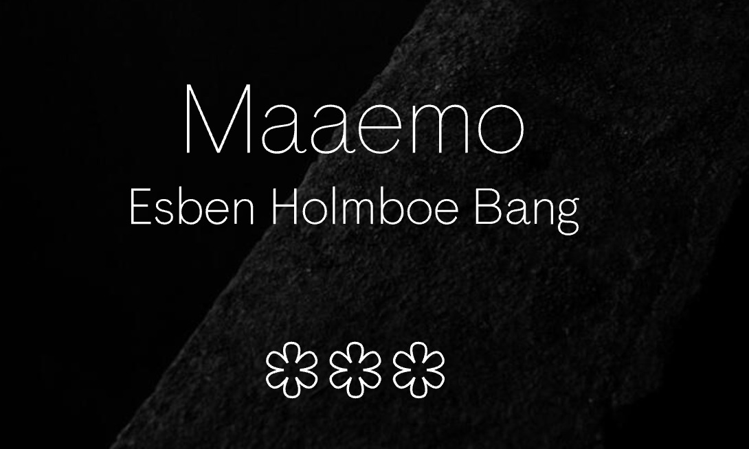
The Oslo-based restaurant has an extremely minimalistic design, but it was awarded three stars in the Michelin Guide. The website has one page where you can buy gift cards, make a reservation, and contact a restaurant. What’s interesting about it — you can’t even find a menu on the website. But the restaurant’s awards speak for themselves, so we think it was their design trick to make a website as less informative as possible.
Quay
The Quay restaurant is located in Sydney, Australia, and its primary cuisine is seafood. Its website design has something similar to Forbes or Entrepreneur websites, so its background is more strict. The website perfectly fits mobile devices, it is mobile-friendly. The restaurant has pages dedicated to its chef and team, and it demonstrates the real value of the restaurant.
Pastaria
Pastaria restaurant is located in two US cities — St.Louis and Nashville. The design of a website is very convenient, and you can easily select between two cities to order a delivery.
According to its name, the restaurant cooks pasta-based dishes and pizza. The website has an unusual sticky menu that moves along with scrolling, and this menu makes Pastaria site one of the best restaurant website designs.
This article may be interesting for you: Pharmacy Website Design
Meson
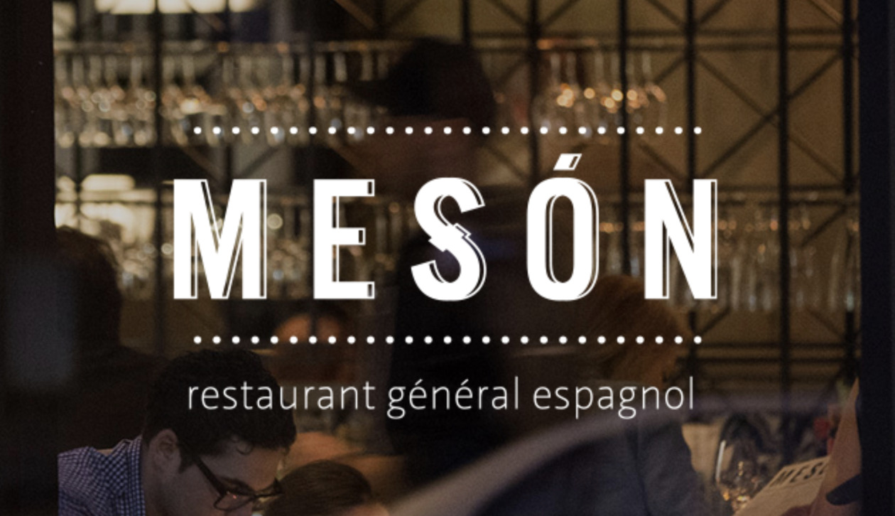
There is also one restaurant from North America that we cannot ignore. Meson is located in Quebec, Canada, and the website’s homepage allows us to find and reserve a table for the specific date. Also, the Meson website has dynamic navbar, high-quality photos with parallax effect, and easy-to-use interface.
The Meson website is also one-page so that you can find any information with simple scrolling. It has similar values with Quay restaurant since the website contains information about each team member and their photos.
4 Rivers Smokehouse
The restaurant that cooks barbecue dishes is located in Orlando, Florida. Its website is split into different sections where each one contains a call-to-action. 4 Rivers Smokehouse website contains the interactive menu with allergen information for the most demanding visitors. Dark colors prevail on a website, but it doesn’t affect the first impression.
Features Websites For Restaurants Must Contain
Having analyzed well-designed restaurant websites, it is impossible to ignore their features that each website has by default. This information will be more than helpful for you if you want to know how to make a restaurant website.
Menu. That is what any restaurant is associated with. Your website should have a detailed menu that is separated into categories — drinks, main dishes, breakfast, salads, etc. Users will appreciate it.
Images. There is no need to create a page for each dish, but the restaurant website without images looks weird. As mentioned above, hire a specialist who will be able to make perfect photos of food that will attract customers.
About page. Let people know more about your restaurant, your values, and your story. It will increase their trust, get them acquainted with the restaurant better.
Contact information. This info should include phone numbers, email addresses, physical addresses, as well as business hours. So users will know precisely when your restaurant is open.
Online reservation. Reserving a table is a good option, especially when your restaurant becomes a favorite place, and customers need to find a vacant table. It is more convenient to reserve a table online rather than calling and waiting for a response.
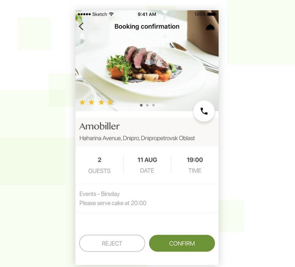
Restaurant App Concept Design by Cadabra
Online ordering. It would be a beneficial option for you since many people like to order food online and get it delivered. So think about delivery services if you want to get more loyal customers.
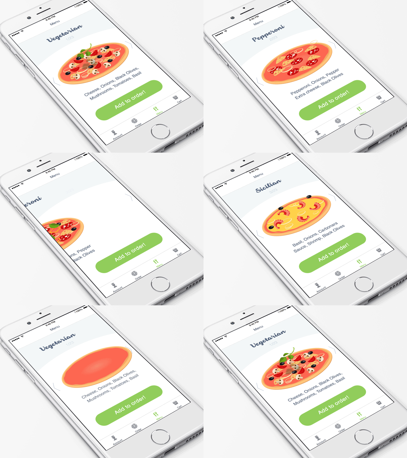
Restaurant App Concept Design by Cadabra
Social media integration. If your restaurant has profiles in various social media, it will increase the chances for customer base growth. Online presence in a large number of social networks will help you improve your business processes.
Careers. Your restaurant will likely need a staff, and offering vacancies via the website is the right option. So you can hire a team for your restaurant using the website as well, in addition to job sites.
This article may be interesting for you: How We Made Arabic Website Design
Bottom Line
When you are already convinced that your restaurant has no future without a website, it is time to find a software development team that will build a website from scratch, including UI/UX design. Probably, there are many companies in your country, but if you outsource the development process to another region, it will be a cost-efficient option. You save money but get a high-quality app!
Eventually, you will be able to save your budget substantially and get a first-rate result. Don’t forget to check out above our design tips on how to build a restaurant website, and it will become outstanding and competitive. Cadabra Studio is always ready for new projects and challenges.
Get in touch with our business development team if you need troubleshooting methods for your business.

