The website design process seems usual and routine for an experienced designer. However, when the software is created for users from Arabic-speaking regions, it requires a designer to adapt to new changes and do their best.
The Arabic language represents ligature that is entirely different from any Western language. And all particularities of this language must be considered during mobile or web app design. According to Internet World Stats, the Arabic language is the world’s 4th common language.
The Arabic website design process includes a range of crucial details designers cannot ignore. But less talking, more moving — we had an experience of the website design for Arabic users. And we will clear it up how the design process was implemented and what challenges we faced.
Difference In Interaction And Cultural Models
Before we proceed to the design peculiarities of the Arabic website, we would like to pay attention to the difference between design for Western and Arabic-speaking users. It is a crucial moment since cultural differences are to be taken into account.
There are cultural and mental models of users from different world regions. The mental model means the behavior of specific users, how they are used to perceiving one or the other thing. It concerns software as well as websites, in particular. That is, if we speak about Arabic users when they start using a new website, it should contain the same mental model as they used to deal with.
UI/UX Design Particularities Of Arabic Website Localization On The Example Of Tarjama Project
To design a website that contains the Arabic language, it is always necessary to keep up with mandatory particularities to avoid mistakes and misunderstandings. That is what we did with Tarjama website.
Tarjama Project Overview
The team of Tarjama got in touch with us and described the idea of their project. Tarjama is a company that is engaged both in translation, proofreading, content writing services, and in AI services like chatbot training data, data typing, data evaluation, etc. The company has offices in 8 different countries and more than 300 specialists. We have successfully managed the meetings in spite of the remoteness of teams.
The company wanted us to create an Arabic UI design of Tarjama website along with the English version. They provided us with the documentation that included a description of a website in English. And our task was to build UI/UX design in the English version first and then use it for creating the Arabic text. Thus, if you want to see Arabic websites examples, check out the Tarjama site.
So, the team of Cadabra Studio consisted of a UI/UX designer, illustrator, motion designer, and project manager. We have cooperated closely with the development team that was engaged in front-end and back-end building. We have prepared all the mockups for them, provided them with tips on proper layouts, etc. Besides, some parts of mockups were handed over upon sprint completion, and it allowed a customer team to launch their website faster.
And the design process was initiated.
UI Mirroring
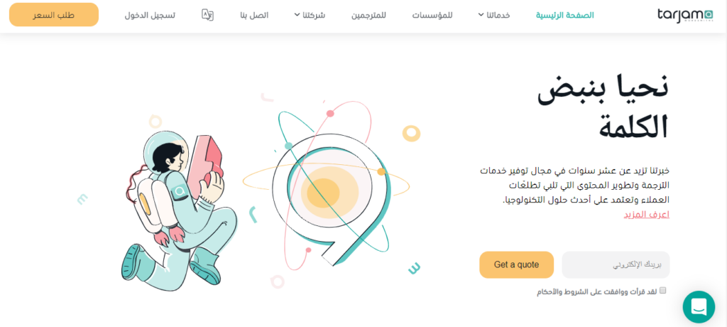
When it comes to software design for Arabic users, mirroring is one of the most vital principles designers should mind. The main peculiarity of the Arabic language is its right-to-left (RTL) design. What is the RTL design? Everything is simple — RTL design is a mirror of left-to-right design that is constant for Arabic users.
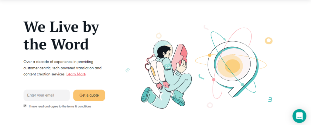
Look at these pages below to see the difference:
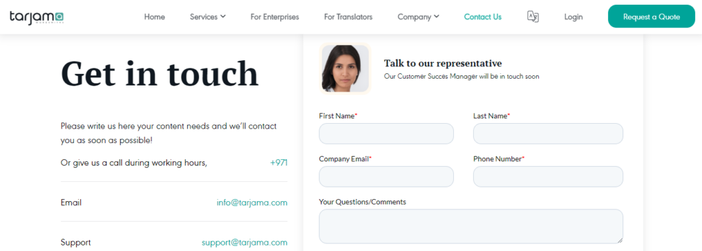
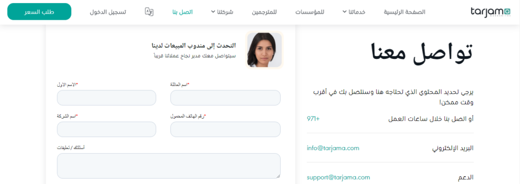
So, in these two pictures, you see the same information but in a different layout. However, Arabic design patterns don’t mean that all symbols and logos should be changed. That is what our next section is about.
- Digits. It is essential to remember that all the digits are still read from left to right in the Arabic design. When working with the Arabic user interface and user experience, designers should consider the length of digits and make sure that it doesn’t damage the Arabic design layout.
How we did it at Cadabra Studio: Our UI/UX designer worked on the adaption of the Arabic text, and he needed to put digits into text keeping the balance. Besides, he had to remember that right-to-left design implied the layout of figures not in the same place as it was in LTR design. In the images below, you will see how he achieved the required result.


- Translation. A clear and easy-to-read text plays an essential role in the interaction between a website and a user. The Arabic language uses more words than the English language, so the sentence in Arabic may be somewhat longer. Besides, font size should be bigger than a font used for English usually.
How we did it at Cadabra Studio: The font type and size of both the Arabic and English letters were stipulated by Tarjama team beforehand. As for translation, we understood that direct translation may not always be applicable.
Therefore, our UI/UX designers translated English words into the Arabic language, and then specialists from Tarjama proofread it and revised it if something was wrong. Once the text was ready, a designer adapted it during the creation of user experience in the Arabic version to make it compact and eye-capturing.
- Icons. Mirroring design also plays an important role when icons, images, and logos are created. They are all aligned to the right, but all symbols on them remained unchanged. It mainly concerns logos that are registered as a trademark.
How we did it at Cadabra Studio: When Cadabra team started working on iconography, we knew only what color palette should be used, but there were no characters you can see now on the Tarjama website. Our illustrator has built a few sketches of different characters, and one of them (astronauts) got a Like from them.
When a character was approved, the illustrator created various astronauts that were used on different pages to reflect actions or features displayed on that or the other page. Then, all astronauts were animated by a motion designer. And each animation with an astronaut was aligned following the English or Arabic version.
However, as you can see in the examples below, the astronaut itself wasn’t mirrored.
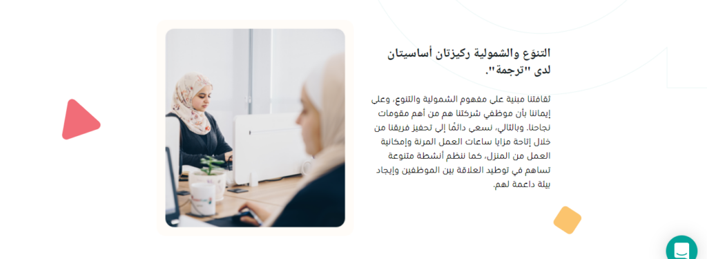
At the same time, some photos were changed for the English and Arabic versions. It was connected with more thematic photos for Western and Arabic-speaking countries.

Challenges And How We Overcame Them
As for the challenges we faced, the translation of the Arabic language was one of them as well as the adaption of the text. Design in the Arabic version is quite different from the English one, so the UI/UX designer did his best to build a proper RTL design process. And the assistance of Tarjama specialists with text translation was significant.
Also, the design team had a task to create a promo video for Facebook that contained the services and capabilities of the Tarjama company. We agreed on the 5-day deadline and started working. But the situation has changed, and due to force majeure circumstances, the deadline was reduced to 2 days. The Cadabra Studio team did the best to finish the promo video within negotiated time, and our customers were delighted with it.
Besides, the screenplay for a promo video was written entirely by Cadabra Studio, and we appreciate that Tarjama entrusted us to come up with the idea.
Finishing Touches
What else we did — a motion designer has animated a home page where you can get a quote after the illustrator has drawn the illustration itself. Besides, since the Tarjama team was completely satisfied with the images we’ve done, they ordered the creation of additional characters that are to be used in advertising.
It was necessary to create the characters of various professions who hold gadgets in their hands (laptops, smartphones). We have built about 30 characters, and they were animated as well. And Tarjama uses them for their purposes.
Finally, we made a website mobile-friendly because many users prefer surfing the web with their mobile devices.
What Is The Success Secret Of Our Design Process?
The matter is that high-class specialists were involved in the design process. And it is one of these cases when you pay more, and you get more. As it is mentioned in our tips concerning the launch of your digital business, you pay for the quality, and junior designers won’t be able to provide you with an excellent product.
A designer has built a well-thought-out UX, impressive UI, so we almost didn’t have any revision requests from the customer team. However, the Tarjama team has also contributed to the successful design of their project — we had continuous conference calls, online meetings, and it allowed us always to be tuned. And we were very thankful for that since it had a tremendous positive impact on the quality of the project.
For the Tarjama website design, we used InVision, Sketch, Illustrator. The process was implemented according to the Scrum methodology, and all sprints were closed on time. Of course, mutual support between the team members of Cadabra Studio and the Tarjama team was really invaluable. The Tarjama website design process took six months.
Ok, let’s sum up. The experience of the Arabic website design became another step forward. We were glad that the customer entrusted us to deal with this complicated task, and we didn’t let them down. In case you also think that Cadabra Studio has the chance to assist you in the creation of something awesome — our mission is to solve your problem. Contact us at any time!

