People insure their property, health, life. It helps them have certain guarantees in case something bad happens to them or their property. That is why an insurance agency is the business idea you may take into account. But mind, all reliable agencies have insurance websites, so you cannot ignore this fact.
We want to share practical tips concerning insurance website development and what insurance website design should include. Also, you will find top inspiring websites that will motivate you to create tremendous software. We believe that this article will be helpful to you.
Reasons To Build An Insurance Website
The availability of a website is not the only reason why your insurance agency needs it. Digital transformation of many processes we tend to use leads to a large number of benefits. We will highlight the major ones.
Cost-efficiency. First, as a rule, customers deal directly with the insurer via the website, and it means that they don’t need to pay the distributor’s commission. Besides, everything can be done in the virtual world, customers don’t need to visit offices; automation of processes leads to the acceleration of employees’ work and simplification of paperwork.
Informed choice. Potential customers don’t want to waste their time. And websites help them do everything faster. They can visit an insurance website and explore prices, types of policies, and choose the best plan they need. Moreover, users can read the feedback and reviews of other customers. It increases users’ trust, customers become more loyal, your website gets more conversions, and you gain more profit as a result.
Customer attraction. You may be surprised, but senior citizens are the ones who can be your new target audience. According to the Pew Research statistics 2019, the number of seniors who use the Internet reached 87% in the USA (age 50-64). These users prefer dealing with websites, even when they use smartphones and tablets. So you need to bridge the gap between new users and your agency.
Mobile apps are also necessary for a successful business. And it is recommended to order both website and mobile apps from the same development company to ensure proper functionality. Contact Cadabra Studio to build your software!
Increased credibility and loyalty. Your insurance agency will be more credible when it is presented online. People have certain doubts concerning companies that have no websites or mobile apps. Thus, you get more loyal customers who know more about you and your services. You appear more professional and credible for users.
Read more: about how technologies are changing the Insurance industry and what InsurTech is.
Must-Have Elements To Include
First of all, you should remember that your insurance website may contain dozens of pages; everything depends on the website’s stylistics. But some pages must be available by default. Homepage, Quote page, Contact us, About us, and Services pages are the ones you should add in the first turn.
Moreover, the website should have Blog and Testimonials pages. Users want to know more about the insurance particularities and read reviews of your previous customers.
If your website lacks these pages, the number of conversions will be zero. There must be features people are accustomed to, and they want to see them intuitively.
Top Ten Insurance Website Designs To Use As An Example
When you are planning to create an insurance website, we recommend exploring the best insurance agency website design examples. You don’t need to copy them; otherwise, your website will be a clone of other popular ones. Let’s take a look at some of the top websites.
Stone Insurance Agency
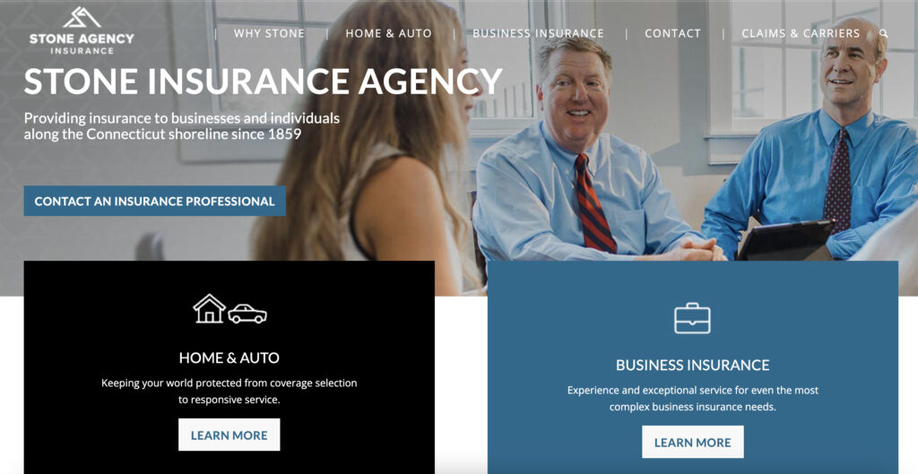
This is the US-based insurance agency that provides home, auto, and business insurance. The website greets users with warm and pleasant colors and a large image representing a meeting. A navigation bar is located at the top, and the contact information is the first that captures an eye. Thus, Stone agency motivates users to contact them quickly.
Easy navigation and a straightforward menu allow new visitors to become loyal users.
Oscar
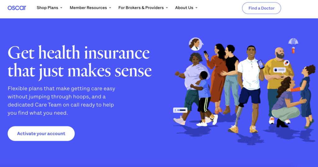
The following website on our list is the Oscar agency. This is one of the best health insurance website designs. As we told above — your website should be unique. That is what the Oscar agency website does. It includes custom illustrations that demonstrate the types of services. A navigation bar contains dropdown menus, so users can find everything they need simply.
The primary principle of Oscar is to let users navigate through the website. The website also offers an easy login feature individually for brokers, members, providers, or businesses.
Erie Insurance
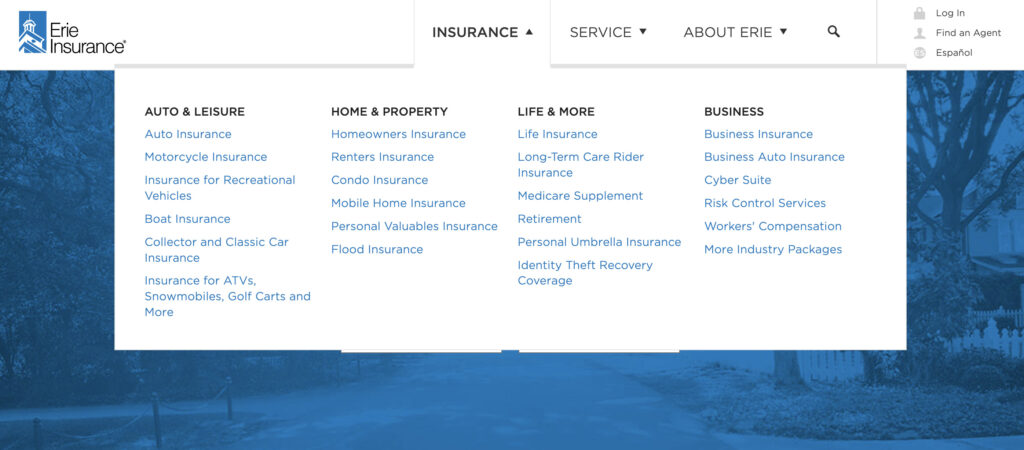
The Erie Insurance agency website offers a wide range of insurance types, including home, auto, life, business, property, etc. It may seem something trivial when you enter it first. However, the website shows a navigation bar at the top, and if you click on one of the provided services — you will see a dropdown menu that will stick to your mouse arrow when you scroll down.
Thus, users can check the website below the fold while the list of their services remains visible. The website is created in blue and white colors that don’t irritate the eye.
Prosper Insurance
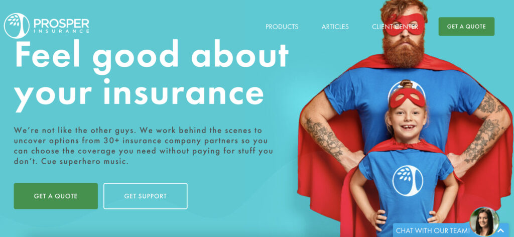
The Prosper Insurance agency is specialized in home, auto, flood insurance. Its website adheres to a consistent color theme on the entire website, and it looks like a landing page divided into sections; each section has a detailed description and a large CTA button. In fact, the website has no unnecessary details. So we can consider this design as one of the best insurance websites design.
Jetty
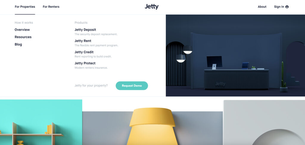
When you need an insurance website design inspiration, you have to visit the Jetty agency website. The agency provides insurance for renters and properties. It has a vivid teal color that prevails on a website. Its color cohesion makes each section on a website work as a coherent whole. And if you want to contact insurance agents as quickly as possible, the Get In Touch button is placed above the fold.
Are you not an insurance agency owner, but you also need a website? Cadabra Studio deals with all types of software. Hurry up to contact us!
Medicare
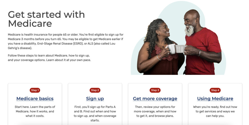
Medicare is the government insurance agency in the US, but we cannot pass by its website. As it is clear of its name, it provides health-related insurance. Its website is quite simple but also straightforward and intuitive. Users can compare pricing plans and choose the appropriate one. The website has a feature to choose larger fonts, and a large number of images allows older people to proceed to the next action in the right way.
Coverage Direct
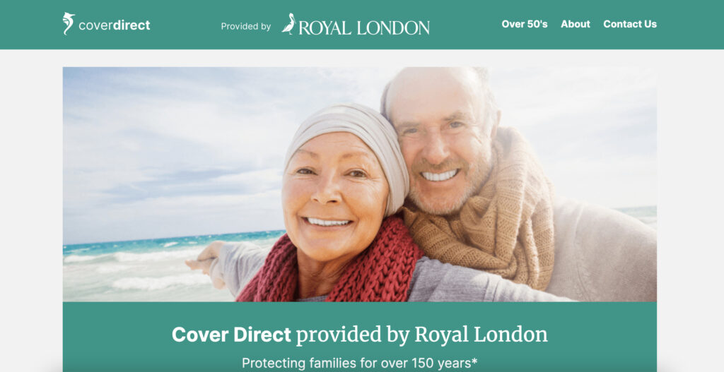
The Coverage Direct website allows new visitors to choose the insurance type they want — life, auto, home, business, renters. All these insurance types have relevant icons. Besides, a homepage doesn’t let users ignore CTA buttons to call agents or start online communication. Overall, the website has a rather minimalistic design, but it doesn’t impact its functionality and purpose.
AXA
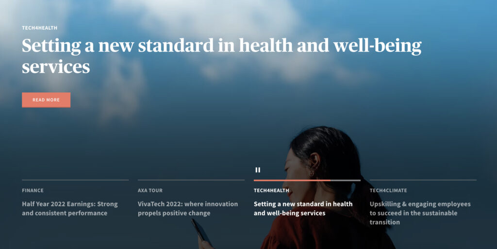
We didn’t forget about European-based insurance agencies, because they also have something to boast about. The headquarter of AXA agency is located in the UK. Car, home, travel, business insurance is their field of activity. The homepage provides a CTA to get an instant quote on different types of services. A navigation bar is located above the fold, as usually, and its dropdown menu opens a wide range of services to choose from.
Brown & Brown Insurance

Another best insurance website design is on the Brown & Brown Insurance website. Its scope of activity includes car, home, flood, life, and other types of insurance. It has a red, navy blue and white color scheme. All CTAs are created in red colors to catch the attention and motivate users to move further. An uncomplicated design doesn’t make users poke around for the right service or function.
The Insurance Experiments
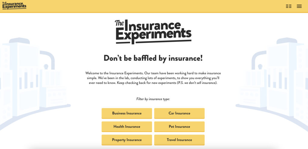
Our list has the last player in the insurance arena that is definitely worth your attention. The Insurance Experiments website makes it possible for users to choose business, car, pet, travel, property, or health insurance. But what’s most notable — this website is full of cartoons and animated graphics, so the name of the agency justifies itself.
The goal of the agency is to make the onboarding process easy and entertaining. Thus, agents can build more trustful relationships with customers due to cartoon graphics and a fresh approach to the customer service sector.
Design Practices Your Best Insurance Website Should Follow
We have provided a compilation of appealing and high-grade insurance website designs. But what secrets do they know to build a perfect design? We hasten to reveal these secrets: they followed conventional design practices and analyzed their target audience. That’s all. And we will be glad to share these practices with you.
Mobile-friendly interface. If you want to increase the number of leads, you need to think about a responsive insurance website design that perfectly matches mobile screens. Thus, users will be able to browse your insurance website via different types of devices, and their customer experience will remain high.
Place enough CTAs. The insurance website should include enough calls-to-action, but they must be placed wisely, in the right spot. The chaotic abundance of CTAs may damage the website. So remind your users to proceed to the next action, but do it sensibly.
Make navigation simple. Have you noticed that all websites in our list above have intuitive and straightforward navigation? That is what your website must have, as well. Place the most crucial information above the fold, add a search bar, dropdown menus, and keep up with the navigation model users are accustomed to.
Besides, we kindly insist on reading the guide containing helpful ways to attract users to your website or mobile app. We bet these tips will lead your software to success.
How To Create A Successful Insurance Website
Design creation is a crucial step. However, we don’t want to take it out of context. And we will cover the entire development process, including essential steps to take if you want to know how to create an insurance website that sells itself.
Elaborate On Your Brand
When users recognize your brand and create relevant associations in their minds, it is half the battle. That is why you should create your own logo and/or some visual elements that make your site more catchy. And don’t forget about the consistency of the color theme. Each color should be justified.
Are you puzzled by the scope of tasks that must be solved? Let professionals do them for you. Get in touch with the Cadabra Studio team to create design and software for your business.
Choose The Insurance Focus Of Your Website
We mean that your insurance website should focus on solutions to specific problems. The insurance website cannot be just about insurance — it should provide specific services. Choose the type of insurance you plan to deliver, elaborate your future website’s particularities, and how it can stand out.
Add High-Resolution Photos
The website won’t be able to draw the attention of users without high-quality photos. Hire professional photographers to take images of your team, office, add some stock photos with landscapes, etc. Experiment with photos, try to astonish your new users.
Moreover, custom illustrations will enrich a website and make the customer experience more exciting. You can see how Cadabra Studio created the RVOS insurance website and applied custom illustrations. (Here is a link for detailed case study)
Pick The Necessary Features
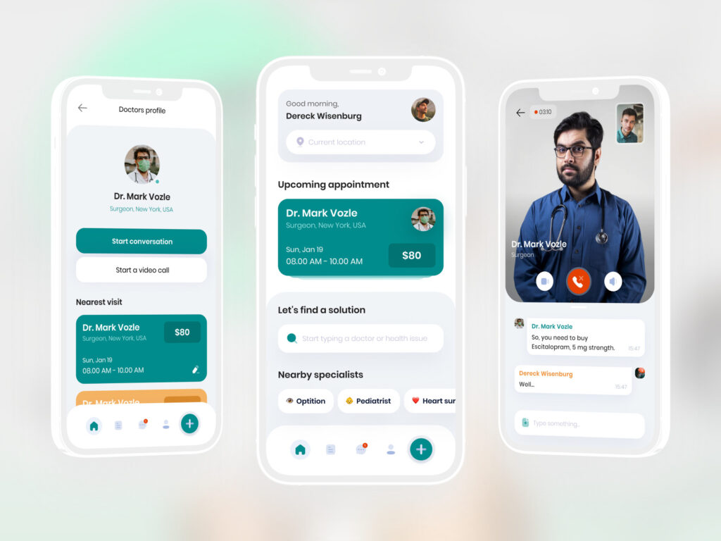
Remember that the website must have a range of MVP features — these features your insurance website cannot function without. We have listed them above — pages like Contact us, Quote form, Blog, About us, Our services must be available. But you can also add some additional features like Payment, Social Networking, Privacy Policy, Image uploading, etc.
And never forget about the importance of MVP. Moreover, read our guide, where you will find reasons to start with an MVP.
Create An Original Content
The Blog page should contain original content that will include helpful guides for customers, and it will make your website ranks higher in the Google search. Well, you can avoid this step since an insurance website may exist without a Blog page, but it will help you draw more interested visitors and turn them into customers.
You can find freelance copywriters and SEO specialists who will build original content using best-fitting keywords. And update your blog from time to time — it will also contribute to the success and customer loyalty growth.
Hire Design & Development Team
Of course, all the mentioned above cannot exist if the website won’t be created. As you already know, everything starts with UI/UX design. You need to hire designers first. If you have a question like “why?”, this guide about the importance of the UI/UX designer role in the software development process will answer all your questions.
In short, designers collect information about the project, design a specific scenario, create instructions for fonts, colors, build wireframes and prototypes, and other vital tasks.
Once the scope of the designers’ task is completed, a development team is involved. You need a skilled insurance website development company that will build your website from scratch, including frontend and backend parts.
Made By Cadabra Studio: RVOS Project
As Cadabra Studio knows firsthand how to create insurance websites, we would like to show you one of our projects related to the insurance sector. RVOS is a Texas-based insurance company, and it is specialized in insuring people’s property from natural disasters. You can learn more about the product in our case study.
We got a task to create a web portal for RVOS clients where they can make payments, manage insurance policies, etc. It was a challenging but engaging project our designers and developers created with inspiration.
Here is one of the shots of our work:
Cadabra Studio is the right troubleshooting company you can cooperate with. We can build an insurance website or any other type of software (e.g., mobile apps) within an exact time frame, keeping up with the highest quality standards.
On that note, we want to leave the last piece of advice. Contact our specialists — they will help you clarify all project requirements and provide a detailed estimate. The Cadabra Studio team are not magicians, but we create fantastic things.


