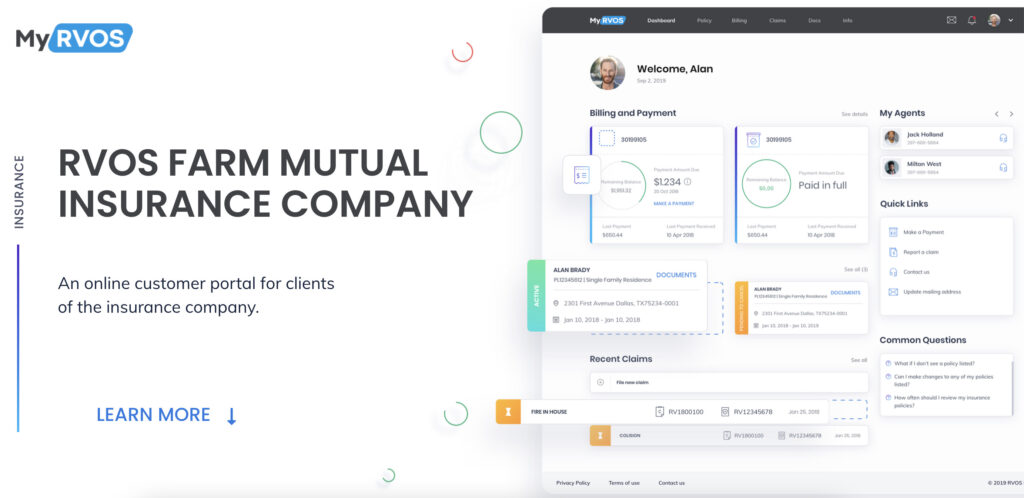
RVOS Farm Mutual Insurance Company is responsible for providing protection to various clients from homeowners to farmers. The company has been already on the American market for 119 years. It started when a group of Texans set up a basic fire insurance protection program. Since then, hundreds of Texans relied on RVOS.
RVOS has never strayed from their vision — “Neighbors helping neighbors”. To blur the boundaries between the company and clients, the customer portal was created. And this is the main object of our Case Study.
RVOS Project Overview
RVOS had an idea of the customer web portal to manage the insurance policies, make payments and control claims. Our task was to provide RVOS customers with an advanced client service that keeps the spirit of security and peace the company has.
Existing problems
Insurance is a very stable business area, so such a client system is quite innovative and it is not easy to make such design from scratch. The task was to make the portal that looks simple, fresh and modern. However, due to the solid history of the company and its reputation, the style of the portal should be moderate. The policyholders got used to customer service at an exceptional level, so the portal should fully meet their expectations.
On the other hand, there were 2 more tasks our team faced with:
To adapt the RVOS platform for people with bad eyesight.
Create a multifunctional portal that is supported by all Internet browsers (including Internet Explorer), because many RVOS clients have been using their gadgets for more than 10 years.
As a result, the developers successfully coped with the tasks, taking into account all the edits and wishes of the client.
Audience Definition
Before starting a design process, we did UX research, including User Personas, User Journey, Mind Map. As a result, we figured out that a large part of RVOS clients is people of middle age.
Let’s introduce typical RVOS clients:
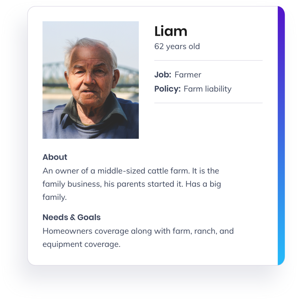
Liam, 62 y.o.
Job: Farmer
Policy: Farm liability.
About: Owner of a middle-sized cattle farm. It is the family business, his parents started it. He has a big family.
Needs & Goals: Homeowners coverage along with the farm, ranch, and equipment coverage.
Grace, 33 y.o.
Job: IT area
Policy: Homeowners liability
About: Lives in the suburb, Dallas city, TX. She has a stable income, pays the mortgage. Divorced, has a son, 12 y.o.
Needs & Goals: Protection for her and family when calamities like fire, burglary, and vandalism happen.
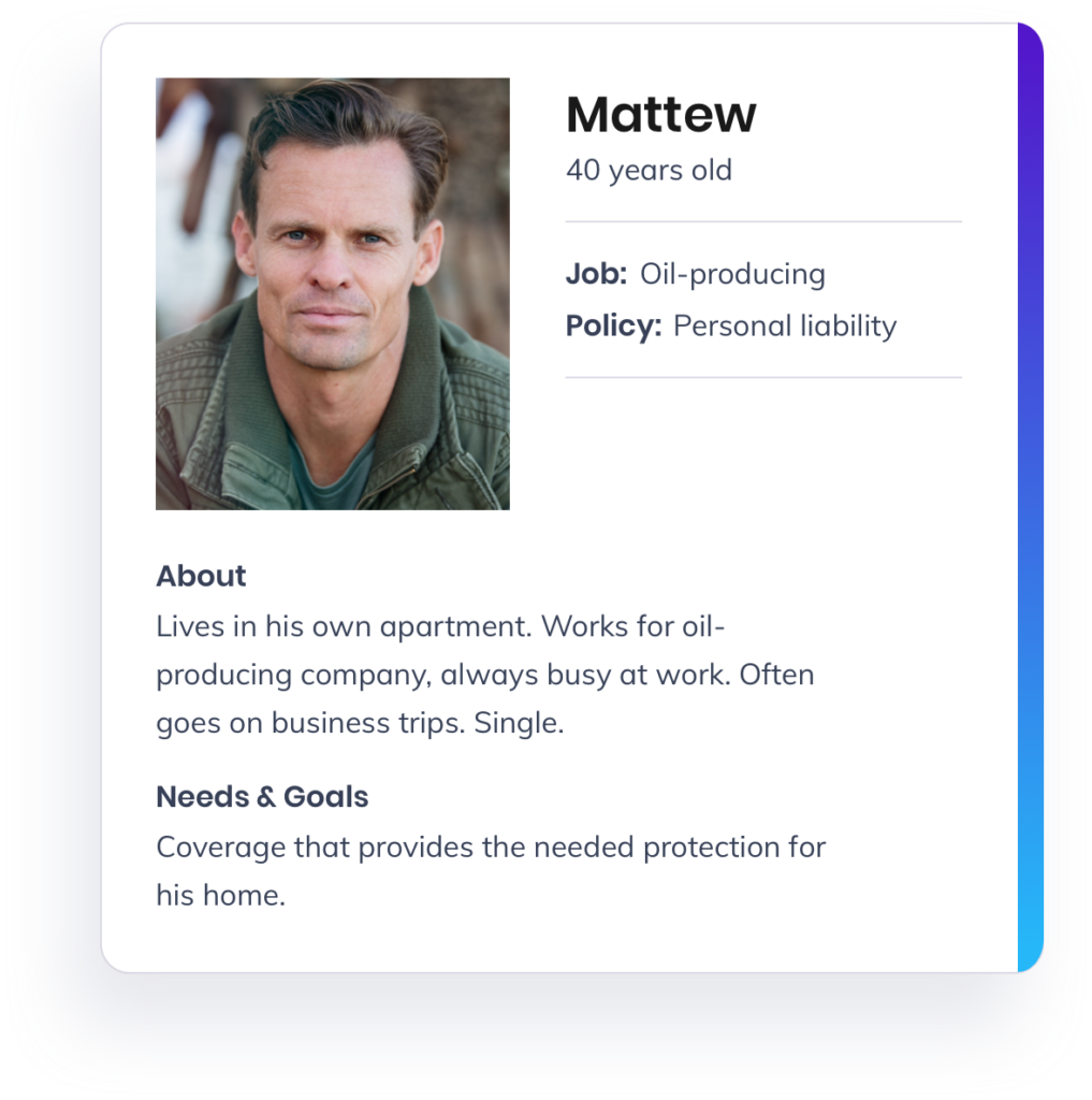
Mattew, 40 y.o.
Job: Oil producing
Policy: Personal liability
About: Lives in his own apartment. Works for oil-producing company, always busy at work. Often goes on business trips. Single.
Needs & Goals: Coverage that provides the needed protection for his home.
Role and Scope
During the project development process, the workflow was changed several times. The reason is simple — both the designers in Cadabra Studio and our client were interested in developing a high-quality product. That’s why many changes were made at the primary stages. To make a quick response to the changes in the project, we consider the Kanban system to be the most appropriate. When the client made a final approval, we switched to the Scrum system.
The rationality of approaches was a key factor to consider. Using both methodologies at different stages of the project development process, we were able to achieve maximum efficiency.
The team consisted of 2 developers (front-end and back-end), 2 back-end developers from the client’s side, manual QA engineer and automation QA engineer, DevOps. The entire process of development lasted for 1.5 years.
During this time, we were developing the project step-by-step, taking into account the smallest details.
Design Process
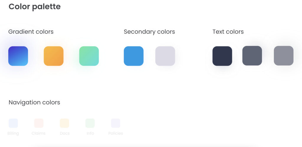
The main task for the design team was to create a bright and clean dashboard for the customer web portal. Users should be able to see their payments, insurance policies as well as overall statistics. Our managers agreed with the client about the style of the dashboards in advance. Light colors and shadows along with appropriate typography were aimed to create the perfect digital product. Just have a look at the primary version of the dashboard.
We suggested the sidebar menu be on the left side. However, soon the location would change. Also, there wasn’t enough information about the payments. By the way, the categorization of the components was different.
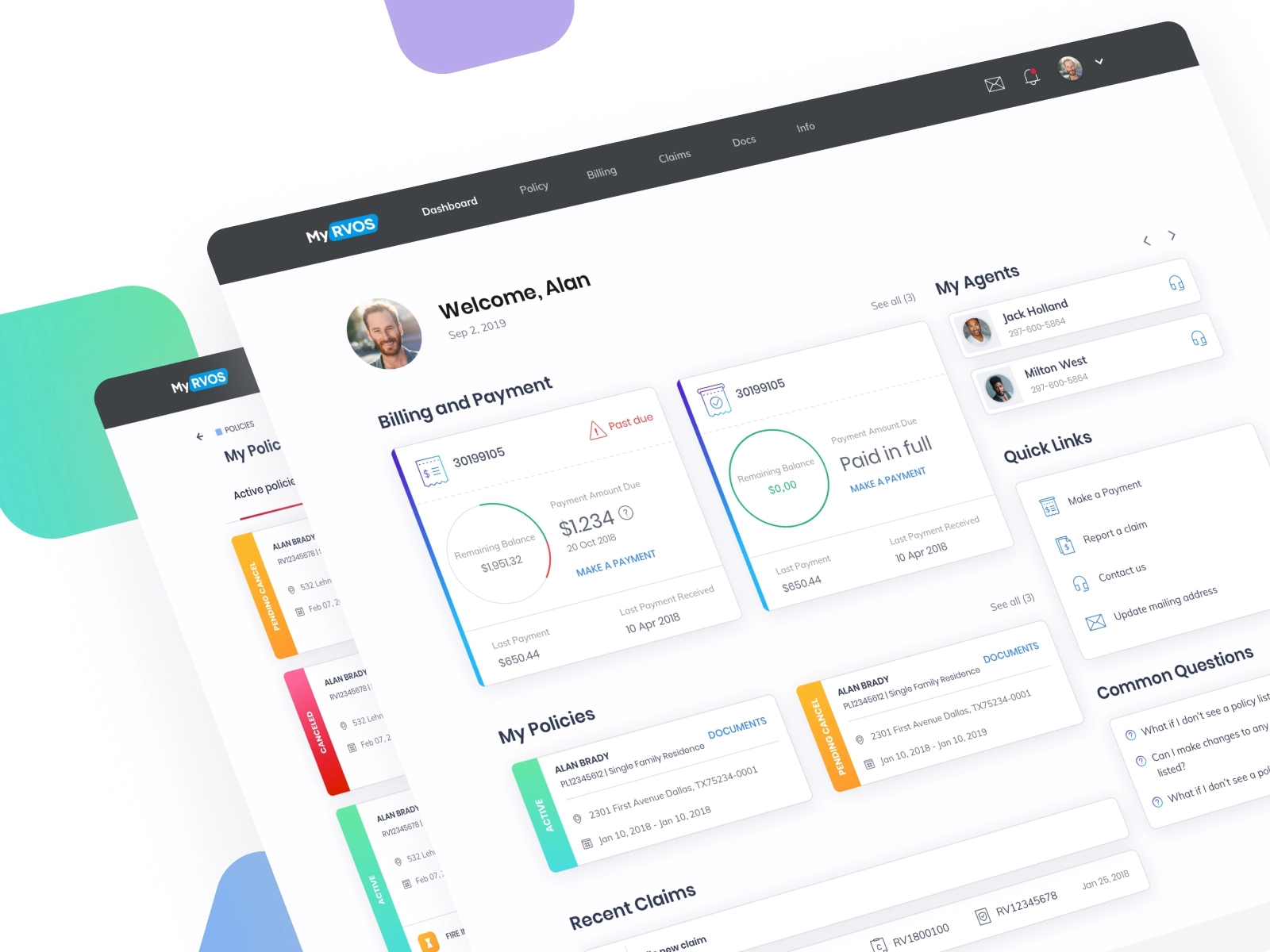
As you can see in the picture above, we made some changes to the menu, added more information about payments. Besides, designers created an agent account on the main menu, added the function “File new claim to each specific policy”. Moreover, the information about claim number and policy number to certain claim was added too.
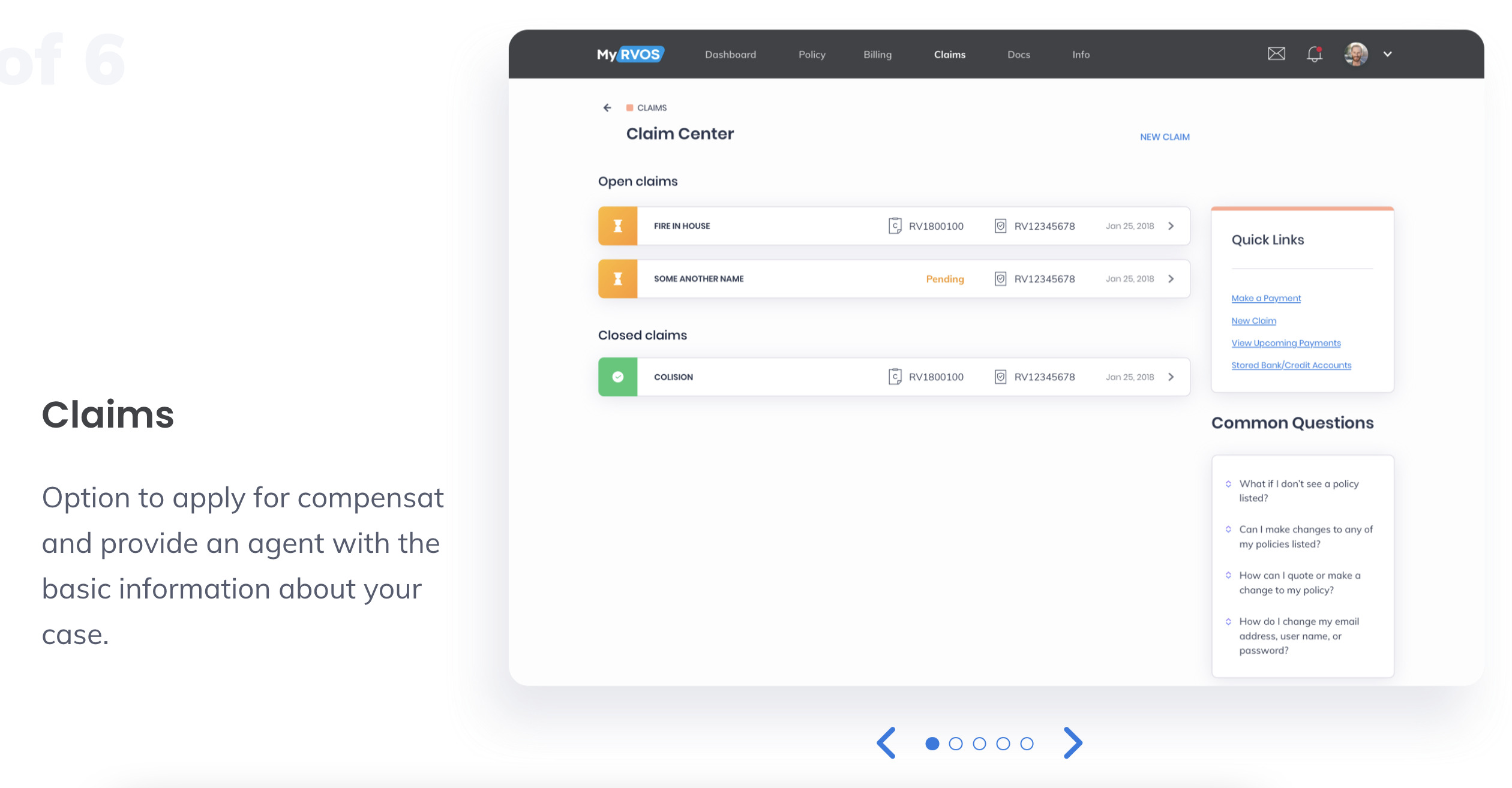
The third screenshot depicts the changes in statistics as well as in buttons “Claims”. We also added more information about billing and payments.
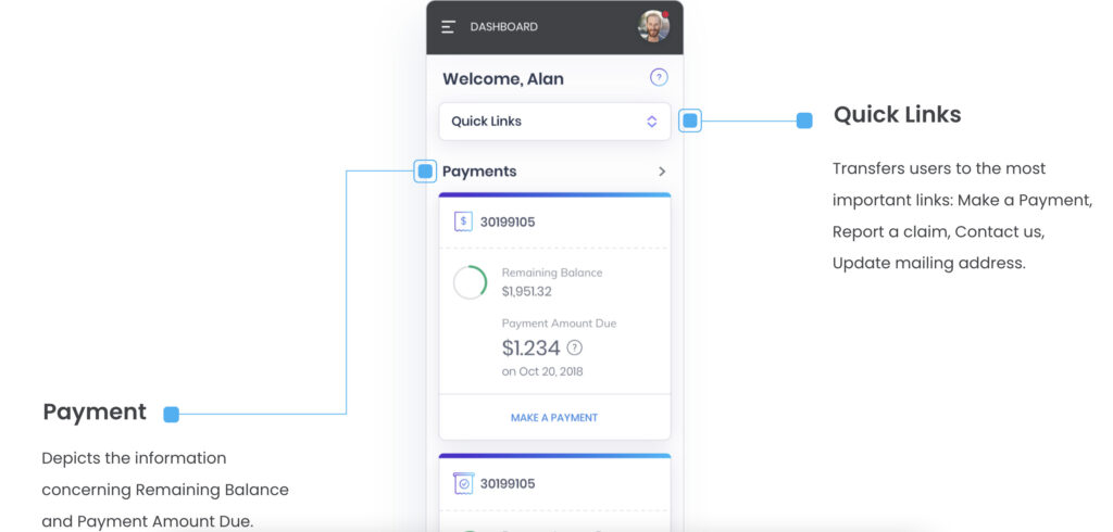
And that’s how the final version of the dashboard looked like. The vertical menu was transformed into a horizontal menu without icons. The menu is good for responsive web design. We also added the pie chart of the Remaining Balance in the Billing and Payment category.
Branding
The customer web portal is a new stage for RVOS. So, we suggested our clients make a trendy style of their brand. Let’s speak about it in detail.
The RVOS brand is a combination of stylish conservatism and modern design. The company adores the brand because it is a reflection of solid history. Therefore, the process of rebranding had to be well-planned. The main goal was to attract a younger target audience to an existing product.
The logo was made in a simple style, to keep the company’s spirit. The blue-colored bar was chosen for the logo as a style-forming feature for marketing campaigns. The shape perfectly matched the content, making the RVOS brand more recognizable.
For Instagram promotion, we chose trendy and relevant typographic, that would stand out from the endless content. For promotion on Facebook, we decided to use contrasting photos with bright colors.

Results and Data
RVOS company moves with the times. The customer portal is dedicated to freshening up a solid insurance company. Thus, the customer portal has been launched recently, the changes in site traffic are significant.
Testimonials From Our Client
Cadabra Studio is happy to get positive feedback from our client Greg Burnett, Information Technology Manager at RVOS:
“Cadabra Studio has been an excellent partner in the design and development of MyRVOS, an online portal for our customers. The Cadabra designers provide impressive designs that meet our requirements and follow UX/UI best practices. Top-notch developers and software testers produce a quality product using modern programming techniques and tools. The Cadabra project manager keeps our project on track and proactively addresses problems before they become big issues. The Cadabra team members speak good English – communication has been a breeze. The entire Cadabra Studio team is willing to help in any way to ensure our project is successful.”
Summary
The experience of developing and designing the RVOS customer portal is an achievement we are proud of. Cadabra Studio is happy that the client trusted us and worked with us for a long period of time.
Plan to build insurance software? Need a dependable partner? Contact Cadabra Studio to get high-quality development services.
Read also: about how technologies are changing the Insurance industry and what InsurTech is.

