
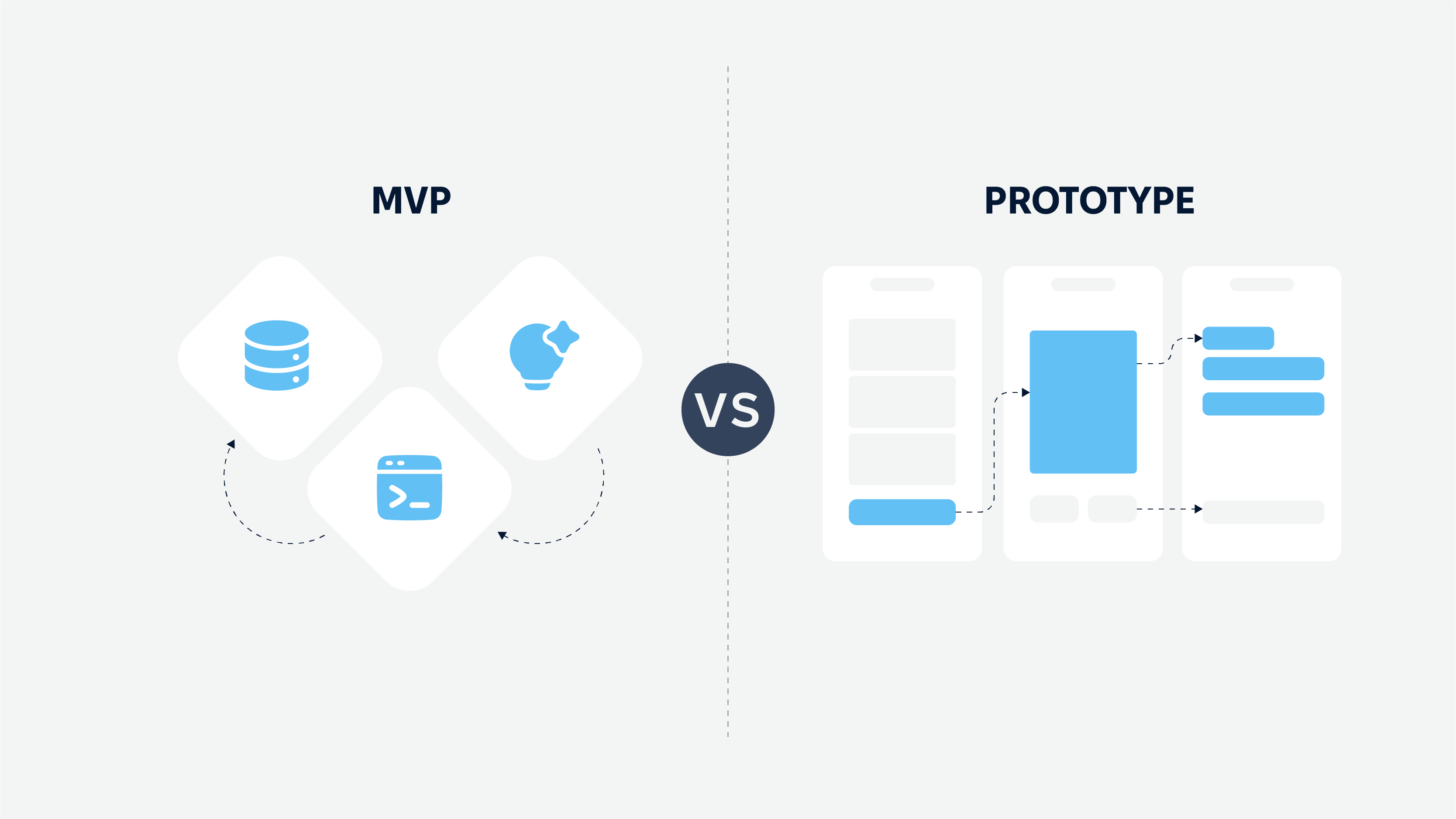
Can you imagine building a house without a blueprint? Chaotic, right? The same applies to digital products.
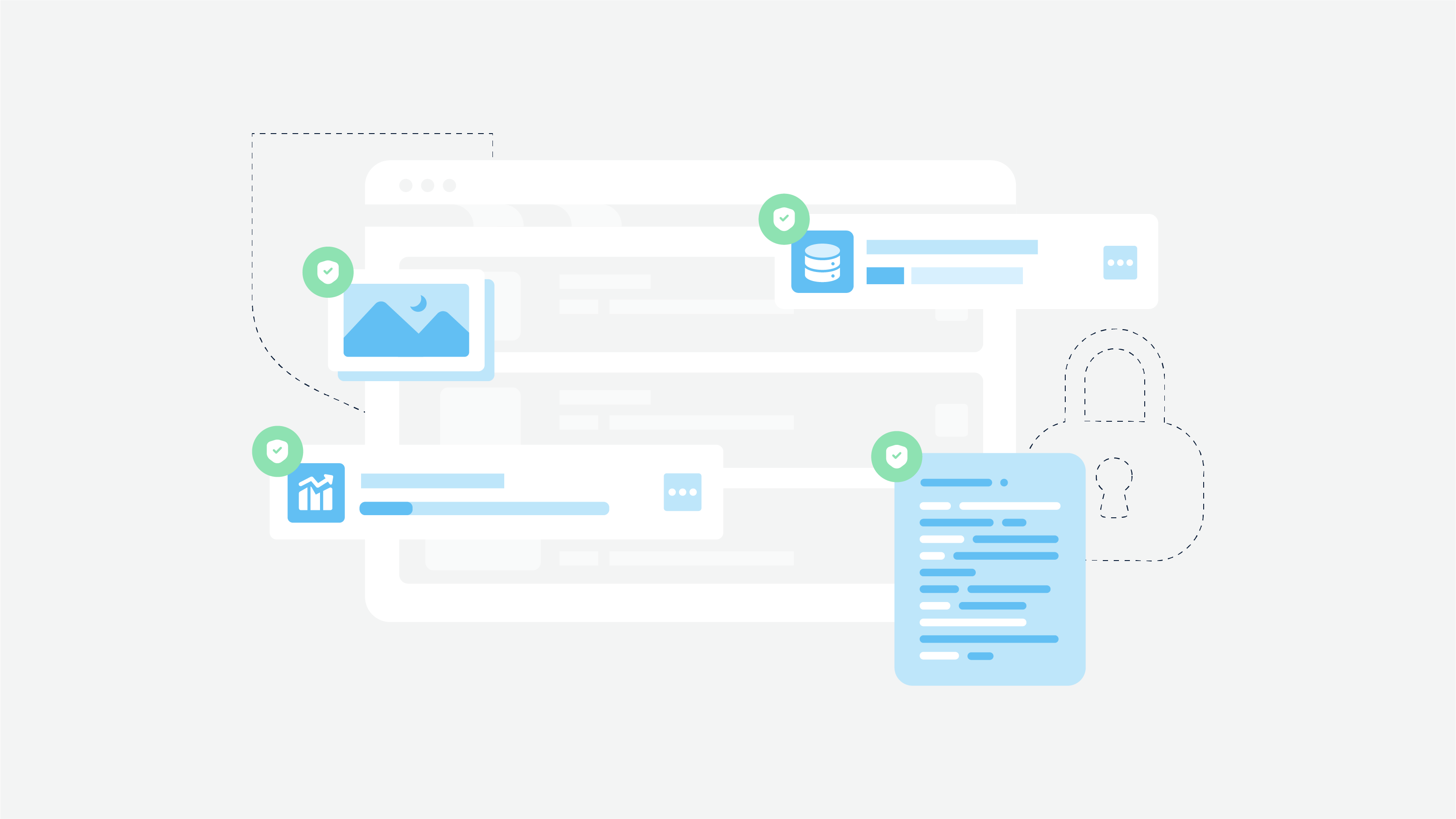
What is a design system? A design system serves as the blueprint for creating consistent, scalable, and efficient user interfaces. You can work on developing a website, mobile app, or enterprise platform, but without a well-structured design system, you can’t ensure a seamless user experience and streamline collaboration between designers and developers.
So, why exactly do design systems matter? They standardize UI elements, improve workflow efficiency, and maintain brand consistency across multiple platforms. In short, they help businesses scale without sacrificing quality or usability.
What is a Design System in UX?
A design system is a comprehensive set of guidelines, components, and tools that ensure consistency in digital product design. It acts as a single source of truth for teams, providing standardized UI elements, reusable code components, and documentation that streamline workflows.
How Design Systems Streamline UX/UI Workflows
Teams can rely on centralized UX design systems to speed up the development process. Think of it as a team’s shared playbook. It keeps everyone on the same page and prevents unnecessary back-and-forth.
Instead of designers and developers reinventing the wheel every time they create a new feature, they can tap into a ready-to-use library of components, ensuring everything stays visually and functionally consistent.
With a solid design system in place, design teams spend less time fixing inconsistencies and more time improving the user experience. It also makes collaboration smoother, as product managers, designers, and developers all work from the same source of truth. Plus, clear documentation means new team members can jump in quickly without getting lost in design chaos.
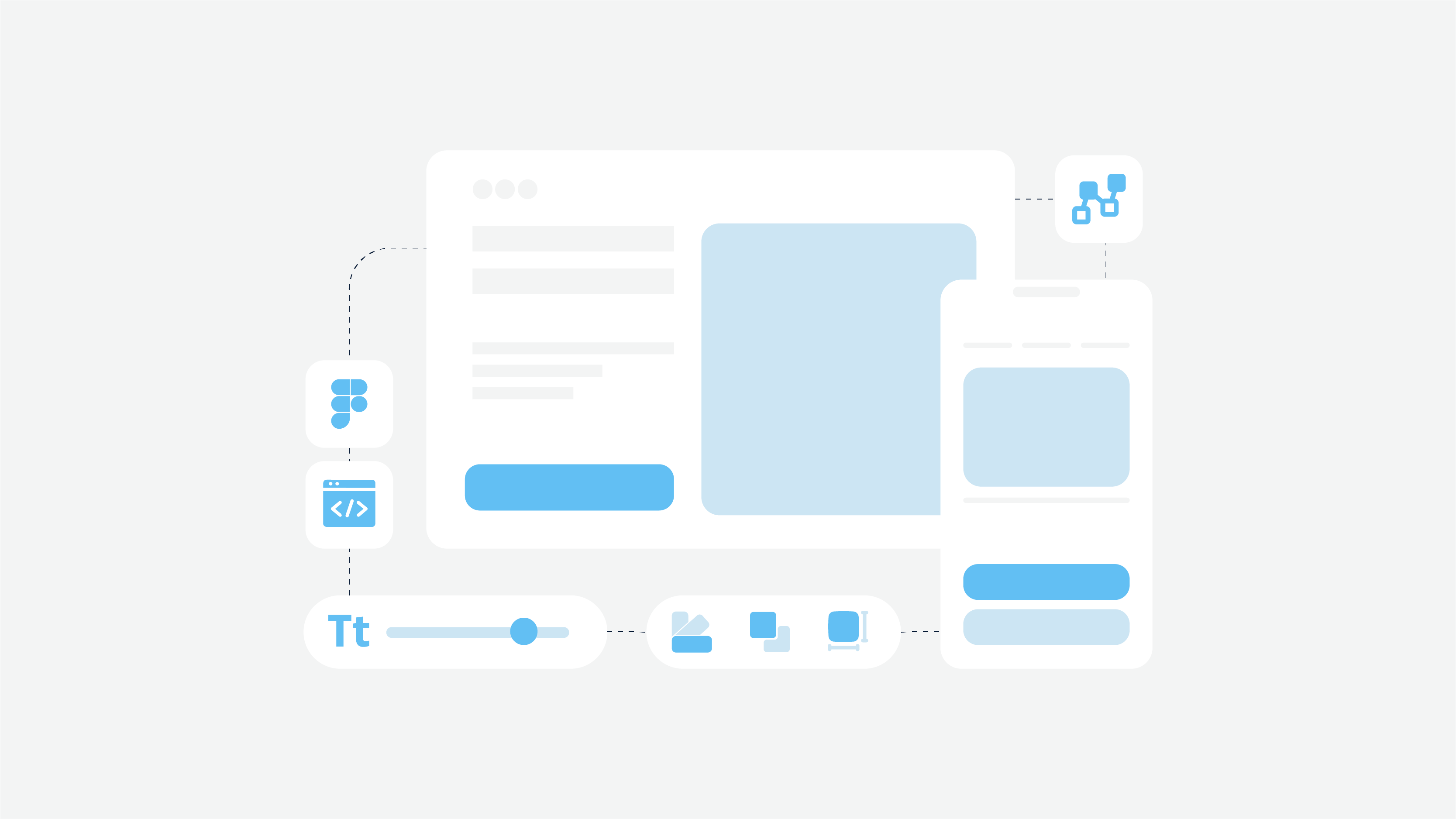
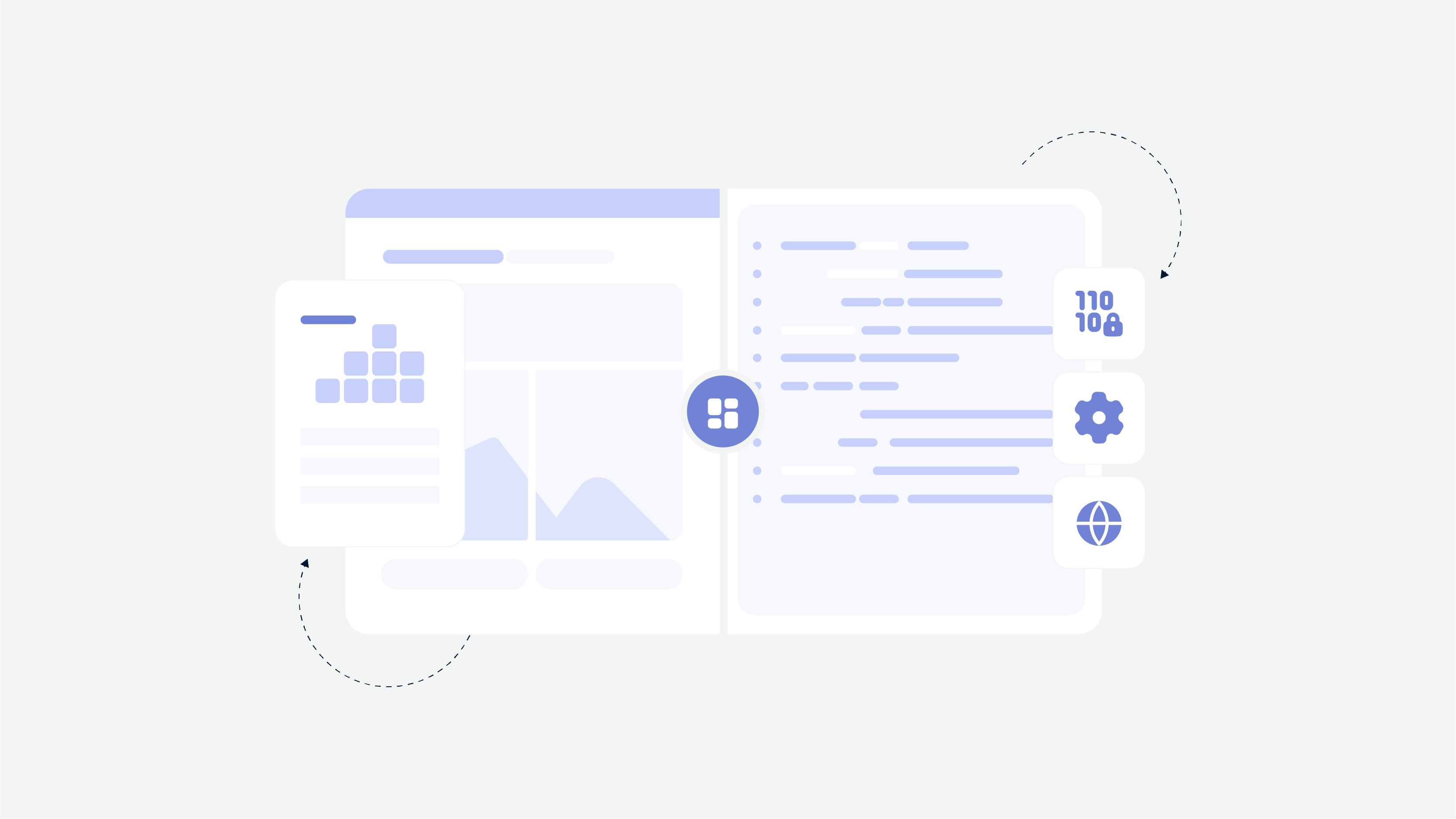
Key Components of a Design System
Let’s come back to our house. Imagine if every time you built something, you had to create new bricks, doors, and windows from scratch. It would be exhausting and inefficient.
That’s exactly what happens in product design without a design system UX. It provides a set of reusable components, guidelines, and standards that make building digital experiences faster and more consistent. Here’s a closer look at the key elements that keep everything running smoothly.
Style Guide and Visual Identity
Think of this as your brand’s DNA. It ensures that every color, font, and icon aligns with your overall design language. A strong style guide includes:
-
Colors. A well-defined color palette to maintain brand consistency. For example, Spotify uses its signature green across all platforms to stay instantly recognizable.
-
Typography. Standardized fonts and hierarchy for readability and aesthetics. Airbnb, for instance, developed its custom typeface, Cereal, to enhance user experience.
-
Iconography. A cohesive set of icons that complement the brand’s look and feel.
-
UI Elements. Buttons, input fields, and layouts that create a seamless experience across all screens.
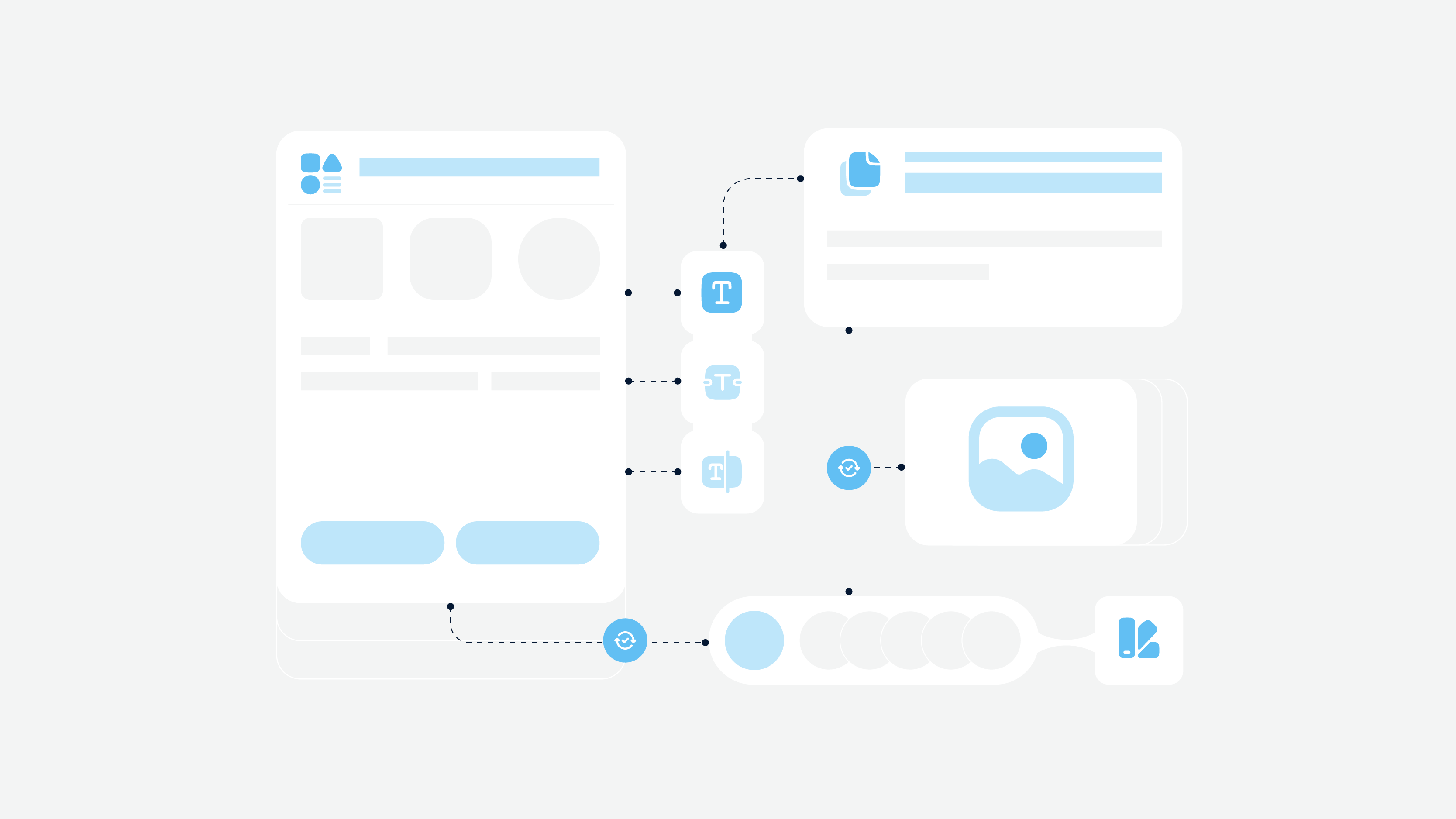
Component Library
A component library is a toolkit of reusable UI elements – think buttons, cards, modals, and form fields. Instead of designing and coding these from scratch every time, teams can pull from a shared collection, ensuring consistency and speeding up development.
For example, Google’s Material Design offers a comprehensive set of components that developers and designers can use to create cohesive experiences across Android, iOS, and the web.
Design Tokens
Design tokens are like LEGO bricks for your design system. They store reusable style properties, such as colors, spacing, and typography, so they can be easily applied across different platforms. This approach makes scaling design changes a breeze.
For instance, IBM’s Carbon Design System uses tokens to adapt UI elements for dark mode or high-contrast settings without redesigning everything from scratch.
Documentation and Governance
A design system only works if people actually use it. That’s where documentation comes in. It provides clear guidelines on:
-
How to use components and styles correctly
-
Best practices for UI/UX consistency
-
Rules for updating and maintaining the system
Without proper documentation, teams may misinterpret or bypass the system, leading to inconsistencies and inefficiencies.
Together, these components create a foundation for scalable, user-friendly digital products that evolve with your brand’s needs.
💡Ready to get consistent with your design? Check our redesign services
Benefits of Implementing a Design System
Try to think of your system design template as your product’s secret weapon. It must be the thing that keeps everything looking polished, functioning smoothly, and working seamlessly across different platforms.
Without one, teams can waste hours tweaking colors, redesigning buttons, or fixing inconsistencies. With one? Everything clicks into place effortlessly. Let’s take a look at other benefits.
Improved Design and Development Efficiency
Without a design system, teams often waste time recreating the same elements or fixing inconsistencies across products. A centralized system eliminates this headache by providing reusable components, predefined styles, and clear guidelines. This means designers and developers can focus on refining user experiences instead of reinventing the wheel.
Stronger Brand Identity Across Platforms
A consistent design language is crucial for brand recognition. A design system ensures that colors, typography, and UI elements remain uniform across web, mobile, and desktop applications. This builds trust with users and reinforces a brand’s identity.
Take Spotify’s Encore Design System, which guarantees a seamless look and feel whether you’re using the mobile app, desktop version, or smart TV interface. The brand’s recognizable green, sleek typography and intuitive layouts stay consistent across all platforms.
Enhanced User Experience and Accessibility
A design system isn’t just about aesthetics – it also plays a huge role in accessibility. By standardizing user interface elements and interactions, companies can ensure a smoother, more inclusive experience for all users, including those with disabilities.
In short, from my own experience, a design system is a must-have for teams that want to work smarter, maintain a strong brand identity, and build products that are both beautiful and accessible.
How to Create a Scalable Design System
Building a scalable design system means not only a set of UI elements but also setting up a flexible, structured approach that grows with your team and product. A good UI design system must keep things consistent. Let’s break down how to start design system step by step.
Setting Up a Design System
Define Goals and Stakeholders
Before you start building, ask yourself: what do you want to achieve with your design system? Is it about maintaining brand consistency? Speeding up development? Improving accessibility? Or do you need a reusable design system UI?
Identifying clear goals from the beginning helps shape the system in the right direction. Involve key stakeholders: designers, developers, product managers, so everyone’s on the same page from day one.
Choose the Right Tools
A strong design system needs the right foundation. There are plenty of Figma design system examples. Designers also often work with tools like Sketch or Adobe XD, while developers rely on Storybook or Zeroheight for component documentation. Choose tools that fit seamlessly into your workflow and allow easy collaboration between teams.
Establish Governance and Guidelines
To keep your design system effective over time, establish clear rules on how components should be used and updated. Define who owns what:
-
who approves changes,
-
how updates get implemented,
-
how new elements get added.
This prevents chaos and keeps everything running smoothly.
Building and Testing Components
Collaboration Between Designers and Developers
A design system is most effective when designers and developers work together from the start. Designers create components that are visually appealing and user-friendly, while developers ensure they’re functional, scalable, and easy to integrate across products.
Open communication between both teams helps catch potential issues early and ensures the system works well for everyone.
Testing for Usability and Accessibility
It’s not enough for a design system to look good. It also needs to work well for users of all abilities.
Regular usability testing ensures that components are intuitive and easy to navigate. Accessibility should also be a priority, following standards like WCAG to ensure inclusivity for all users.
Document Everything
A design system without documentation is like a map without labels. It’s hard to follow and easy to get lost.
Maintain a well-organized library that includes usage guidelines, code snippets, and best practices. This makes it easy for teams to understand how to use the system correctly and keeps everyone aligned.
Scaling and Maintaining the System
A design system isn’t a one-and-done project. It must involve and evolve over time. As your product grows, you’ll need to refine components, introduce new patterns, and adapt to changing user needs. Regular updates keep the system relevant and useful.
Also, a great UX design system only works if people actually use it. Provide training, create clear documentation, and show teams how the system makes their work easier. Encouraging adoption from the start helps ensure long-term success.
How do you know if your design system is working? Track key metrics like development speed, design consistency, and user experience improvements. Gather feedback from teams using the system and make adjustments based on real-world insights.
Examples of Successful Design Systems
Some of the best design systems out there set the bar for consistency, efficiency, and scalability. They serve as playbooks that help teams build cohesive digital experiences without reinventing the wheel. Here are a few standout examples:
Google Material Design Systems
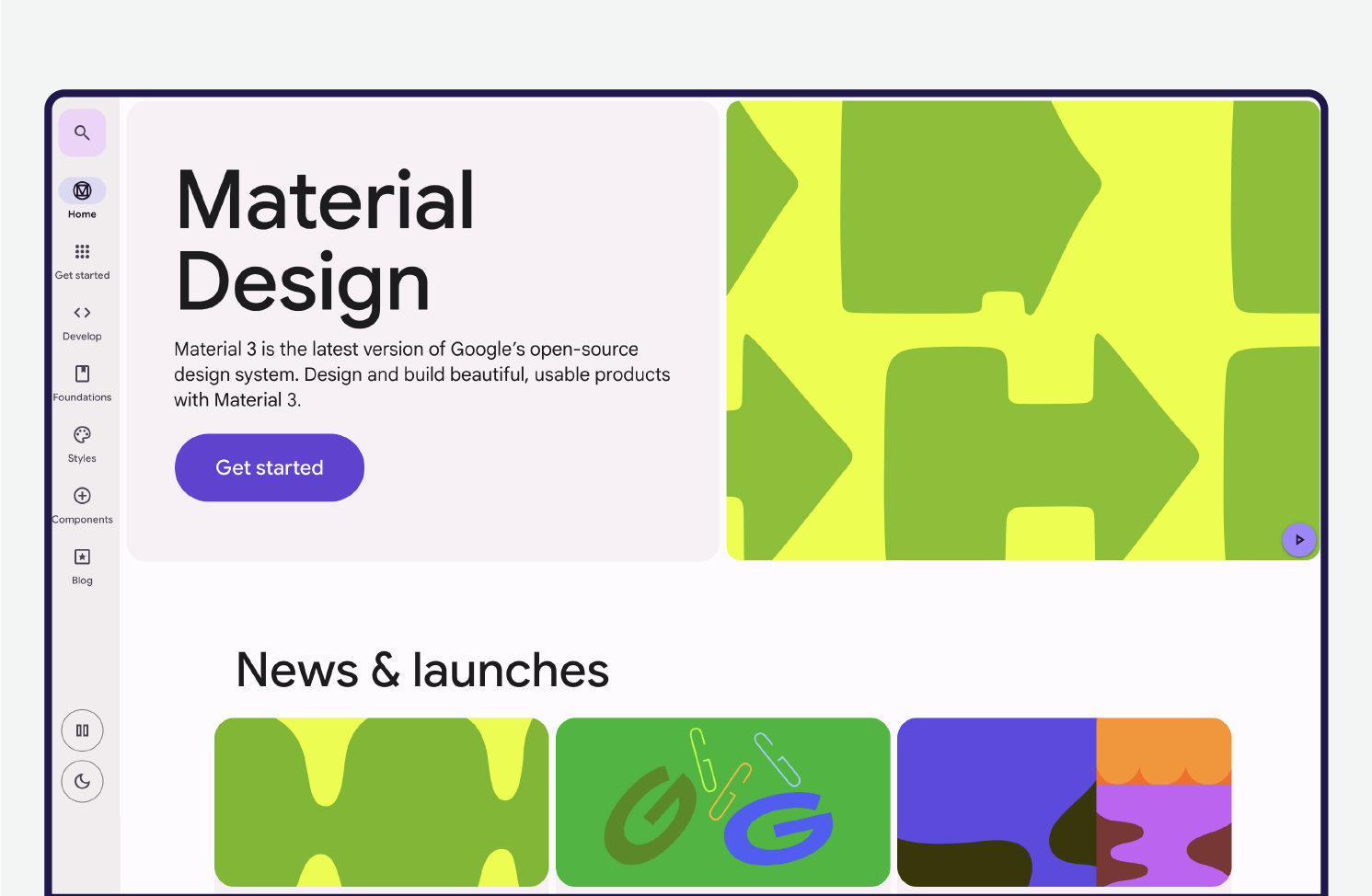
Material Design is all about creating intuitive and accessible interfaces across devices. Google designed it to provide a seamless user experience by using consistent visual elements, motion principles, and adaptable layouts. It’s widely used across Android apps and even web applications, making it one of the most recognizable design systems in the world.
IBM Carbon Design System
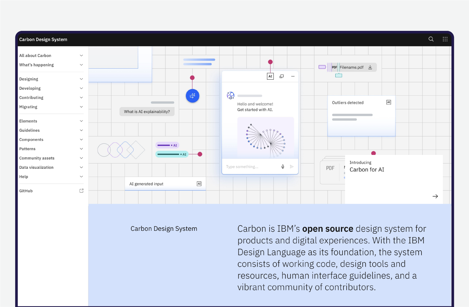
IBM’s Carbon Design System is built for enterprise applications, offering a modular approach that makes it easy to scale. It emphasizes flexibility, allowing teams to create complex digital products while maintaining a unified brand presence. Carbon also prioritizes accessibility, ensuring that interfaces are usable by everyone, regardless of ability.
Atlassian Design System
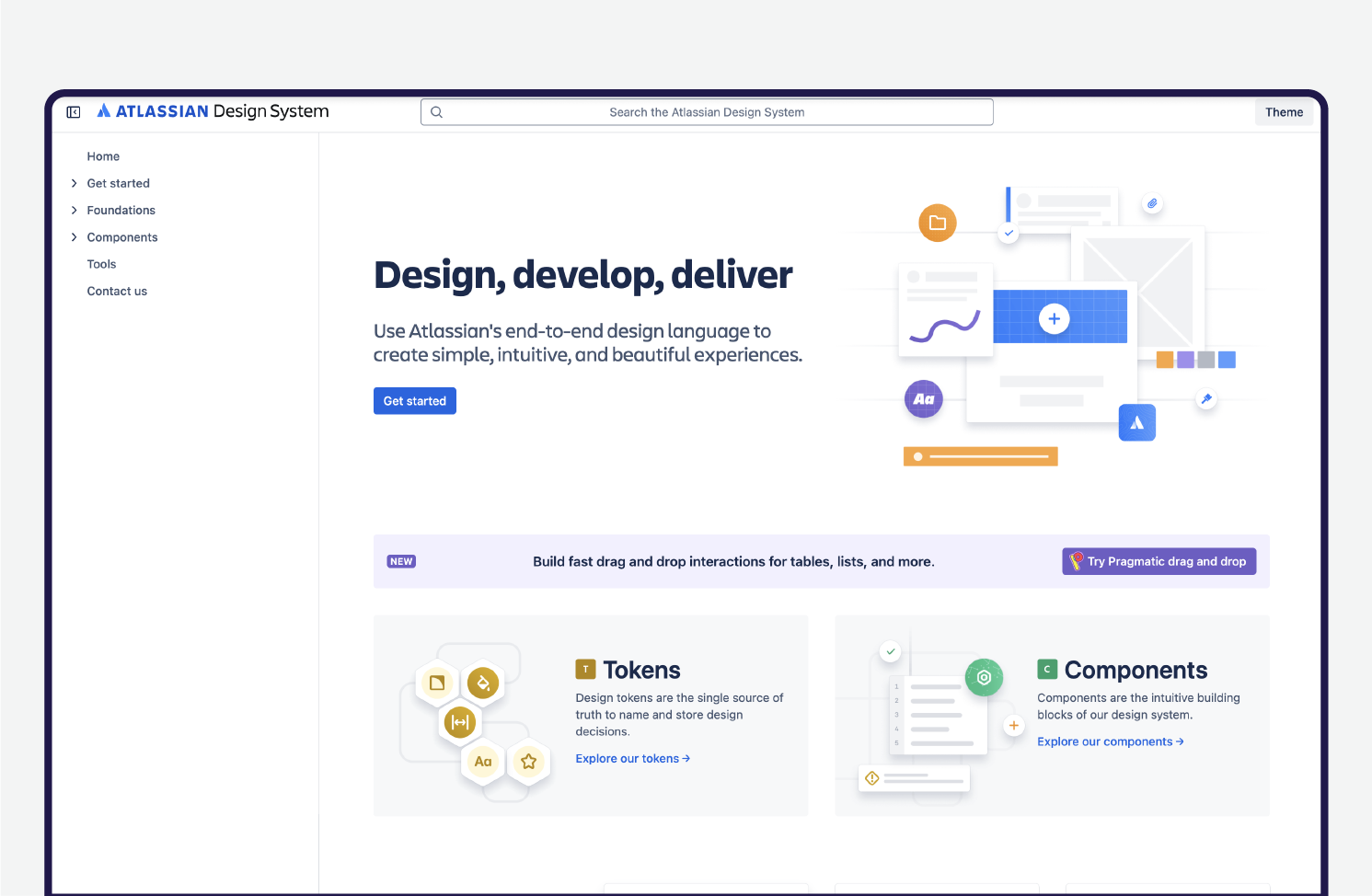
Atlassian, the company behind tools like Jira and Confluence, has developed a design system that focuses on usability and collaboration. The system is designed to work across different Atlassian products, creating a seamless experience for users. It includes detailed guidelines for typography, color usage, and interaction patterns, making it easier for teams to design and develop consistently.
These design systems prove that having a structured approach doesn’t mean sacrificing creativity. Instead, they offer a flexible foundation that helps teams move faster while ensuring a polished, cohesive look and feel. The key takeaways? Invest in clear documentation, build reusable components, and continuously evolve your system to meet new design and user experience needs.
Microsoft Fluent Design System
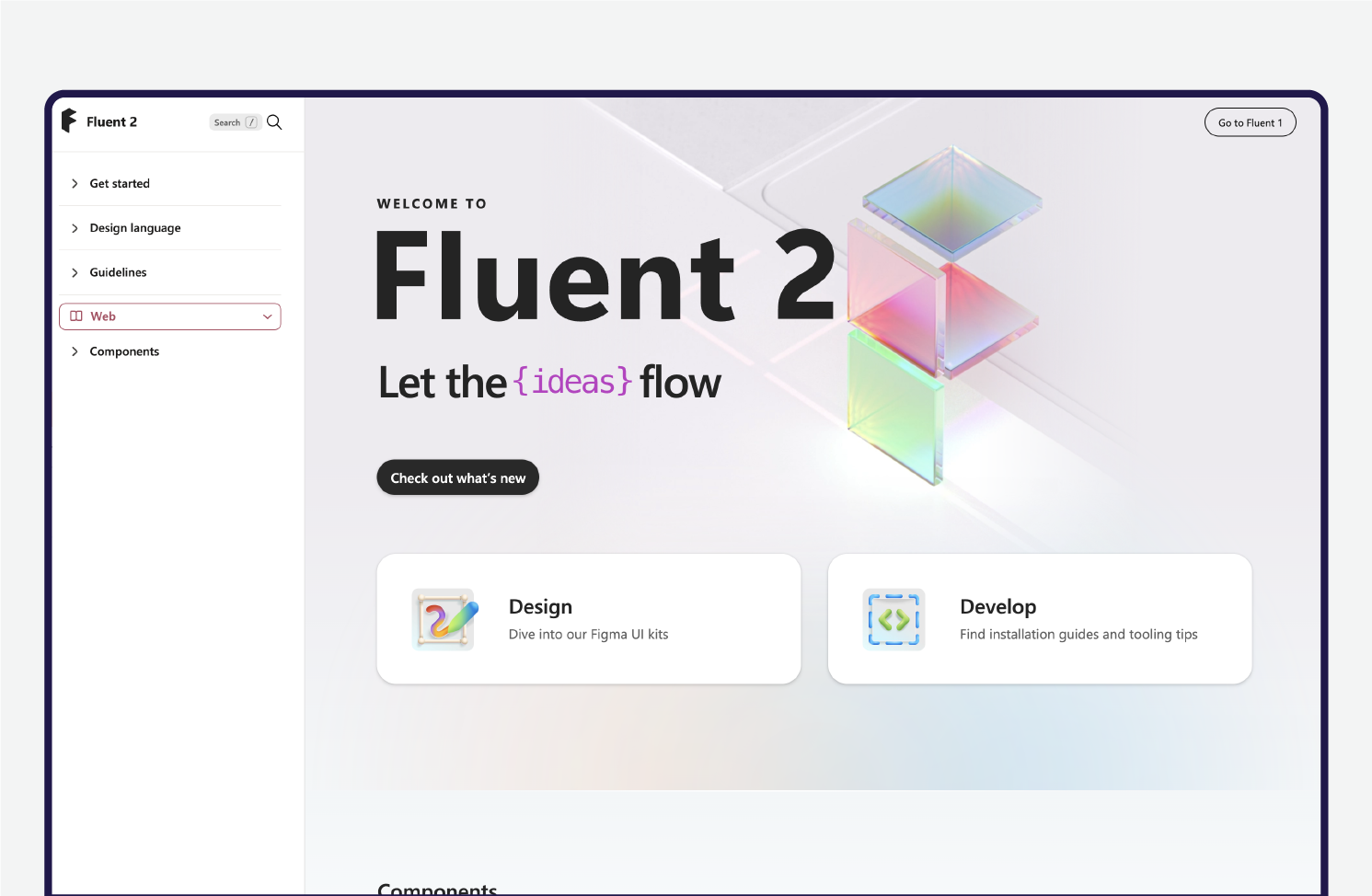
Microsoft’s Fluent Design System is all about making the user experience across its platforms feel more immersive and dynamic. The system brings together elements like lighting, depth, motion, and material to create a polished and responsive experience.
Fluent Design’s goal is to merge the physical and digital worlds, offering interfaces that adapt smoothly across all devices, from desktops and smartphones to mixed-reality setups. One of the standout features is motion, which helps make interactions feel more seamless by giving users a sense of flow and responsiveness.
Then there’s Acrylic, a cool, semi-transparent material that gives the design a modern and fresh look. Overall, Fluent Design helps Microsoft create a natural, intuitive user experience while still being flexible enough for developers to work with.
Apple Human Interface Guidelines
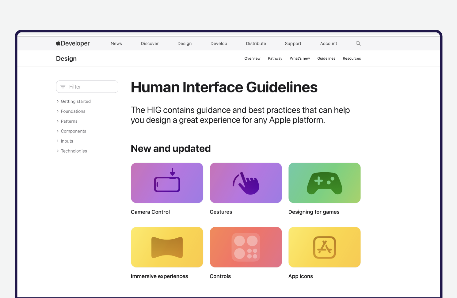
Apple’s Human Interface Guidelines (HIG) have set the bar for great design in apps on all of Apple’s devices – from iPhones to Macs to wearables. These guidelines focus on making apps easy to use, with clear instructions on things like interface elements, layout, interaction patterns, and animations. Apple encourages designers to build with clarity, deference, and depth in mind, making sure apps feel intuitive.
For example, Apple champions touch gestures for mobile devices and recommends designing with natural interaction and ease of use at the forefront. HIG’s emphasis on simplicity and aesthetic integrity ensures that every app feels like it belongs in the Apple ecosystem. Apple also prioritizes accessibility, ensuring that users of all abilities can enjoy a smooth, functional experience.
Common Challenges and How to Overcome Them
Rolling out a design system isn’t always smooth sailing. Teams might hesitate to adopt it, struggle to keep it flexible or run into roadblocks that slow things down. Let’s look at some of the biggest challenges and how to work through them.
Resistance to Adoption
Not everyone is eager to embrace a design system, especially if they’re used to working in their own way. Designers might see it as limiting their creativity, while developers may view it as extra work.
How to Overcome It
Show the value early. Demonstrate how the system speeds up workflows, reduces rework, and improves collaboration. Offer training sessions, provide clear documentation, and encourage teams to contribute so they feel ownership over the system.
Maintaining Flexibility While Ensuring Consistency
A design system should provide structure, but it shouldn’t be so rigid that it stifles innovation. Teams need the freedom to create while maintaining a cohesive look and feel.
How to Overcome It
Define when and how components can be modified. Establish core design principles but allow room for customization where needed. A governance team can help balance standardization with adaptability.
Keeping the System Up to Date
A design system isn’t a “set it and forget it” project. As products evolve, the system needs to evolve too – but without becoming chaotic.
How to Overcome It
Assign ownership to a dedicated team that continuously refines and updates the system. Schedule regular reviews to remove outdated elements and introduce improvements based on user feedback.
Getting Cross-Team Alignment
A design system touches multiple teams – design, development, product management, and marketing – and if they’re not aligned, things can get messy.
How to Overcome It
Encourage collaboration from the start. Hold regular check-ins and ensure all teams have a voice in shaping the system. Clear documentation and communication channels help keep everyone on the same page.
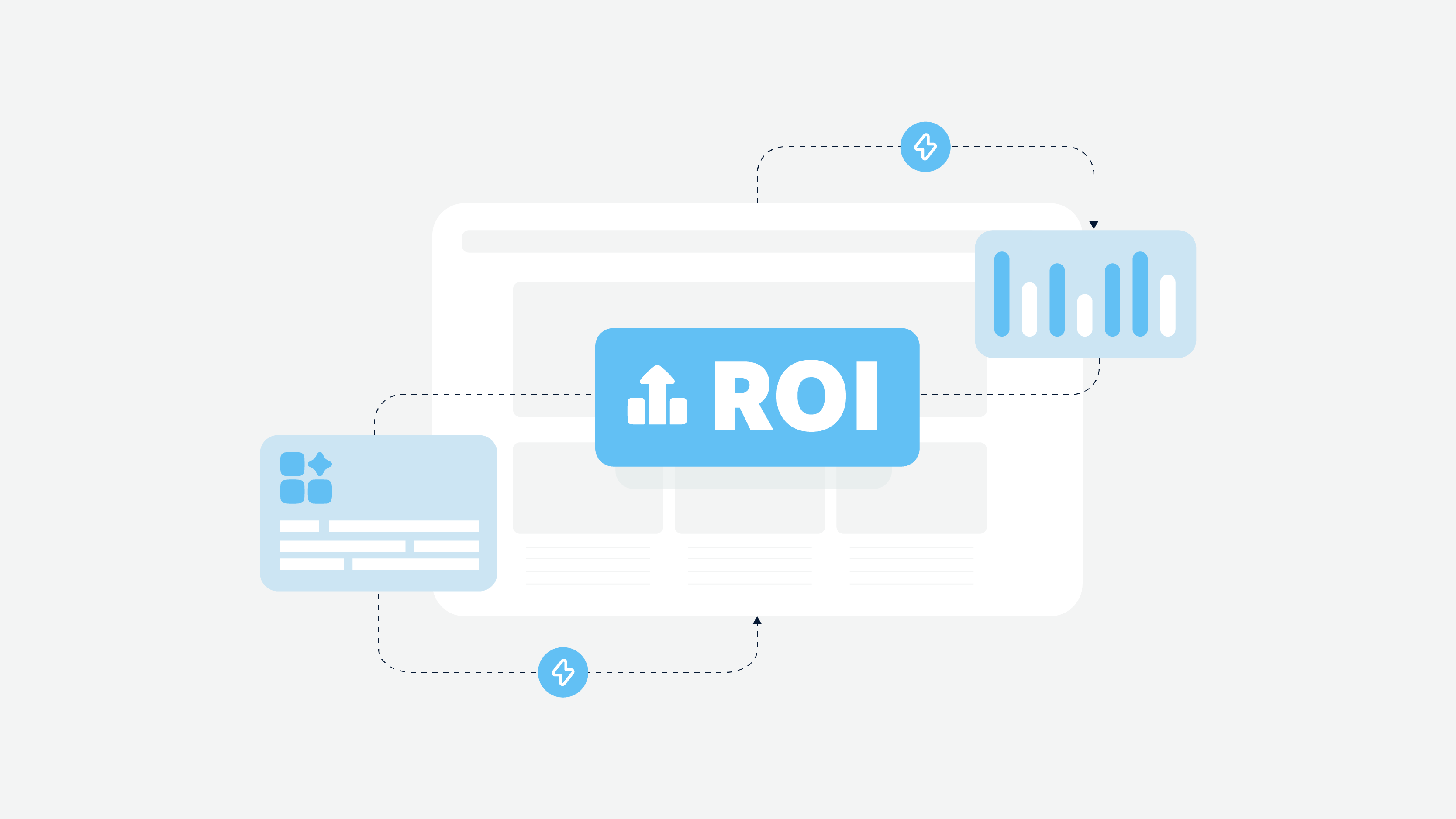
Proving ROI to Leadership
Leadership buy-in is crucial, but decision-makers often want hard numbers before investing in a design system.
How to Overcome It
Track efficiency improvements, reduced design inconsistencies, and faster development times. Show how the system saves time and money by reducing duplication of work and streamlining design-to-development handoff.
Future Trends in Design Systems
Design systems aren’t static. They evolve alongside new technologies, user needs, and industry shifts. Here are some of the most important trends.
AI-Driven Design Automation
AI is making life easier for designers and developers by handling tedious, repetitive tasks. It can generate UI components, suggest improvements based on user behavior, and even help enforce design guidelines automatically. This means teams can focus more on creativity and problem-solving instead of spending hours tweaking minor details.
AI-driven design tools can analyze trends, predict what works best for users, and help teams make more informed design choices. This speeds up development while maintaining high-quality, user-friendly designs.
Cross-Platform Component Libraries
Users expect a seamless experience whether they’re on a phone, tablet, desktop, or even a smartwatch. To keep up, companies are investing in cross-platform component libraries – reusable design elements that adapt to different environments without sacrificing consistency. This ensures that products feel unified across multiple platforms without requiring extra work from designers and developers.
A well-built cross-platform library also helps teams stay efficient. Instead of reinventing the wheel for each platform, designers and developers can pull from the same set of pre-approved components, ensuring brand consistency and reducing duplication of effort.
Design Systems as a Service (DSaaS)
More businesses are treating their design systems as living, evolving products rather than static documentation. Some are even offering them as internal or external services, making them accessible to different teams or companies. This approach keeps systems up-to-date, well-maintained, and valuable for long-term scalability.
By adopting a DSaaS model, companies can ensure that their design guidelines, updates, and best practices are always available. Such an approach reduces misalignment across teams and makes design collaboration smoother.
Code-Integrated Design Systems
The gap between design and development is shrinking. Instead of working with static mockups, teams are integrating design systems directly into code, using real UI components that reflect the final product. This speeds up prototyping, reduces inconsistencies, and makes collaboration between designers and developers much smoother.
With live code integration, developers don’t have to manually translate designs into working components. Instead, they can pull pre-built, tested elements straight from the design system, reducing errors and ensuring visual consistency across different screens and interactions.
Accessibility and Inclusive Design
Accessibility is no longer an afterthought. It is becoming a core part of modern design systems. More teams are building accessibility guidelines into their systems from the start, ensuring that colors, typography, navigation, and interactions are user-friendly for everyone, including those with disabilities.
A strong accessibility framework is a necessity. Embedding accessibility standards into the design system gives design teams the opportunity to create digital experiences that are more inclusive, legally compliant, and ultimately more usable for a wider audience.
Personalization and Adaptive Design Systems
One-size-fits-all designs are being replaced by adaptive, personalized experiences. Design systems incorporate customization options like dark mode, language localization, and UI scaling to cater to different users’ needs. This makes digital experiences more engaging and user-friendly.
The shift toward personalized interfaces means users feel more in control of their experience. Whether it’s adjusting text size, selecting a preferred theme, or enabling accessibility features, a well-structured design system makes personalization seamless and intuitive.
Sustainable and Performance-Optimized Design Systems
With growing concerns about digital carbon footprints, companies are prioritizing lightweight, efficient design components that reduce unnecessary resource consumption. Optimized design systems help improve website and app performance, making digital experiences faster and more environmentally friendly.
Reducing page load times, optimizing image assets, and using energy-efficient UI components – all of these a steps toward more sustainable digital experiences. As more users and businesses become environmentally conscious, design systems that focus on performance and sustainability will become the new standard.
How Cadabra Studio Helps You Build a Design System
Building a design system is all about creating a solid foundation that keeps your product consistent, scalable, and easy to maintain. But let’s be real: getting started can feel overwhelming. That’s where Cadabra Studio comes in.
We take the guesswork out of the process, helping teams build and manage design systems that actually work for them. Whether you’re starting from scratch or fine-tuning an existing system, we make sure your design framework is built to grow with your product.
Tailored Design Systems for Every Need
Creating a design system from scratch can feel overwhelming, but Cadabra Studio simplifies the process. Whether you’re building from the ground up or refining an existing system, we work closely with your team to develop a scalable, well-documented framework tailored to your specific needs.
A Practical and Flexible Approach
We focus on more than just visual consistency. Our approach ensures that your design system enhances collaboration between designers and developers while maintaining flexibility for future growth. We build reusable components, establish a solid design language, and integrate governance structures to keep your system efficient and adaptable.
Seamless Implementation and Ongoing Support
A great design system isn’t just a one-time project – it requires continuous evolution. We help implement best practices, provide hands-on training, and offer ongoing support to ensure smooth adoption across teams. From initial setup to long-term maintenance, we guide you every step of the way.
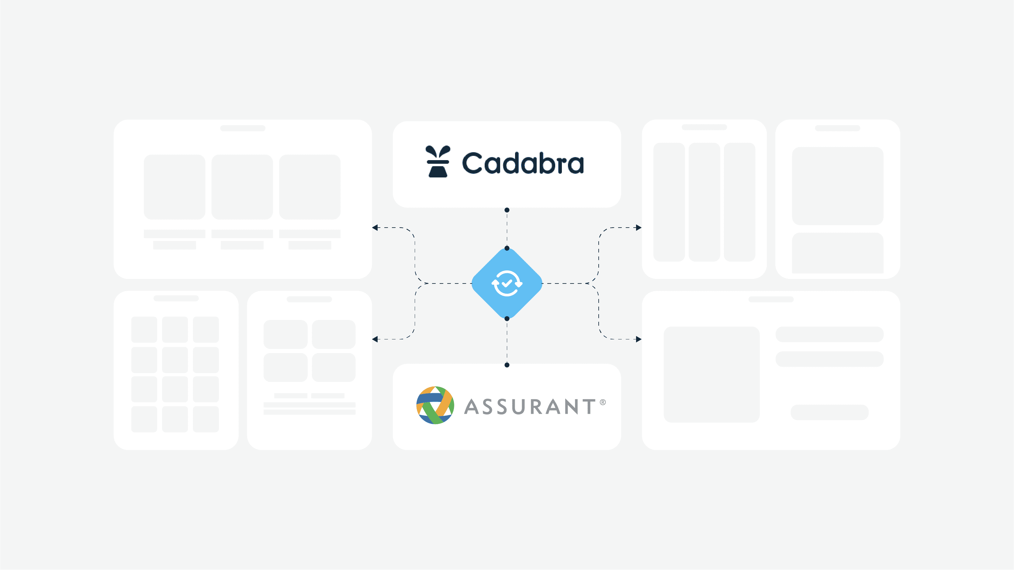
Case Study: Assurant’s Design System Transformation
Assurant, a global leader in risk management solutions, needed a way to bring more consistency to their digital products. With so many services and products under their belt, it was becoming tough to keep things aligned and provide a seamless user experience across their platforms.
Partnering with Assurant’s team, we worked together to create a design system that would streamline workflows, enhance UI/UX consistency, and ultimately save time during development. The goal was simple: make their design process more efficient and scalable.
We started by building a comprehensive component and pattern libraries. They included reusable UI components, patterns, and templates, so Assurant’s design teams didn’t have to reinvent the wheel every time they worked on a new project. With standardized components across teams, we made sure everything from buttons to layout styles stayed consistent.
We also created detailed documentation to guide teams on how to use the system. This made the design process easier for both existing team members and new hires, helping them get up to speed quickly.
Thanks to the new robust design system, Assurant saw faster development times, improved collaboration, and a smoother, more consistent user experience across all their products.
💡If you’re curious about how we helped Assurant make it happen, check out the full case study
Final Thoughts
To wrap it up, design systems act like the backbone of any successful digital product, making sure everything looks and works in harmony. When design and development teams work from the same playbook, they can cut down on the back-and-forth, speed up their process, and keep things running smoothly.
With the right design resources – think components to reuse and clear guidelines – teams avoid reinventing the wheel every time they start a new project. Whether you’re building a custom design system from scratch or refining one you’ve already got, having a solid framework makes life a whole lot easier. It helps teams stay on the same page, produce better results, and keep things flexible as the product grows.
In the end, a great design system keeps everything on track and ready to scale, so you’re never caught flat-footed when things take off.
FAQs
What’s a design system in UX design?
A design system in UX design is basically a toolkit that includes components to reuse, design patterns, and guidelines. It helps design and dev teams stay on the same page and keep things consistent. Think of it as a one-stop shop for making sure your interfaces look and work the same way across the board, all while keeping your brand’s vibe intact.
How do design systems boost workflow efficiency?
Design systems boost workflow efficiency by standardizing elements for UI, so teams don’t have to start from scratch every time. With a solid set of design components, everyone can work faster, reduce errors, and stay consistent.