
How to Create a Design System for Insurance – A Real Case Study with Assurant
Insurance companies are under pressure to modernise their customer experiences while maintaining the trust and reliability that their customers expect. A unified, scalable, and user-centric digital presence is no longer optional – it’s essential. Design systems are the foundation that allows insurance companies to deliver consistent, efficient, and high-quality digital experiences across multiple platforms and stay competitive.
Understanding why design systems matter is crucial before starting the creation process. They address issues like inconsistency across platforms and streamline workflows, offering a tailored approach to fit the unique needs of an organization, whether it’s a simple setup for a small team or a complex system for larger enterprises.
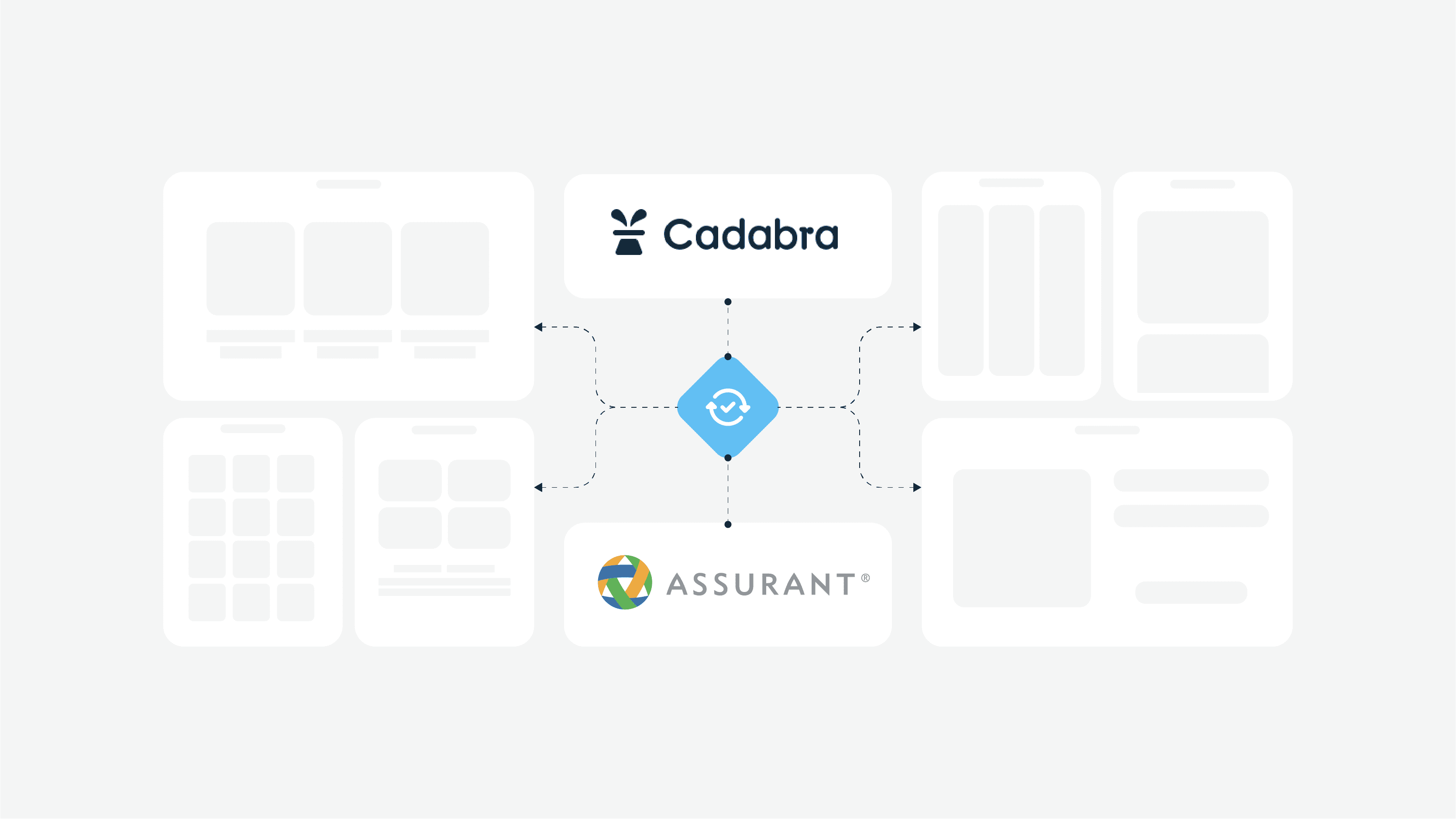
In this article, we’ll walk you through the process of design system creation and implementation by going through a real-world case study with Assurant – a global leader in risk management and insurance solutions with Cadabra Studio’s help.
Introduction to Design Systems
Design systems are a crucial tool for companies to succeed in the software market. They help create a consistent design language across products, speed up workflow, and free up teams to focus on solving user problems.
A well-crafted design system is a powerful tool for teams looking to create cohesive, scalable, and efficient designs. By establishing a unified set of design principles and reusable components, design systems enable designers and developers to work more effectively, ensuring that all digital products maintain a consistent visual and functional identity.
Why Insurance Companies Need a Design System
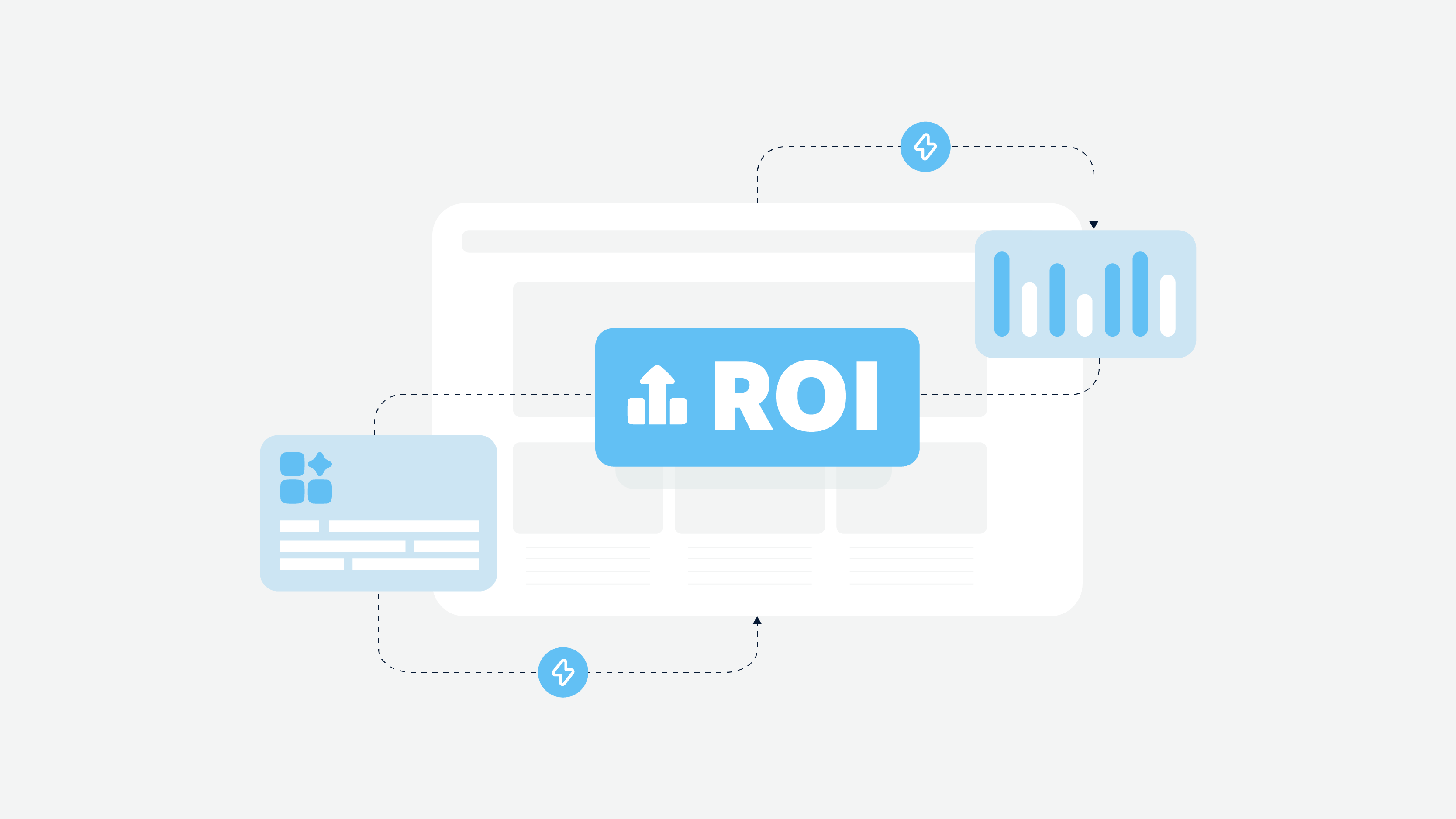
Streamlining Digital Experiences: A design system ensures consistent user journeys across websites, mobile apps, and internal portals,resulting in a better user experience.
Benefits of a Unified UI/UX: By increasing trust, accelerating user onboarding, and reducing customer support queries, a design system is an asset. Additionally, it leads to significant long-term time and cost savings by minimizing design and coding time.
Scalability and Consistency: Design systems allow for rapid development and easier scaling as new features or platforms are introduced, so the company can adapt to market changes.
For the insurance sector, where customer trust and operational efficiency is key, a robust design system is a competitive advantage that sets companies apart from their peers.
Laying the Groundwork
Before building a design system, it’s essential to lay the groundwork. This involves taking stock of existing design assets, organizing and evaluating the current design process, and finding champions and stakeholders for the design system. By establishing a solid foundation, teams can ensure that their design system is built on a thorough understanding of their current design language and processes, setting the stage for a successful implementation.
Take Stock of Existing Design Assets
The first step in building a design system is to take stock of existing design assets. This includes gathering and cataloging all UI components, design patterns, and style guides. By compiling a comprehensive inventory of these assets, teams can identify areas for improvement and standardization. This step is crucial for understanding the current state of the design language and ensuring that the new design system addresses any inconsistencies or gaps.
Organize and Evaluate Current Design Process
Once all design assets have been gathered, it’s essential to organize and evaluate the current design process. This involves identifying inconsistencies, redundancies, and disjointed areas in the design language. By thoroughly analyzing the existing design process, teams can pinpoint areas that need improvement and develop strategies to enhance efficiency and consistency. This step helps ensure that the new design system is built on a solid foundation and addresses the specific needs of the organization.
Find Champions and Stakeholders for the Design System
Building a design system is a team effort, requiring advocates and champions from various departments. Designers, developers, product managers, and customer support teams can all contribute to the design system.
It’s essential to find champions and stakeholders who can help drive the design system initiative forward and ensure that it aligns with company goals and objectives. By involving a multidisciplinary team, organizations can ensure that their design system is comprehensive, well-supported, and effectively implemented across all digital products.
What is a Design System?
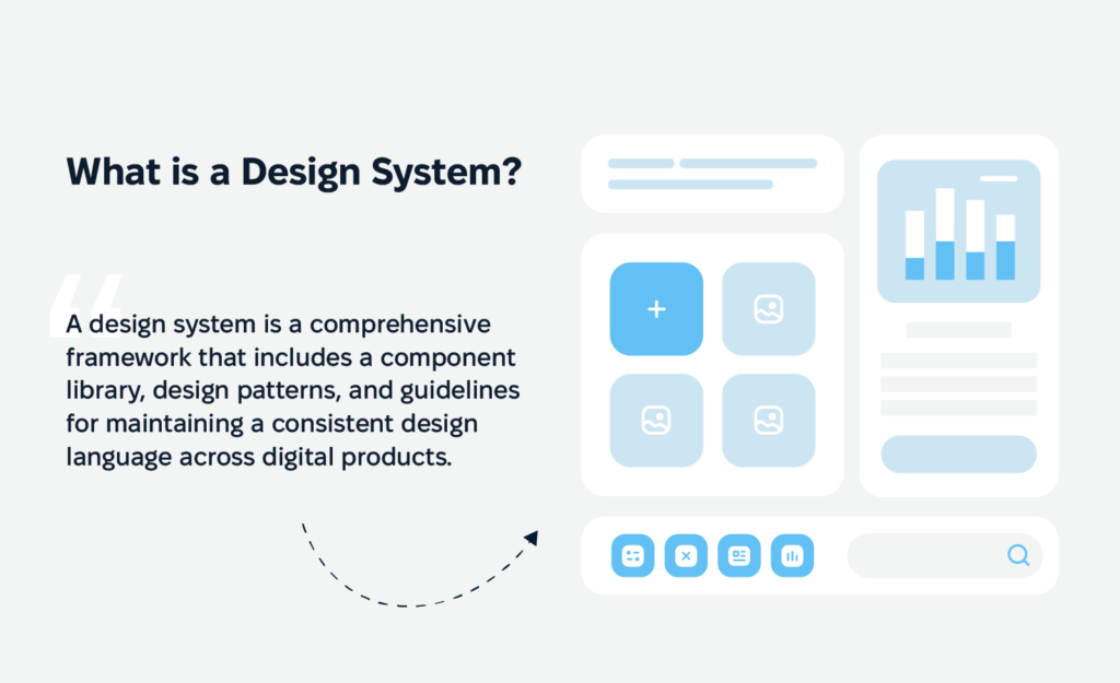
A design system is a comprehensive framework that includes a component library, design patterns, and guidelines for maintaining a consistent design language across digital products. It’s a unified language for multiple teams so dthat esigners and developers can create cohesive user experiences. By including reusable components and clear guidelines, design systems ensure all team members are on the same page, and innovation can happen.
Design system patterns are crucial in this process as they help in building and organizing reusable UI components, ensuring consistency across products.
Benefits of a Design System for Insurance Companies
Insurance companies can benefit from design systems in several ways. A design system can help maintain consistency across different platforms and products, improving the overall user experience. It can also streamline the design process, reducing the time and effort required to create new products or features.
Additionally, a design system can help ensure that all products and platforms are accessible and usable for all customers, regardless of their abilities. By providing clear guidelines and reusable components, design systems enable insurance companies to deliver a seamless and cohesive user experience, enhancing customer satisfaction and loyalty.
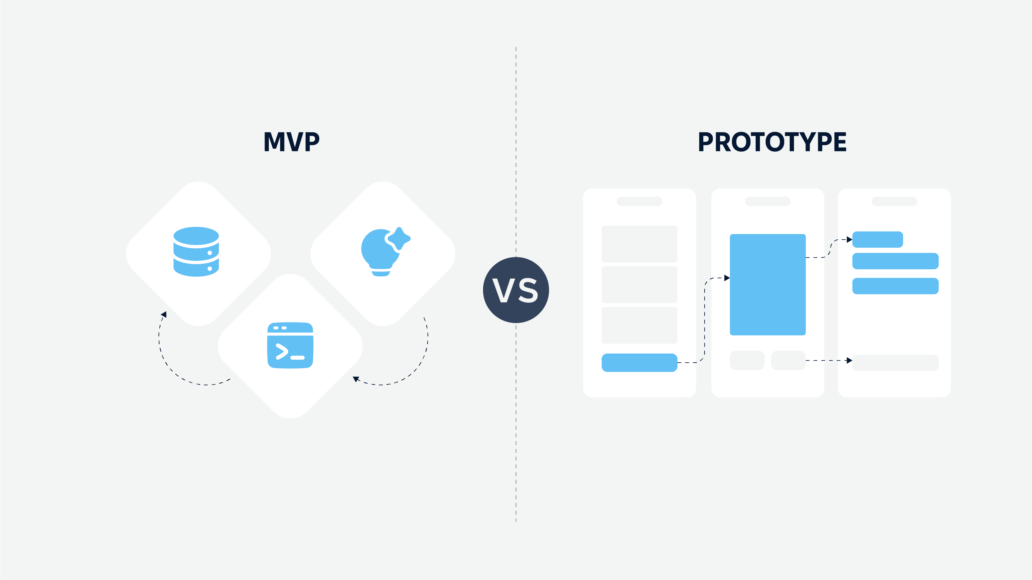
Design System vs Style Guide
A style guide focuses on visual elements like typography and colour schemes; a design system encompasses a broader scope. It includes functional elements, usage guidelines, and design principles that guide the entire design process. This allows design systems to be consistent across platforms while allowing for faster time to market and reduced development costs.
Pattern libraries are collections of reusable UI components that streamline design processes and ensure consistency across different parts of a product.
The Challenge – Unifying Assurant’s Global Digital Experience
About Assurant: With over 300 million customers worldwide, Assurant is a Fortune 500 company offering risk management products across a broad range of industries, from mobile devices to home insurance. Their expansive global footprint and multibrand ecosystem made design consistency both a technical and operational challenge. Assurant’s digital presence spans numerous teams, regions, and platforms — many of which had evolved independentl
Business Goals:
Assurant needed to unify its fragmented design and development efforts into a single, scalable system that could serve multiple teams and brands across the globe. The goal wasn’t just visual consistency; it was operational efficiency. Teams needed to move faster, reduce design debt, and improve user experience without duplicating work. At the same time, the system had to be flexible enough to support both core brand products and white-labeled partner experiences.
Challenges:
Bringing together a global organization with varying design patterns, tools, and priorities was no small feat. The design system had to account for different tech stacks (like Angular and React), accessibility regulations across markets, and the unique brand expressions of different business units.
Most importantly, the project had to bring consistency without slowing down innovation or constraining individual product teams.
The Assurant Enterprise Design System Process
Step 1 – Research and Discovery
Stakeholder Alignment: We started by working closely with Assurant’s internal teams to understand their multi-brand needs, existing inconsistencies, and future scalability goals. With over 300 million customers worldwide and a portfolio of global digital products, Assurant needed a system that could unify and scale seamlessly.
Audit and Analysis: We conducted a full audit of existing design and development assets across departments and product lines. This gave us a clear picture of duplication, gaps, and inconsistencies that needed to be addressed system-wide.
Use Case Identification: Through workshops and collaborative sessions, we identified high-priority scenarios for reuse – from claims dashboards to partner-facing portals. This helped prioritize the most valuable components for early inclusion in the design system.
Step 2 – Core Design Principles
Visual Cohesion Across Brands: While Assurant has a strong master brand, its teams support multiple regional, product-specific, and white-labeled experiences. We established a modular system with shared foundations but flexible theming for brand variations.
Scalable Component Library: We developed a reusable library of UI components – buttons, forms, navigation patterns, and data cards – that could support a wide variety of product needs without duplicating effort.
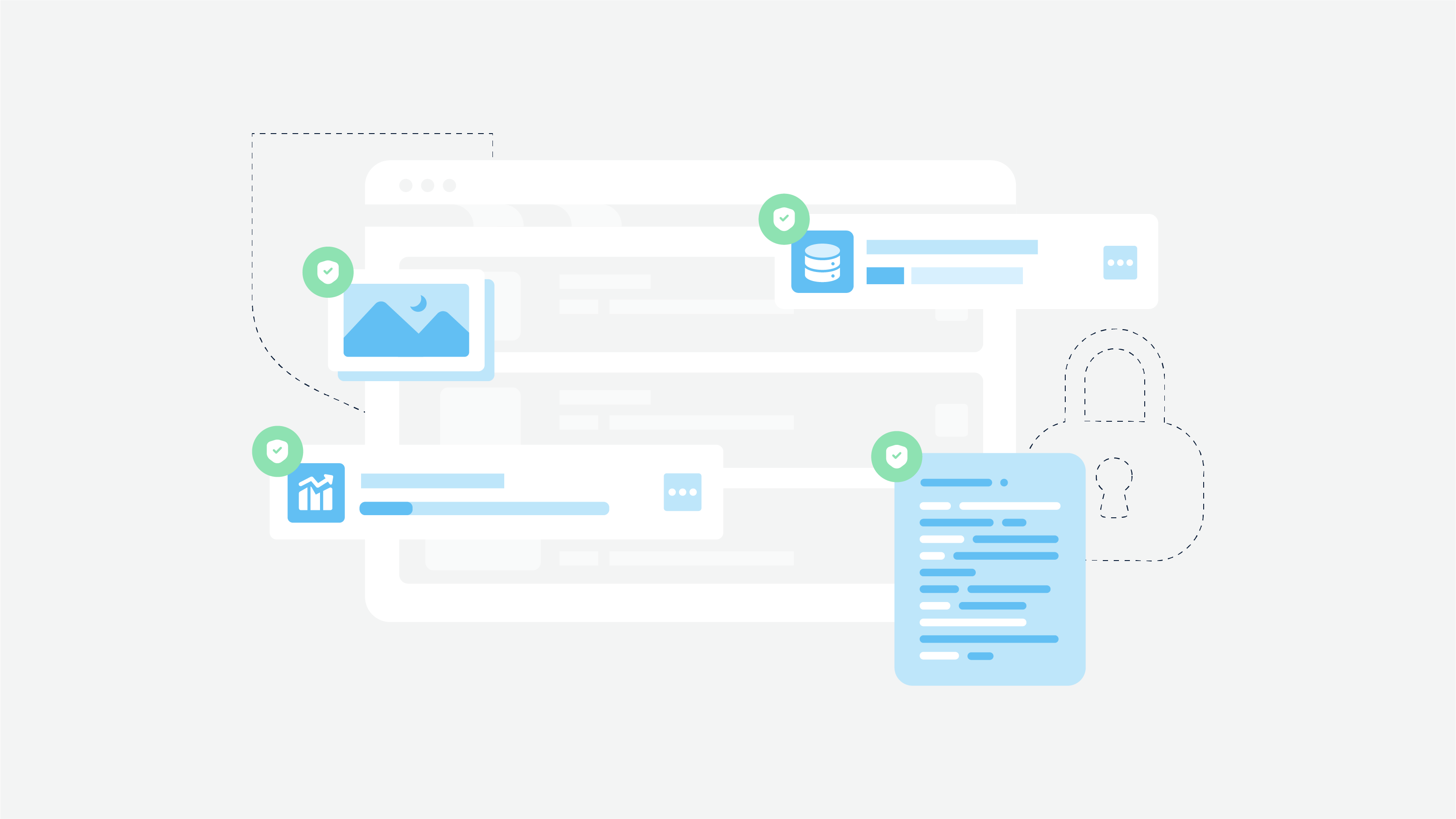
Accessibility by Design: Every component was designed and tested to meet WCAG 2.1 AA standards, ensuring inclusivity for Assurant’s broad and global customer base.
Design Tokens for Consistency: To ensure global scalability, we defined a comprehensive set of design tokens for color, typography, spacing, and elevation. These tokens allowed teams to apply consistent styles while adapting to local market needs.
Step 3 – Design System Development
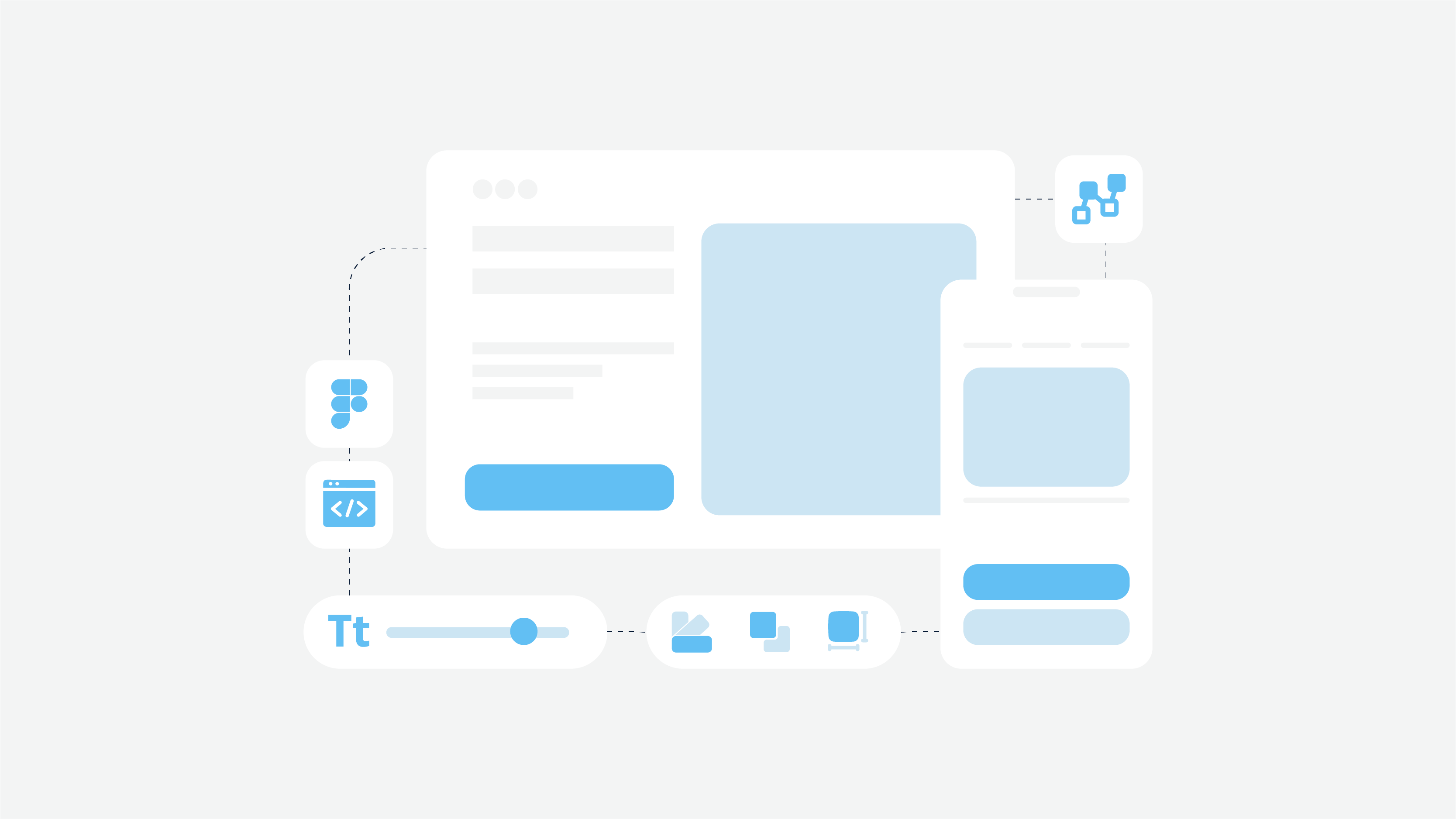
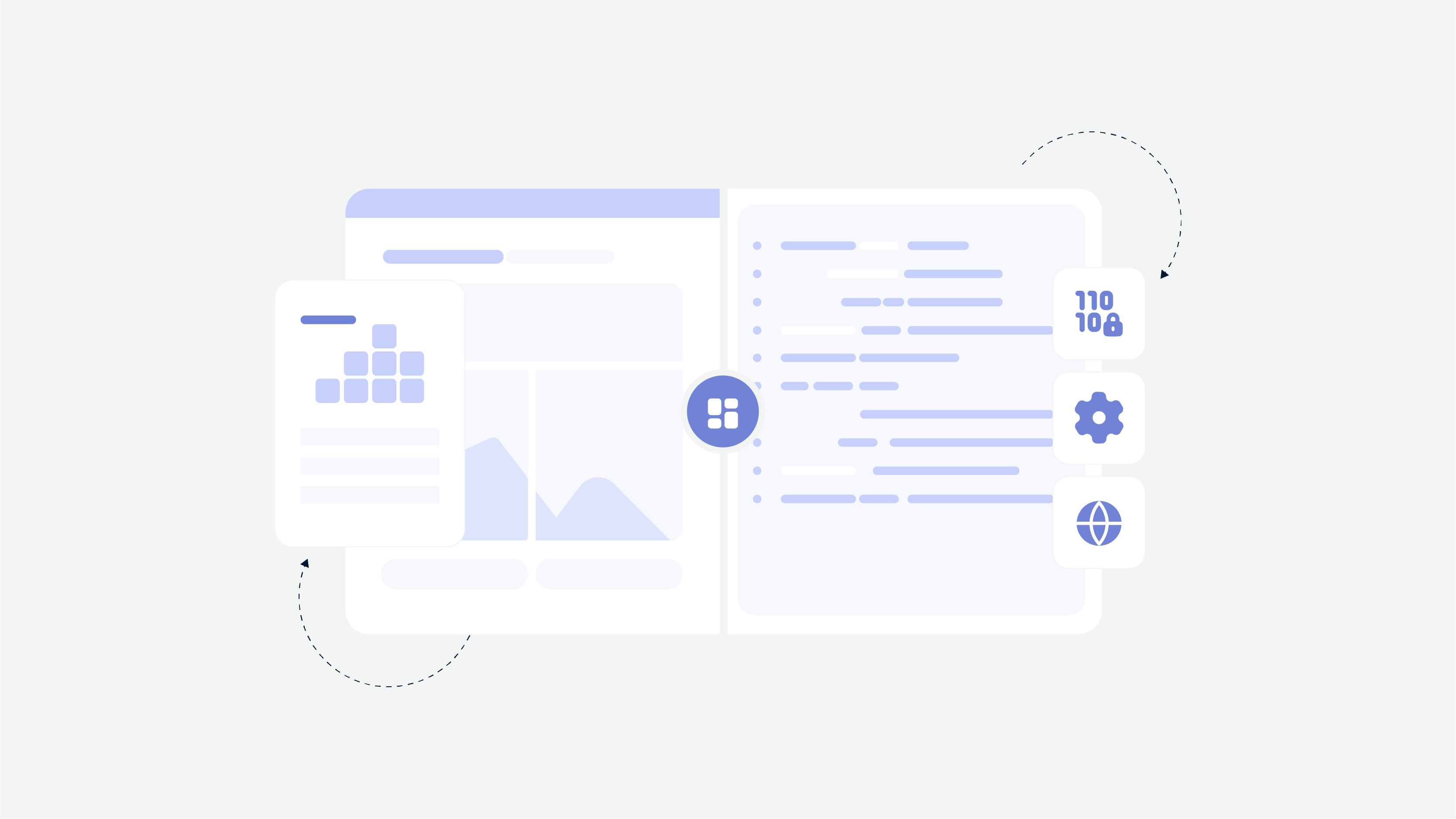
Figma-First Library: We created a modular and version-controlled design system in Figma, allowing designers from around the world to work efficiently within a shared structure.
Atomic Design Principles: Components were built from the ground up, starting with foundational atoms and progressing into larger templates and page-level patterns. This allowed flexibility while preserving coherence.
Code Implementation: Our engineering teams collaborated directly with Assurant’s internal dev teams to implement matching components in Angular, ensuring 1:1 parity between design and production.
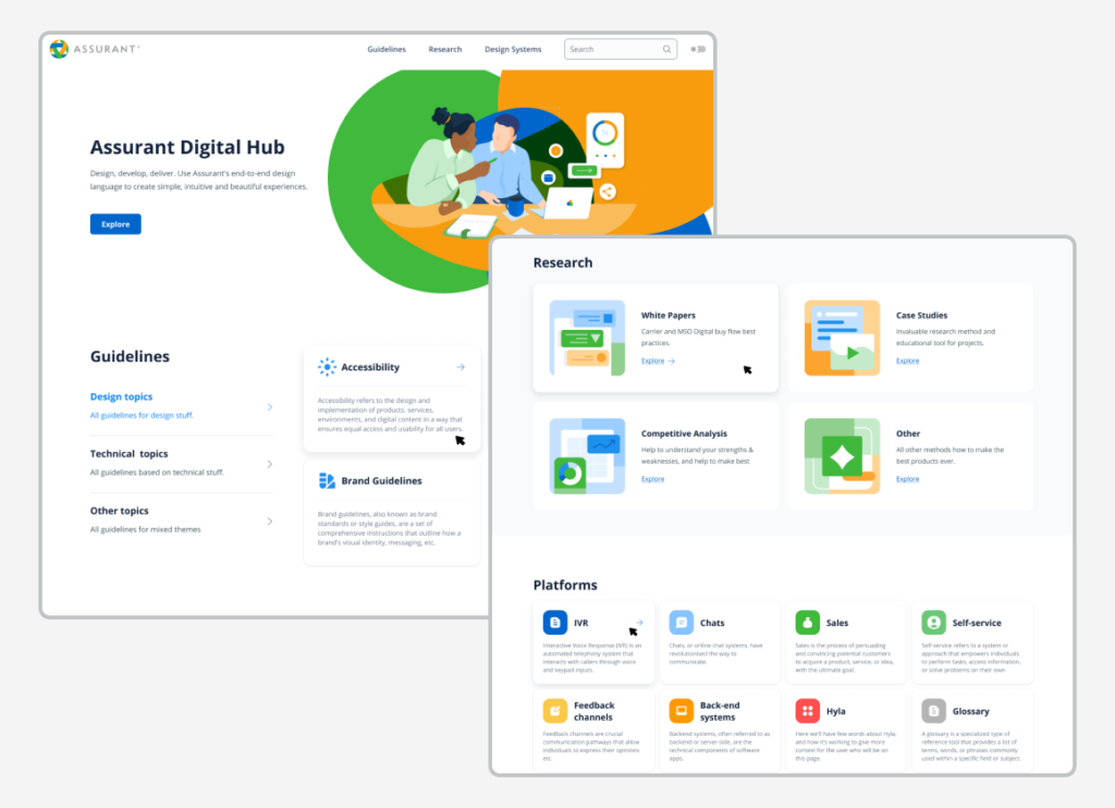
Documentation Site: We created a live documentation hub where developers could see code snippets, usage guidelines, accessibility notes, and contribution workflows.
Step 4 – Testing and Iteration
Internal Pilots: Select teams were invited to pilot the design system with real features. This helped validate component flexibility, surface missing edge cases, and streamline contribution workflows.
Cross-Team Feedback Loops: We introduced feedback channels across design, product, and engineering groups to ensure the system evolved with real usage needs, not static assumptions.
Governance Model: We helped Assurant establish a scalable governance structure, including contribution guidelines, component review committees, and a backlog prioritization system.
Step 5 – Implementation and Scaling
Rollout Strategy: The design system was introduced in phases, beginning with high-impact products and gradually expanding to additional business units and regions.
Team Enablement: We led live training sessions, created onboarding materials, and provided office hours support to internal teams across time zones.
Living System Maintenance: Processes were put in place to track usage analytics, update components, and ensure long-term adoption and alignment.
The Results – How the Design System Impacted Assurant
100% Design Consistency Across Products: Teams across the globe now speak a shared design language, dramatically improving usability, brand trust, and efficiency.
Reduced Time-to-Market: Product teams reported faster UI development and shorter QA cycles, thanks to tested, reusable components.
Improved Developer Experience: Engineers now work with well-documented, standardized code, reducing rework and accelerating feature development.
Scalable Architecture: The modular system now supports Assurant’s expansion into new geographies and product lines without rebuilding UI foundations.
Key Takeaways from the Assurant Design System Project
Takeaway 1: Centralization fosters speed and coherence. By consolidating fragmented design efforts, Assurant unlocked faster product delivery and consistent customer experiences.
Takeaway 2: Governance is just as important as components. A strong governance structure ensured sustainability, quality control, and cross-team collaboration as the system scaled.
Takeaway 3: Start with shared principles, build for flexibility. Supporting multiple brands doesn’t require separate systems — it requires a smartly architected, token-based foundation.
Takeaway 4: Treat your design system as a product. Ongoing maintenance, documentation, support, and internal marketing were critical to achieving high adoption rates.
How Cadabra Can Help You Build a Scalable Design System
Cadabra Studio specialises in design system creation for highly regulated industries like insurance and healthcare, tailoring solutions for your business. Cadabra Studio can help businesses create their own design system tailored to their specific needs. Learn about our Redesign Service — a proven process to modernise without losing brand essence, so a smooth transition to a new design system.
👉 See our Insurance Solutions and how we tailor UX/UI for complex insurance needs to give you a competitive edge.
A design system is a long-term investment: reduced costs, faster time to market, improved user retention and brand loyalty, so it’s an essential part of your business strategy.
Conclusion
The Assurant case study demonstrates how a well-designed and strategically implemented enterprise design system can align complex global operations under a single visual and functional framework. In a company where teams span regions, brands, and development stacks, Cadabra Studio helped deliver a system that brought consistency without compromise.
By focusing on scalability, accessibility, and modularity, the design system empowered Assurant to move faster, reduce redundancies, and elevate design quality across their digital ecosystem. More than just a set of components, the system became a unifying language for cross-functional teams to innovate together.
This project is a prime example of how a design system, when treated as a living product and governed properly, can unlock both creative freedom and operational efficiency – giving enterprise organizations the edge they need to compete in today’s rapidly evolving digital landscape.
Ready to Transform Your Insurance Business with a Scalable Design System?
FAQs
What is the process of creating a design system for an insurance company?
Creating a design system involves following a step-by-step process to ensure strategic planning and execution. This includes several key steps, such as audience research, core design principles, reusable components, and integration with existing tech. This ensures a consistent design language and a better user experience across digital platforms.
How do design systems benefit insurance companies?
Design systems provide scalability, consistency, and operational efficiency. They streamline digital experiences, reduce customer support queries,s and speed up time to market, so they’re essential for insurance companies to stay competitive. Additionally, design systems advocate for design consistency by gathering input from various stakeholders to ensure the system effectively serves the wider organization.
How long does it take to implement a design system in the insurance industry?
The implementation timeline varies depending on the complexity and scope of the project. Typically, it’s an ongoing process of several months, including research, development, testing,g and iteration to ensure the design system meets the company’s needs and industry standards. Creating design components that can be utilized in multiple contexts enhances reusability and flexibility within design systems.
What’s the difference between a design system and a style guide?
A design system is a comprehensive framework of reusable UI components, design patterns, and guidelines for a consistent design language across products. Breaking down designs into individual elements is crucial for avoiding design duplication and ensuring consistency across projects. A style guide is just visual elements like typography and colour schemes, so it has a more limited scope.
How can a design system improve user experience for insurance clients?
A design system gives users clarity and consistency across digital touchpoints.