Over the last years, the role of UX writing in design increased significantly. Nowadays, it is no longer about textual components but about helping people get a superior user experience.
In this article, we’d like to talk about the importance of UX writing in UI/UX design and why it matters. Have a nice reading!
What Is UX Writing?
UX writing is a process of creating readable and convincing texts that help the user interact with the app and website interfaces. You often see such texts on login screens, error messages, welcome screens, button text, etc.
By delivering the right information at the right time, UX writing helps users easily navigate through a product and use it effectively. Also, UX writing forms the brand tone and the voice of your product.
There are four basic principles of good UX writing: the copy has to be clear, concise, useful, and human. Let’s look at how these principles work.
Clear. Often words on the website describe software issues, not human problems. With UX writing, we remove technical terms and give users leading roles.
Concise. Being concise doesn’t mean short. Instead, it means more effective. When the text is concise, each word serves a specific purpose.
Useful. UX writing challenges to bring people closer to what they want to achieve. You can do it with the help of a call to action (CTA). It prompts users to take the next step — and this step should be towards their goal.
Human. If your product sounds human, it’s easier for people to trust you. Websites and apps are created by people for other people. Don’t forget about it.
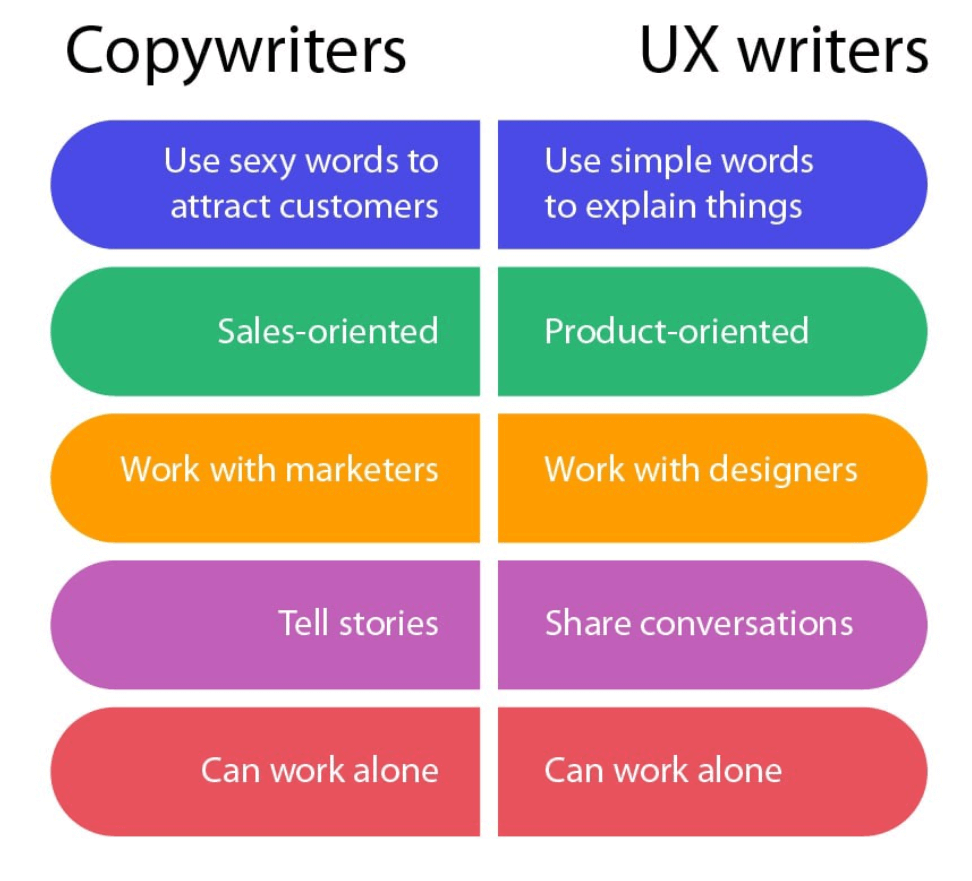
What Is UX Writing? When all these principles are implemented in UX writing, users feel that the people who created the product care about them. UX writing makes the products open to users so that they can open up to the product, too.
Types of UX Content
Basically, the UX content includes pop-up messages, warnings, alerts, notifications, error messages, transactional messages, un/subscribe confirmation messages, forms, and more. However, to get the full picture of UX writing, we list five main types of UX content to consider. Let’s have a look at the examples.
Coach marks. A coach mark points users’ attention to the targeted UI elements on the page, calls attention to new features, nudges users in the right direction, and guides them during onboarding.
Confirmation messages. This type of UX content confirms that a task is completed.
Email messages. Writers use them to welcome users after successful registration and provide detailed instructions, critical information, etc.
Empty state messages. The text in empty state messages appears when there is no data to display on the page. Such information can educate, delight, and motivate users to take action. It is useful to combine the messages with simple, friendly images.
Error messages. When the system or an application fails, clear communication minimizes the stress, explaining the reasons for problems. If possible, there needs to be a friendly solution.
Dropdown menu. The list of dropdowns consists of various options to choose from, so users need to understand them to make a choice quickly. Therefore, the words in the list have to be very clear, concise, and familiar.
Loading times. Texts are important when the website or app is loading and users need some interaction. The good idea is to put an animation accompanied by clear text. It can be interesting statistics about your platform, facts, or jokes — whatever fits your tone of voice.
Each type of UX content has to use clear and simple language and a positive, friendly tone.
The Importance of UX Writing
UX writing is the bridge between the product and the consumer. Products have a short period of time to impress users, and UX writing plays a critical role in creating the first impression with a new product by setting the tone for user experience. Without words, there is always the risk of being ambiguous
Let’s say your business is a human. With the help of UX writing, your human becomes the most empathic person in the world. UX writing helps to tell users: “I know, you have to wait, so here are some fun facts that make the time fly. I understand you might not know this, so I will show you how to make it right. I won’t judge you. I won’t laugh you out. I’m here for you because I’m your friend. Together, we can do something awesome!” Look how Mailchimp conveys such friendly and warm messages.

When people feel they are cared for, they will keep using your product and become your loyal customers.
The UX writing process is an inevitable part of UI/UX design. During the product development process, UX writers start working from the very beginning — product concept development. An ideal workflow is the following: a marketer, designer and writer set clear goals for each page of the website or screen of the application, plan its logic, agree on how to combine visuals and text. Then a writer develops the concept and texts, and a designer gives life to the whole picture. Great website is a result of harmonious teamwork.
The lack of collaboration may lead to numerous edits, or even worse — broken sites in conversions to leads. That’s why, if you want to create a successful product, include UX writers not at the end of the process but at the beginning.
With this in mind, several UX writing samples prove the importance of texts for your product and business. Let’s look at how famous brands communicate with their customers. UX writing becomes a part of their success.
Airbnb. To minimize a common fear that users experienced during the booking flow, Airbnb used UX writing power. When buying anything online, people like to have a holistic view of pricing and other details before committing to payment.
Knowing this, Airbnb lets users know that “You won’t be charged yet” when they press the “Book” button.

This small bit of text reduces the fear that people have about being charged and allows them to comfortably move on to the next step in the booking process.
Slack. When new users join Slack workspace, their first interaction starts from Slackbot — a chatbot that acts as a live support assistant and teaches users how to navigate the interface.

Slackbot’s friendly tone and voice make the supporting process highly interactive. New users feel like they are reaching out to a friend who knows all the answers and eager to help.
Google. UX Writing has improved user engagement in Google hotel search. Previously, there was a label that motivated users to “Book a Room.” After extensive research, UX writers found that the phrase was too firm for the early stage of the user’s decision-making process.

After switching “Book a Room” to “Check Availability” — a phrase that matched users’ mindset in this stage — the team saw a 17% increase in engagement.
If the listed above samples motivate you to bring some changes to your website, schedule a call with the managers from Cadabra Studio. Our professional designers will effectively modify its appearance and create the voice of your product.
Who Can Do UX Writing?
UX writers are significant specialists in creating the experience of a product. They are embedded within design teams, working hand-in-hand with UX and UI designers, UX researchers, and information architects to ensure that product layout and wireframe perfectly work together. As members of the design team, they conduct research, analyze UX practices, and create entire user experiences from end-to-end.
UX writers use the brand tone, voice, and personality to digitally guide users through various actions on their site. To be specific, copywriters, content writers, content strategists can tame the art of UX writing.
What Does a UX Writer Do?
UX writing is a mixture of responsibilities across writing, communication, psychology, and design. The list of duties looks like this:
Creating texts, descriptions, messages within digital products;
Maintaining guidelines and style guides that include brand tone and voice;
Collaborating with UX designers, product teams, and researchers to improve text;
Understanding key product strategy metrics and tying them into content strategy.
Conducting the testing of UX writing.
By hiring the UX writer in your team, you’ll get excellent UI copies, highlighted design flaws, better UX prototypes, and much more. That’s what you hire a UX writer for.
If you are looking for a dedicated team of UX designers and writers, you can hire Cadabra Studio. We build outstanding products that talk with customers.
Typical Mistakes in UX Writing
UX writing mistakes can be very confusing and taxing to find at times, but they can break your product. In this passage, we’ll cover bad UX writing examples that should be avoided.
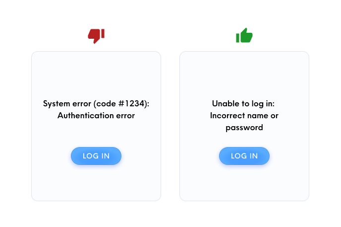
Mistake #1. Too Much Jargon and Technical Terms
Unknown technical terms or phrases confuse users. The best solution is to avoid industry-specific terms. Use understandable words to both beginning and advanced users.
Mistake #2. The Usage of Lorem Ipsum
Even for building a mock-up product, it is more effective to use real content. The usage of “Lorem Ipsum” in your product makes designs look alien and odd. The difference we present below.
Mistake #3. Active Usage of Passive Voice
The passive voice sounds very verbose and complicated. Use an active voice, so the users understand you better.
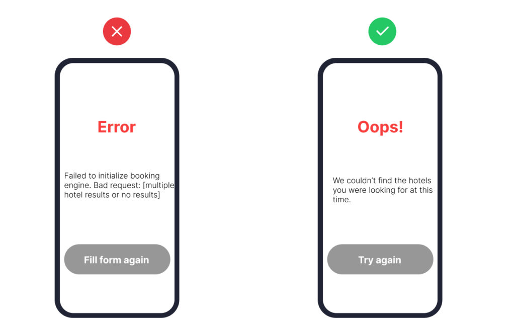
Mistake #4. Inflated and Wordy Sentences
Inflated sentences in the product don’t make any sense for users. Nobody is going to read small-sized long sentences. If you want to catch the user’s attention, make the content concise, short, and crisp. Write to make every word tell.
Mistake#5. Mixing “Me”/”My” With “You”/”Your”
It seems strange when the user sees both forms of addressing in the same sentence.
Don’t: “Activate your discount in My Account.”
Do: “Activate personal discount in My Account.”
It is easier to avoid mistakes if you know the tips for better UX writing. Let’s have a look at them.
Tips for Better UX Writing
Every product has a voice. Many factors contribute to users’ perception of voice: typography, visual appearance, and the words themselves. The following tips help to understand the sense of UX writing and create the voice for your product.
Tip #1. Make It Clear
Some words are hard to read or take a while to pronounce (even this takes a time to say). Choose the words wisely. Users don’t have to guess what you mean.
Tip #2. Keep It Concise
Even if the long-size copy contains beautiful words, users aren’t there to enjoy it. They will be grateful if you don’t waste their time. The best solution here is to create bite-sized content. Users may not have the patience to read long-form text on their devices when they’re navigating through your app/website.
Tip #3. Keep It Constructive
Constructive language is easy to follow. UX writing is about making the user experience easy, so use direct CTAs. And again, avoid passive voice.
Tip #4. Keep It Consistent
Users don’t have time to guess what writers and designers meant. Give them consistent cues to direct their attention. For example, when you have a button ‘Book a Room’ online, don’t change it to ‘Reserve a Room’.
Using the same terminology across your product, you are introducing your voice, tone, and language. It helps to create a dialogue with users. Consistency makes UX writing easier to understand.
Tip #5. Keep It Conversational
The product gets closer with its customer if they have a conversation. Users don’t have to know everything, and you’re there to inform them and provide options.
The delight is in details, whereas the power is in words. The list of tips is much longer. In this passage, we presented the most effective ones. As we mentioned previously, UX writing is an art that consists of details. If you follow them, you’ll create a strong connection with your customers.

Wrapping Up
User experience is the key to achieving loyalty. If you want to increase trust in the company and qualitatively develop relationships with customers, you need to improve it. And UX writing will help with this. UX writing acts as a helping hand, making the product experience clear and intuitive.
UX writing is a relatively new sphere, but its value is enormous. Many companies are constantly improving their products, services and trying to create their own way of communication.
By investing in UX writing, you’ll make your product inclusive and closer to people. Everybody needs to understand you, so why not speak to people using your brand tone and voice?
With the amount of effort your team puts in, your product deserves shining at the end of the process. UX writers help you to achieve this.
Cadabra Studio has a professional design team that does its job best. If you’re a business owner who wants to be always on the wave, contact our managers. We can make your product talk to customers.


