
Disclaimer: This article is based on a real case study. However, to protect client confidentiality, names, specific identifying details, and certain aspects of the project have been altered. The core lessons and insights remain true to the original experience.
As the CTO of Cadabra Studio, I’ve seen my fair share of tech nightmares. But nothing quite prepared me for the day a brilliant yet struggling medical startup landed in our virtual workspace, desperately seeking help to save their failing project.
This is a story about the power of medical UX design and how it transformed a failing healthcare startup into a success.
The Unexpected Video Call: Remote Patient Monitoring
Picture this: It’s a Tuesday afternoon, and I’m knee-deep in code when a notification pops up on my screen. “Urgent meeting request: Dr. Sarah Chen – MediTrack Startup.”
Now, “urgent” in our world usually means a server’s on fire or a client’s website just turned into a digital Jackson Pollock. But Dr. Sarah Chen? She was about to redefine urgent for us.
As her face appeared on my monitor, you could practically feel the caffeine-fueled intensity radiating through the screen. “We have a revolutionary patient monitoring system,” she said, eyes wild with a cocktail of brilliance and desperation, “but no one can figure out how to use it. Can you help us?”
The Challenge: A Brilliant Idea with Usability Testing Techniques Nightmare
Dr. Chen’s brainchild, MediTrack, was genuinely impressive – on paper. A comprehensive system for tracking patient vitals, medication schedules, and treatment progress? Sign me up! But as she navigated through the demo, I felt a growing sense of dread. This wasn’t just confusing; it was an incredibly complex and frustrating user interface that seemed intentionally difficult to navigate.
Dropdown menus bred like rabbits. Icons looked like they were designed by an abstract expressionist. And the navigation? Let’s just say if this were a real hospital, patients would be flatlining while docs tried to find the “call nurse” button.
Even Dr. Chen, MediTrack’s proud mama, stumbled through the demo like she was walking through digital quicksand. Our lead UX designer, Anna, shot me a look that screamed, “Houston, we have a problem.” We were facing one of the most significant healthcare startup challenges I’d ever seen: a brilliant product crippled by poor medical software usability.
Improving user satisfaction was crucial to addressing the usability nightmare. By prioritizing user needs, we aimed to create an intuitive and engaging design that would meet business goals and exceed user expectations.
Identifying the Core Issues: Beyond Aesthetics
Over the next few days, our team dove into MediTrack’s code like it was the world’s geekiest swimming pool. What we found wasn’t just a cluttered interface; it was a fundamental disconnect between the software and the real world of medicine.
Imagine a stethoscope that requires a Ph.D. to operate, and you’re getting close to MediTrack’s level of user-unfriendliness. Critical information was buried deeper than ancient medical texts. The workflow resembled a game of digital Twister rather than a day in a hospital.
The lightbulb moment?
This system was built by brilliant minds who knew everything about medicine and nothing about how actual humans interact with technology.
It was clear that what MediTrack needed was a strong dose of medical UX design, incorporating user feedback to ensure the technology is both effective and tailored to user needs.
Introducing User-Centered Design (UCD)
User-Centered Design (UCD) is like the secret sauce that turns a good idea into a great product. It’s all about putting the user at the heart of the design process, ensuring that every decision made is with their needs, behaviors, and motivations in mind. In the healthcare sector, this approach is not just beneficial; it’s essential.
Imagine trying to navigate a hospital with signs written in a foreign language. Frustrating, right? That’s what it feels like for healthcare professionals when they use poorly designed software. UCD flips the script by making sure that the software speaks the same language as its users. It’s about understanding what healthcare providers need to do their jobs effectively and designing tools that make their lives easier.
Incorporating UCD into the design process means diving deep into the world of healthcare professionals and patients. It’s about observing their workflows, understanding their pain points, and creating solutions that fit seamlessly into their daily routines. This approach not only improves patient care but also enhances the overall patient experience.
By collaborating closely with users and stakeholders, we ensure that the products we create are not just functional but also intuitive and easy to use. This collaboration is the cornerstone of UCD, and it’s what makes it so powerful. When healthcare providers have tools that work for them, they can focus on what really matters: improving patient outcomes.
In the fast-paced world of healthcare, UCD is the key to creating products that are not only user-friendly but also effective. It’s about designing with empathy, understanding the unique challenges of the healthcare industry, and creating solutions that truly make a difference.
The Strategy: Marrying Medical Precision with User-Centric Design
We knew we had to redesign the entire user experience without losing the medical mojo that made MediTrack special. Our battle plan was simple:
-
Declutter the interface (Marie Kondo would be proud)
-
Align the workflow with how docs and nurses actually work within healthcare systems, addressing the diverse needs of patients and healthcare providers while navigating stringent regulations on data security and privacy
-
Make critical info pop like it’s wearing neon in a coal mine
This strategy was at the heart of our approach to healthcare user experience. We weren’t just making things pretty; we were making them work better for the people who needed them most.
Resistance and Breakthroughs: Convincing Stakeholders
Not everyone was thrilled with our plans to “dumb down” their baby. Dr. Chen and her team looked at us like we’d suggested replacing their sophisticated algorithms with a Magic 8 Ball.
It took more meetings than I care to count, fueled by enough coffee to keep Seattle in business for a year. But slowly, with each prototype we showed, the light of understanding dawned in their eyes. They finally got it: simplicity and power could coexist. It wasn’t about dumbing down; it was about smartening up.
This process of stakeholder education is a crucial part of medical UX design. It’s not just about convincing users; it’s about helping creators see their product through the eyes of those who will use it every day. Health technologies that meet regulatory requirements while being user-friendly are essential in this context, as they ensure that medical equipment is both effective and accessible.
Overcoming Technical and Regulatory Challenges
Implementing User-Centered Design in the healthcare sector is no walk in the park. It’s more like navigating a maze with a blindfold on. The technical and regulatory constraints can be daunting, but they’re not insurmountable.
One of the biggest hurdles is ensuring that the products meet stringent regulatory requirements while still being user-friendly. It’s a delicate balancing act. Healthcare providers need to create software that is secure and compliant with data privacy laws, but also intuitive and easy to use. This is where usability testing techniques come into play.
Techniques like the “think aloud” method, where users verbalize their thought process while interacting with the software, can provide invaluable insights. These insights help designers identify areas for improvement and make data-driven decisions to enhance the user interface. It’s like having a roadmap that guides you through the maze.
Another challenge is integrating multiple devices and platforms to create a seamless user experience. In a hospital setting, healthcare professionals use a variety of tools and systems. Ensuring that these systems work together smoothly is crucial for efficient patient care. It’s like making sure all the gears in a machine are perfectly aligned.
Healthcare providers also need to consider the needs of diverse user groups, including patients with disabilities. Inclusive design is not just a buzzword; it’s a necessity. By designing with accessibility in mind, we can create products that are usable by everyone, regardless of their abilities.
Overcoming these challenges requires a deep understanding of the healthcare sector and a commitment to user-centered design. By focusing on the needs of healthcare professionals and patients, we can create products that improve patient care and outcomes. It’s about turning obstacles into opportunities and creating solutions that truly make a difference.
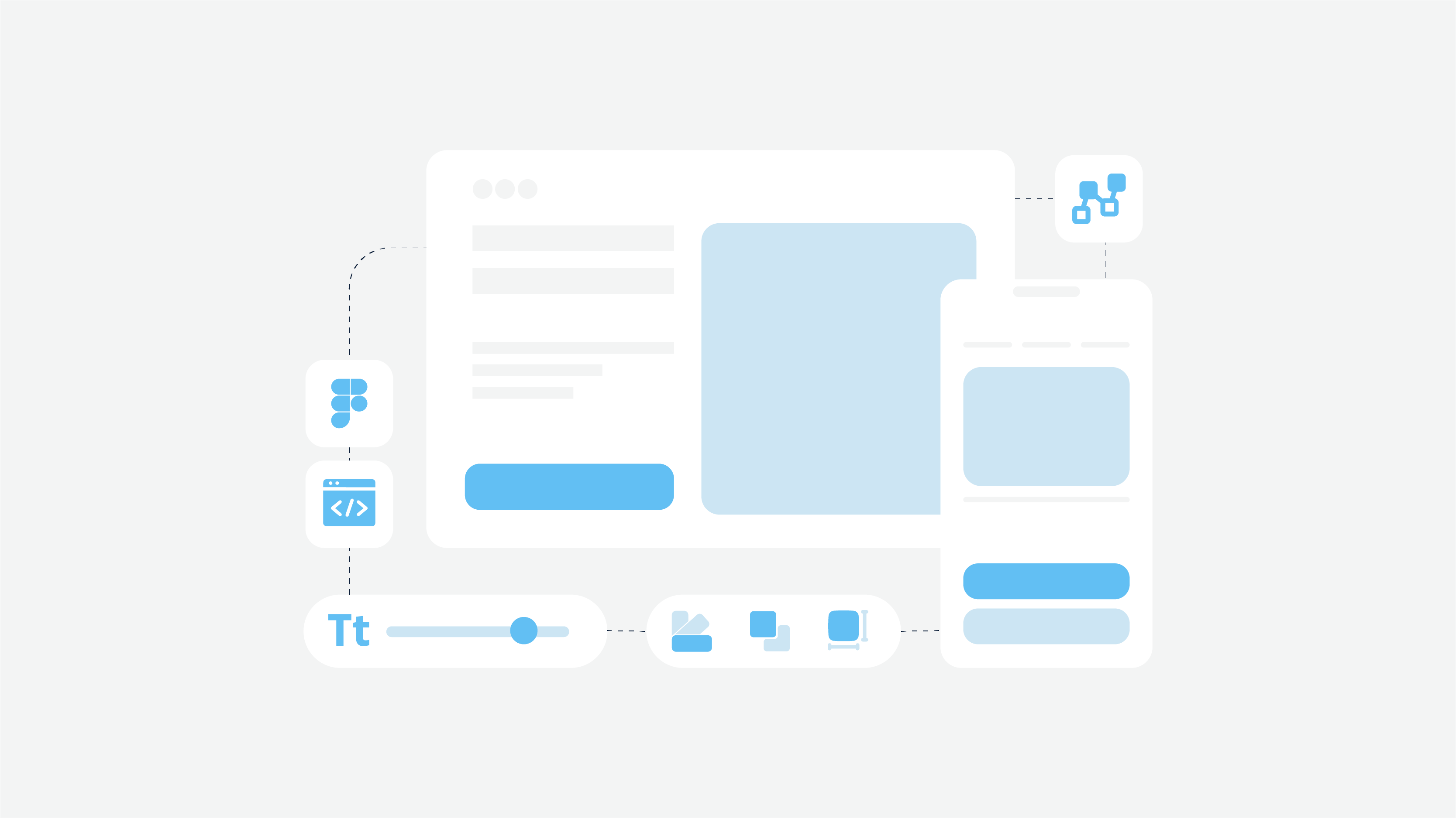
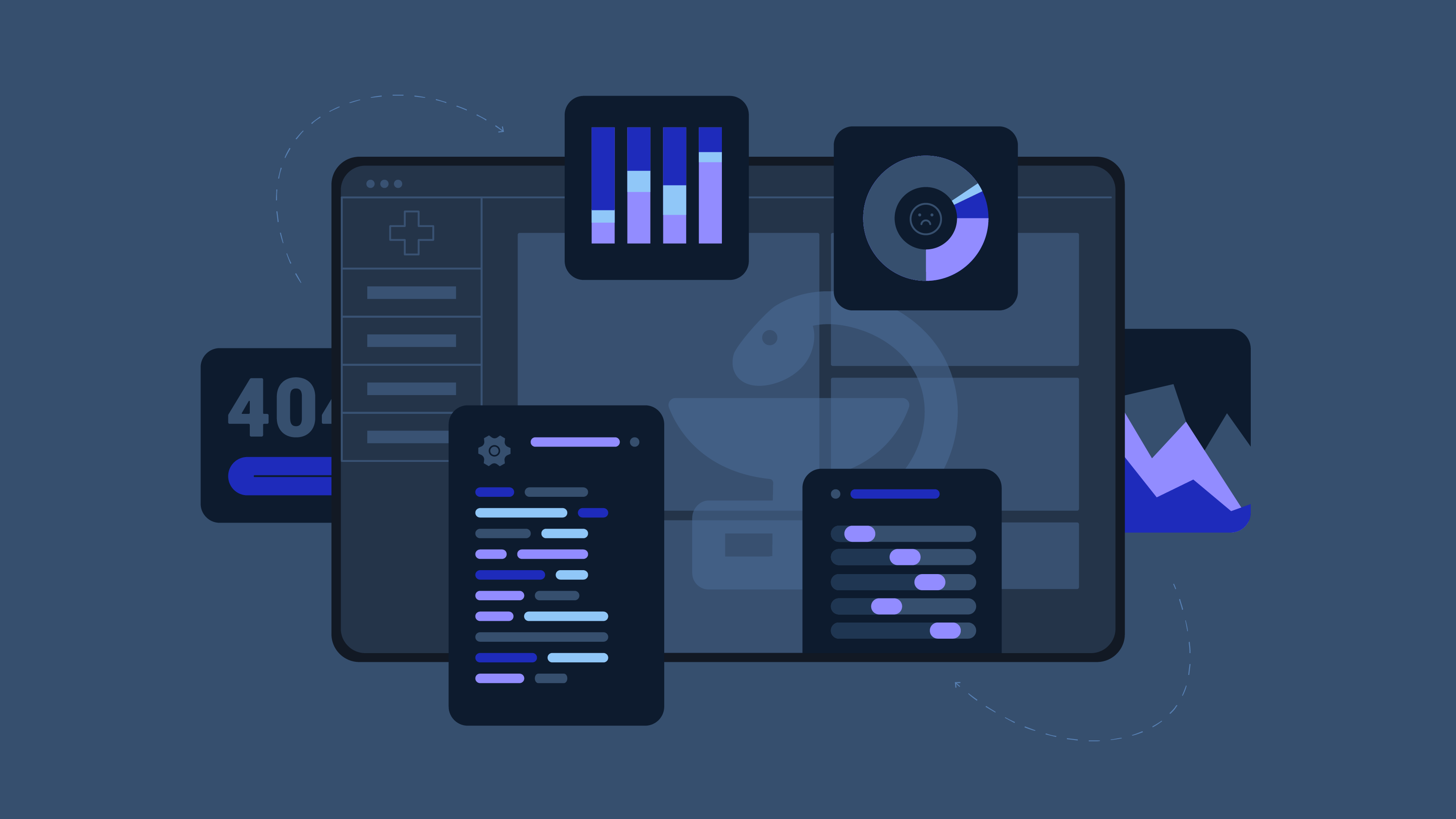
The Redesign Process: Balancing Functionality and Simplicity
Our UX team, with Anna at the helm, went into overdrive. They shadowed nurses and doctors like particularly persistent ghosts, created more wireframes than I thought humanly possible, and debated every pixel like it was the last one on Earth.
The result?
A dashboard that served up critical patient info faster than a short-order cook slings hash. Smart defaults that made the software feel almost psychic. And a navigation system so intuitive, you’d think it was reading minds.
This is where the rubber meets the road in healthcare user experience. It’s about creating interfaces that feel natural and effortless, even in high-stress medical environments. The redesigned dashboard also helps in monitoring vital signs effectively, ensuring timely alerts and diagnosis by continuously tracking and analyzing important patient health metrics such as temperature, heart rate, and oxygen saturation.
User Testing: Surprising Insights from Healthcare Professionals
Then came the moment of truth: user testing. We brought in medical pros who’d never laid eyes on MediTrack before. Watching them navigate the new interface was like seeing a swan take to water – graceful, natural, and oddly satisfying.
But the real gold? Their feedback. These frontline heroes pointed out nuances we’d missed and suggested tweaks that made the system sing. It was like they were finishing the lyrics to a song we’d started.
Remote patient monitoring was also tested and improved based on their feedback, ensuring that our IoT-driven solutions could effectively facilitate continuous and real-time monitoring of patients’ vital health metrics.
This phase of medical UX design is crucial. It’s where theory meets practice, and where we learn if our solutions truly solve the problems we set out to address.
The Launch: Nervous Anticipation and Initial Feedback
When launch day rolled around, our nerves were more frayed than a doctor’s after a 36-hour shift. As MediTrack 2.0 went live, we huddled around screens, watching feedback roll in like the world’s most nail-biting Twitter feed.
The response?
It was like we’d given the medical world a shot of digital adrenaline. Users weren’t just pleased; they were ecstatic.
“It’s like the software reads my mind!” gushed one nurse. High praise indeed for a bunch of geeks who couldn’t tell a scalpel from a spatula.
The Results: Transforming User Experience and Patient Outcomes
Within months, MediTrack wasn’t just surviving; it was thriving. Their user base tripled faster than a virus spreads in a kindergarten class. Hospitals that had previously dismissed the system were now banging down Dr. Chen’s door.
The startup that had stumbled into our office on life support? It was now the talk of the medical tech world. And all it took was a healthy dose of UX magic.
This turnaround demonstrates the profound impact that good medical UX design can have on a healthcare startup’s success. It’s not just about making things look good; it’s about creating tools that genuinely improve workflow and patient care.
Lessons Learned: Key Takeaways for Healthcare UX Design
This wild ride taught us more about healthcare UX design than a year of med school (not that we’d know):
- Balance medical brains with UX brawn
- Nothing beats watching the actual users in their natural habitat
- Simple doesn’t mean stupid – it means smart
- Sometimes, you need to educate the experts about why UX matters
These lessons are the foundation of effective medical software usability. They remind us that in healthcare, user experience isn’t just about aesthetics – it’s about creating tools that seamlessly integrate into the workflow of healthcare professionals, ultimately improving patient outcomes.
For those hungry for more details on healthcare UX design, we’ve unpacked all our best practices and insights in our guide: ‘User-Centered Design in Healthcare Software: Best Practices and Impact.’ It’s a deep dive into everything we touched on here with MediTrack, and then some.
The Ongoing Evolution of Medical Software Design
The MediTrack makeover was more than just a project for us at Cadabra Studio. It was a wake-up call. In the high-stakes world of healthcare tech, bad UX isn’t just annoying – it can be downright dangerous.
As tech keeps evolving at breakneck speed, so must our approach to designing medical software. It’s not just about cramming in cool features; it’s about making complex systems as easy to use as a tongue depressor.
For all you healthcare innovators out there, remember: in medical tech, great UX isn’t a luxury. It’s as vital as clean needles and steady hands. It’s about creating tools that fit into a healthcare pro’s workflow smoother than a well-oiled stethoscope.
Here at Cadabra Studio, we’re not just pushing pixels; we’re pushing the boundaries of what’s possible in healthcare user experience. Because at the end of the day, it’s not just about building software; it’s about giving medical heroes the digital superpowers they deserve.
So, got a healthcare app that’s flatlining? Don’t wait for a miracle. Sometimes, all it takes is a little UX CPR to bring it roaring back to life. Trust me, your users (and their patients) will thank you.
Wondering how to breathe new life into your healthcare software?
Let’s chat. At Cadabra Studio, we specialize in turning digital headaches into user experience triumphs.