We believe you know how hard it can be to park your car in an overcrowded parking lot somewhere in downtown. Mainly it is a real challenge when you don’t even know whether there are vacant parking spots, or you will have to leave and look for another place to park.
That is what our client wanted to take care of and help people save their time. He ordered the development of a parking app from Cadabra Studio. We were glad to deal with a new project and now want to share the development particularities and challenges we needed to overcome.
More About The Project
Business development managers at Cadabra Studio got a request from the new client where he described the problem that could be solved with the software. The client had the startup idea in mind concerning developing an app that will help people find a vacant parking spot beforehand and book it.
The lack of parking lots and a significant number of cars in the region where the client resides (Atlanta, GA, USA) encouraged the client to come up with a solution. As the client needed app development investments, he decided to order the iOS app design concept to pitch an app idea to investors.
Software design makes the first and often the most important impression. That is why you need to hire a dependable design team like Cadabra Studio. Get in touch with us!
He found Cadabra Studio when he was looking for reliable outsourcing companies in Eastern Europe and provided us with project requirements. We coordinated all nuances, and our design team started working.
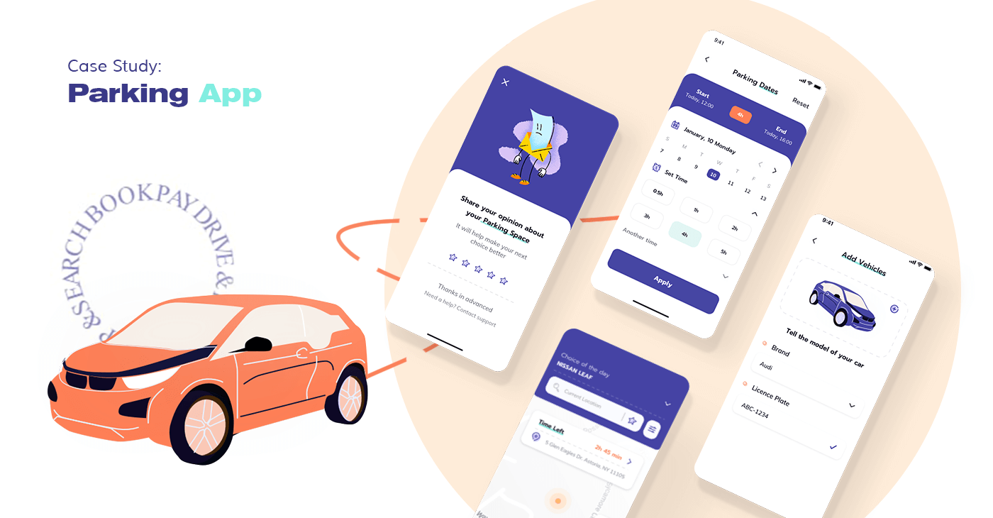
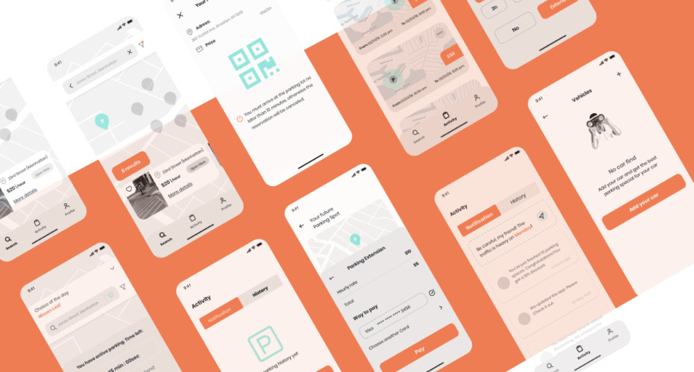
The parking app’s main goal was to let drivers do everything as quickly as possible, in a few clicks — search-book-pay-park-rate. Each parking lot should have a QR code at the entrance that users should scan upon arrival if they want to pay by cash. The payment must be available both in cash and cashless options, but cashless payment is much more convenient, of course.
As for parking lots, our client has negotiated with owners of different lots around his region concerning the integration of new software. And some of them supported this idea and cooperated with the client to make an app. It was the first iteration of the project. In the future, it is planned to extend the geography and make it available in other states.
Challenges And Issues Our Team Faced And Solved
As we noted above, the problem of parking lots and a limited number of spots was the major challenge that could be solved with the parking app. But when our team started to delve into the matter’s substance, we found out that this is not the only problem the client intends to solve.
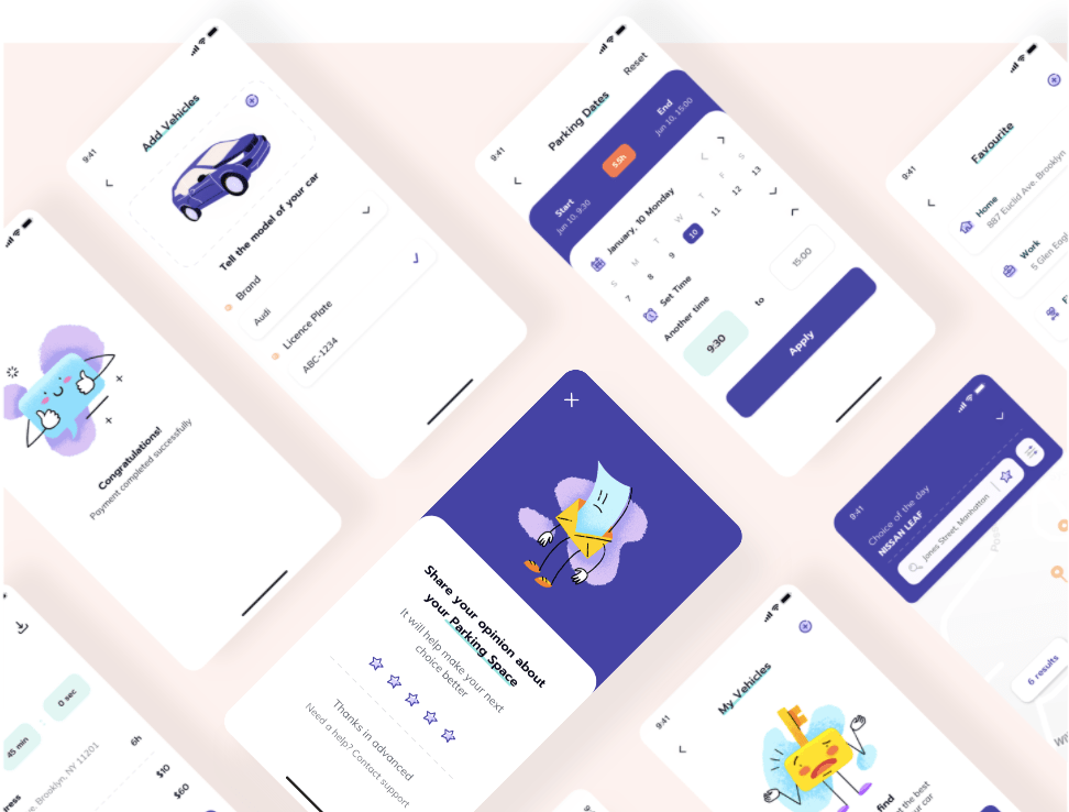
Apart from the inability to find a parking spot, schedule parking time, and book it, many drivers face problems when they can’t park a specific car type (oversized vehicle, or a car for disabled people), they don’t have detailed traffic information, parking services are limited. When we analyzed the market and existing apps, we saw that these apps lack the mentioned features.
Problems with booking. When the Cadabra Studio team thought about the booking feature and how it will work, we faced the problem with booking schedules. For example, if you booked a spot for 2 hours from 12 p.m. to 2 p.m., and you don’t have enough time to take your car, other users may already reserve this spot at 14.
And if the user arrives in the parking and sees that the spot is occupied, they will be angry and confused. The system should provide bonuses to such users and make automated rebooking to the nearby spot to avoid such situations. And we considered it. In turn, drivers who were late and didn’t extend the parking time will have to pay a fine.
Traffic jams and scheduling. Another challenge we needed to solve is to ensure that information about traffic jams and the travel time will be synchronized. For example, if you need to book a spot in 30 minutes, and you are 20 minutes away from the parking lot, but there are traffic jams on your route, the system will notify you that you cannot make it, and you need to change the booking time.
Thus, we identified the weak sides of other apps and elaborated on the strategy to make the new parking app more robust and useful for drivers. Our parking app will let drivers book a spot and share the car location, save places to favorites, and get all information about traffic jams.
The Analysis Of The User Persona
Another critical stage of the development process was the target audience identification. The Cadabra Studio design team conducted UX research and analysis of primary users who will use the parking app, singled out their pain points, and created a few portraits of typical app users.
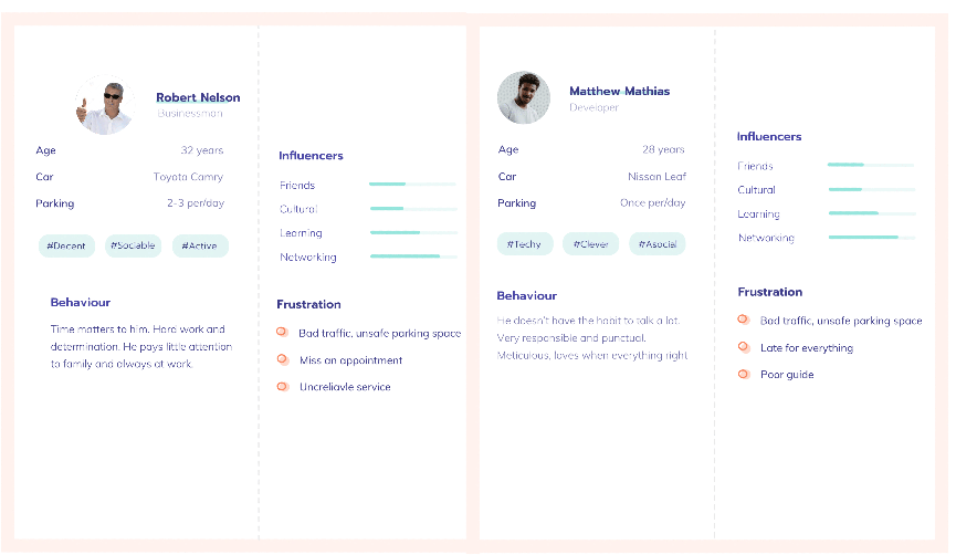
Name: Robert Nelson, 32 y.o.
Job: Businessman.
Car: Toyota Camry.
Parking: 2-3 per day.team’s primary roleThe
Behavior: Time matters. Hard-working person, and this quality doesn’t allow him to pay more attention to the family; he spends a lot of time at work.
Frustration: Bad traffic, not enough parking space; it is the main reason for delay.
Name: Matthew Mathias, 28 y.o.
Job: Developer.
Car: Nissan Leaf.
Parking: Once per day.
Behavior: He doesn’t like to talk a lot. Very responsible and punctual.
Frustration: It is difficult to plan travel time since nobody knows whether he will be able to find vacant spots or not.
Scope Of The Project And Team Roles
The Cadabra Studio team’s primary role was to build a design concept for a parking app, so 2 UI/UX designers and a project manager were involved in this process. It took 2,5 months for designers to conduct a detailed analysis of competitors and research to build a unique UI design and clickable prototypes for investors’ presentation.
In the future, as the design was created on the iOS platform, iOS and backend developers, along with QA engineers, will become part of the team.
Do you have an app idea, but you don’t know how to make it real? Let us be your assistant. Contact Cadabra Studio.
How The Design Process Was Carried Out
The first thing our designers planned to do was to create a distinctive style of a future parking app. Designers created a mind map (a structure of the future app in hierarchical order), user stories that show the customer journey in the app from beginning to the end, sketches, and low-fidelity prototypes. When the client approved low-fi prototypes, designers proceeded to the creation of high-fidelity (clickable) prototypes.
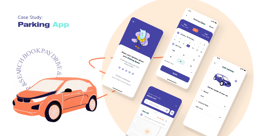
As for the user interface design, the design team paid rapt attention to the color scheme. It shouldn’t duplicate existing apps, and it must be outstanding. So designers used a purple color scheme to make a UI more pleasing to the eye, especially at night.
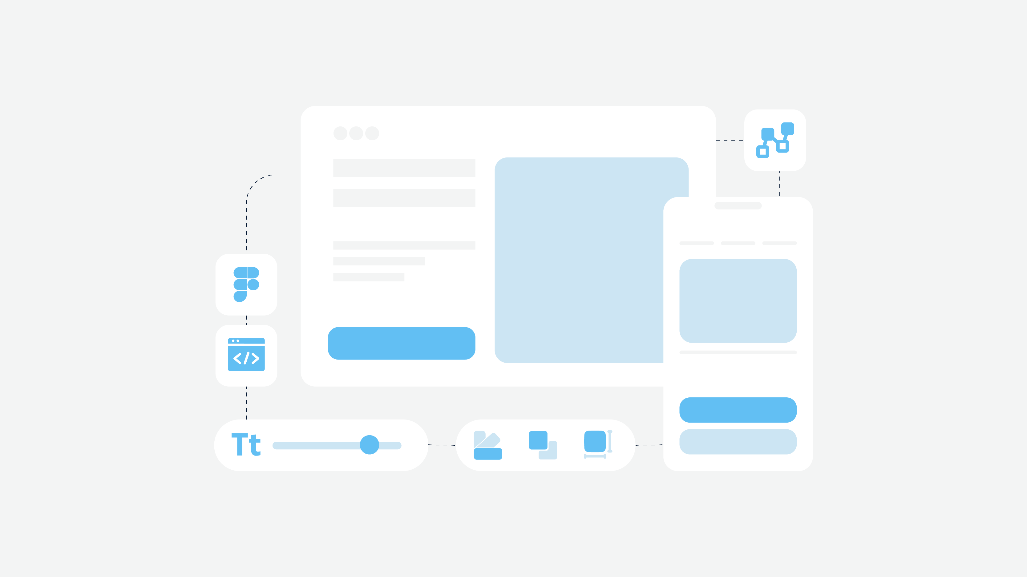
Also, designers built UI kits and style guides that contain all elements of the UI design of a specific project (parking app in our case). It will help them quickly scale the app up for the next app version and make quick changes after the testing stage.
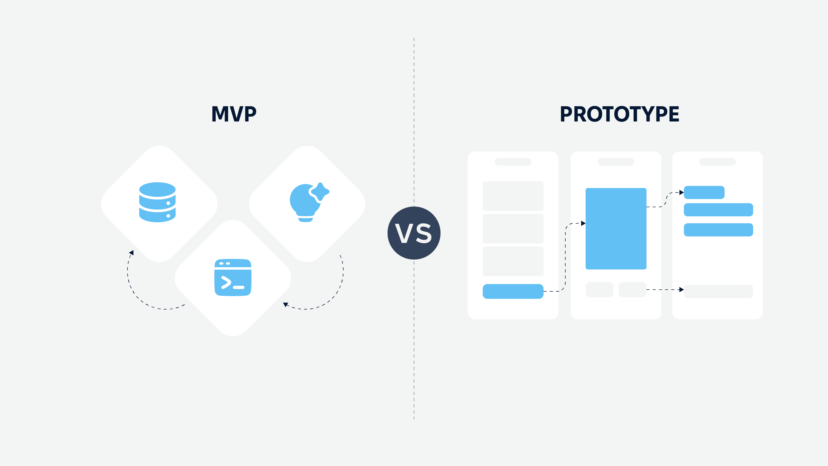
Finally, our specialists created a feature list for a parking app. Currently, the parking app has a range of MVP features (i.e., basic features), but the number of features can be extended when the development starts.
By the way, an MVP can be essential if you are afraid to fail. So get acquainted with the article about the MVP’s importance and learn more about its advantages.
Essential features for a parking app were the following:
Advanced search. A parking app allows users to find something they need with the help of advanced filters, so they can narrow down search results and find an appropriate parking lot. Default geolocation feature contributes to this process.
Parking info. All information about parking like price, rating, number of available spots is stored here. Also, you can find regulations of the specific town where the user is located.
Driver profile. Statistics, history of activity, and the info about all drivers’ vehicles (if they have a few cars) are stored here.
Booking. Users can book a vacant parking spot beforehand, or right on the parking lot, as they want.
Payment. Payment can be made with the card once the driver booked a spot or later via a QR code after parking a car.
Notifications. If users forget about the time to take a car, they will get a notification. But it is one of the examples. Notifications are often used in a parking app to let users know any necessary information.
Reviews/ratings. Drivers can rate a parking lot or even a spot (e.g., if it was dirty), read reviews (and leave them as well).
Also, the app has a gamification feature that improves customer experience and adds more entertainment. Each driver may get achievements and levels, depending on parking frequency — a newcomer, buddy, tourist, activist, agent.
To be continued?
As the client planned to get an app concept and attract investments, we completed this stage and put the project on hold. The client recently notified us that everything is going exactly as planned, and we might prepare for the next development stage.
We are looking forward to it and always ready to keep working on the project and let our client accomplish his goals. If you also want to launch a new project and don’t know whom to cooperate with, Cadabra Studio will be glad to consult you and provide further instructions. Reach us at any time!

