To find out, you have to think and act like a customer. Or, as UX designers say, map a customer journey. In this post, we’ll talk about using customer journey maps to improve customer experience and review some examples.
What Is a Customer Journey in UX?
The customer journey is present in any type of business, be it an e-commerce website or a local coffee house. Let’s take Starbucks, for example. The customer journey for this business starts at the point when a person wants to have a cup coffee, continues when they visit the closest outlet, have a conversation with a barista, taste their drink, and so on.
So, every interaction (in marketing, it’s called a touchpoint) counts. In digital, it’s the same. Customer journey in UX defines the set of all user’s interactions with a website or a mobile app: from checking out a landing to completing a purchase and getting customer support. Why put efforts into creating a detailed customer journey anyway?
Let’s see the benefits of a customer journey for your website:
Getting a helicopter view on all touch points of your customers;
Building empathy towards users and eliciting insights on customers’ needs;
Determining bottlenecks (a gap between a desired customer experience and the actual one) and finding ways to fix them;
Prioritizing the efforts and focusing on the gaps that require immediate fixes.
Now let’s knuckle down to unfolding UX customer journey: how to map one, analyzу the results, and optimizу the customer experience.
How to Improve the Customer Journey?
Customer Journey Mapping
To visualize the customer journey, UX designers create customer journey maps (CJMs). These maps represent the whole user flow, including touchpoints and interactions.
As a result, organizations are able to get an “inside-in” outlook on how their customers perceive the website or an app and whether their interaction is satisfactory. Also, customer journey mapping helps:
Align sales, marketing, and design operations. Since CJMs represent the whole customer interaction with your product, they allow you to set up collaboration among departments and facilitate consistency of the services;
Detect ownership gaps. CJMs allow you to detect the lack of ownership for specific touch points and their stages and assign the responsible department or a team to bridge that gap.
Building better relations. Done right, the customer journey map allows you to find out how users will react to a certain design move, content, or even tone of voice. For example, interface with elements like burger buttons may not resonate with the senior audience, which leads to high bounce rate and customer support requests.
Customer journey maps can be quite visual (colorful diagrams with emojis, graphs, illustrations, and so on) or in simple textual forms like text documents and spreadsheets.
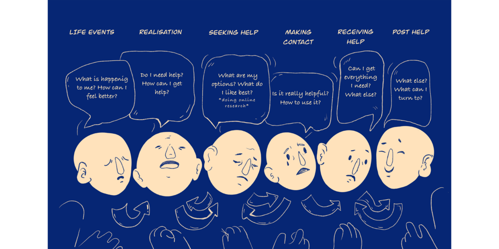
There’s no right or wrong approach to creating customer journey maps in UX design. The map has to uncover strategic questions like personas (who will use the product), emotions (what personas feel at a certain stage), touchpoints, and interaction channels (a website, an app, a customer support chat, a newsletter etc). If these must-have components are included, the CJM becomes a powerful tool.
A customer journey map is concentrated on a person and their goals, motivations, and moments of truth. Let’s see what a person, or a UX persona, means and why you should focus on addressing their needs.
UX Personas
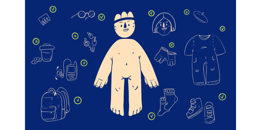
Personas represent an imaginary concept of your target audience classified into attributes like age (young adults, seniors), professional background (students), pain points, and so on.
These attributes are the most evident and they can be gathered even without heavy investments in research. The most common approaches to creating UX personas include interviews with stakeholders, competitors analysis, and user interviews.
Remember that personas mustn’t be completely fictional: in this case, they won’t bring any value. The information included in a persona’s profile must be aligned with the project specifics. For instance, when creating personas for an educational website, it’s vital to include educational and professional background while for e-commerce, it’s necessary to include purchasing power specifics.
Why create personas at all?
First, personas allow you to examine the needs and concerns of a target audience. For instance, when designing the interface for a senior audience, you might want to avoid complex elements and micro-interactions. Meanwhile, designing for the younger audience implies a certain space for non-standard design moves (prominent swipes in Tinder), tangled systems (like Snapchat), or audacious color scheme.
Second, personas allow you to predict what website or app blocks will be mostly used by a certain user category and put your efforts into enhancing usability.
Finally, creating personas leads to designing the most useful functions and blocks that will appeal to a target audience instead of reinventing the wheel or creating features that won’t resonate with the users.
A/B Testing
A/B testing is a common technique used to evaluate design solutions. In fact, 48% of surveyed respondents revealed they use this method to research and improve the effectiveness of customer journey.
In A/B testing, designers test two version of a button or any other element, placing of elements, or even the entire webpage structure. The goal of the testing is to figure out which element or a block performs better (for example, which button receives more clicks). Often, A/B testing is implemented in order to boost website conversions.
Website Customer Intent Survey
Still not sure why users leave your website so fast? Ask them directly with a customer intent survey!
Customer intent survey is actually a survey which pops up when a customer is about to leave a website (hovering a mouse to the top of a web page gives this intent away).
Results of a survey allow you to get insights on website usability, content performance, or even value proposition that doesn’t put the squeeze on visitors.
A customer intent survey brings to most value:
Shopping cart abandonment. The survey allows you to figure out what caused a customer to leave in the middle of a purchase: whether it was unreasonable pricing or inconvenient payment option. To survey users, it’s recommended to implement multiple choice forms that include common reasons (complicated purchasing flow, necessary registration, high price etc);
Landing page bounce. Landing pages play a key role in lead generation. That’s why it’s necessary to figure out what prevents a user from signing up, subscribing to service, downloading the content, or making a purchase. For landing pages, you might want to create surveys that allow users to submit their answers. Surely, the questions must be straightforward and clear.
Goal completion. On large websites with multiple purposes and content like Hubspot, it might be hard to figure out the user’s goal and if it was completed. A laconic pop-up with the question like “Did you accomplish the goal of your visit?” may address that problem.
Pricing abandonment. On SaaS websites, users often check the pricing pages and leave. Just like with shopping carts, it’s hard to determine what scared the visitors away: pricing or unclear conditions of purchase. Asking visitors directly (“What prevented you from choosing the plan?”) will do.
Remember that customer intent surveys must be unobtrusive while wordings must be short and clear. Thank users after they’ve completed a survey.
Wrapping Up
Of course, that’s not the complete list of available techniques for researching and optimizing the user journey. We recommend devising a customer journey with professional and experienced UX designers that’ll provide workable solutions to help you reach business goals and meet users’ needs.
Can’t wait to start customer journey mapping? Contact us and we’ll get back to you shortly!


