In 2024, healthcare apps are no longer just a “nice-to-have”; they’re as vital as your morning coffee. With everything from AI-driven personal health assistants to telemedicine that brings doctors to your living room, these applications are transforming how we access healthcare.
The healthcare industry is on a digital rollercoaster, and the design of these apps is crucial in making the ride smooth for patients, doctors, and even insurance companies. And as we dive deeper into this world, there’s one thing we know for sure: great app design can be the difference between a lifeline and a frustration line.
In our new article, we’re going to take a close look at what’s happening with healthcare app design in 2024. We’ll:
- talk about how things like AI, telemedicine, and wearables are changing the way patients get care and make healthcare software development companies win the competitors’ game;
- break down key design tips – like making apps easy for everyone to use and keeping patient data safe with tools like blockchain;
- cover how much it costs to get perfect healthcare design solutions and the rules you need to follow.
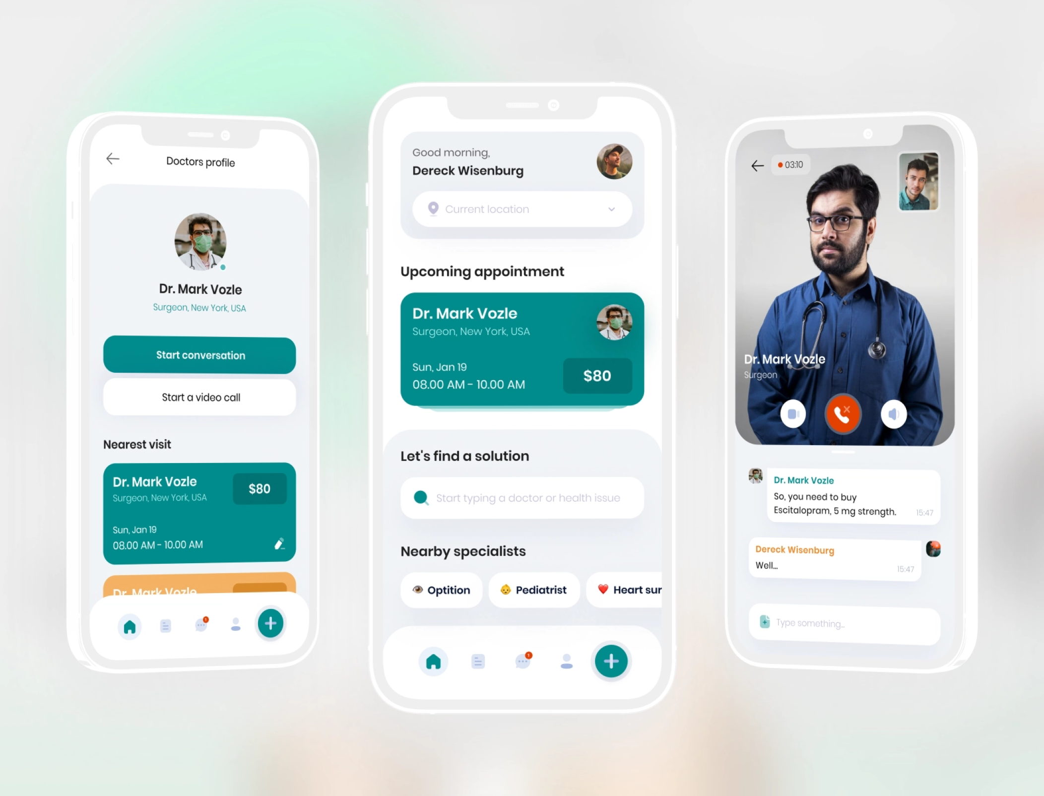
The Value of UX/UI Design for Healthcare Industry
Digital health is booming this year, with revenue from digital fitness and well-being, digital treatment and care, and online doctor consultations expected to hit $193.69 billion, according to Statista (February 2024 data). That’s a significant jump from just $45.69 billion in 2017, and the growth shows no signs of slowing down.
In 2023, the global digital health market was valued at $240.9 billion, and it’s set to grow at a compound annual growth rate (CAGR) of 21.9% from 2024 to 2030. This surge is fueled by the rise of telehealth platforms, mHealth apps, wearable devices, and e-prescription systems.
About 63.4% of U.S. adults used a health-related app in the past year. With growing health awareness in the U.S., fitness and nutrition tracking apps are leading the way, showing a strong consumer interest in digital healthcare solutions.
Healthcare and UX design
In this context, the impact of UX is higher than average across other industries. Our research outlines that UX takes a 50% share in gaining a competitive advantage and a 33% share in customer retention rates. With a top-level UI/UX design, a healthcare app can become an effective lead-generation tool.
The primary function of healthcare app design is to make the application accessible to every user. Thus, a sensitive target audience may cause some limitations in the design — if you manage to overcome them, you’ll get an on-demand healthcare application.
The healthcare industry is seeing a growing demand for inclusive design. A McKinsey report showed that apps designed with accessibility in mind – such as those that include adjustable font sizes, high-contrast modes, and voice interaction – improve usability for a wide range of users, including the elderly and people with disabilities. This focus on accessibility has become a priority, as healthcare apps aim to serve diverse populations with varying needs.
How UX design affects healthcare applications: real example
One prime example is the MySugr app, designed for diabetes management. Its user-friendly interface allows patients to easily track their blood sugar levels, receive reminders to take medications, and access real-time data to share with their doctors.
The app’s simple yet powerful design has led to a 72% increase in user engagement compared to less intuitive apps in the same category. And healthcare software development companies should definitely pay attention to this case.
In a nutshell, healthcare design solutions are about much more than aesthetics – it’s about creating a functional, easy-to-use experience that encourages patients to stay on top of their health. By offering clean, intuitive interfaces, healthcare apps can empower users, improve engagement, and ultimately lead to better health outcomes.
Poor design can lead to confusion, frustration, and even missed treatments, while great design can boost engagement, increase patient satisfaction, and improve health outcomes. Together with a competent UI/UX design team, you can create a functional, intuitive, and user-friendly application. In the following passage, we’ll tell you how to do it right.
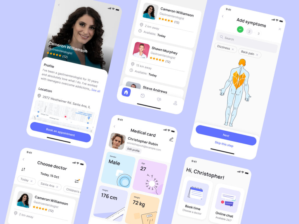
How to Design Healthcare Applications?
Designing a healthcare app is like building a bridge between technology and human well-being, and your design team is the crew holding it all together. The goal is to create mobile solutions that are not only functional but also easy to use.
Step 1: Do your homework
Before you even think about creating healthcare software solutions and sleek interfaces, start with research. You need to know who your users are, where they live, and what makes them tick.
The more you understand your audience (age, preferences, daily app habits), the better. It’s like preparing a recipe: without the right ingredients, it’s going to flop.
Ask yourself:
- Who’s my audience? Are they patients, doctors, or maybe caregivers?
- What’s their daily tech diet? (Apps, habits, behaviors)
- Why would they want to use this app? How will it improve their lives?
The deeper you dig, the more you’ll uncover about what makes your users smile.
Step 2: Spy on the competitors (with kindness)
This is where you scope out what’s already out there. Take a look at other healthcare software development companies and medical apps, analyze their designs, and see what’s working. What do they offer?
Where do they fall short? Make the process of designing healthcare software solutions not copying but inspiration. Like an artist studying the greats before painting their masterpiece.
If you’re working on an Electronic Health Record (EHR) app, for instance, check out the top players in that field. Test their features and think, “How can I make this better?” Maybe one app is great but lacks a user-friendly appointment scheduler. You can swoop in and fill that gap!
Remember, your goal for healthcare design solutions is to stand out, not blend in. Your app should be able to leap over the competition with unique features and solutions. And no, capes aren’t necessary, but a slick UI is a must.
Step 3: Prioritize functionality like a pro
Now, it’s time to focus on the app’s functionality. Think of functionality as the backbone of your app – without it, everything falls apart.
Start with planning an onboarding experience that’s smooth and intuitive. No one wants to feel like they’re taking an exam just to figure out how to use your app. Make it easy.
The rule here: The simpler, the better. If your users feel lost, they’ll ditch your app faster than a doctor running behind schedule.
Stick with familiar design patterns. Include tooltips, walkthroughs, and FAQs to gently guide your users through complex features.
Step 4: Design navigation with a GPS-level precision
Speaking of navigation, this is the heart of any good app. If users can’t find what they need quickly, frustration kicks in – especially in healthcare, where time is critical. Make sure your app’s navigation is as clear as daylight.
Integrate common navigation tools like:
- Hamburger menus: for quick access to everything.
- Tab bars: perfect for switching between sections.
- Navigation drawers: a user-friendly way to dive deeper into different features.
If your app’s navigation feels like trying to navigate a maze, users will give up. And you know what they say: “A confused user is an uninstall waiting to happen.”
Step 5: Bring it to life with colors, fonts, and visuals
Here’s where your app’s personality really shines. Colors and fonts might sound like the icing on the cake, but they’re more like the cake itself! Think about it: people subconsciously associate different colors with different emotions.
Most healthcare software solutions stick to blues and greens to give that “trustworthy” and “calming” vibe. But guess what? You don’t have to follow the crowd.
You can mix it up while still keeping things professional. For example, AmeriHealth Home Care uses a warm palette of pinks and oranges to create a welcoming atmosphere. It’s like being wrapped in a cozy blanket – perfect for healthcare, right?
Choosing the right font is also key. Stick with fonts that are easy to read, like Montserrat or other sans-serif options. The goal is legibility, especially since healthcare apps are often used in stressful situations. No one wants to squint at the tiny text when they’re looking for their medication reminders.
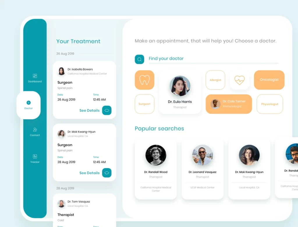
Let’s look at the design of a medical app made by Cadabra Studio. The clean layout and minimalistic style complement each other. People can easily use the medical card, track health indicators, and set up reminders in the calendar. Sans serif font Montserrat and light colors evoke a positive user experience and convey the mood of the app. Such color schemes and visuals don’t distract user attention but provide intuitive navigation through the app.
If you want to make a 5-step check of your application, contact managers from Cadabra Studio. We are open to cooperation that makes your healthcare app user-focused, intuitive, and fast.
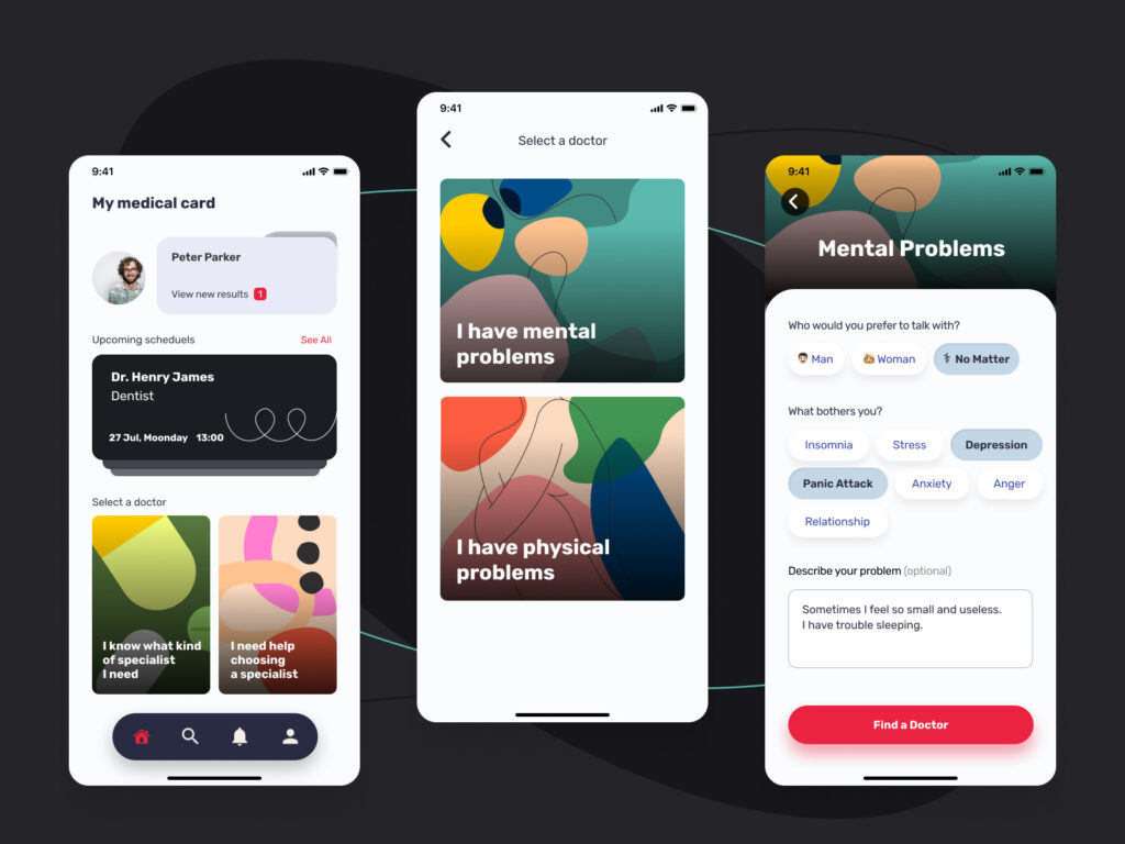
Essential Healthcare Software Design Features to Consider
There is a must-have set of features that should be present in your healthcare app design. These features work as an excellent tool for engaging users in the application together with a simple and intuitive interface, easy functionality, and positive emotions. So, what features are best suited for healthcare software design?
Notifications
Notifications are vital for healthcare apps — they keep users informed when there is an update or status change, for example. Depending on the type of the app, users might get a notification to do a 5-minute exercise or a reminder about upcoming doctor’s appointments, taking pills, etc.
Notifications differ depending on the status, type, and purpose. These allow you to tailor their UI and UX design to the specific situation.
Notifications should be:
- Relevant: No one wants a reminder to drink water if they’re using your app for managing chronic conditions. Tailor your custom healthcare software!
- Timely: Like the perfect punchline, it’s all about timing.
- Customizable: Let users choose how they want to be notified, so they’re never caught off guard.
Think of notifications as the app’s version of a sticky note – handy when needed but annoying when plastered all over the place.
Payment Processing Feature
If your app offers paid consultations, medication, or even subscription plans, you need to make payment processing smooth. You don’t want users to feel like they’re trying to solve a Rubik’s Cube just to make a payment.
Add multiple payment options (credit cards, digital wallets, etc.), keep it secure, and for the love of user experience—make it fast.
Cloud Integration
In the age of instant everything, users want immediate access to their health records, test results, or even their fitness progress. Integrated cloud storage will be an on-demand solution for your app, together with serverless app development. With these technologies, you give them the ability to pull up important information from anywhere – whether they’re at the gym, the doctor’s office, or binge-watching Netflix.
But it’s not just about speed; it’s also about the security of custom healthcare software. Enter blockchain. Think of it like locking your data in a high-security vault: every transaction or data transfer gets logged, verified, and encrypted. Users will appreciate knowing their medical info is secure.
Messaging, Chat, and Video Conferencing Features
Your healthcare app will stand out among the competitors if users are able to easily communicate with doctors, chat with each other, or have video training sessions. What is more, such features allow them to get an urgent doctor or instructor consultation from home whenever they need it.
So, whether it’s chatting with a doctor, consulting a specialist via video, or even connecting patients with support groups, these features make your app a one-stop healthcare hub.
AI Integration: Your App’s Superpower
AI integration is a beneficial feature for any application. Today, it is the app’s all-knowing, invisible sidekick that’s always one step ahead. In most caesars, it provides
- symptom checker,
- health monitoring custom healthcare software,
- virtual assistant that helps with appointment scheduling.
Lorem ipsum dolor sit amet, consectetur adipiscing elit. Ut elit tellus, luctus nec ullamcorper mattis, pulvinar dapibus leo.
AI makes your app smarter. Let’s take a closer look at AI use cases for healthcare apps:
- AI-powered symptom checkers: Users input their symptoms, and AI provides suggestions or flags potential health concerns.
One of the most prominent examples of this type of app is Ada Health. You tell the app what symptoms you’re experiencing, and Ada’s AI gets to work. It asks you some follow-up questions to really pinpoint what could be going on.
Once it’s done, it gives you possible causes for your symptoms and suggests what to do next, like seeing a doctor or taking some rest. Think of it as your personal health detective, helping you figure out what’s up and whether you need a professional opinion.
- Personalized health insights: AI can analyze user data (like sleep patterns or exercise routines) and offer tips for improvement.
An example is Google Fit – an AI-powered fitness buddy that keeps tabs on users’ health data and tells them how to do better. It tracks things like heart rate, activity levels, and how well you’re sleeping.
- Predictive analytics: AI can help predict trends, like when a user might be at risk of a certain condition, based on their data.
Here, you can take a look at IBM Watson Health. It crunches through massive amounts of medical data and uses predictive analytics to spot health patterns.
For example, it can predict how a patient’s condition might progress based on their history and current data, helping doctors catch potential issues early. Watson’s tech is used more by hospitals than by individuals, but it’s behind a lot of the predictive healthcare tools out there today.
Basically, AI turns your healthcare app into a crystal ball, only much, much, much more reliable.
User Profile Feature
The creation of a profile feature for patients and doctors seems obvious enough. This feature makes your app personalized and allows users to manage their profiles according to their needs, upload necessary information, etc. In terms of design, user profiles should be easy to access and intuitive in navigation.
Here’s an example of a healthcare app design for a UI kit. The application has a control panel with all the necessary information about a patient, for instance, body parameters, prescribed medicines, the required number of meals, etc.
Users can easily track check-ups, control medical expenses and get valuable pieces of advice. The special feature is a user’s line graph that monitors the health state dynamics and compares it with an average for their country.
Accessibility
Here’s a golden rule: design for everyone. Accessibility is no longer a nice-to-have; it’s a must-have for every healthcare software development company. Whether users have mobility impairments, visual challenges, or are simply left-handed, your app needs to be ready to serve them all.
The good news? Accessible design is like setting up extra chairs at a party – it only makes the app more inviting.
Best practices for accessibility:
- Thumb zones: Keep key features in areas easy to reach with one hand.
- Text size options: Allow users to increase text size without losing readability.
- Voice commands: Enable voice navigation so that users with limited dexterity can get around your app with ease.
Think of accessibility as offering everyone a front-row seat to healthcare. You’re not just designing an app; you’re opening doors to people who might otherwise be left out.
Designers at Cadabra Studio always remember that people with various needs will use our products. It is challenging, but we consider accessibility as an extra opportunity to make technologies convenient for everyone.
Peculiarities of Healthcare App Design

In order to show you some peculiarities, we’d like to take EHR design as an example. To begin with, EHR (Electronic Health Record) is computer software used to store, structure, and share patient data.
An EHR shares medical information among all the parties involved in the patient’s care: hospitals, labs, pharmacies, emergencies, nursing homes, state medical registries, and patients themselves.
The best practices for EHR design can be rounded in one sentence — the solutions have to lead to error reduction. With doctors spending 50% of their time using this recording system, the EHR screen design and user interface should be natural and comfortable for their eyes.
As an example, let’s consider a medical app UI design that comprises good EHR design practices.
The app has an intuitive design: users can easily check their medical test results, prescriptions and track physical parameters. The application reminds the user to take medicines, visit a doctor, update health information, etc. The minimalistic style allows both patients and doctors to move conveniently through the system.
Ready to design a healthcare app? Hire a dedicated team of professionals from Cadabra Studio. We’ll provide you with top-level UI/UX design services.
Compliance and Security in Healthcare App Design
Designing a healthcare app isn’t just about sleek interfaces and user-friendly features – it’s about making sure user data stays safe and secure right from the start. Since healthcare apps deal with highly sensitive information, they have to meet strict privacy standards and regulations.
Key regulations
HIPAA (Health Insurance Portability and Accountability Act)
In the U.S., every healthcare software development company has to comply with HIPAA. Think of it as the rulebook for handling patient data. It sets clear guidelines to keep personal health information private.
For example, apps need to use encryption to ensure that data stays secure, whether it’s being stored or transferred. Access should also be restricted to only those who truly need it.
GDPR (General Data Protection Regulation)
Over in the EU, GDPR is the name of the game. While GDPR covers all types of personal data, it’s especially important for health information. It puts users in control of their data, requiring clear consent for how it’s used. Developers who don’t play by these rules can face hefty fines, so aligning with GDPR from the start is a must.
Compliance across borders
Designing for a global audience means dealing with a patchwork of regulations. For example, while HIPAA is all about protecting health data in the U.S., Canada’s PIPEDA (Personal Information Protection and Electronic Documents Act) and Australia’s Privacy Act have their own rules. Each regulation has its quirks, so it’s important to plan for them during the design process.
A user-centered approach means integrating these compliance requirements in a way that doesn’t disrupt the experience. For example, providing clear, easy-to-read consent forms during onboarding helps meet GDPR requirements while also building trust with users from day one.
Designing for security: user-centric measures
To build trust with users, healthcare apps need to incorporate security measures that don’t compromise usability:
- Data encryption. Imagine encryption as a digital lockbox for user data. It’s crucial that all sensitive information is encrypted – whether it’s sitting on a server or moving between devices. The best part? With thoughtful design, this can all happen seamlessly in the background without the user even noticing.
- Secure logins and authentication. Multi-factor authentication (MFA) is a must-have in healthcare apps. This step makes it much harder for unauthorized users to get in, but it should be designed to be quick and easy so that it doesn’t frustrate legitimate users.
Why it matters for user experience
Compliance and security aren’t just about avoiding fines – they’re about building a relationship of trust with users. When people use a healthcare app, they’re trusting it with some of their most personal information.
By prioritizing privacy and security, you’re showing them that their well-being is your top priority. And in the long run, that trust is what keeps users coming back.
Cost to Build Healthcare Mobile App Design
Healthcare mobile app design is in great demand nowadays. Due to the increase of telemedicine app development and doctor appointment apps during the coronavirus outbreak, many businesses invest in healthcare application development. As the market is continually growing, you can easily double or even triple your investment.
The design cost depends on the level of app functionality. The more functional and accessible the app design is, the more custom features need to be added.
The price can range anywhere from $60,000 to $500,000. The lower end covers basic features like appointment scheduling and reminders. But if you want all the bells and whistles –AI, telemedicine, wearables, and security – the price can soar upwards of $500,000.
A fully customized and unique application design brings benefits like user loyalty, demand within the industry, visual appeal, and attractiveness. And we want to assure you that these benefits will outweigh the healthcare app design cost.
Emerging Trends in Healthcare App Design

AI and Machine Learning
AI in healthcare apps is like having a personal health coach right in your pocket. They are getting better at providing custom health advice, thanks to artificial intelligence. So, 79% of healthcare organizations already use AI.
The AI in the healthcare market was worth $19.27 billion in 2023 and is set to grow by 38.5% each year until 2030, according to Grand View Research. This growth is fueled by AI’s ability to help with diagnostics, symptom checks, and predicting health trends.
Take Ada, for example –it’s been downloaded over 12 million times, proving that people are eager for AI-powered health advice.
Telemedicine Features
Telemedicine has become a regular part of healthcare, especially since the COVID-19 pandemic. The telemedicine market was valued at $114.98 billion in 2023 and is expected to grow by 17.96% per year through 2030.
Apps like Doctor on Demand let you consult with doctors without leaving your couch – perfect for when you want care without the hassle of a waiting room.
Wearable Device Integration
Wearable tech is making a huge impact on healthcare. Statista says that in 2023, there were 1.1 billion connected wearables around the world. The market for wearable health devices is expected to reach $195.5 billion by 2027, growing at a rate of 26.4% each year.
Apps like Apple Health can sync with wearables to monitor everything from your heart rate to sleep patterns, offering users – and even doctors – valuable real-time health insights.
Voice User Interfaces (VUI)
Voice tech is making healthcare apps easier to use, especially for older adults. According to Juniper Research, there will be 8.4 billion voice-enabled devices worldwide by the end of 2024, up from 4.2 billion in 2020.
More than half of consumers (56%) are interested in using voice assistants for managing their health. Voice features in apps make it simple to set medication reminders or book appointments without even touching your phone, offering a hands-free way to stay on top of your health.
Designing for Telemedicine
Here are key considerations to keep in mind:
1. Focus on quality
When it comes to virtual doctor visits, quality is non-negotiable. Both video and audio should be crystal clear. After all, no one wants to squint at a blurry screen or struggle to hear what their doctor is saying.
Investing in high-definition video technology and ensuring a stable connection can make all the difference. Additionally, offering options for users to test their audio and video settings before their appointment can help alleviate any technical issues and set the stage for a smooth visit.
2. Make it easy to use
Simplicity is key in the world of telemedicine. Booking an appointment should be as straightforward as reserving a table at your favorite restaurant. This means an intuitive interface that allows users to select their preferred doctor, choose a convenient time, and receive instant confirmation –all with just a few taps.
Including features like reminders, calendars, and integrations can help users keep track of their appointments without added stress. A well-designed user journey from start to finish makes the experience seamless and reduces the likelihood of missed appointments.
3. Remote Monitoring
If patients are using wearable devices to track their health, integrating these metrics into the telemedicine app can provide significant benefits. Imagine a doctor monitoring a patient’s heart rate or blood sugar levels in real time, all without needing an in-person visit.
This not only enhances the quality of care but also empowers patients by keeping them engaged in their health journey. The app should allow for easy syncing of wearables, presenting health data in an easy-to-understand format. Dashboards that display trends over time can help doctors and patients make informed decisions together.
4. Patient-doctor communication
Effective communication is at the heart of any healthcare experience. Incorporating secure messaging features within the app allows patients to ask follow-up questions or share concerns with their doctors at any time.
A chat function can help address minor issues without the need for a full appointment, enhancing the overall patient experience. Providing resources, such as FAQs or educational materials, can also help patients feel more informed and engaged in their healthcare.
5. Feedback mechanisms
After each telemedicine visit, gathering patient feedback can provide valuable insights into the user experience. Simple surveys or rating systems can help identify areas for improvement, whether it’s the technology used, the scheduling process, or the quality of care received.
Listening to user feedback not only helps enhance the app but also demonstrates that you value patient input, which can strengthen trust in the service.
6. Adapt for different user needs
Keep in mind that users will have varying levels of comfort with technology. Some may be tech-savvy, while others might struggle with app navigation. Offering tutorials or guides within the app can help bridge this gap, ensuring that everyone can access telemedicine services easily.
Additionally, providing options for different communication preferences, like video, audio-only calls, or even chat, can accommodate various user needs, making telemedicine more inclusive.
Who Can Make an Outstanding Healthcare App Design?
Healthcare is a tender and challenging subject that needs special attention. When designing healthcare apps, it’s important to think of people accessing your app to get quick and easy access to information or medical providers.
Healthcare software design firms implement their best practices to create an outstanding design product. That’s how Cadabra Studio works. We have strong expertise in the healthcare sector. Our team is careful in considering how to design healthcare apps. Our projects are functional, accessible, and secure. Check our works out on Dribbble and Behance.
Do you have an idea for a healthcare startup but need consultation on designing an app? Contact us, and our dedicated design and development teams will make your application good-looking and accessible for users.

