Less than 10 seconds are needed to check out the website we have accidentally run into. A user is hard to catch and even harder to keep – we leave at once we feel slightly bored. Like little kids, we are attracted to something bright and moving.
That is why even being adult we keen on some cartoons, comics – the stuff with animation implemented.
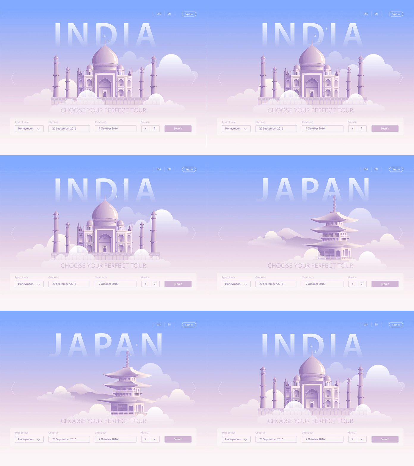
And digital products are not exclusion. Motion design here is not just a growing trend, it is a necessary design element. There is a wealth of ways how to use motion design. Though, there is a risk to do it in the wrong way and get a disappointing result.
There is a vital principle you should remember about while implementing animated effects into your product design – the animation should serve a purpose. It has to draw the eye to the element highlighted without being distracting and why it was used must be easy to explain.
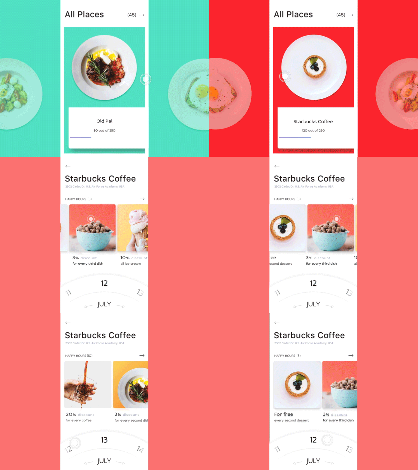
Addressing our expertise in this issue, we offer you the shortcut of the basic ways of using motion design with the aims they are used for.
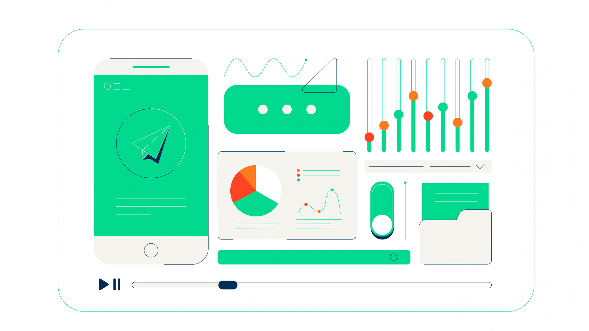
Reveal. Hide. Change. React. These minor details often stay unnoticed. Still, they are the basic effects you can add to your product. They are motion design features used to enhance the effects of mobile or computer screens.
We perceive what we see on screen as the moving dimensional elements. It is the illusion produced by animated details. There are micro-interactions – the reaction of UX elements to the user’s actions.
They serve two different goals – provide the user with visual feedback and information on how the element should be used. The special of the micro-interactions is that they must be subtle – they don’t steal the spotlight from the elements they highlight, but simply make them easier to use. Looking closer, we can suggest a few cases when motion elements worth implementing:
To highlight when you turn a feature on or off.
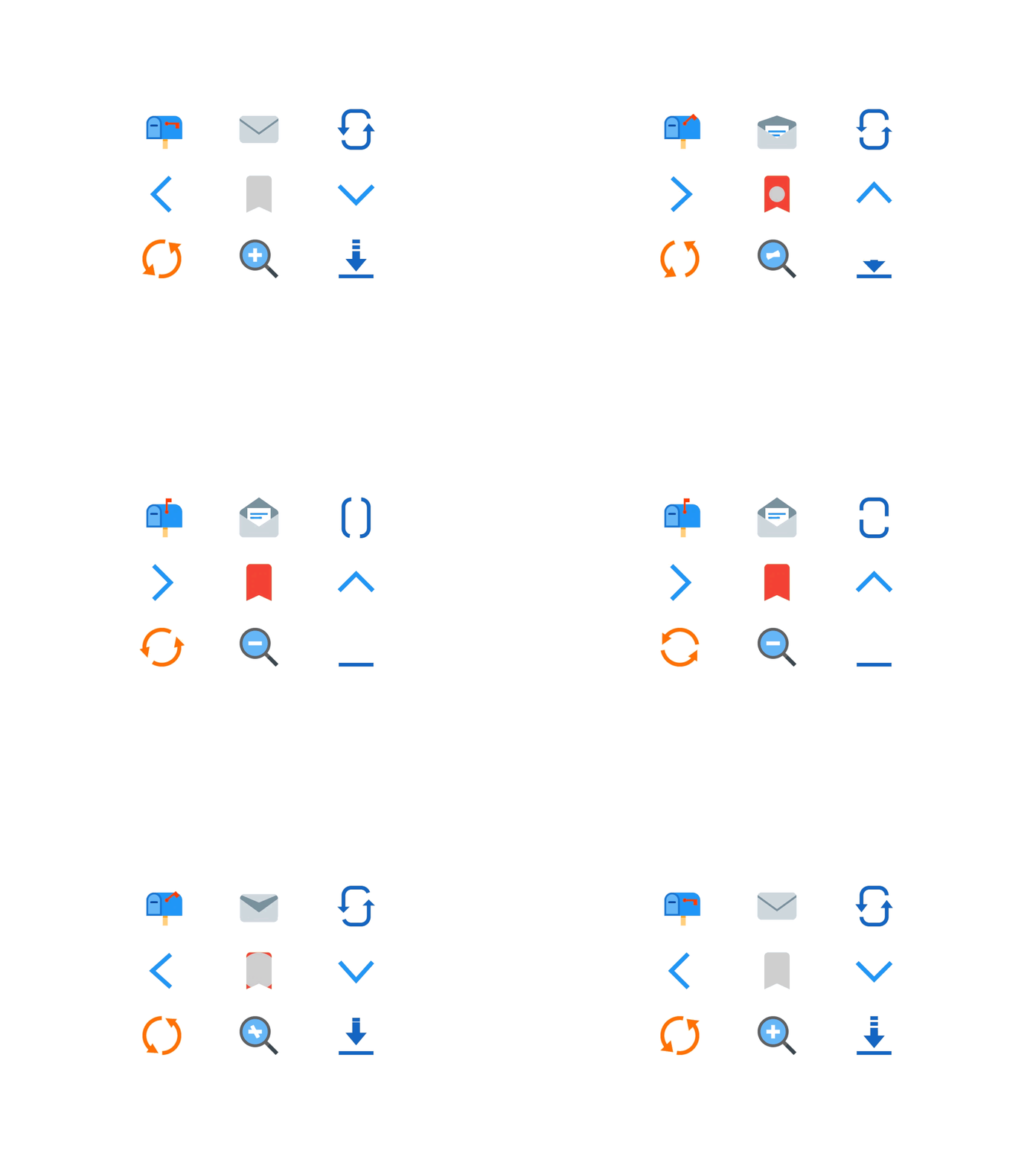
To let users know the action was a success (such as submitting a message through a contact form)
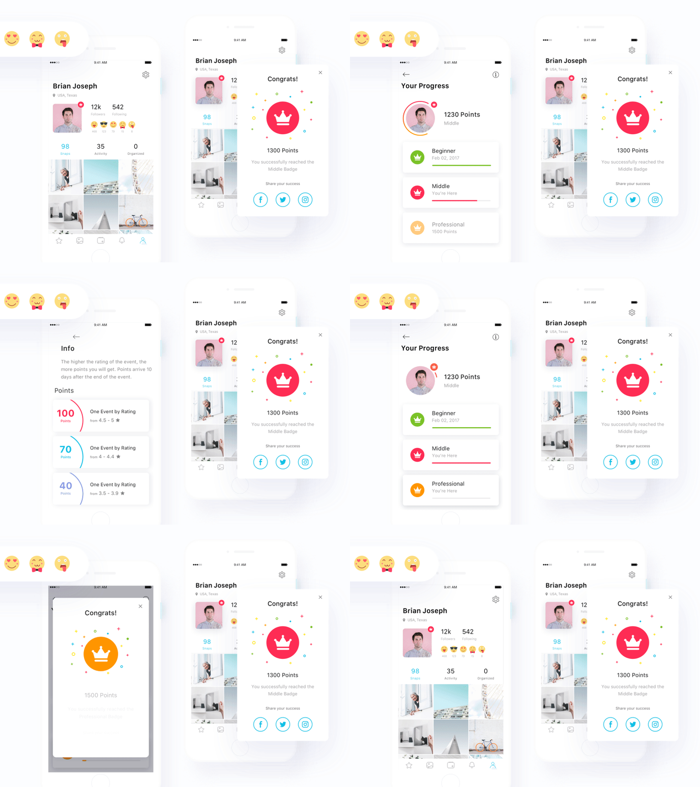
To highlight specific pieces of information (such as prices within a table)
To animate icons on your site.
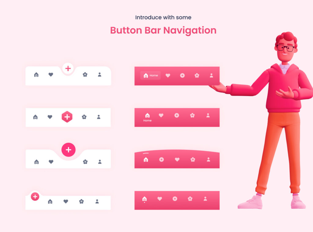
Another trick is the usage of hover animations. They allow maximizing the information you provide in the space available. The key is to add information your visitors will be interested in reading about. Such animations are easy to implement, and they can add some depth to simple websites.
Talking about motion design, revealing hidden menus is often mentioned. Actually this option is quite controversial. Many people think that menus as an important part of navigation must always be visible. But in some cases, for example, when we work with a large number of pages, such kind of menu is helpful and convenient. Animation makes it less abrupt, pleasing the user’s eye.
Transition. Scrolling. Pacing. We began by explaining the function of motion design as a bait for the user. It grabs attention and keeps it. But if we look at it from the other perspective, we can notice that by grabbing our attention, animation can distract from something users shouldn’t pay much attention to.
Changing screens always feel slightly abrasive. Loading time is a natural drawback of the website that sometimes cannot be avoided. Blunt transitions make the website difficult to perceive and sometimes tears your UX. Transitional animation is here to fix it up and make the process of transition pleasant for the user or even unnoticeable.
Funny animation keeps the user entertained while the website is loading. Also, it can be used to remind the user of your brand identity or just to make the website more memorable. That’s how by means of motion design we can turn drawbacks into advantages.
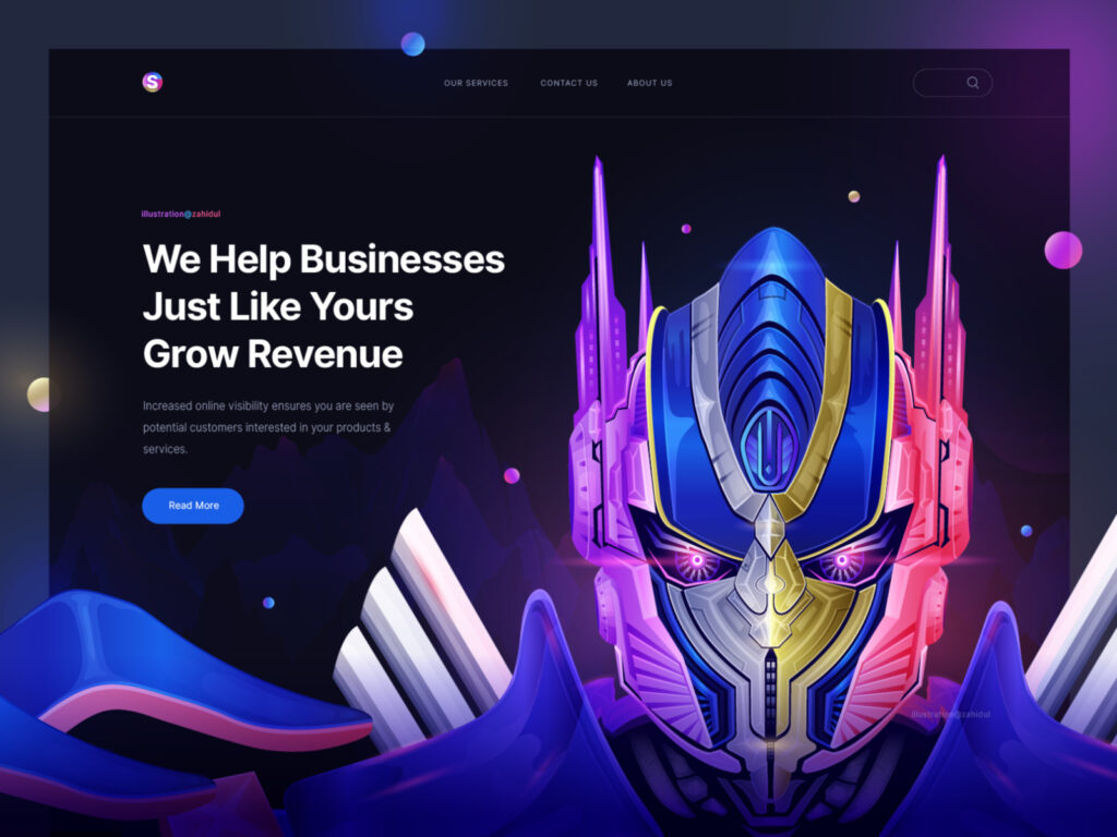
The other important function of motion is scrolling. In fact, scrolling is a huge transition. Such an effect makes the transition less jarring, users get the impression that the page is real and exists behind the screen.
Scrolling is not just visually appealing, practically it is the instrument to help users interact with the product and lead them through the website or an app. Another bonus – the page that changes while scrolling can also entertain the user and thus improve your product recognition.
The option we rarely think of is pacing. The thing is, our brain takes some time to process the information, so abruptly changing screens and information may be confusing. Motion effects may slow it down helping users work with information and comforting them.
Educate. Inform. Delight. Motion is effectively used to give the instructions. Visuals and movement can teach better than words. Thus, motion effects are widely used for onboarding, instructions and some new features presentations.
They are more lively and bright than even illustrations, not to mentions sentences. For example, the use of hover animations usually has an educative effect – when there is a response to cursor movement, the user intuitively knows what to do.
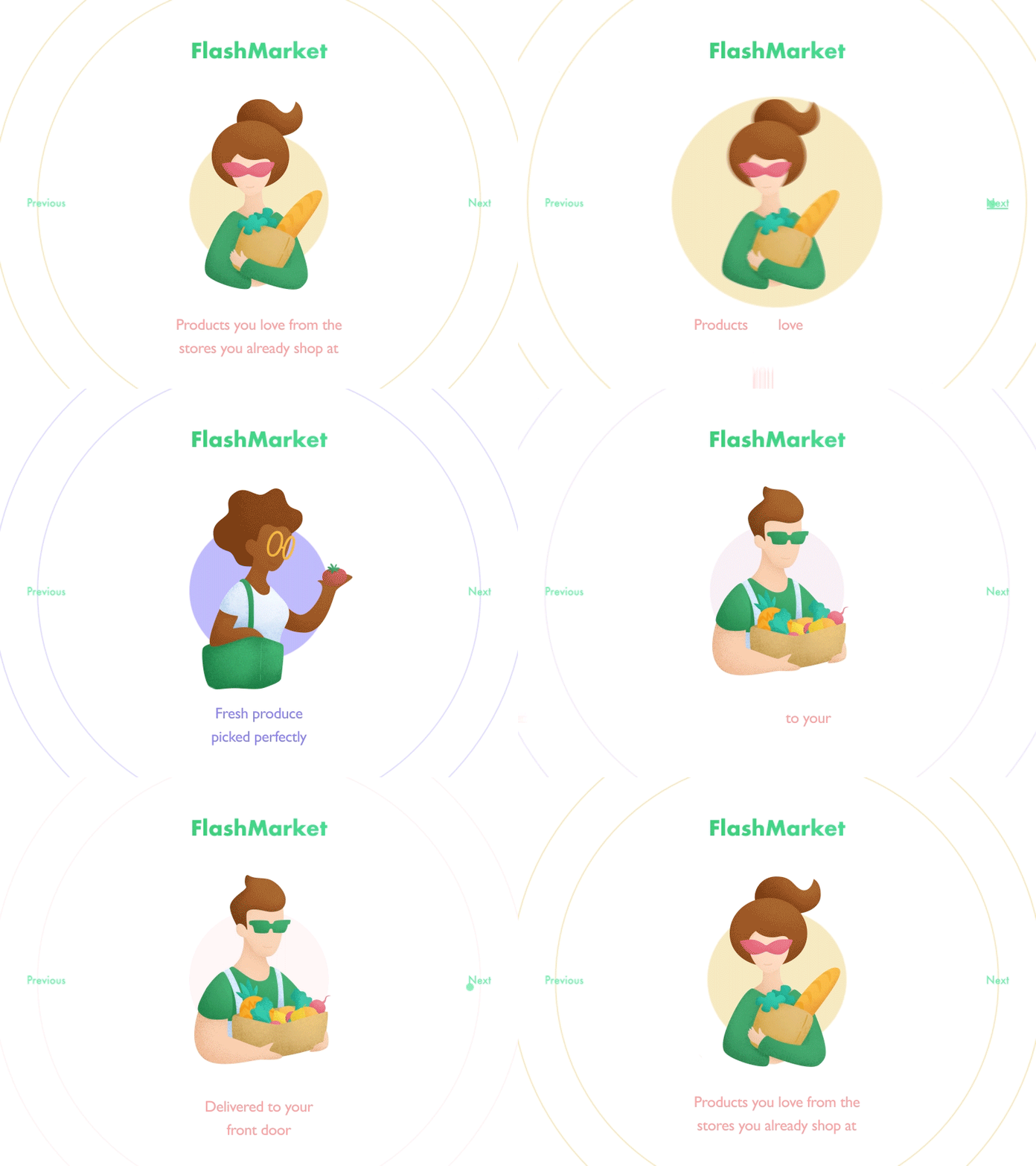
But the real magic of motion design is a delight. It makes a difference when you try to make something special out of the product, wish it to be remembered and shared. Options here are motion effects on the background, manipulations with a logo or just page motion.
Motion boosts users’ interest, makes an impression on them. For the business, delighted user means increasing traffic, conversion and benefits growth.
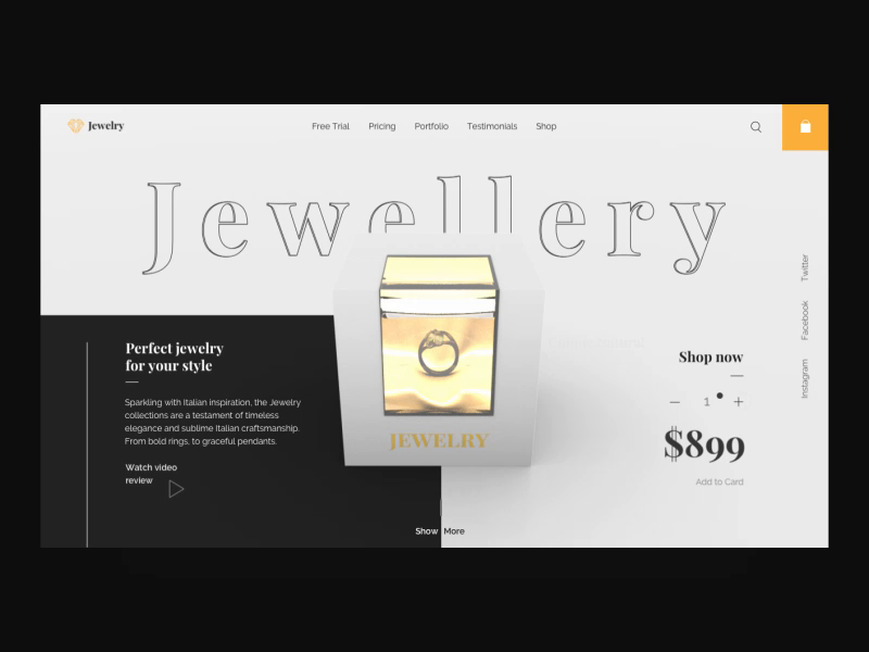
Jewellery Website Animation
Whatever the actual practical meaning of the motion elements you use, remember about three main points – keep it simple, useful and fascinate the user, and graphics will be of great value for your business.

