There are many skilled and experienced motion designers nowadays. However, the dedicated ones have their own vision at motion design, know the principles of functional animation in UI design, learn the history of motion design and can foresee its future. Motion designers at Cadabra Studio have rich experience in creating up-scale animations, so we are eager to share it with you.
It’s always a good idea to freshen up the knowledge of animation fundamentals, and come across the basic principles of animation we are inspired with. Let’s have a look at 12 principles of animation that are used in modern animation as well as web design.
12 basic principles of animation
Squash and stretch.
This principle is used to add the weight, speed, flexibility, and gravity to the small objects or complex constructions. Objects are stretched and squashed to a maximal degree to look natural. The most important thing is that the object’s volume has to remain the same. For instance, if the length of a ball is stretched vertically, its width needs to contract correspondingly horizontally.

Anticipation
This principle is utilized to show up the character’s preparation for a specific action to make it appear in a more realistic way. Anticipation clarifies what a character is going to do, so that each action doesn’t come as a sudden surprise.
Staging
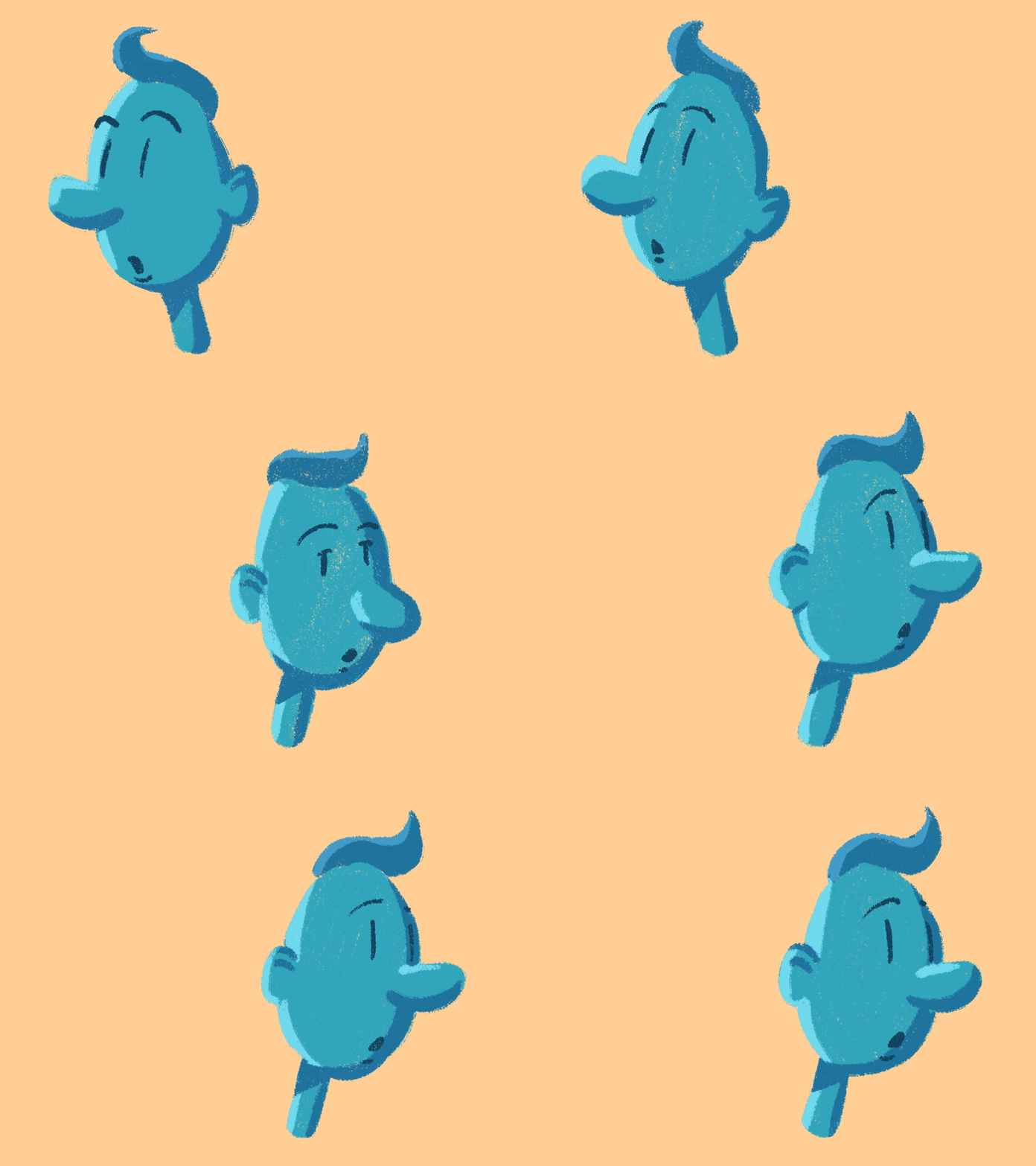
This principle is akin to staging in theatre. The purpose of the principle is to pay audience attention at the action, a personality, an expression, or a mood of the greatest importance in a scene. This can be done in the following ways: to use light and shadow, to place the character in the frame, to angle and position the camera accordingly. The staging principle focuses on what is exactly relevant.
Straight ahead action and pose to pose.
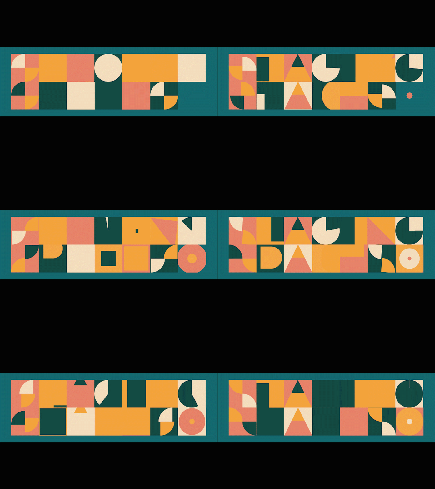
These are two different approaches to draw the process of motion. “Straight ahead action” principle means to draw out a scene from beginning to end frame by frame. “Pose to pose” means to draw the keyframes, add extremes to the intervals between the keyframes and connect them with the breakdowns. This principle works better for smooth transitions. Straight ahead action is used to show unpredictable scenes such as fire, water drops, clouds of dust and explosions.
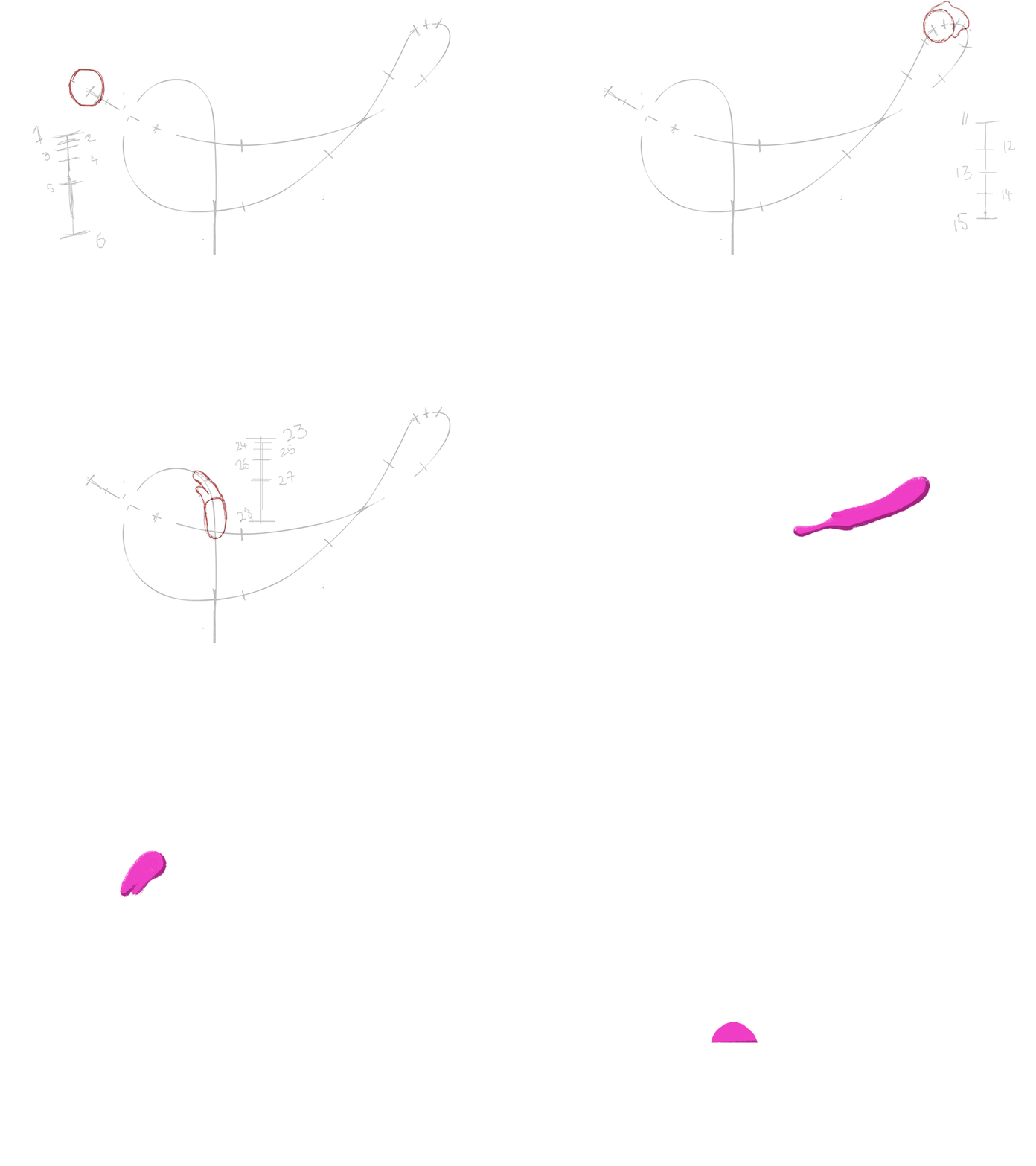
Slow in and slow out
This principle makes the animation more natural. The animation looks more realistic if it has more drawings near the beginning (slow in) and end of the action (slow out), emphasizing the extreme poses, and fewer in the middle. This principle goes for characters moving between two extreme poses, such as sitting down and standing up.

Arcs
Animators apply this principle to make moving actions of the character or object more natural. In real life, our movements aren’t straight — we typically move by a specific trajectory. Therefore, animated characters and objects have to act in the same way. And the principle of arcs enhances animators to draw movements following the logical arc from one extreme pose to the next.

Secondary action
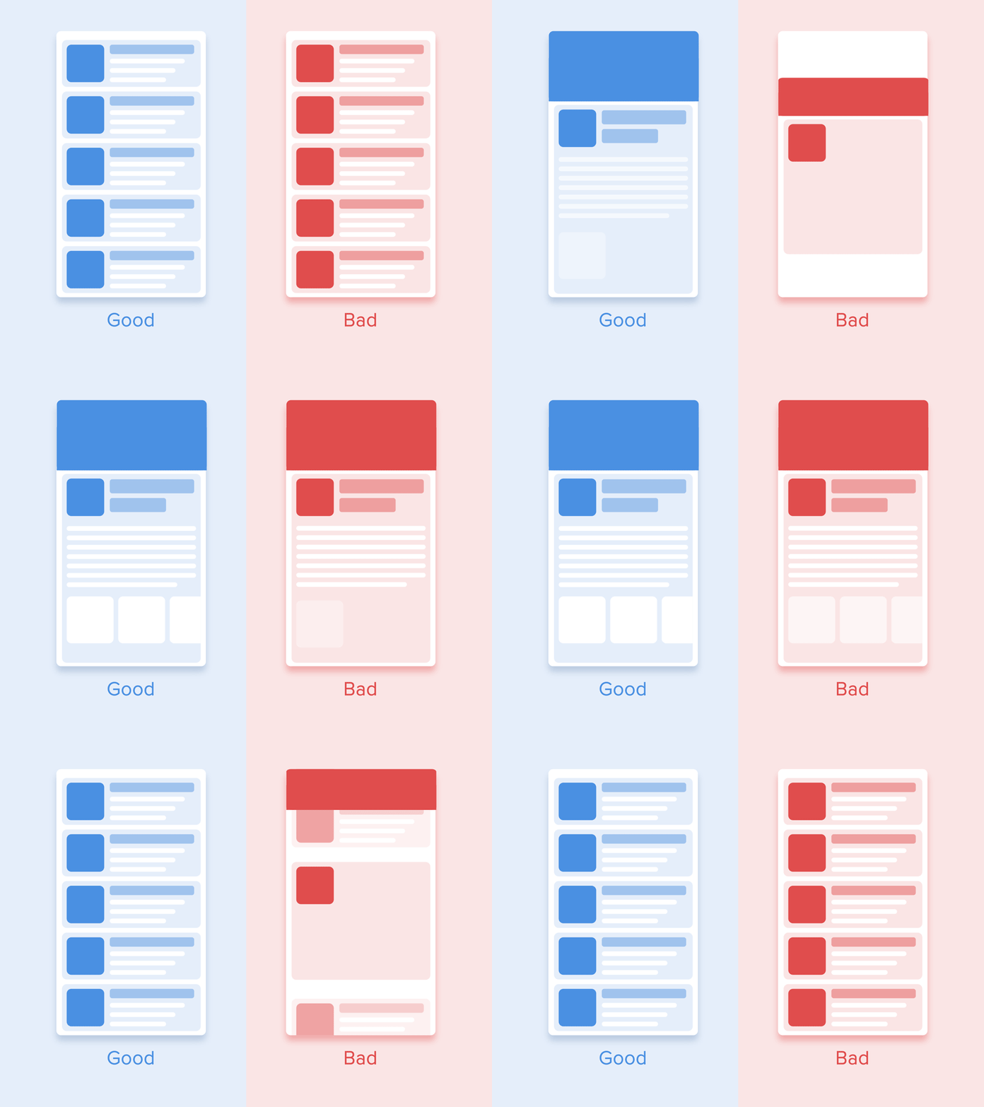
Secondary actions support the main action and add more dimension to the character’s animation. The important thing about secondary actions is that they emphasize, rather than take attention away from the main action. For example, a character eats a sandwich and this is the main action. By adding facial expression we emphasize that the character is hungry and really enjoys the meal. To understand how this principle works, look at the picture below.

Timing
The timing principle implies the number of drawings or frames used for creating a given action. Subsequently, it translates to the speed of the action in the film. Correct timing is critical for establishing a character’s mood, emotion, reaction and pose.
Exaggeration
Exaggeration is not a distortion of poses and facial expressions, it is just a presentation in a wilder, more extreme form, remaining close to reality. This means the modifications of the character’s physical features or elements in the storyline itself. The level of exaggeration depends on whether one seeks realism or a particular style.

Follow through and overlapping action.
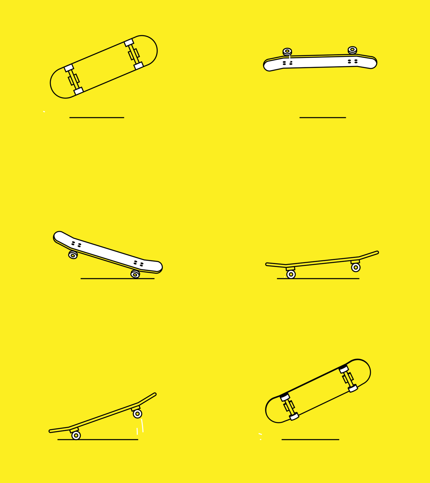
This principle increases the quality of the animation by adding essential movements to the secondary parts of the character. All the secondary parts of the character will continue moving after the character stopped moving. For better visualization look at the animation below and analyze the difference.

Solid drawing
The principle of solid drawing means considering forms in three-dimensional space by giving them volume, weight and balance. Skilled animators understand the anatomy and skeleton of the characters so that the props are correctly animated. Avoiding good structures and bending in the wrong places leads to deformation of drawings.
Appeal
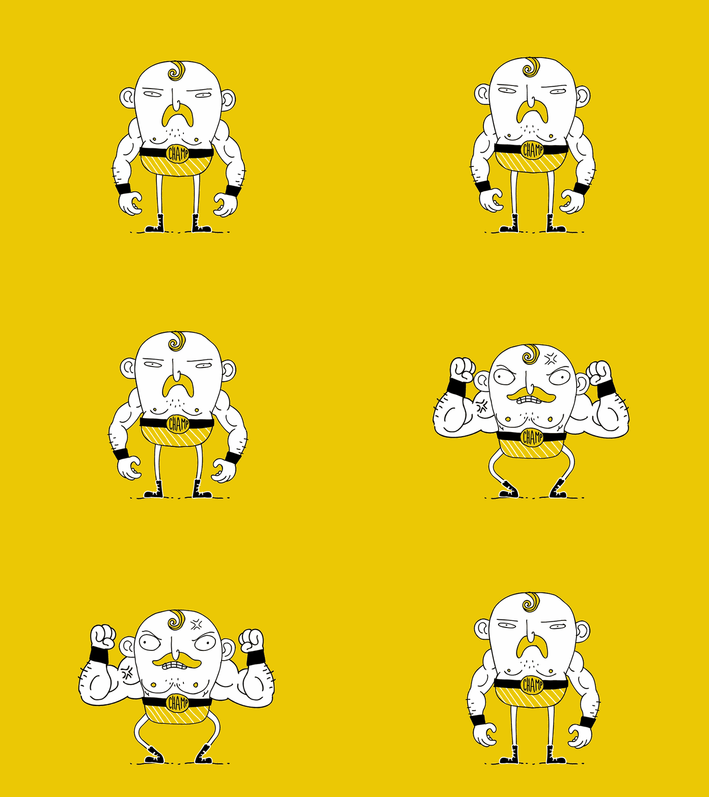
The visual appeal is synonymous with charisma. It is not necessary for appealing characters to be sympathetic — criminals and monsters may be the cutest characters in the cartoon, however viewers have to feel that their distinguishing features are real and characterize their roles. The most likable features are big eyes, baby-like faces, extremely long hair, exaggerated parts of the body.
The theoretical part of the article is over, so it’s time to introduce the motion specials based on 12 basic principles of animation Cadabra Studio has to offer.
There are 6 motion examples at our disposal:
promo with characters
interface demo
3D animation for apps
tutorials
loaders and interactions
logo animations
Promo with characters explains the functionality of your website or app. The character is used for better visual presentation.
The interface demo represents product features and how it will look.
3D animation for apps shows the workflow of the product or app.
Tutorials are akin to instructions — they tell about the functions and explain the ways of proper usage.
Loaders and interactions are specially created to entertain users while the content is loading. The more entertained the users are, the less attention they pay at the loading process.
Logo animations are aimed to maximize the focus on the brand logo and make users remember who you are.
The importance of animation videos for business is huge. Animations not only entertain your customers; they also motivate them to actually purchase and help your business maximize the profits.
Cadabra Studio is experienced in creating high-quality motion design. Check out our Dribbble and Behance pages and make sure that we are true artists! If you get inspired, share your ideas with us.


