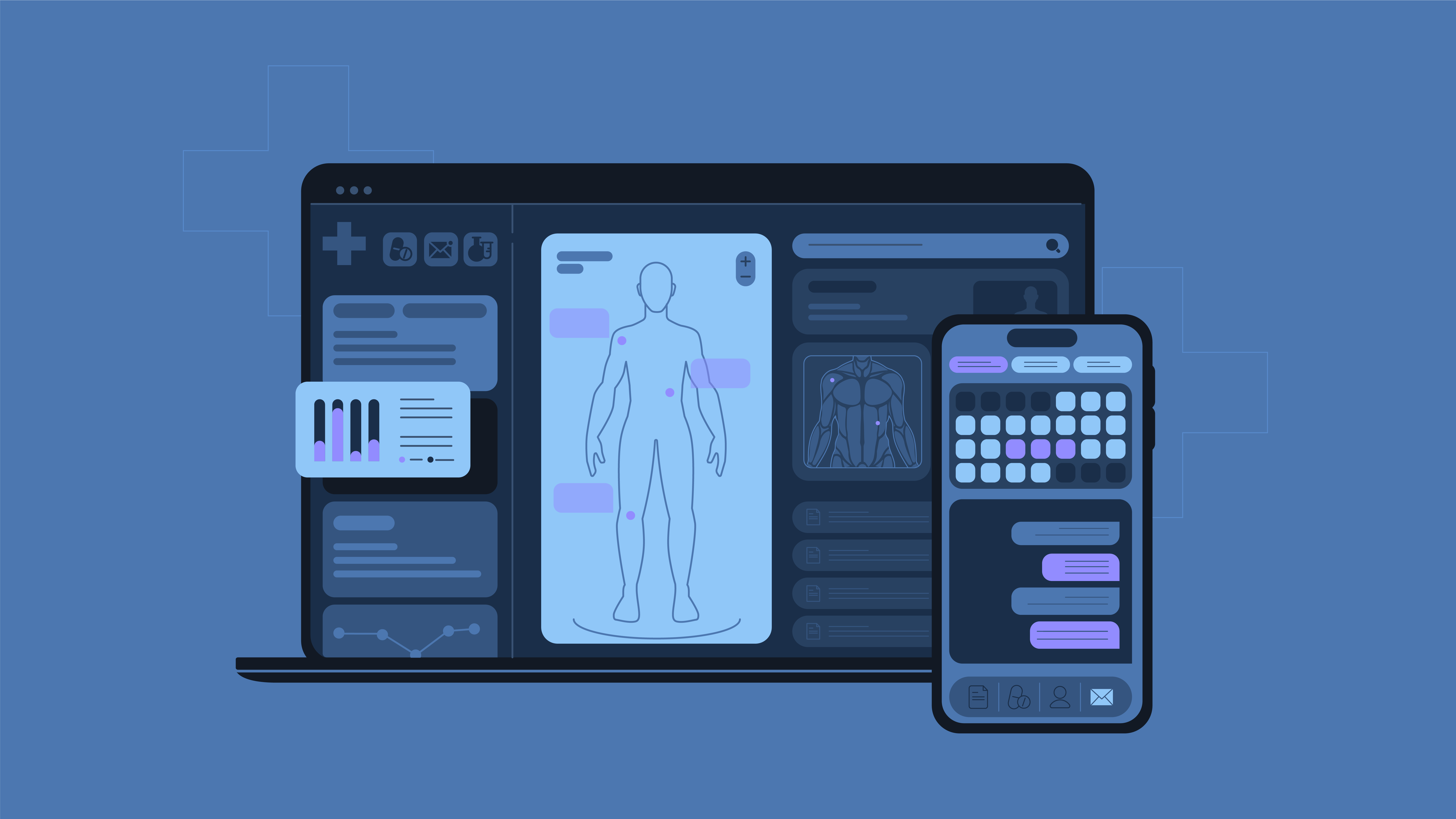
If you’ve ever spent more time clicking through an app with poor healthcare UX design than actually getting healthcare services, you’re not alone. Software can be a bit of a nightmare at times.
We’ve seen it all – apps with so many tabs it feels like flipping through the world’s longest textbook, systems that crash more often than they work, and interfaces that require a Ph.D. in frustration. But at Cadabra Studio, we know that with the right dose of user-centered healthcare app interface design, these headaches can turn into life-saving solutions.
This is the story of why user-centered design (UCD) matters in healthcare software, the challenges you’ll face when designing for doctors and patients, and how you can make apps that won’t have nurses pulling their hair out in frustration. So grab a cup of coffee, and let’s dive in.
Why User-Centered Design is a Game-Changer in Healthcare
Let me set the scene. You’re a healthcare IT professional rushing between doctors’ rooms and administrative buildings in a busy hospital. You’ve got ten things on your mind, a list of tasks longer than your shift, and a digital system that feels like it was designed by a robot, not for a human. Frustrating, right?
User-centered design (UCD), or patient-centered design, steps in as a solution to make healthcare technology less frustrating and more human-friendly. The key? During healthcare software development, focus on real-world challenges that doctors, nurses, and patients face.
Doctors, for example, often juggle multiple tasks under intense time pressure. If a healthcare app is slow or requires endless clicks, it’s more than an inconvenience – it’s a barrier to patient care. UCD helps streamline those workflows. Proper healthcare app interface design makes the application easier to navigate and faster to use, which directly improves care.
Saving great ideas from failure
Healthcare is full of brilliant innovations that never take off because the tools are too complex. Hospitals invest in cutting-edge platforms, but if no one can figure them out, they quickly become expensive dust collectors.
Why is UCD a game-changer? It increases medical software usability and, as a result, adoption. When software is easy to use, people are more likely to embrace it. For instance, during the pandemic, telemedicine boomed, but not all platforms were created equal. Some apps were so confusing that both doctors and patients gave up.
User-centered healthcare software ensures that its tools work for people, not against them. It builds interfaces that are intuitive, so medical professionals and patients can focus on what matters – treatment and communication. By the way, you can see the real-life example of using UCD to save a great idea from the dead end in our article “From Complex to User-Friendly: How We Saved a Failing Medical Startup.”
The shift to a user-first mindset
Medical applications are often designed by people who deeply understand medicine and technology, although they can miss the mark when it comes to healthcare user experience. User-centered healthcare software changes that. It’s about stepping into the shoes of the users – doctors, nurses, patients – and designing tools that actually fit their needs.
Take a patient managing a chronic illness. It’s not just about making the app navigable. UCD ensures features like medication reminders or real-time updates are designed to empower patients, helping them take control of their health.
For healthcare professionals, the goal is to create systems that are so intuitive they feel like an extension of their expertise. Doctors shouldn’t be battling cumbersome interfaces when making life-saving decisions. The best medical software usability makes software invisible – it just works.
Impact on patient outcomes
Here’s where UCD really shines – improving patient outcomes through medical software usability. Think about this: the right software, designed with the user in mind, reduces errors and speeds up decision-making. A doctor using a well-designed Electronic Health Record (EHR) system can quickly access a patient’s allergy history, ensuring they don’t prescribe something harmful.
Moreover, UCD boosts patient engagement. When patients can easily use their apps to manage treatment plans, they’re more likely to stay involved in their care, especially those with chronic conditions. This leads to better health outcomes across the board.
The UX/UI Challenges Unique to Healthcare Apps
Now, let’s talk about the elephant in the room: designing user-centered healthcare software isn’t easy. There are some pretty big challenges that come with the territory, and they can’t be ignored.
Let’s walk through a few.
- Information overload. Medical apps are packed with data. We’re talking everything from lab results to medication schedules, vital signs, billing info – the list goes on. Finding a way to present this mountain of information in a clear, manageable healthcare app interface design can feel like solving a Rubik’s Cube blindfolded.
- A wildly diverse user base. The people using your healthcare app could be seasoned doctors, fresh-faced medical students, or patients with minimal tech experience. Each group has vastly different needs, and designing something that works for all of them to achieve full medical software usability? That’s no small feat.
- No room for error. Unlike your average mobile game or social app, mistakes in healthcare software can have life-or-death consequences. A misplaced button or confusing navigation can lead to critical errors. So, yeah, the stakes are pretty high.
- Regulations, regulations, regulations, and healthcare UX design. HIPAA, GDPR, FDA guidelines – these acronyms are more than just buzzwords. Healthcare is one of the most tightly regulated industries around, and any software needs to comply with a slew of privacy and security requirements. Mess this up, and you’re not just facing user complaints – you’re facing lawsuits.
Medical UX Best Practices
So, how do you design an app that handles all this without giving users (and you) a headache? Here’s a quick rundown of the best practices we swear by:
1. Get in the trenches with users
You can’t design for someone unless you truly understand their day-to-day. Shadow doctors, interview patients, run medical software usability tests – whatever it takes to get a real sense of how your users interact with healthcare software. It’s all about empathy in user-centered healthcare software.
2. Simplify, Simplify, Simplify
Remember, users are already drowning in information. Your job is to present it in a way that makes sense. To follow medical UX best practices
- group similar data together;
- highlight what’s most important;
- get rid of anything that doesn’t absolutely need to be there.
Think of it like Marie Kondo-ing an app – keep what sparks joy (or, in this case, functionality) and ditch the rest.
3. Prioritize mobile in healthcare app interface design
Telemedicine and remote healthcare are the new normal and common medical UX best practices. Your app needs to work just as smoothly on a smartphone or tablet as it does on a desktop. Design mobile-first, and make sure the most essential features are front and center on smaller screens.
4. Don’t forget accessibility
Healthcare apps should work for everyone, including users with disabilities. So you must follow one of the most important medical UX best practices: built-in features like screen readers, high-contrast modes, and text resizing to ensure that all users, regardless of their abilities, can easily interact with your software.
How Good UX Improves Healthcare Efficiency
Great UX and medical software usability isn’t just about making users happy. It can also have a huge impact on patient care and hospital efficiency. Let’s break down why:
- Fewer mistakes. When medical staff can access the right information quickly and without confusion, it reduces the chances of human error. And in healthcare, fewer mistakes can mean fewer complications, better outcomes, and even lives saved.
- Faster decision-making. Speed is everything in healthcare. The easier it is for doctors and nurses to find what they need, the faster they can act. User-centered healthcare software cuts down on wasted time searching for data, leading to quicker, more informed decisions.
- Better patient engagement. Patients are more likely to stick with apps that are easy to use. This is especially important for chronic disease management, where long-term engagement with healthcare apps can significantly improve health outcomes. So medical app usability is a must.
Real-Life Wins: Transforming Healthcare Tech, One User Experience at a Time
Let’s take a look at three recent projects we worked on. Each one started with its unique set of challenges, but the outcome was the same – through smart, user-centered design and high medical software usability.
The Patient Health Portal: turning complex data into simple care
The concept was solid – a digital hub where patients could schedule appointments, track medical history, and connect with doctors. The problem? The original design looked like it had been created by someone with a degree in cryptography, not UX.
We dove in and quickly realized this was about more than just polishing the interface. Patients needed something easy, intuitive, and, most importantly, accessible, especially for elderly users who weren’t digital natives. So, we stripped everything back, creating a clean, clutter-free design where the essentials – appointments, test results, medical records – were just a tap away.
The result? User-centered healthcare software. Patients found the portal easier to navigate than ever before, and the doctors? They were thrilled. No more missed appointments or misplaced patient info, and engagement rates soared. A win for the users and a win for the healthcare provider.
The Mental Health Support App: creating a safe space for healing
Designing for mental health comes with its own set of challenges. People using a mental health support app need a space that feels safe, calming, and trustworthy. But when we first saw this app, it looked more like a complex puzzle. Users were feeling overwhelmed, and the app itself – though packed with powerful features – was losing them at “hello.”
We knew right away that this app didn’t just need a new design; it needed an entirely new approach. Our healthcare UX design team started with the basics: creating a minimalist, soothing interface where users could instantly connect with therapists or access support materials.
The most important feature was privacy – every interaction had to feel secure. So, we streamlined the user flow and introduced features like quick access to licensed therapists and real-time chat support.
Users found ithe app easy to navigate, comfortable to use, and reported feeling more in control of their mental well-being.
Got a healthcare app that’s struggling to connect with users? Sometimes, all it takes is a little UX magic to turn things around. Let’s talk.
Balancing Medical Software Usability with Complexity
One of the trickiest aspects of healthcare UX design is balancing usability with the complexity that healthcare demands. Medical professionals need access to detailed information, but that doesn’t mean the software should be complicated.
UCD simplifies without dumbing down. It prioritizes the most critical information upfront while allowing access to deeper data when needed. For instance, a nurse checking a patient’s vitals needs immediate access to recent readings but should also be able to pull up the full history if required. A good design makes both tasks seamless.
At the end of the day, user-centered design in healthcare isn’t just about creating better software – it’s about creating better care. By focusing on the needs of healthcare professionals and patients, UCD makes the complex world of medicine a little simpler and a lot more human.
So:
- Show users the most important data first, but let them dig deeper if they need more details. This way, you don’t overwhelm anyone, but you also don’t hide critical information.
- Let users customize. Not all doctors and nurses need the same data. Allow them to personalize their dashboards so they can organize the info in a way that makes sense to them.
Regulatory Considerations and Healthcare UX Design
Regulatory compliance in healthcare software isn’t just a box-ticking exercise; it’s the backbone that keeps your user-centric designs from turning into legal nightmares. If you’ve ever tried to navigate the complex web of regulations, you’ll know that one misstep can be as catastrophic as a misdiagnosis.
And that’s where healthcare UX design faces its unique challenge: balancing the seamlessness of everyday apps with the ironclad privacy and security standards that healthcare demands.
HIPAA-compliant design
Picture this: you’re designing an app that allows doctors to access patient records on the go. Your goal is to make this as simple as swiping through a music playlist. But hold up – enter HIPAA, demanding that you encrypt every piece of data and ensure only authorized personnel can access the records.
Suddenly, that clean, effortless design you’re aiming for starts to look a lot more complicated. You’ve got to find a way to make security features like multi-factor authentication and secure login flows feel less like stumbling blocks and more like natural steps in a doctor’s workflow.
GDPR
And it doesn’t stop there. In Europe, GDPR is like the strict headmaster who insists on data minimization and patient consent for every data collection. Forgetting a checkbox for user consent can lead to fines that would make your accountant’s hair turn gray.
It’s not just about meeting regulations but designing a user experience that communicates security and trust to healthcare providers and patients alike.
Secure feeling
This isn’t the part of UX design that gets a standing ovation at launch parties. But it’s critical. Good medical UX isn’t just about looking pretty; it’s about building software that feels like a trusted, secure tool rather than a potential data breach waiting to happen.
When done right, regulatory considerations can be woven seamlessly into the user experience, helping to build trust between the users and the technology they rely on every day.
Pro Tip: build compliance into the design
It’s easier to design for HIPAA from the start than to retrofit it later. Partner with legal teams early on, so privacy features like data encryption and user access controls are baked into your design from day one.
Future Trends in Healthcare UX Design
The world of healthcare software is rapidly shifting, with user-centered design taking the front seat – and it’s not just a passing trend.
AI-powered personalization
In the future, healthcare software won’t just be smart; it’ll be intuitive. We’re talking about AI systems that understand individual patient needs and adapt interfaces to offer a truly personalized experience.
Imagine a patient portal that knows a senior citizen prefers larger text and voice instructions while a tech-savvy young adult enjoys chat-based interaction. This level of customization means patients can access information their way, leading to better adherence and outcomes.
Wearables and the seamless integration of data
Smartwatches are no longer just for tracking steps – they’re mini-medical hubs. As wearable tech becomes more advanced, the challenge lies in integrating this deluge of data into usable insights for healthcare professionals.
The future of healthcare software design will focus on making this data flow seamlessly into electronic health records (EHRs), turning raw numbers into actionable insights. This means doctors get real-time updates, and patients get a nudge when their blood pressure spikes.
Telehealth 2.0: beyond the video call
If the pandemic taught us one thing, it’s that telehealth is here to stay. But we’re moving beyond clunky video consultations and glitchy connections. Future healthcare software will deliver a more integrated virtual care experience.
Think virtual exam rooms where doctors can access patient histories, lab results, and even remote diagnostic tools, all in one intuitive interface. No more scrambling between tabs or asking, “Can you hear me now?”
Focus on mental health through digital empathy
Let’s face it: mental health care has often taken a backseat in healthcare UX design. But not anymore. Future healthcare software is starting to prioritize digital empathy, making mental health support as accessible as booking a dentist appointment.
Expect apps that use AI-driven emotional analysis during telehealth sessions or digital therapeutics that adapt to a patient’s mood, helping to destigmatize and streamline mental health care.
Designing for humans, not just users
The future of healthcare software isn’t about stuffing apps with every feature imaginable. It’s about creating tools that fit into the lives of patients and professionals, making the digital world feel as human as a handwritten prescription.
With each advancement, from AI to voice recognition, the focus remains on user-centered design because, in healthcare, a better user experience isn’t just a nice-to-have but a matter of life and death.
Wrapping it Up The Transformative Power of Healthcare UX Design
Good UX design in healthcare isn’t just about making an app look nice but building tools that help medical professionals do their jobs better and more efficiently. At Cadabra Studio, we’ve seen firsthand how user-centered design can turn clunky, confusing software into life-saving tools.
In the high-stakes world of health tech, poor UX can have serious consequences for users and their health outcomes. Our experience taught us invaluable lessons about healthcare UX design:
- Balance medical expertise with user-centric simplicity.
- Nothing beats observing users in their natural environment.
- Simplicity doesn’t mean lack of sophistication; it’s about smart design.
- Sometimes, the greatest challenge is educating experts on the importance of UX.
You must create tools that seamlessly integrate into the workflows of healthcare professionals, ultimately enhancing patient care. If you’re navigating a similar struggle with your healthcare app, don’t wait for a miracle. Sometimes, all it takes is a bit of UX CPR to revive it. Trust me, your users (and their patients) will thank you.
Curious about how to breathe new life into your healthcare software?
Let’s chat! At Cadabra Studio, we specialize in transforming digital headaches into user experience triumphs.

