The Outcome

Aesthetics and functionality intuitive design;

Easy-to-use content management system;
233.95%
Increased conversion rate;

Visit time to the site increased by three times.
Our task
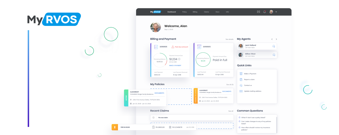
RVOS had an idea of a web portal for their clients to manage insurance policies and make and control payments and claims.
Our task was to provide RVOS customers with modern and efficient client service reserving the community feeling the company has.
The biggest challenge was to create such a system for a very narrow market from scratch.
About company
RVOS is an insurance company from Texas, US, that has been on the market for more than a hundred years now. The company emerged when a group of Texans set up a mutual help community to protect their property from natural disasters and other accidents.
Country:
USA
Employees:
up to 50
Cooperation:
2020-present
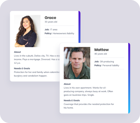
Project Team
Project
Manager
Business
Analyst
UI/UX
Designer
3 Developers
Copywriter
User Experience
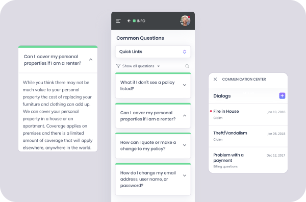
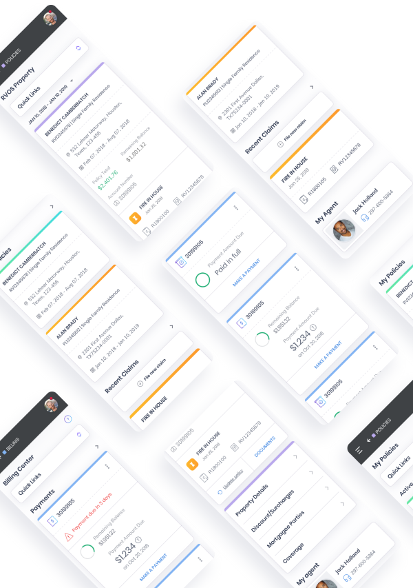
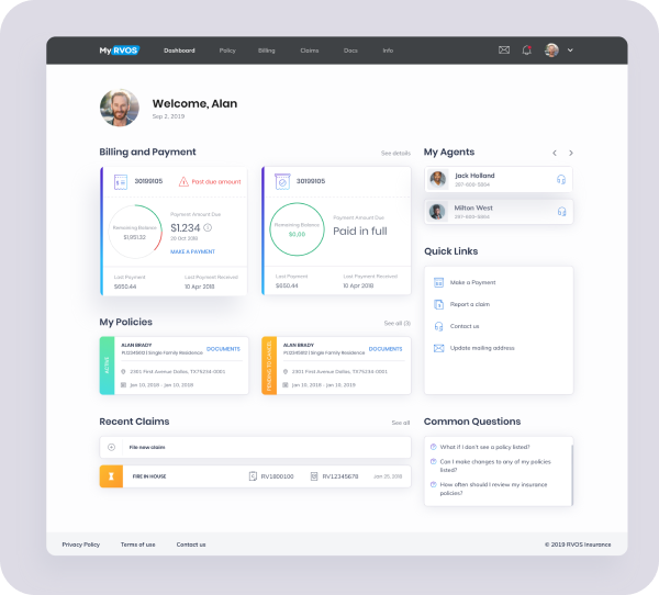
To be apparent to any user, navigation should be simple and elegant. We developed a convenient system for a few policy owners. Also, quick links to the important questions and personal agent contacts were added. The dashboard provides generalized information, which also simplifies interaction with the product.
Style Guide
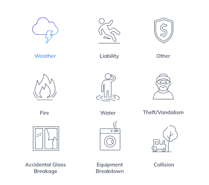
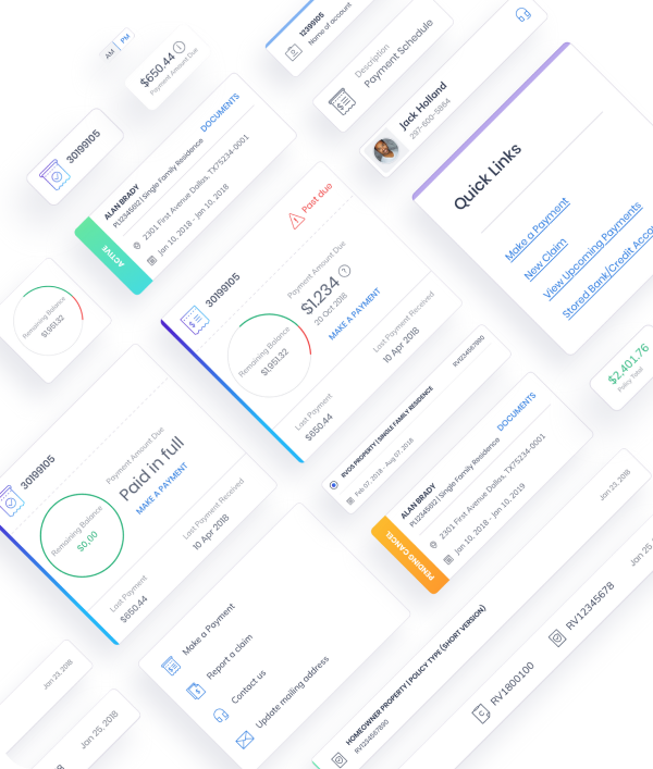
The visuals also should be developed the way they welcome and comfort users and lead them through the product. We developed the smooth design full of light and refreshed it with pops of color and gradient. Each category on the website is marked by a specific color. By the way, look at the icons! We developed the set of cute custom icons for the website and like them a lot.

Branding
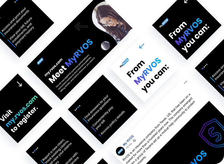
We got inspired by the Texans team spirit, which are always cued to lend a helping hand. To make a successful branding, we tried to synchronize the company stable reputation with modern design trends.
Project technology stack
The Insurance industry is known for complex processes explained by the high level of responsibility.

