
Gone are the days of endless forms and confusing websites—customers expect things to be fast, easy, and digital. If your insurance user experience isn’t up to par, you’re losing business. Nail the experience, and you’ll turn curious visitors into long-term clients.
This guide delves into why UX matters in the insurance industry, outlines core design principles of insurance portal modernization, and provides actionable strategies to further enhance user experience across your digital offerings.
Why User Experience Matters in Insurance
The modern consumer is no longer willing to tolerate cumbersome processes or confusing interfaces. Whether they’re signing up for a new policy or filing a claim, customers expect the same level of ease and efficiency they experience with leading tech platforms.
The rise of on-demand services, from ridesharing apps to food delivery platforms, has set a high bar for digital experiences. Insurance companies must rise to meet these expectations to remain competitive, whether they use create from scratch service or redesign service.
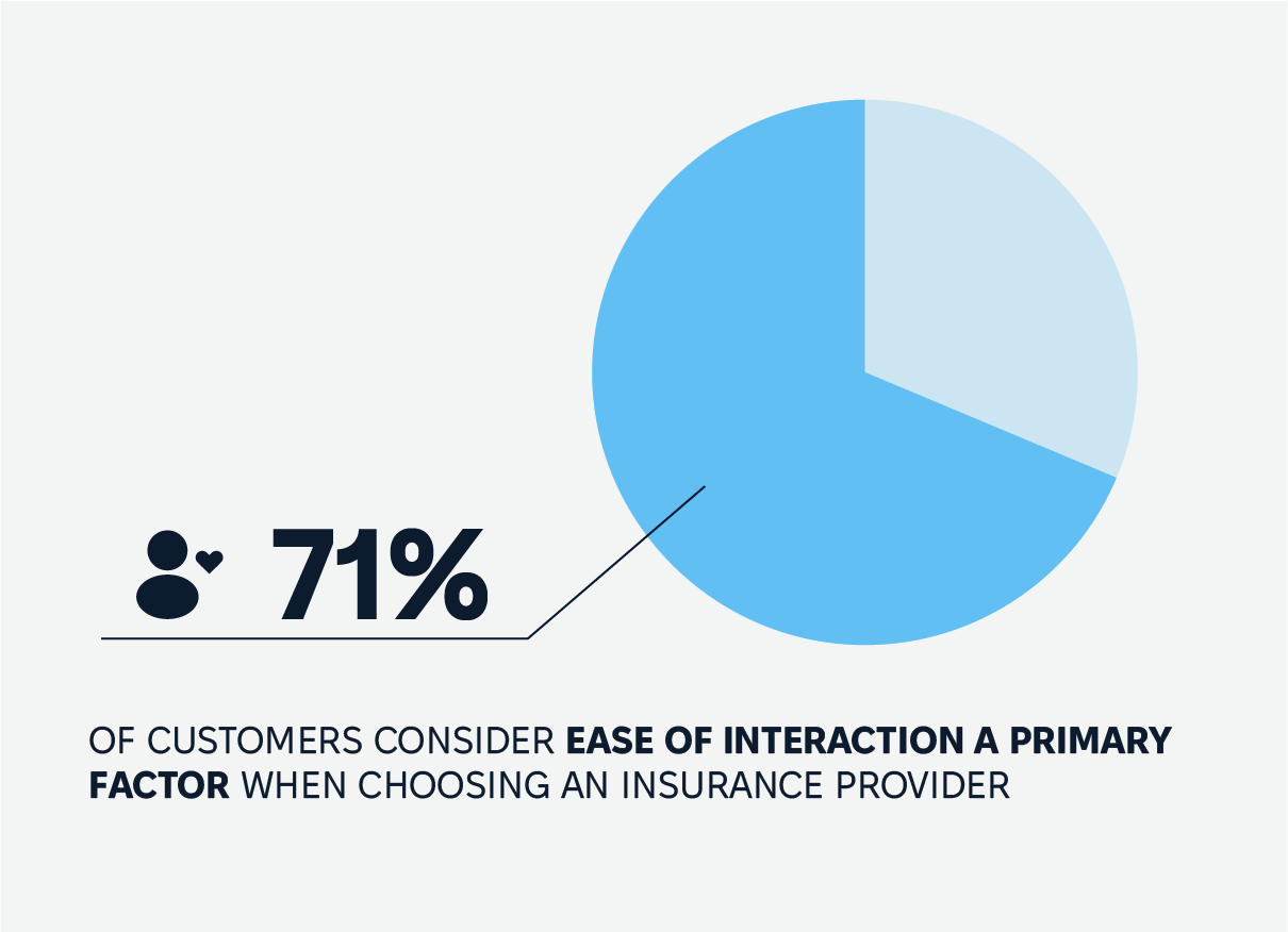
In fact, according to a recent survey, 71% of customers consider ease of interaction a primary factor when choosing an insurance provider. Digital-savvy customers expect seamless processes, from finding information to managing their policies—any friction can push them toward competitors.
Impact of Poor UX on Insurance Business
The cost of poor UX goes beyond customer frustration. It can result in lost sales, increased customer churn, and negative brand perception.
Consider this: a customer struggling with an unintuitive claims process may not only abandon insurance application for their current claim but also switch providers when it’s time to renew. In an industry where trust and reliability across various services are paramount, poor insurance user experience can have a ripple effect, impacting reputation and revenue.
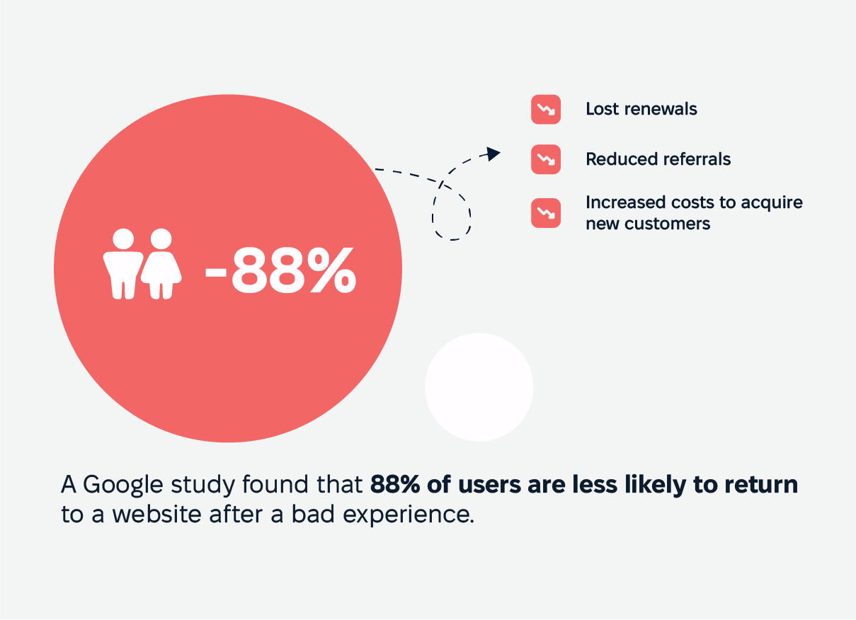
For instance, a Google study found that 88% of users are less likely to return to a website after a bad experience. In the whole life insurance sector, this translates to their business models
lost renewals,
reduced referrals,
increased costs to acquire new customers.
Furthermore, regulatory scrutiny may arise if poor interfaces lead to compliance issues, such as unclear communication confuse users about policy terms.
Impact of Good Insurance UX Design: ROI
Investing in UX is an investment in business growth. Studies consistently show a strong return on UX spending, with some estimating that every dollar spent on UX design returns $100 in benefits. In the insurance sector, this can mean higher customer retention, increased policy sales, and reduced operational costs through self-service solutions.
A standout UX is a serious competitive edge , first of all. But it’s also a driver of profitability and therefore customer satisfaction and loyalty. Ready to discuss your UX opportunities?
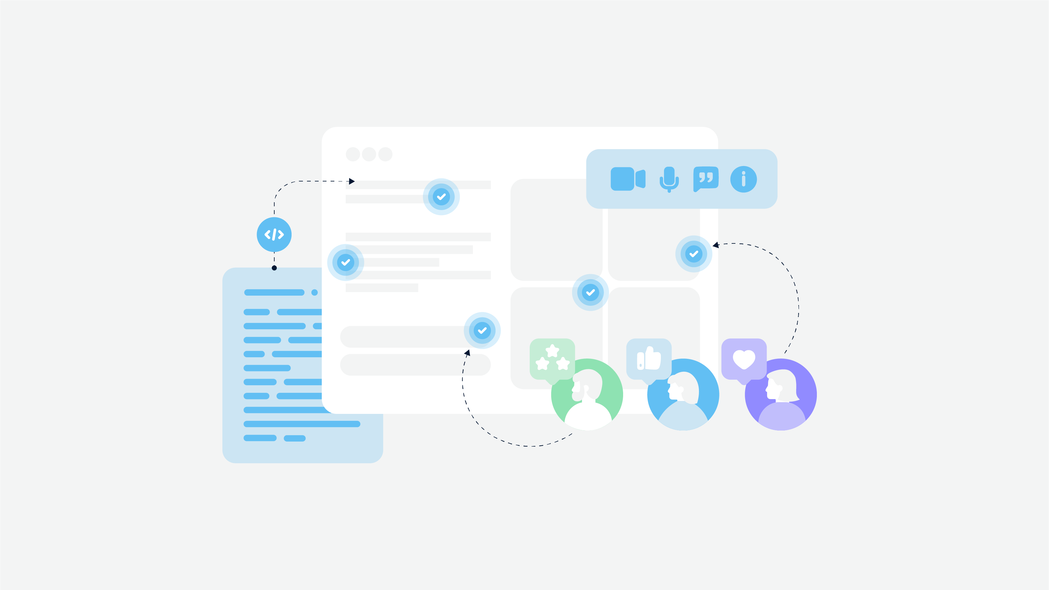
Core Elements of Insurance User Experience
Insurance user experience (UX) is all about cutting through the clutter and making things smooth as silk for everyone involved. For policyholders, the goal is to make navigating the insurance world feel like a breeze, not a storm. For insurers, a great UX means happier customers and fewer headaches on the operational side. Let’s break down what it takes to craft an insurance UX that hits it out of the park.
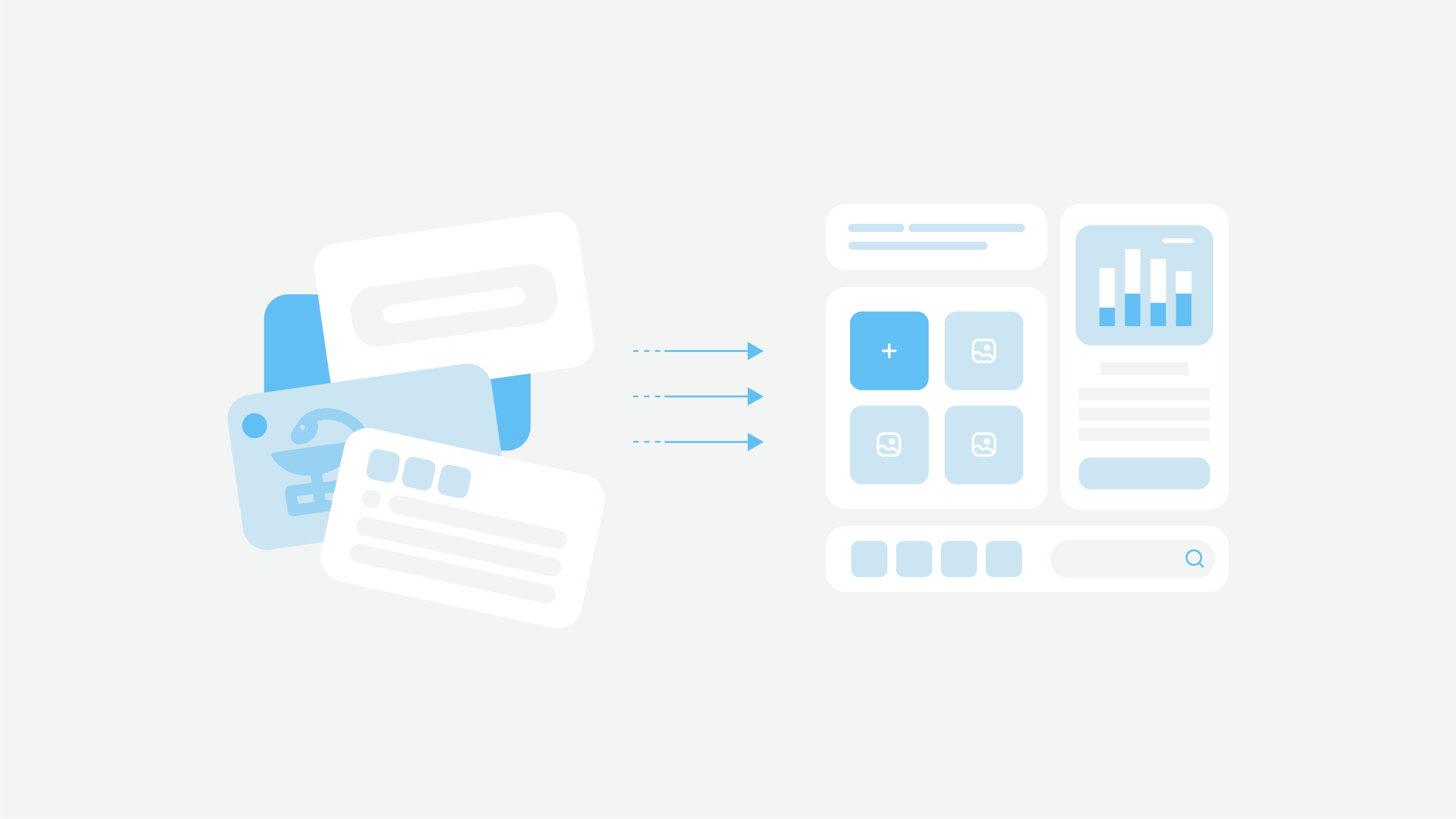
Turning a Mess Into a Masterpiece: Simplifying Complex Information
Insurance policies often read like they were written by a lawyer with a thesaurus. Simplifying this maze of jargon is step one to a stellar UX.
Making policies crystal clear
Skip the gobbledygook. Use plain language, bullet points, and bite-sized summaries to ensure the most important stuff stands out. Think of adding “key takeaways” sections that act like a map, guiding users to what matters most.
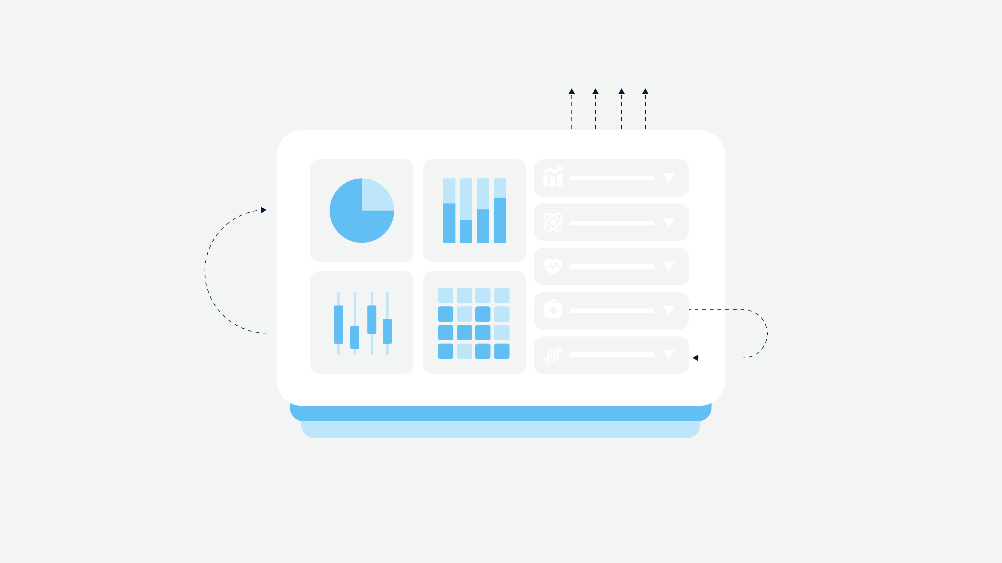
Visuals that pack a punch
A picture’s worth a thousand words—and in UX, maybe even more. Charts, graphs, and icons help transform dense data into something people can easily digest. For example, a simple graph showing how premiums evolve over time is far easier to grasp than a wall of text.
Peeling back the onion with progressive disclosure
Show info in layers so users don’t get overwhelmed. Start with the basics, then let them click for more details. For instance, a concise policy summary with an expandable “read more” option keeps things tidy while leaving the details just a click away.
Why it matters
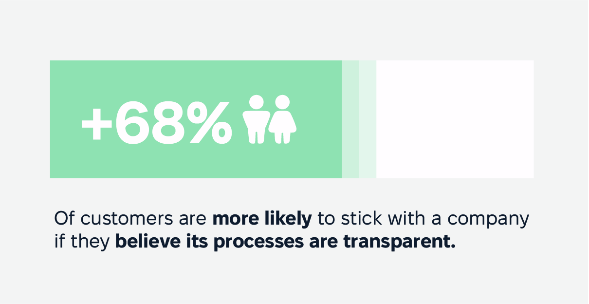
Here’s the kicker: clear communication is a win-win. It reduces confusion, which in turn cuts down on errors and disputes. In fact, 68% of customers are more likely to stick with a company if they believe its processes are transparent. Plus, customers who understand their policies are less likely to feel blindsided when they file a claim.
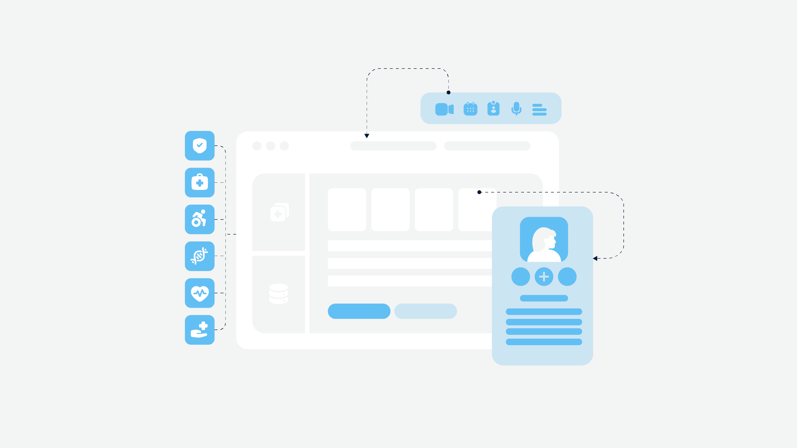
Streamlining Insurance Processes: Cutting Out the Middleman Hassle
When it comes to insurance, the digital transformation isn’t just about flashy tech—it’s about making life easier for customers. A smooth process keeps end users happy and insurers running like a well-oiled machine. Here’s how to make it happen:
First impressions done right with proper onboarding
Think of onboarding as a front door that swings open instead of making people fumble with keys. Use intuitive forms, autofill features, and real-time validation to make signing up a breeze. Clear progress bars show potential customers where they’re on track, reducing drop-offs.
Claims processing: turning nightmares into nods of approval
Claims can feel like navigating a maze, but a user-friendly interface can change the game. Provide step-by-step guidance and real-time tracking so customers know exactly where they stand. Notifications and updates at every stage are like a GPS for peace of mind, easing anxiety and frustration.
Policy management
Customers crave quick and easy access to policy details, payment options, and renewal tools. A centralized dashboard with clean navigation is the secret sauce. Toss in self-service tools—like the ability to update policies or schedule payments—and you’ve got empowered users who don’t need to call for help every five minutes.
The dynamic duo of automation and personalization
AI-powered chatbots and guided navigation are like having a digital concierge 24/7. They handle common tasks with efficiency and a personal touch, giving users a sense of being understood while freeing up your team for more complex issues.
Why it matters
Smooth processes don’t just make customers happier—they improve loyalty. 74% of consumers say they’re more likely to stay with a company that offers simple, effective digital tools. Plus, fewer complaints mean lower premiums and fewer headaches for insurers, too.
Read also: Insurance Digital Transformation Guide 2025
Key Principles of Insurance UX Design
Form my perspective, these three principles help to create a platform that works for every customer, every time.
1. Accessibility and Inclusivity: Open Doors for Everyone
Making your digital platforms accessible isn’t just the right thing to do—it’s a must for both legal compliance and happy customers.
Features like adjustable font sizes, screen reader compatibility, and alt text for images ensure your platform is easy to use for people with disabilities. Think of it like adding ramps and elevators to a digital building—access for all, no exceptions.
With most folks glued to their smartphones, optimizing for smaller screens is crucial. Responsive design is your MVP here, ensuring the experience is smooth whether users are scrolling on their phones or tapping on a tablet. From desktops to wearables, users expect the same functionality and design no matter where they log in.
2. Trust and Security
In the insurance world, trust is not only earned but designed. A clean, uncluttered layout with professional visuals reassures users that they’re in good hands. Familiar navigation and clear labels make them feel at home rather than lost in a digital jungle.
Show users you take their safety seriously. Two-factor authentication, secure payment options, and visible security badges act like locks on a front door—reassuring and protective.
3. Consistency and Intuition
Whether it’s the insurance app UX, insurance website, or portal, users should feel like they’re interacting with the same “personality” across every touchpoint. Use the same design elements, color schemes, and logic across platforms. This reinforces your brand identity and makes navigation second nature.
Think ahead and predict user needs. For example, an app that suggests quick actions—like paying a bill or reviewing a claim—can feel like it’s reading their mind.
The RVOS Insurance UX Case Study: Insurance UX Transformation
RVOS Insurance, a trusted name in Texas, needed a major digital upgrade. Customers wanted an easy way to manage policies, file claims, and make payments online—but outdated manual processes were slowing things down. The challenge? Modernizing their system without losing the personal touch that made them stand out.
The Solution
Our team stepped in with a user-first approach. Using React Native, Java, and PostgreSQL, we built a seamless, intuitive platform that automated tasks, simplified claims, and made payments effortless—all while further user adoption and preserving RVOS’s strong community values.
The Results
30% increase in customer engagement,
25% fewer support queries,
faster, smoother claims and payments.
By focusing on user experience, we didn’t just improve the platform—we made life easier for RVOS customers and set the company up for long-term success.
More details: RVOS case study
Common Insurance UX Challenges and Solutions
Creating a smooth UX in insurance has its bumps in the road. Here’s our breakdown of common hurdles and how to leap over them like a pro.
1. Complex Navigation: Don’t Leave Users in the Maze
When users feel like they’re wandering in circles, frustration sets in fast. So try fix it with:
Logical menus and breadcrumb trails to give users clear paths forward.
Robust search function so they can jump straight to what they need.
Sticking to the three-click rule: any key feature or info should be reachable within three clicks.
Think of navigation like road signs—clear, visible, and guiding users exactly where they need to go.
2. Information Overload: Less Is Better
Throw too much at users at once, and they’ll check out faster than you can say “deductible.”
At Cadabra, we fix it with:
Using white space generously to give the page breathing room.
Prioritizing content so the most important info pops out.
Breaking content into bite-sized pieces, layering complexity with progressive disclosure.
From our experience, most users say an uncluttered user interface also makes them more likely to trust a site.
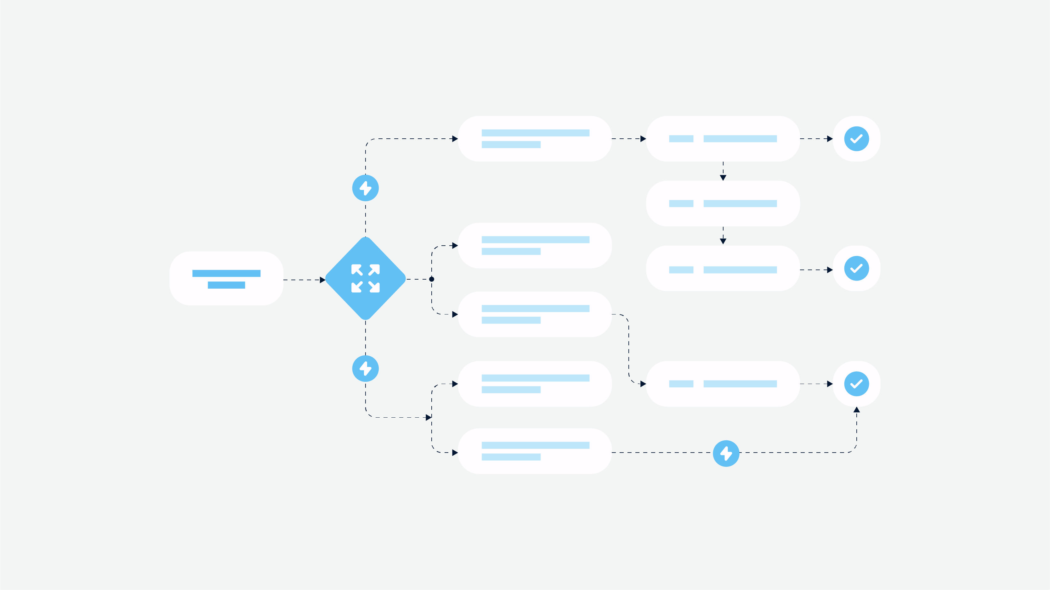
3. Multi-Step Processes: Short and Sweet Wins the Race
Lengthy or unclear workflows can make users throw in the towel. Fix this with:
Chopping tasks into smaller, manageable chunks to make them less overwhelming.
Adding progress indicators so users know exactly how far they’ve come and what’s left.
4. Legacy System Integration: The Elephant in the Room
Outdated systems can bog down efforts to modernize the user experience. They are hard to navigate, slow to load, and impossible to make intuitive and secure. We fix it with:
Using modular design solutions that work alongside legacy systems.
APIs and middleware act as the glue, allowing sleek new interfaces to play nice with older tech.
Upgrading doesn’t have to mean ripping out the old—think of it as renovating the house while keeping the foundation intact.
How to Implement Better Insurance User Experience
In a way to improve insurance UX design, you need to use a strategic approach, blending research, user centered design principles, and continuous optimization. A well-structured design process also ensures that every digital interaction enhances user satisfaction. Here’s how you can do this.
Research and Planning
Before diving into design, it’s crucial to understand user needs, pain points, and meet user expectations first.
User research methods: conduct surveys on insurance product, interviews, and usability testing to gather insights directly from customers. Leverage heatmaps and analytics to identify friction points in existing digital experiences.
Competitive analysis: study competitor platforms to assess industry standards, identify gaps, and uncover opportunities for differentiation.
Defining UX strategy: UX designers develop a roadmap that aligns user needs with business objectives, prioritizing areas for driving user adoption and improving operational efficiency.
Design and Development
With a solid research foundation, the next step is crafting and using the information architecture for successful solutions and refining user-centric experiences.
Prototyping: develop wireframes and interactive prototypes to visualize and test different design concepts before full implementation.
Testing: conduct A/B testing, usability testing, and accessibility checks to ensure that the interface is intuitive and inclusive for all users.
Implementation: roll out UX improvements iteratively, using agile methodologies to refine designs based on real user feedback and performance metrics.
Measuring Insurance UX Success
Measuring UX success starts with quantifiable data. Here are essential UX metrics to monitor:
User Engagement: Track time on site, page views, and session duration to assess user interaction levels.
Conversion Rates: Evaluate how effectively users complete desired actions, such as policy sign-ups or claims submissions.
Task Success Rate: Measure the percentage of users who complete key tasks without issues.
Drop-off and Bounce Rates: Identify where users abandon the process, signaling areas that may need simplification.
Customer Support Requests: A high number of support inquiries may indicate usability problems that require attention.
User Feedback Analysis
Numbers only tell part of the story—real user feedback is where you uncover the good, the bad, and the frustrating. Surveys and questionnaires give customers a chance to voice their opinions, whether it’s about a clunky form or an easy-to-use claims process. Watching actual users navigate the platform through usability testing is another eye-opener, often revealing issues that aren’t obvious in data reports.
Continuous Improvement
Improving UX isn’t a one-and-done deal—it’s an ongoing development process that needs constant tweaking. A/B testing helps figure out what actually works by comparing different versions of a design. Instead of flipping everything upside down with a big overhaul, making small, steady updates based on user feedback keeps things moving in the right direction without throwing anyone off.
Future of Insurance UX
The future of insurance UX is all about making things quicker, smarter, and more user-friendly. AI and automation are taking over tedious tasks like claims processing and customer support, making everything run smoother and faster. Chatbots are handling common questions, while machine learning is fine-tuning policy recommendations so customers get what they actually need.
Personalization is also becoming a game-changer. People don’t want generic plans—they want insurance that fits their specific needs. Whether it’s flexible pricing, tailored policy suggestions, more benefits, or helpful risk insights, insurers who use data to create a more personal experience will win customer trust and loyalty.
Ready to Transform Your Insurance UX?
We’re here for you. Team up with Cadabra to craft smooth, easy-to-use digital experiences. We’ll help boost conversions, streamline processes, and make your customers happier. Reach out today and kick off your UX redesign!
FAQ
How much does UX design cost for insurance companies?
The cost of UX design for insurance companies can vary widely based on the scope and complexity of the project. Factors include the size of the insurance portal, the level of customization required, and the expertise of the UX designers involved. On average, costs can range from a few thousand to several hundred thousand dollars, depending on these variables.
What factors influence the cost of UX design in the insurance industry?
Several factors influence the cost of UX design in the insurance industry. These include the project’s scale, the number of features and functionalities required, the need for research and user testing, and the experience level of the design team. Additionally, ongoing maintenance and updates can also impact the overall cost.
What role does UX design play in insurance portal modernization?
UX design is crucial in insurance portal modernization as it focuses on creating intuitive and user-friendly interfaces that enhance the overall user experience. By understanding user needs and incorporating user feedback, UX designers can craft solutions that improve customer satisfaction and encourage long-term engagement.
What are the latest technology trends in the insurance industry?
The latest technology trends in the insurance industry include the use of AI and machine learning for personalized policy recommendations, automation of claims processing, and the integration of digital tools to enhance user experience. These trends help insurers stay competitive and meet evolving user expectations.