What are the reasons for low conversion? Well, there is a large number of them. For example, according to WordStream, even a 1-second delay in page loading time may lead to a 7% reduction in conversion. And you need to monitor all key metrics not to lose your customers.
If it has already occurred, you should identify the reason and think about options to increase and optimize your conversion. Low conversions are reflected in bounce rate metrics. The higher the bounce rate is, a large number of customers leave your website. So a high rate is not always good.
We would like to share with you important tips on how to increase conversions, optimize a website, and how to reduce bounce rate. Check it out!
Reasons For High Bounce Rate
For a start, it is necessary to identify what bounce rate is and how to monitor it. The bounce rate shows the number of users that visited your website and left it after a short period. It is calculated in percentage to the total number of users and those who left a website quickly.
So if you have a question like “what is a good bounce rate?”, you can see that it depends on the number of visitors, there are no precise figures.
Analysis Of A Bounce Rate
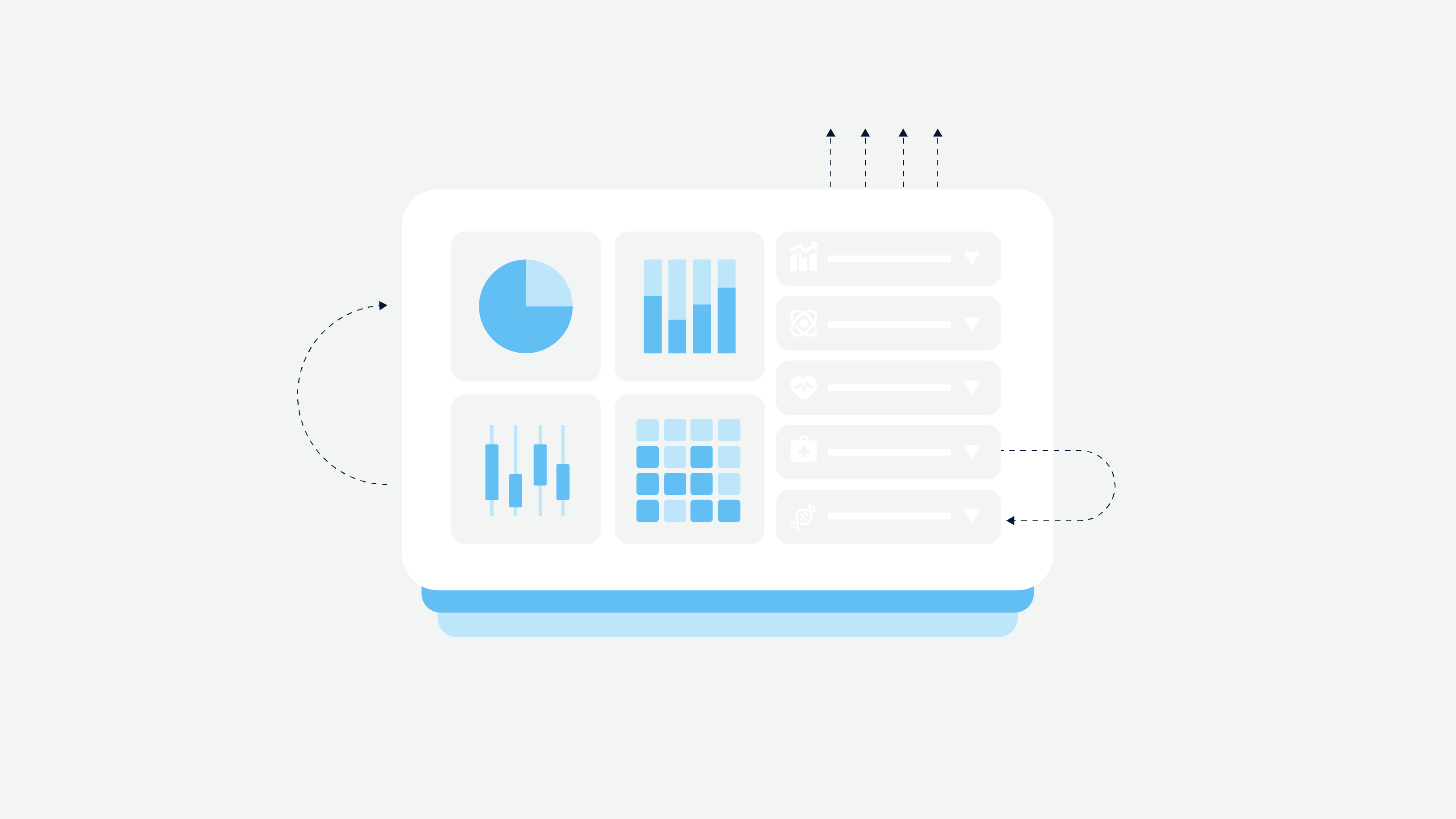
We recommend you to use the Google Analytics tool. It is a robust service that allows you to find all the required data concerning actions on your website. The Google Analytics tool registers bounce when during a session only one page was opened, and then users closed it without activation of other links or buttons.
How to fix the bounce rate? You need to analyze pages that are closed quickly by users. Content on these pages may be not interesting, navigation and UX may be too complicated, or non-targeted users visit these pages.
Besides, analysis of traffic sources (search system, contextual advertising, keywords, etc.) is also vital. A lack of certain products or services, the irrelevance of requests to page content — these are some of the possible reasons.
To avoid a bounce rate increase in the future, you need to consider a conversion rate optimization (CRO). The next section will cover all the necessary conversion optimization tips.
What Are The Steps Of Conversion Optimization?
In fact, what is conversion optimization? It is a process of increasing the number of website visitors who take the desired action — make a purchase, contact you, push the button, etc. Once you identified a high bounce rate and conversions reduction, you need to get a grip and analyze everything calmly.
If you keep up with the following recommendations, you will improve the situation and optimize your website.
Gather Essential Data
You need to gather as much information as possible. Remember that information is never enough when it concerns website optimization. The more information you have, the better the interaction you will have with your customers and provide them with the right services. This is how the conversion rate optimization works.
Let’s review 3 main options to gather data:
Google Analytics. Apart from bounce rate monitoring, as we noted before, you should use Google Analytics to monitor all other essential data like the number of visitors, funnel conversion rates, session length and interval, top pages, site speed, etc. Google Analytics is what you definitely should start with.
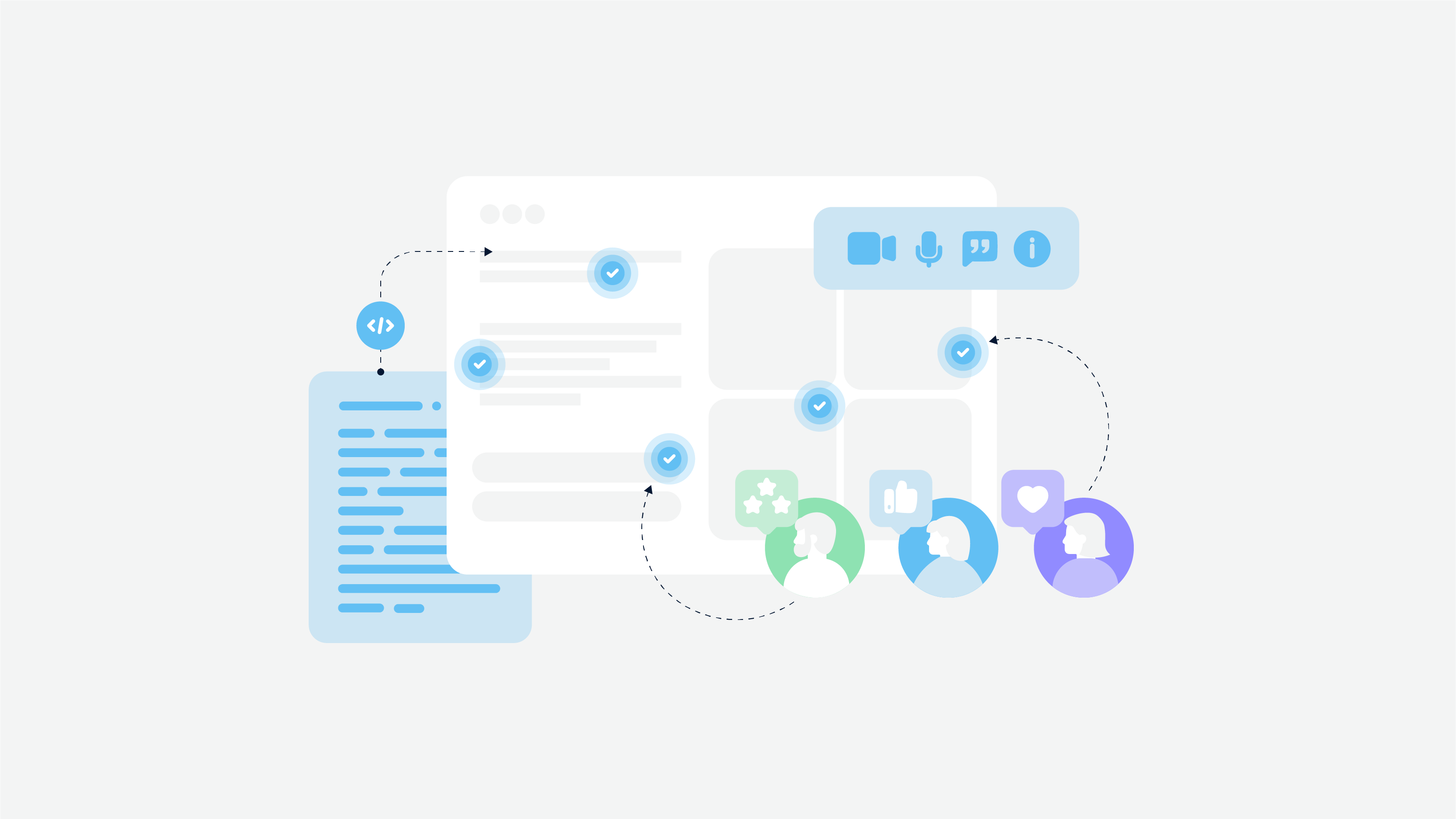
Customer survey. Conduct an online survey among your customers. For example, Hotjar tool has a Feedback Polls feature — it will simplify feedback collection. Make a list of the most important questions, but try to ask no more than 10 questions per one survey. Also, make sure that questions are clear for customers. And to motivate customers to spend some time on your survey, offer some small rewards like discounts or something else. By the way, if you conduct customer research prior to website development, it is a chance to increase customer loyalty.
Usability testing. You can find a few volunteers and ask them to perform a series of specific steps. You can record this process and then watch to find out everything about customer experience and whether something was confusing for them. A Hotjar tool is also appropriate in this case, it may help you record all the actions of your users. Usability tests are also crucial since you collect real feedback and you can improve everything ASAP.
A/B Testing
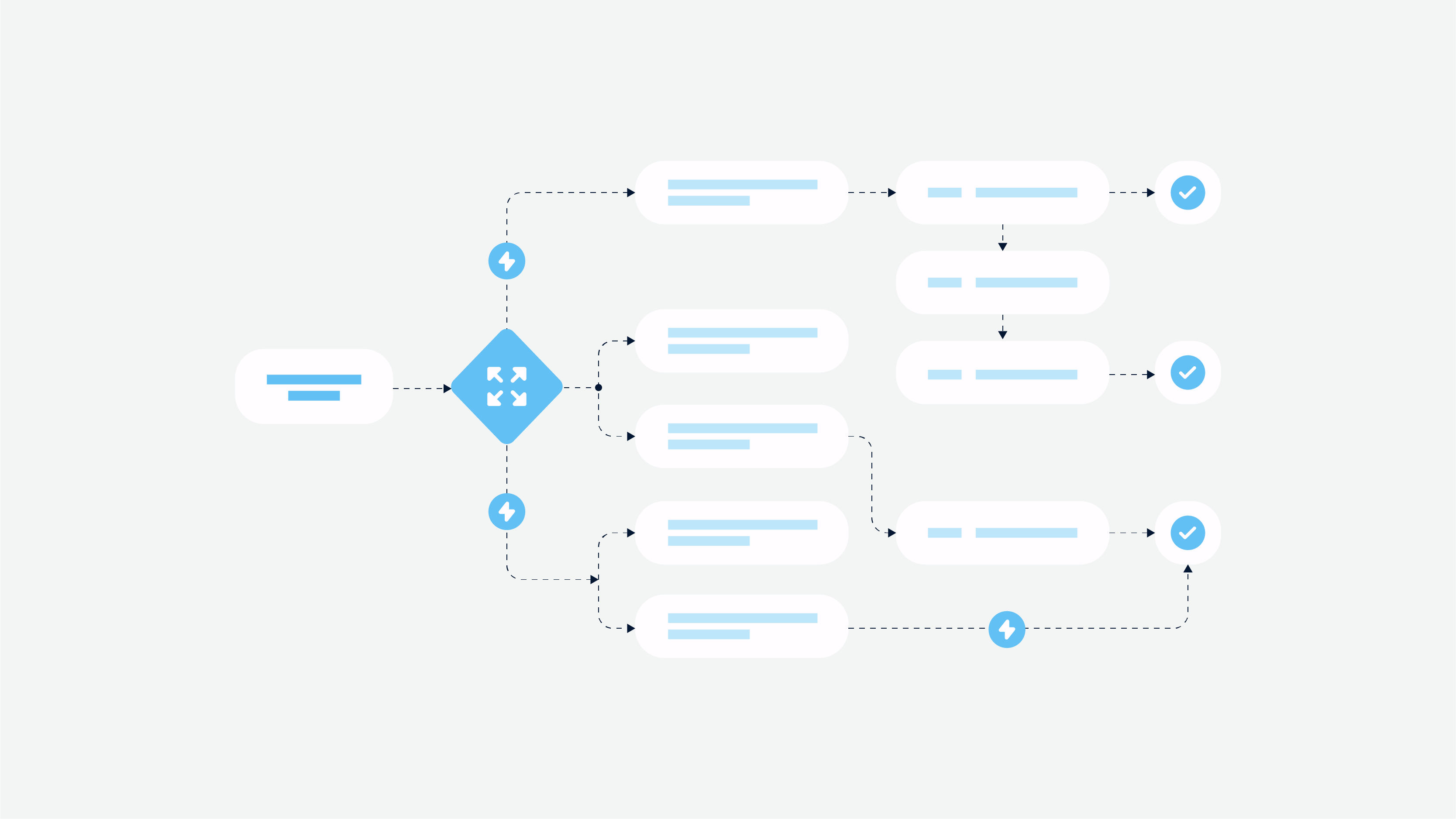
This testing stage is separate and it requires much time to do everything wisely. What is A/B testing? It allows you to measure the efficiency of a website (or one page) by comparing its different versions. That is, visitors may see different versions of one page.
You set specific goals — for example, each version should be seen by 10,000 users — and then an appropriate A/B testing tool compares the results and shows you what version is more interesting for users.
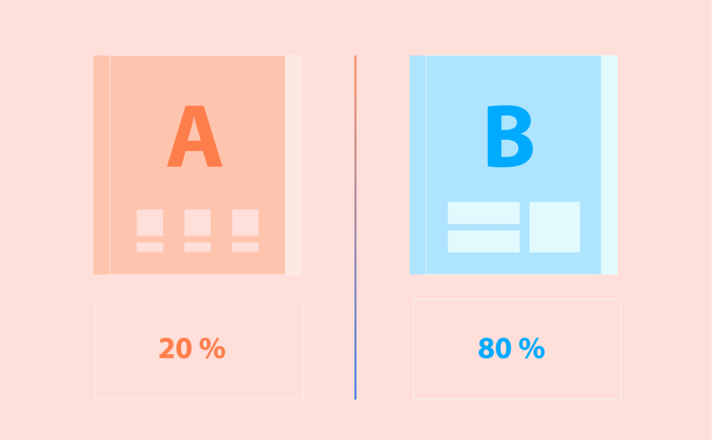
To start A/B testing, you may use the Google Optimize tool. It may be coupled with Google Analytics, so you benefit from both these tools when performing website funnel analysis. To perform A/B testing, you need to consider the following steps to succeed:
Start with website UI elements. We mean you need to start with user interface elements like icons, color schemes, themes, buttons, images, etc. You may change it, create as many variations as you plan. And then see what variation meets expectations of customers mostly.
Determine the number of variations. Smoothly switching to the point of variations amount. Decide on the number of variations based on your traffic.
Make a list of hypotheses. Hypotheses mean some ideas or affirmations that should be verified by testing. You may collect the ideas of your employees and consider their opinion, it may be important. Testing without hypotheses is useless since you don’t know what to do with results.
Don’t stop testing too early. If you want to see valid results, you should perform testing for a rather long period. Otherwise, haste makes waste, and quick testing won’t show you precise results.
Don’t ignore consistency. Test everything sequentially. You should have a plan for each testing stage. If you perform A/B testing in order, you will not miss everything, and it lets you improve your website.
That’s it! All gathered data and results of testing may be used to improve your website and meet all preferences of customers. But there is something you also need to take into account when you improve a website — well-designed user experience.
Why Is Well-Thought UX Design Essential For Conversion Optimization?

Good user experience means a lot for website optimization. Especially if you intend to create a website, UX of your website should be intuitive and simple. Thus, you will be able to avoid a bounce rate increase and retain more users. There are 4 key UX points you need to pay attention to when building a website.
Content Importance And Readability
When a website is being created, a UI/UX designer must consider beforehand the location of the content on the pages. When users see the content that is in the right place, with properly chosen fonts, they feel comfortable and read everything at ease.
One more point to consider is website readability. Everything should be visually clear, users won’t spend time trying to understand what is written over there. All copies should be readable enough, so a large font is what you need in the first turn.
At Cadabra Studio, our UI/UX designers always keep in mind content readability during the design process. Especially if the website should be responsive, and readability on mobile devices plays a crucial role as well. Our experience will help you choose the right approach. Contact us to know more!
CTA Buttons
As experience shows, it is recommended to place call-to-action (CTA) buttons above the fold. It will have a positive impact on website design and conversion optimization. When visitors enter your website first, they should see a call to action. But remember that it cannot be too intrusive, otherwise, potential customers will close the page and it won’t improve bounce rate.
Forget About Too Many Navigational Links
Another point that may confuse your visitors is an abundance of navigational links. For example, you open a landing page and you see too importunate (and even furious) calls to make a purchase/order a service ASAP, etc. It is the wrong approach. And it is what we’ve just told you about CTA buttons.
You shouldn’t think only about getting your visitors to convert. Let them stay awhile on your landing page, read more about your services, make their decision, and then move on! You will see that conversions begin to increase.
If you have already conducted a customer survey, you could have gathered useful feedback from potential and existing customers concerning a user journey, so you will be able to start reducing the bounce rate.
Keep It Mobile-Friendly
Your website should be mobile-friendly if you want to gain more customers and improve conversions. If you don’t have a mobile app, make sure to provide users with a perfect experience via a responsive website. Make your website optimized for mobile.
For your information, the Google search engine prioritizes the mobile version of the website, it is a mobile-first indexing approach. Thus, if your website isn’t mobile-friendly, you fall behind. To make sure your web page is mobile-friendly, use a specific testing service from Google.
Website Performance
And the last but not least issue is the speed of your website. Page loading time shouldn’t exceed 5 seconds, 3 seconds ideally. The majority of websites suffer from conversion reduction due to high loading time.
Visitors will abandon the website if it loads more than 3-4 seconds. What should you do if your website is heavy and it processes too many requests, deals with complicated features? A splash screen may be a solution. If you add some information on a loading page, users may be distracted by it and wait till full page loading.
Besides, keep in mind to use the FCP metric — a First Contentful Paint. It had a direct impact on the bounce rate since it measures perceived load speed. Give your users content first instead of images. It can be done using progressive web apps (PWA) practices when text is loading first, and graphic content is afterward. It may ensure that users will get acquainted with the text and won’t close a page within 5 seconds.
Conclusion
Drawing the line, we can give you one more piece of advice if you just start your business. Even if you cannot afford a good UX, what should you do? Our relevant article will spell everything out.
Analyze, make changes, test, analyze — keep up with this simple rule and your luck is around the corner. Use appropriate conversion optimization services, and your website will increase conversions and the bounce rate will be as low as possible. Do you need our help? Get in touch with us via the contact form — our goal is to spell everything out for you.


