Our designer Olga shares her experience in creating an easy design handoff as well as dealing with common mistakes designers and developers typically make. Below, you will find Olga’s essential tips when it comes to design handoffs.
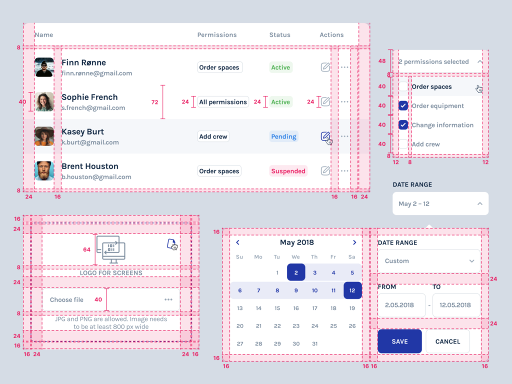
Mistakes everybody forgets about
Users
While making a design, it is always important to consider the users because you create the interface for them. Sometimes, we forget this truth, making an understandable design only for clients, designers, and developers.
Generally, before starting a design process, it is necessary to do UX research, including User Personas, User Journey, Mind Map, etc. Practically, the analysis depends on the clients’ budget, their participation in the project development process, and the art of conviction.
Sometimes, designers can stubbornly insist on particular design solutions they believe to be suitable for users. However, that’s not exactly true.
Once, the designers at Cadabra Studio were to do user research for the joint cycling app. Our clients and we considered people aged 25-35 to be the potential audience; however, the results of research impressed us a lot.
People aged 25-35 weren’t interested much in cycling. They had other types of entertainment. But people aged 40-50 showed great interest and even asked when the application would be released. They were interested in finding someone to join for active weekends. So, the interface of the app had to be designed accordingly to the potential audience.

This real-life example affirms that clients sometimes may be wrong with the identification of the app target audience.
Conditions
A digital product will always be used in certain situations and places it is created for. Building an interface depends on the interaction between the users and the product. It is necessary to find out this interaction in advance.
Determine whether a person is focused on the screen or works with it indoors/outdoors. It is especially true for products that people will use for work. We call it a situational factor that determines app features.
For example, the application for navigation that can be used on the go, while driving a car or when a person makes a glance at the screen while operating something else, should have the following features:
readable interface with large, bold, unambiguous icons and text;
the ability to make voice control.
Once, we were to design a video surveillance system app for a security agency. The challenge we faced was a misunderstanding of the security agency working conditions. Our team thought that the security room is sparse with light, so the app should have some specific features accordingly.
However, it occurred that the end-users of this product worked in huge bright rooms with large screens, like the air traffic control rooms in airports. Fortunately, we turned it out early enough to make some changes to the design. But the experience was precious.
Accessible design
Accessible design isn’t complicated but there are several points you have to consider. Always check your design for contrast, readability, the presence of a visual hierarchy, adequate typography, and ease of perception. Generally, these features work not only for user-friendly design but also for inclusive type.
A modular grid, both with a library of project styles and rules (header styles, etc.) are the best tools for making an accessible design. By the way, there are many programs for checking the contrasting effect of your design and how people with various color deviations see it (for example, the Color Oracle application). Which one is easier to read?

Data checking
It is the most challenging point, even for experienced designers. Frankly speaking, it is more a question of negligence rather than a lack of attention. So, before submitting the mockup to further development, make sure that the data used in it works properly. Check the length of the text on the screens, specify the maximum of possible numbers, and determine the date format.
There are specific limitations for each product type, so make sure you have examples of real data. Try to coordinate the restrictions at the design planning stage. For instance, there is a specific format for the insurance number. This fact helps you to take into account how much space you should leave for it.
Testing
Measure twice and cut once. If you are designing a website, try to open it in various browsers and see how it looks. If you’re designing an application — set up a clickable prototype on your smartphone and evaluate it from the user’s point of view.
Simply installing your app on the smartphone helps to find some bugs if there are so. Such distinct components as resolution, screen type, angles can affect the perception. You can look at the screen and understand that everything should be done differently or that there are some issues to be corrected.
User testing reduces the error costs if real users do not understand some parts of User Flow. It is cheaper to make some changes at the stage of design rather than at the stage of development and release.
We recommend using programs such as InVision/Marvel, Sketch Mirror/Figma Mirror, which allow us to simulate the process of product usage in real-life conditions, as well as Fullscreen Mode and the Preview in browser plugin for Sketch.
The lack of literacy
It is essential to know the basic terminology within the specific project. When the designer presents to a client the screen with typos in the words, it’s a horrible situation. Don’t embarrass yourself. Try to look through the text before uploading the mockup to the presentation.

How to avoid the mistakes above?
Place the buttons correctly.
For example, do not put the “Delete Post” button next to the “Save” button. Make sure that the users won’t delete anything by accidental clicking.
Provide your app with the function to undo the action.
Snackbar on Android is a great example. When you close tabs in the mobile version of Google Chrome, you get a message whether you want to close them and in case you don’t, you can cancel the action in a few seconds.
Help users with data entry.
If users can make a mistake, they will. A person can enter the wrong street name several times, and the absence of options leads to further lousy feedback and even leaving the site. The solution is simple: offer users the right options.
Data checking.
Provide users with the ability to check the data they enter.
How to optimize web design accessibility?
The following recommendations are based on our personal experience in Cadabra Studio.
Streamline your mockups
There is a golden rule for designers: streamline your mockups to make them handoff for developers and other designers within the project. Therefore, it is necessary:
To streamline all the components once the first screen is approved.
Of course, it is difficult to do at the beginning of the project when the style is unclear. However, we advise you to start organizing the mockups when the client makes the first approval.
Not to create chaos. It will grow like a snowball.
If you suddenly decide to put things in order at the end of the project, this process will be time-consuming.
Never transfer an incomplete file to a client/developer.

Always check the versions
To optimize your work and create design handoff to developers, we recommend you to check all the mockup versions in the following way:
Create a new folder in the cloud or drive with limited access. This folder should contain the “Archive” folder and the original version of the mockup. It helps your colleagues not to get confused.
There should be no “Final Final” file. We name the project and the date of its last edit. When the project designing process is done, you put the original version of the mockup in a separate folder and present it to the client.
All files must be saved in a separate folder in the cloud or drive. Accidents happen, right?
Before deleting/changing the components the customer has not approved, you need to copy the mockup to the “Archive” folder. Clients may suddenly decide to return some features that they resolutely refused two months ago.
Remove irrelevant screens in InVision to the archive. If there is a long-term project, some unrelated screens will confuse designers and developers. We do not advise you to delete the screens completely, but to archive them is a great thing.
Summary
What makes a good design? Communication and cooperation in creating a project. Design handoff provides a complete mutual understanding between designers and developers. While designing, keep in mind the design specs for developers. That’s the core of handoff design.
As the designers, we know what it feels like to get a poor project started by someone “experienced” and you waste tons of time to find the clue of the project. That’s extremely annoying.
At Cadabra Studio, we believe that the design handoff unites developers and designers. We are interested in command work that leads to successful project designing. Have you ever had any cases in creating an effective design handoff for users and developers? Share them with us.

