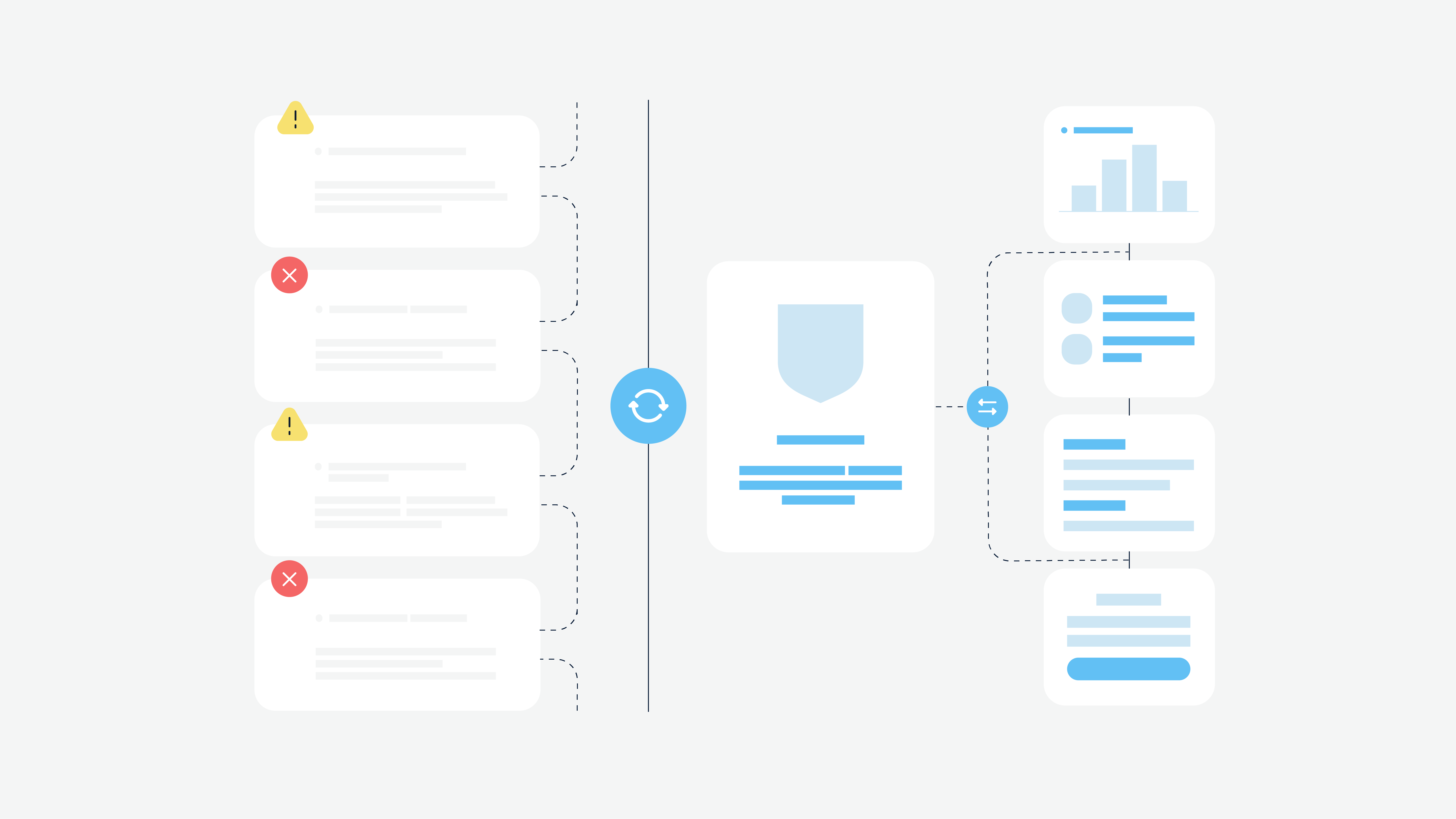
Online banking has already become a widespread and customary model of funds control and management. All modern banks create their website and mobile apps first to let people perform all financial operations remotely. But the development of a banking website is a complicated process, and it is highly required to consider even a small nuance.
We want to share some tips on making a banking website better, what must-have features it should have, and provide a compilation of the best financial websites design. Also, there are some UX mistakes you should never make when designing a banking website. Enjoy the reading!
What Makes A Successful Banking Website
For a start, we should determine what exactly makes a good banking website. Thus, it is essential to list the main aspects of banking websites that users need first.
- Availability. It may sound weird, but banking website availability is the first step to success. A young generation won’t consider a financial institution if it doesn’t have a website or mobile app. So any bank must have a website today with an online banking feature.
- Being mobile-friendly. According to Statista, in the second quarter of 2020, mobile devices generated more than 51% of global website traffic. It means that mobile devices are more popular today. And banking websites should be mobile-friendly and responsive to let users interact with the website efficiently.
- No landing pages. We mean that a banking website cannot look like a one-page brochure. Such websites usually offer different services, and the website should contain separate pages for each service. Also, it should have visible call-to-action buttons.
- The “above-the-fold” principle doesn’t work. Many websites try to provide all the vital information above the fold since not all users scroll the page down. However, banking websites cannot (and shouldn’t) contain unnecessary info. Thus, don’t be afraid to leave useful data below the fold — it doesn’t make a banking website worse.
- Social media integration. The bank should be represented in social media and communities must be created. The bank needs to stay active in these social media networks. Provide users with up-to-date information, create YouTube videos, and share envolving or educatory content — it will increase users’ trust and loyalty.
- Well-built SEO strategy. The banking website should have a robust search engine optimization (SEO) strategy to appear in top search results. Otherwise, even excellent content and high usability won’t make your website as popular as it can be.
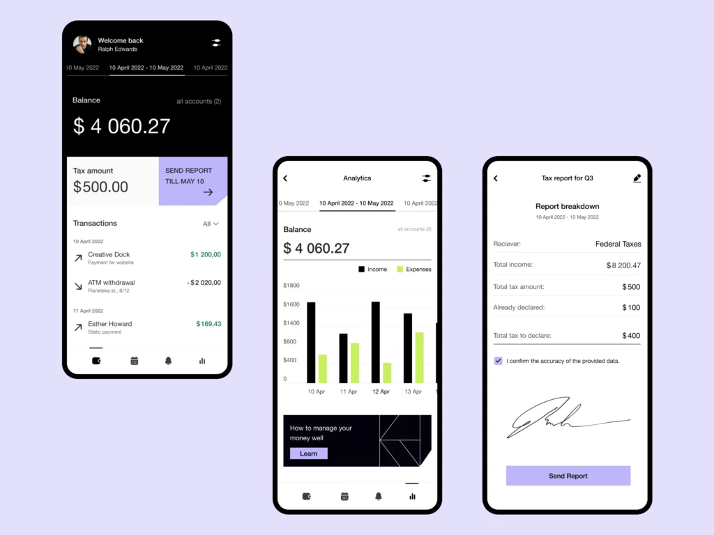
Ten Best Bank Website Designs In 2021
Now let’s take a look at banking websites that capture users’ attention and boast about fascinating design. We selected ten examples of the best bank websites, and you can look them through mindfully. It will help you understand the principle of financial services web design.
Simple
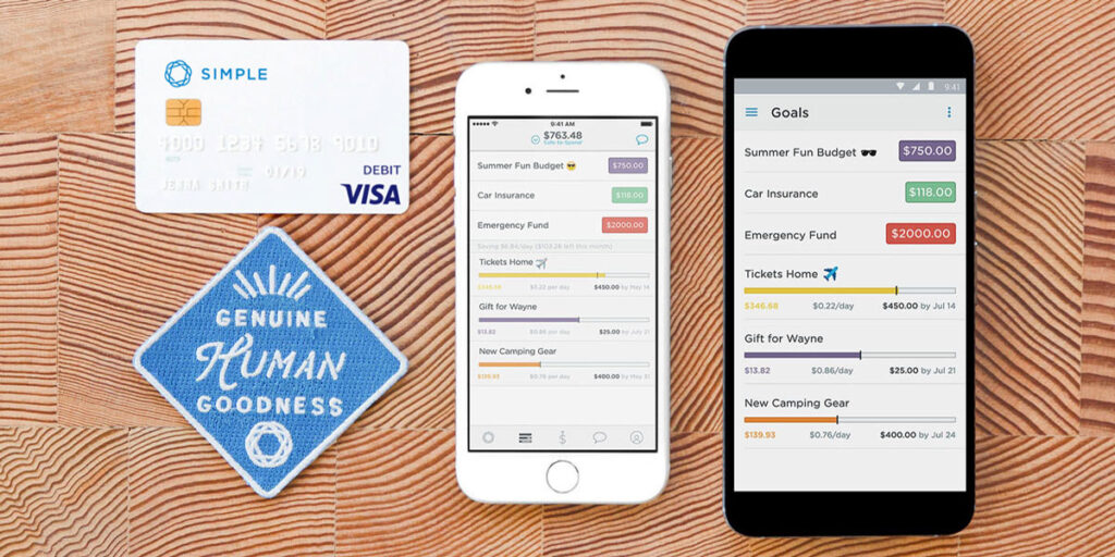
The name of the bank speaks for itself. Simple bank website provides simple and clear navigation; users won’t be confused even when they first enter the website. The website has a white background and large spaces between blocks to deliver the information better. The Contact us page contains a separate block related to social media pages where the bank is actively communicating with clients.
People’s United Bank
The People’s United Bank shows a golden mean in delivering as much info as possible without irritating the user’s eye. It is one of the best online banking sites with an eye-catching design. The PUB has a wide range of CTAs on the homepage that attract attention, and they can offer the right service clients need.
What’s interesting, the PUB contains the most vital information below the fold, not above. But the navigation bar at the top of the page allows clients to choose primary banking services like accounts creation and card issuance, etc.
KeyBank
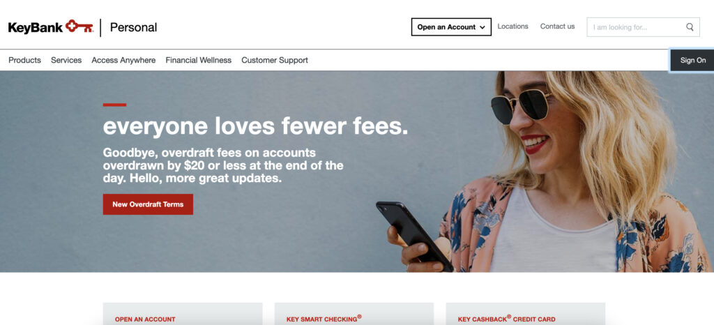
The KeyBank bank shows a logo in the form of a key. This an identification mark of the bank. The security of their clients is a top priority — as you enter a website, you see a large call-to-action button that leads you to a phishing FAQ containing crucial tips on avoiding fraud.
The window at the right corner above the fold calls clients to access their online banking accounts. White and red colors prevail on the website, making the design more consistent. On the whole, the KeyBank bank uses a user-friendly UX design model.
Heritage
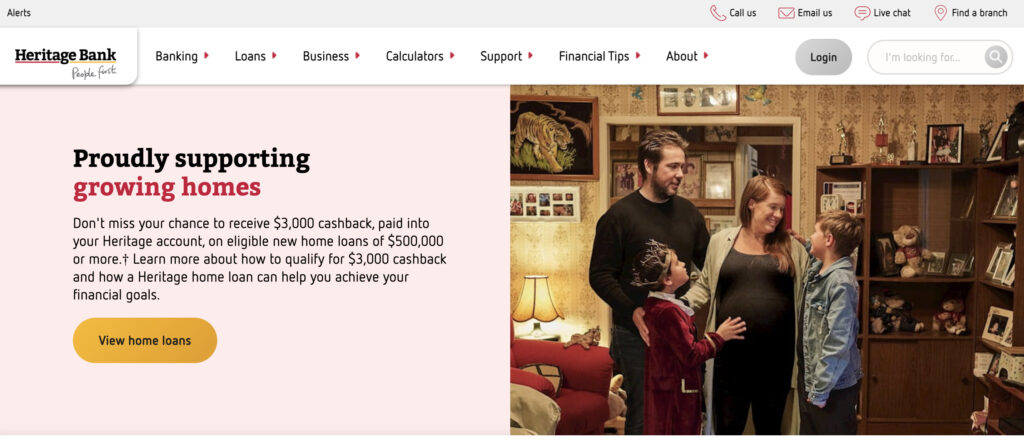
It’s another website that can also be considered as one of the best financial services websites. Heritage bank website focuses on convenient navigation and intuitive user experience. As you can see, the website allows anyone to find everything easily, considering that the navigation bar at the top of the homepage provides all available services with dropdown menus.
The website’s design has more white colors. Banking websites tend to use white color as an optimal color for the user interface.
Johnson Bank
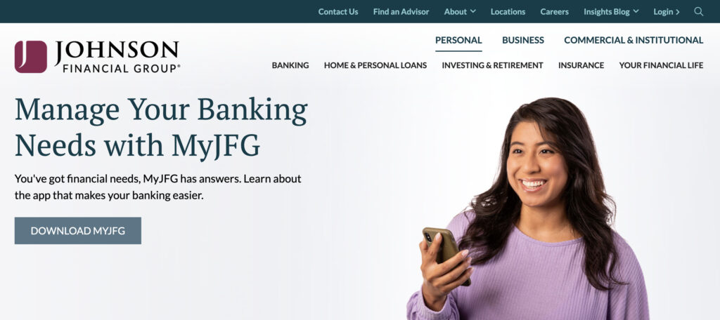
Johnson Bank is the bank with a conventional design model similar to websites listed above — a navigation bar, CTA to log in, list of services. However, it doesn’t make a website a clone of other banking websites. The website provides high usability, and it considers navigation behavior and the needs of all clients.
Also, the homepage starts with advice on how to communicate with the bank during the COVID-19 pandemic. However, such tips are contained on each banking website today.
Alliant
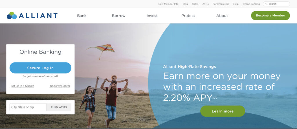
The Alliant bank can become a bank website design inspiration for your future (or existing) website. The bank has three circles in their logo, and the UI of the website uses these circles boldly — overlapping circle elements contain CTAs and other buttons to attract more attention. The Alliant bank contains images of cheerful grown-ups with kids — the habitual particularity used by many financial institutions.
Zenith
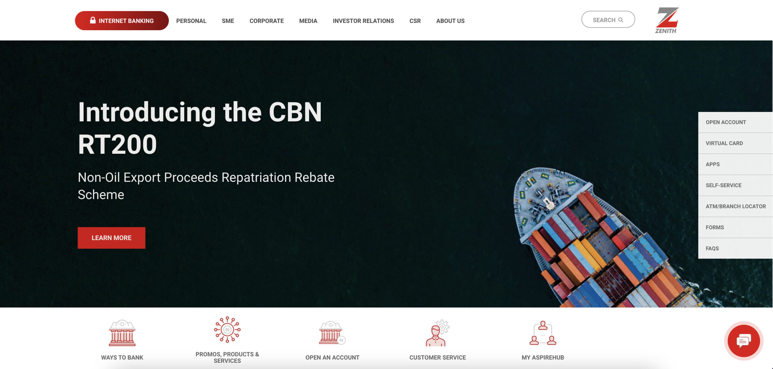
If you want to see another best financial services websites design, the Zenith bank is a good example. The website shows custom icons and custom background, high-resolution images, top-notch animation, and consistent design that makes the navigation process intuitive and easy. Loop video footage below the fold makes the overall design fascinating and calmer.
City Bank
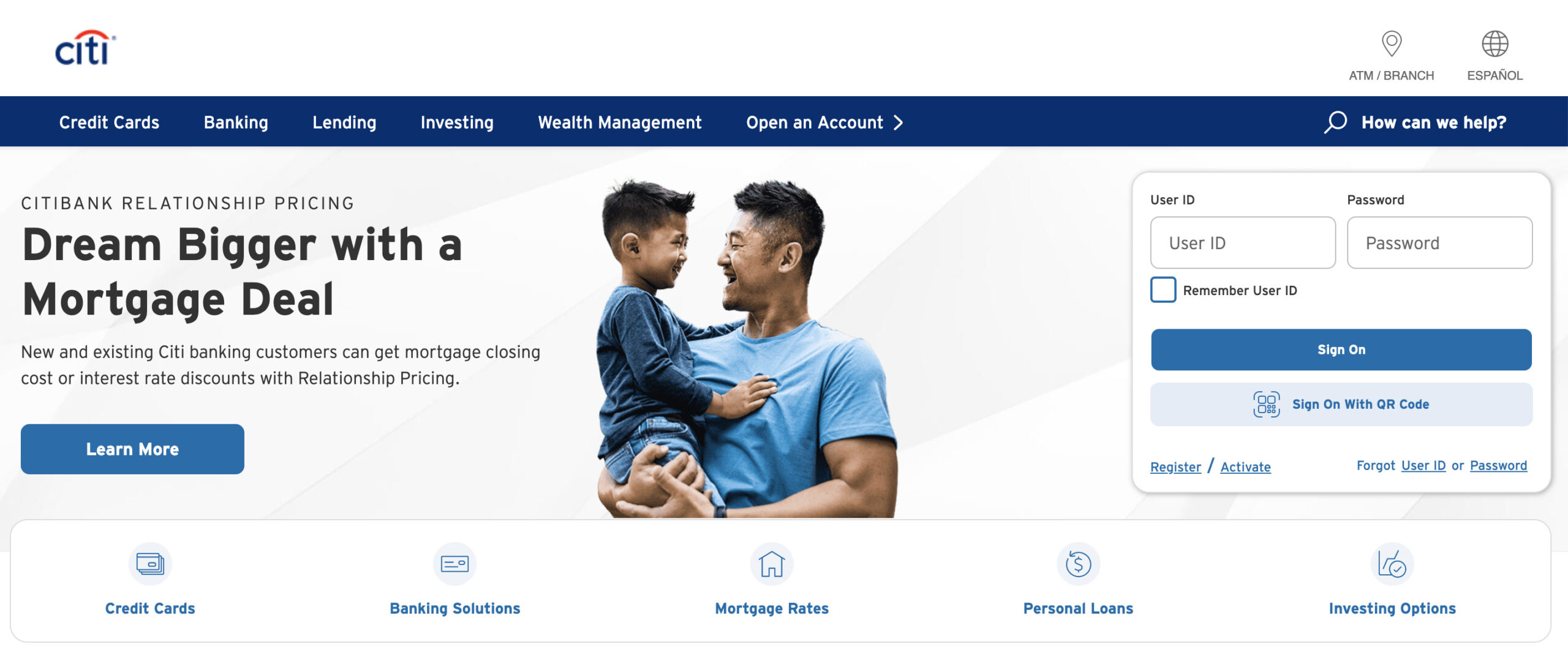
The City Bank website has an advanced user interface containing a promo video of its mobile app and CTA to download the app. The homepage consists of different blocks separated from each other, and each block contains its CTA and high-resolution image. Apart from white-and-blue background colors, the City Bank website focuses more on darker colors like red and gray.
Gateway Bank
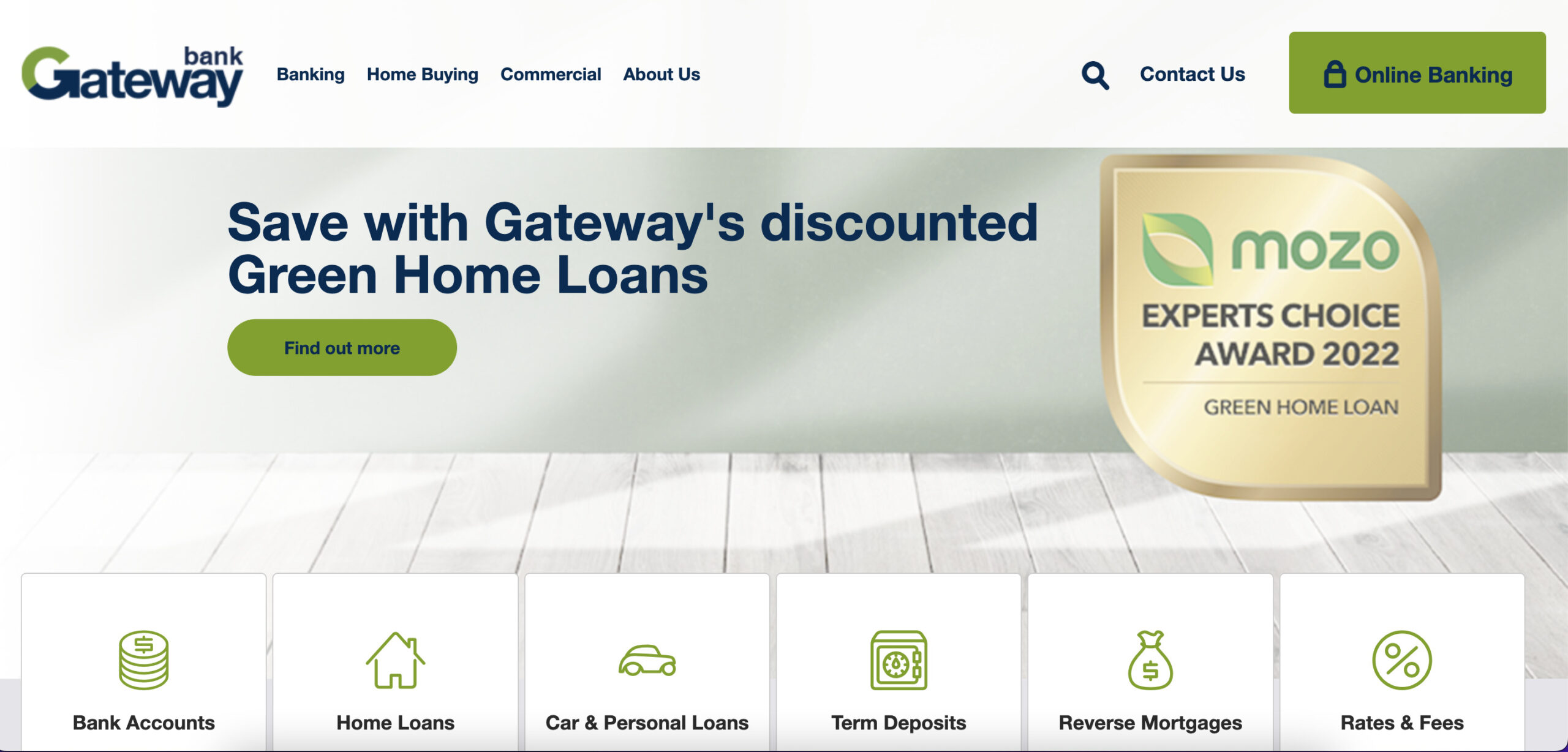
Also, you should consider the Gateway Bank website as a fantastic example of website design. You can see large buttons filled with text, and there is a scroll-over function to help users find everything quickly. At the top of the homepage, a large Help Center button is placed — it strikes the eye once you enter the site.
Byline Bank
And the last banking website on our list is Byline Bank. The website’s design is predominantly white and black color. However, it combines contemporary design particularities with old-fashioned style, so it becomes a memorable detail of Byline Bank. The website has large CTA buttons and clear navigation.
Unorthodox design style contributes to building tight and friendly relationships with clients. All necessary links are placed in the navigation bar above the fold.
Top Features For Banking Websites
Not only a striking UI and UX design is essential for a website. The banking website should have a primary number of features to make a fully-functioning website with financial services. That is why we want to list the top features your banking website requires.
- Navigation bar. As a rule, when users enter any banking website first, they pay attention to the navigation bar to find a required service. So add this bar with necessary links at the top of the page and make it visible.
- Search. The search bar is usually placed nearby the navigation bar. Search is vital to let users find the information quickly.
- Contact us page. If users have any questions about one or the other service, they should directly contact the customer support team. Contact information is usually available in the navigation bar, so users can quickly get support managers.
- Pricing page. This page should include all pricing terms and conditions the bank provides, types of cards, loyalty programs, fees/commissions, etc.
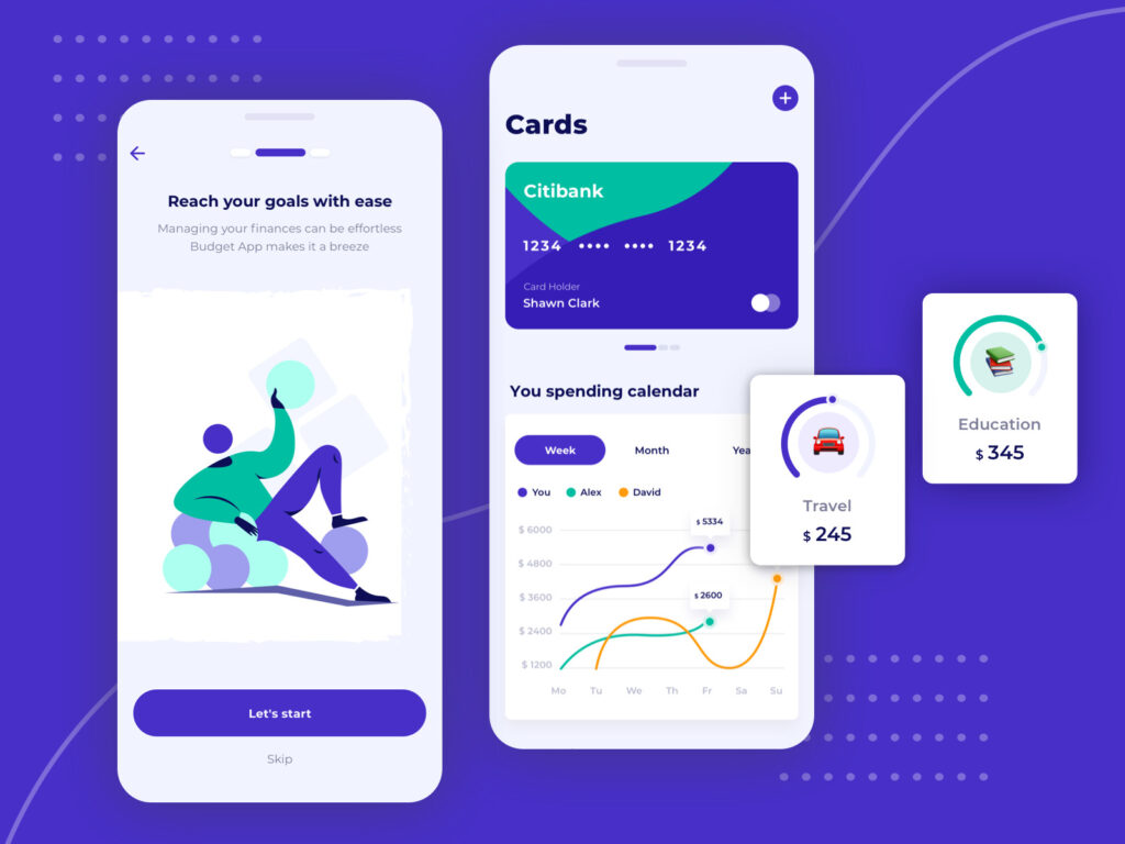
- Signup. Registration is necessary since users need to access their online accounts, and identity verification is a must. Social login (sign-up via social media networks) is impossible because the account should be duly protected via password and phone number verification. Two-factor authentication must be available.
- User personal account. There has to be a personal account of the user where their financial information is stored. The user can track financial statistics, incomes and outcomes, see all available cards, manage them, etc.
- Registration form. When potential customers enter your website, and they decide to create an account in your bank, provide a registration form as a CTA button. They will be able to fill out the form and become a client quickly.
- Blog page. On the Blog page of the banking website, you will find exciting news and articles concerning any changes in financial regulation, relevant guides, etc.
- Privacy information. A separate section on a website should be dedicated to privacy and security where users can find information about the privacy policy, and how they can be protected from cyber fraud, etc.
- Maps/geolocation. The map on your website that shows the location of ATMs, banking terminals, branches, etc. Also, depending on users’ location, it may help them find nearby branches or ATMs.
- Social sharing. When customers can share some exciting information and news concerning your banking services, it plays into the hands of your bank. Words are superfluous.
- Exchange rates. It is an additional advantage of the banking websites — users can check exchange rates to have up-to-date information.
- Customer support chat. The support team should always be in touch to help users if they face some problems or have any questions. But apart from online chat, add phone numbers to let users call the support team directly.
Common UX Mistakes To Avoid: Takeaways To Make A Bank Website Design Better
Pitfalls exist, you know. When designing a website, no matter what type, it is crucial to avoid design mistakes that will lead to failures and website abandonment. What should you do to make your website design perfect? Here are some tips to help you.
- Be customer-oriented. Remember that your banking website should be created as a customer service tool, not a sales tool. Of course, you sell services, but you should provide it flawlessly. Imagine as if you are a customer. Think like a customer. Your website should contain only the necessary features. The faster customers perform an action, the higher their loyalty will be. Besides, customer support must be available 24/7 to help users solve arising issues.
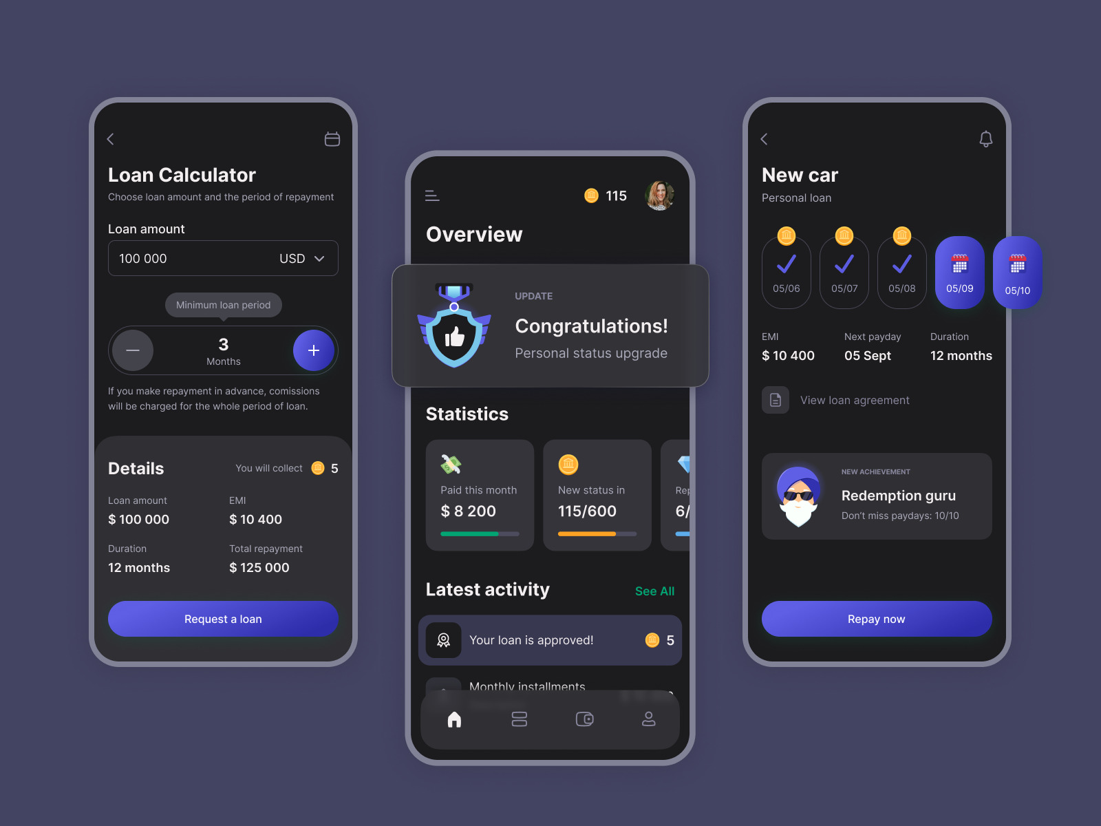 UI\UX for Cash Advance App Cadabra Studio
- Make vital information easy-to-find. Unfortunately, even a stunning design may hide important information behind many layers of tangled interface. How will your customer feel when they have to play a guessing game? It is a simple play with fire. So give users what they need as quickly as it is possible.
- Explain everything. A detailed explanation of each taken action may serve you well. For example, when you ask the user to enter card data, you have to indicate the correct format example. Don’t remind the user that they made a mistake — help them avoid this mistake by providing how-to tips.
- Choose the right color. Although colors are related to UI design, properly selected colors directly impact the user experience. Colors shouldn’t be irritating, and color backgrounds must be calm and warm.
So What’s Next?
However, all these above tips may be unnecessary for you if you entrust web design for financial service companies to professionals like Cadabra Studio. Our designers will select the appropriate colors for your banking website. They will think out UX and build a top-notch UI.
If you need to develop a banking website from scratch, our team is also ready for the battle. Web developers will create the frontend and backend, including your requirements and considering all security issues.
Do you need a detailed consultation? Get in touch with our business development team. Do you need a project estimation? They will do it as well. Have any questions? Managers are at your disposal. Start your project right now!

